描述性统计
Section outline
-
The Purpose of this Lesson
In this lesson, you will use statistics to summarize data about scenarios. You'll interpret what those statistics tell us about the data and the scenario. You'll begin to represent data and statistics graphically with box plots.
::在此教训中, 您将使用统计数据来总结关于假设情况的数据。 您将解释这些统计数据告诉我们的数据和假设情况。 您将开始用框块来图形化地表达数据和统计 。Introduction: Descriptive Statistics
::导言:描述性统计Previously , you've modeled scenarios with a variety of function types and solved equations to answer questions about those scenarios. You've explored the tables, graphs, and equations that represent relationships between two quantities represented by two variables. You've learned to transform your functions and modify their parameters to better reflect the scenario you are modeling. Y ou've also learned a variety of techniques you can use to solve equations and systems of equations. Your work so far can generally be classified as the practice of algebra . Algebra is primarily concerned with using variables to represent relationships between quantities.
::之前, 您已经用各种函数类型模拟了假设情景, 并解决了方程式来回答关于这些假设情景的问题。 您已经探索了代表两个变量所代表两个数量关系的表格、 图表和方程式。 您已经学会了转换函数和修改参数, 以更好地反映您正在建模的假设情景。 您还学习了各种技术, 您可以用来解析方程式和方程式系统。 您迄今为止的工作一般可以被归类为代数练习。 代数主要涉及使用变量来代表数量之间的关系 。The branch of mathematics called statistics uses tools from algebra, but is primarily concerned with numerical summaries of data. These numerical summaries are named the same as the overall practice: descriptive statistics .
::称为统计的数学分支使用代数工具,但主要涉及数据的数字摘要,这些数字摘要的名称与总体做法相同:描述性统计。You work with statistics every day. A statistic is a single number that summarizes a data set . The purpose of a statistic is to reflect something true about the data, and hopefully something true about the reality that the data was drawn from.
::你每天都在用统计来工作。统计是汇总数据集的单一数字。统计的目的是要反映数据的真实性,并希望数据来自真实性。
Activity 1: Interpreting Statistics
::活动1:解释统计Work it Out
::工作出来Here are several examples of statistics. Speculate on what the statistic tells about the data and scenario it is meant to reflect .
::以下是几个统计数字的例子,说明统计对它要反映的数据和假设情况所说明的情况。
::2015年波士顿马拉松500个完成者的数据 2015年 2: 24: 56 波士顿马拉松赛跑者2015年 3: 45: 45: 00 最低时间 波士顿马拉松赛跑者2015年 2: 09: 17: 17: 500 篮球质量 317.420千克马西姆 篮球质量 以上500. 0.705千克马西姆质量 以上500篮球 0.0.625千克 2017年 以上500个篮球 0.635千克日均质量 500袋多色糖果中500袋多色糖果的绿色罐头 6.3 以500袋多色糖果中的绿色糖果数量 6: 45: 00 最低时间 2012年 美国汽车和卡车每加仑每加仑500个篮子 317. 420: 0. 705千克美日日日食质量 0.003 2017 以上篮球篮球球 201 20 20 双倍 方糖卡路里卡路里卡数量 121Midian calto卡路里卡路里卡热 20 出售的KMIM2MIMMIM2 的卡卡卡卡卡卡卡卡卡卡卡卡卡卡的卡卡的卡的卡路里热2020 销售。Statistics
::统计统计统计统计统计Descriptive s tatistics is a branch of mathematics concerned with describing the world with numerical summaries of data. These numerical summaries of data are called descriptive statistics.
::描述性统计是数学的一个分支,涉及用数据数字摘要描述世界,这些数据数字摘要称为描述性统计。Common examples of descriptive statistics : mean, , mode, minimum , maximum , range , quartiles, inter- quartile range, standard deviation , and the correlation coefficient , all of which you'll explore in this chapter.
::描述性统计的常见例子:平均值、 模式、 最低值、 最大值、 范围、 四分位数、 分子间范围、 标准偏差 和关联系数, 所有这些都将在本章中加以探讨。Box Plots
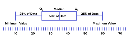
::框绘图In prior studies, you have likely learned how to create a box plot from five statistics about a data set . The five specific values are often referred to as a five-number summary . It consists of the following:
::在先前的研究中,您可能已经从关于数据集的五个统计数据中学会了如何创建框图。这五个具体值通常被称为5个数字摘要。它包括以下内容:-
The
median
of the data set.
::数据集的中位数。 -
The
minimum
.
::最起码的。 -
The
maximum
.
::最大点 -
The median of the
lower quartile
, that is, the median of the first half of the data set.
::下四分位数的中位数,即数据集前半部分的中位数。 -
The median of the
upper quartile
, that is, the median of the second half of the data set.
::上四分位数的中位数,即数据集后半部分的中位数。
A box plot is constructed as shown below to represent these values and how they relate to each other. It shows you the distribution of the data : the shape , center , and spread . The -axis reflects the possible values of the data. The median is a measure of center; it's the vertical line in the middle . The minimum and maximum show you the spread of the data. They are shown as vertical lines at the extreme left and right, and they form the end points of the whiskers of the plot. The lower quartile, is the median of the first half of the data. It's at the left boundary of the central box. The upper quartile, is the median of the second half of the data. It forms the right boundary of the central box. The central box representing the middle 50% of the data tells you something about the shape and spread of the data.
::框图的构造如下所示, 以显示这些值以及它们彼此的关系。 它向您展示数据分布情况: 形状、 中心、 和分布。 x 轴反映数据可能的值。 中位数是中间的量度; 中位数是中间的垂直线。 中位数是中间的垂直线。 最小值和最大值显示数据的分布。 它们显示为极左和极右的垂直线, 并形成图图中胡须的终点 。 下方的四角值 Q1 是数据前半的中位数 。 它位于中位数框的左边缘 。 上方的四角值 Q3 是数据后半的中位数 。 它构成中方框的右界 。 代表数据的中点 50% 的中央框会告诉您关于数据形状和扩展的某个东西 。A box plot shows the distribution of data, specifically shape, center, and spread. Box Plots
::框绘图Box plots use five statistics from a data set to represent the shape, center, and spread.
::框图使用来自数据集的五种统计数据来代表形状、中心和传播。-
The median is the measure of center.
::中位数是中间的量度。 -
The range is an indicator of the spread of the data.
::范围是数据传播的一个指标。 -
The inter-quartile range and the relative sizes of each quartile are indicators of the shape and spread of the data.
::每四分位数之间的分布范围和相对大小是数据形状和分布的指标。
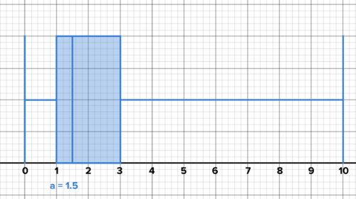
PLIX Interactive
::PLIX 交互式互动Example 1-1
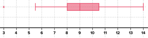
::例1-1Each student in a class of 20 takes his or her heart rate, in beats per minute. The data is below. Represent the data as a box plot. What is the inter-quartile range , that is, the difference between the third and first quartile ? Interpret the IQR in the context of the scenario. What is the overall range of the data? Interpret the range in the context of the scenario. What does the box plot reveal about the data and the class?
::20年级每个学生的心率每分钟以节拍方式计算。数据在下面。将数据作为框图显示。 数字之间的范围是多少, 即第三个和第一个四分位之间的差别? 在假设情景中解释IQR。 数据的总体范围是多少? 在假设情景中解释范围是多少? 框图显示的数据和类别是什么?78, 84, 60, 62, 72, 79, 64, 81, 72, 51, 88, 84, 93, 98, 57, 72, 79, 74, 81, 60
Solution: The box plot is shown below. The IQR is 19.5 beats per minute. This means that the heart rates of the middle 50% of the class are all within 19.5 beats of each other. The range of the data is 47 beats per minute. The range is almost as large as the minimum value of 51 beats per minute. The fastest heart rate is almost twice the slowest. The 25% of heart rates just above the median range from only 76 to 82.5.
::解决方案: 框图如下。 IQR 是每分钟19.5个节拍。 这意味着中层50%班级的心率都在19.5个节拍内。 数据范围是每分钟47个节跳。 范围几乎等于每分钟51个节跳的最低值。 最快的心率几乎是最慢的两倍。 仅高于中位的25%的心率在76到82.5之间。Each student in a class of 20 takes his or her heart rate in beats per minute. What is the IQR?
Activity 2 : Outliers
::活动2:外部点A box plot shows us the shape, center, and spread of a data set. Sometimes, a value is so far from the middle 50% of the data that, if you like, it can be graphed separately to distinguish it from the rest. These values are called outliers . To detect an outlier , look for values that are far above or far below How far? If a value is more than 1.5 times the IQR above or below it's an outlier. When graphing outliers separately, the whiskers stop at the last values before any outliers.
::框图显示数据集的形状、 中心及分布 。 有时, 值离数据中间的50%太远, 如果您喜欢的话, 可以将其图解与其余数据分开。 这些值被称为外部值 。 要检测外端值, 请查看远高于 Q3 或远低于 Q1 的值 。 如果一个值是 Q3 或 Q1 以上的IQR 1.5 倍以上, 则是一个外部值 。 在单独绘制外端图时, Whistskers 会在任何外端前的最后一个值停止 。Example 2-1
::例2-1The winning time of the 2014 Boston Marathon was 2:08:37. The values below represent the minutes above two hours (rounded down to the nearest half-minute) for the winning times from 1983 to 2014. Graph as a box plot. Make observations about the shape, center, and spread of the data, interpreted in the context of the scenario.
::2014 年波士顿马拉松的胜利时间是 2: 08: 37 。 下面的数值代表了1983 至 2014 年两小时以上(四舍五入到 近半分钟) 的分数。 图显示为框图。 对数据形状、中心及分布进行观察,并结合情景来解释。9, 10.5, 14, 7.5, 11.5, 8.5, 9, 8, 11, 8, 9.5, 7, 9, 9, 10.5, 7.5, 9.5, 9.5, 9.5, 9, 10, 10.5, 11.5, 7, 14, 7.5, 8.5, 5.5, 3, 12.5, 10, 8.5
Solution: The data ranges from 3 minutes above two hours to 14 minutes above two hours. It suggests that for some reason there is great variety in the performance of elite runners, perhaps due to weather variability, or improvement over the years, or some other factor. Except for the outlier of 3 minutes, the data above the median spreads further than the data below. The central box shows this too--the data is slightly more tightly packed on the left of the median than on the right. There is, after all, a limit to how good the weather can get, and to how fast runners can run, but there is no limit on how bad the weather can get, or how slow the winners can run! The outlier of 3 minutes is two and a half minutes faster than the next fastest time and is in fact quite close to the world record.
::解答: 数据介于两小时以上3分钟到两小时以上14分钟之间。 它表明, 精英选手的表现由于某种原因, 也许由于天气变异, 或多年来的改善, 或其他一些因素, 存在很大的差异。 除了离3分钟以外, 中位数以上的数据会比下位数据进一步扩展。 中央框显示这个太过 -- 中位数左边的数据比右位的略为紧凑。 归根结底, 天气如何好, 以及跑得有多快, 但对于天气如何坏, 或者胜者跑得有多慢, 没有限制! 3分钟之外的数据比下一个最快的时间快2分半分钟, 事实上非常接近世界记录 。The winning times for the Boston Marathon in minutes above two hours (rounded to the nearest 30 secs) 1983 to 2014. Outliers
::外部线Outliers are values that are 1.5 times the IQR above or below the quartiles.
::外部值是四分位数以上或以下IQR的1.5倍。You choose whether to graph them separately or not.
::您选择是否将它们单独图形化 。If you graph them separately, the whiskers stop at the last value before the first outlier.
::如果您将它们分开图解, 胡须会在第一个外星之前停留在最后值 。Work it Out
::工作出来-
Watson
is a track coach
measuring shot put distances in feet for his varsity and junior varsity teams. Here is
the
data:
::华生是一位赛马教练 测量他的队伍和初级队伍的距离
Varsity: 36.8, 43.5, 45.8, 46.2, 49.1, 50.7, 52.7, 54.3, 54.4, 55.8, 56.0, 58.5
::种族: 36.8, 43.5, 45.8, 46.2, 49.1, 50.7, 52.7, 54.3, 54.4, 55.8, 56.0, 58.5Junior Varsity: 33.2, 35.4, 36.2, 37.0, 37.6, 39.4, 40.6, 40.8, 41.3, 42.1, 44.5, 50.3
::青年代:33.2、35.4、36.2、37.0、37.6、39.4、40.6、40.8、41.3、42.1、44.5、50.3Use box plots to represent and compare the data. Record your observations.
::使用框图显示和比较数据。记录您的观察结果。-
Shanda runs on her school’s track team.
Her team
recently ran the 100 meter dash at a track meet and recorded their times in seconds as shown below. Represent the data with a box plot. Shandra ran the dash in 11.1 seconds. Interpret the performance of Shandra's team members as reflected in the plot. Interpret Shandra's performance in terms of the plot.
::山田在她学校的轨道队中运行。 她的队伍最近在赛道赛场上运行了100米的冲绳,并在数秒内记录了他们的时间,如下文所示。 数据用盒子图示。 山田在11.1秒内运行了冲绳。 解释山田队成员的表现,如图中所反映的。 解释山田队的表现。
11.7, 10.8, 11.1, 10.9, 11.7, 11.6, 12.0, 19.6, 12.2, 11.6, 11.5, 11.6, 11.0, 12.0, 11.6, 11.5, 11.7, 11.3, 12.3, 10.1.
-
Create a
box-and-whisker plot
for each data set.
- 90, 104, 98, 156, 140, 85, 122, 129, 142, 138, 131, 81, 151, 147, 130, 156
- 316, 385, 338, 410, 390, 328, 335, 406, 355, 310, 332, 374, 359, 640, 417, 382, 317
::为每套数据集建立一个盒子和密码图。 90、104、98、156、140、85、122、129、142、138、131、81、151、147、130、156、316、385、338、410、390、328、335、335、310、332、374、359、640、417、382、317 -
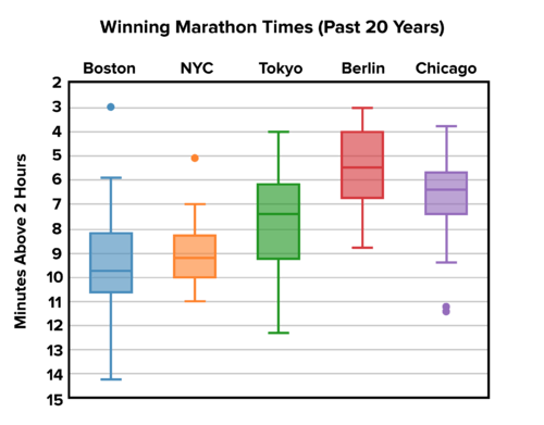
Below are box plots showing the winning time for various marathons over 20 years, with outliers shown. Interpret, compare, and contrast the data from each marathon.
::下面是显示20年中各种马拉松获胜时间的方框图,并显示外线。解释、比较和对比每个马拉松的数据。
Winning times for various marathons over 20 years. Outliers are shown. -
A class of 20 students takes a difficult test. The scores have a median of 85 with an IQR of 10. There are no outliers. The minimum is 65. Sketch several possible box plots to represent the data. Interpret each plot.
::由20名学生组成的班级接受困难的测试,分数中位数为85,智商报告为10,没有离子,最少为65,可以代表数据的几块可能的框图。每个图图解。 -
The height of corn stalks in a field ranges from a minimum of 4 feet to a maximum of 7 feet. The median is 6 feet. Sketch several possible box plots that represent the data. Interpret each plot.
::田野中玉米根茎的高度从最少4英尺到最多7英尺不等,中位数为6英尺。可绘制几块代表数据的框块。解释每一块块。 -
Is it possible for the median of a data set to be the same as exactly one quartile? Explain with examples.
::数据集的中位数能否与一四分之一完全相同?请举例说明。 -
A box plot is given below. Are outliers graphed separately? How do you know?
::下面给出一个框图。 外部线是单独图解的吗 ? 你怎么知道 ?
A box plot. Are outliers graphed separately? How can you tell? -
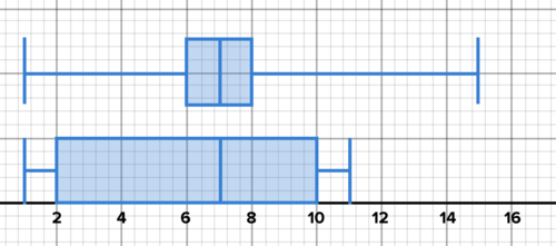
Two box plots are shown below. In both cases, the data is roughly symmetrical, but the shape and spread of the data are different. Compare and contrast the two data sets. Discuss the range, the IQR, and the range compared to the IQR.
::下面显示两块框图。 在这两种情况下,数据大致对称,但数据的形状和分布不同。比较和比较这两个数据集。讨论范围、 IRR 和与IR的比较范围。
Two box plots with roughly symmetrical data, but with differing center and spread.
Activity 3: Skew
::活动3:扭曲Many distributions are roughly symmetrical, that is, the shape and spread to the left and right of the median is roughly the same. T he box plots in the last problem are roughly symmetrical. But sometimes data can be skewed so that it's not symmetrical. An example follows.
::许多分布大致对称,即中位数的形状和向左和向右的分布大致相同。 最后一个问题中的框块大致对称。 但有时数据可以被扭曲,因此数据不是对称的。 一个例子如下。Example 3-1
::例3-1Jim works part-time at a coffee shop . He keeps track of the value of every tip on his birthday, including those customers who didn't leave a tip. Below are his tips for the day, in dollars. Make a box plot of the data. Interpret the plot in the context of the scenario. Discuss skew . What is the mode ? How does the mode influence the distribution?
::Jim在咖啡店兼职工作。 他记录了他生日时每条小费的价值, 包括那些没有留下小费的顾客。 下面是当天的小费, 以美元计。 绘制一个数据框图。 解释假设情景中的图案。 讨论 扭曲。 模式是什么? 模式如何影响分布 ?1, 1, 0, 0, 0, 0, 0, 1, 1, 1, 1, 1, 1, 2, 2, 3, 2, 2, 2, 2, 3, 3, 3, 1, 3, 4, 6, 1, 4, 10
Solution: The plot below shows that the values are more tightly clustered close to the minimum. This makes sense given the scenario. It's not possible to give Jim a negative tip, and values for tips are typically not very high at coffee shops, so they are by nature clustered around smaller values. The mode is one dollar. But perhaps surprisingly, there were enough tips above a dollar that the median was 1.5. The third quartile was 3 dollars, with an impressive maximum of 10 dollars. This data is skewed right. There is a long tail to the right, showing data extending far to the right of the median.
::溶液 : 以下的图示显示, 数值更紧密地组合在接近最小值的地方。 考虑到这种情况, 这样做是有道理的。 给吉姆一个负提示是不可能的, 咖啡店的小费的值通常不高, 所以从性质上来说, 小费的值通常不高, 所以小费的值是围绕小值的。 模式是一美元。 但也许令人惊讶的是, 超过一美元的小费就足够了, 中值是1.5。 第三个四分位数是三美元, 令人印象深刻的上限是十美元。 这个数据向右倾斜了。 右侧有很长的尾巴, 显示的数据远达中值的右侧 。Jim works part-time at a coffee shop. Here are the tips he received on his birthday. Skew
::扭曲扭曲A data set is skewed if it is not symmetrical.
::如果数据集不是对称的,则数据组是偏斜的。This can occur when a large proportion of the values are clustered close to a value, with other values relatively well-dispersed opposite the median.
::当相当大比例的数值集中在接近某一数值的组群中,而其他数值相对分布较好,与中位值相反时,就可能出现这种情况。Interactive
::交互式互动Use the interactive below to adjust a set of 10 data points and observe the results. How do you create outliers? How do you skew the data to the left or to the right? How do you make the median the same as one of the quartiles?
::使用下面的交互效果来调整一组 10 个数据点并观察结果 。 您如何创建外部线 ? 您如何将数据偏向左边或右边 ? 您如何使中位数与四分位数中的中位数相同 ?INTERACTIVEBoxplots and Outliers-
Move the red points to change values in the data set and observe how the box-and-whisker plot changes in response.
::移动红点以改变数据集中的值, 并观察框和条纹图的响应变化 。
+Do you want to reset the PLIX?Work it Out
::工作出来-
Create a data set of 10 values that is skewed right. Create a data set of 10 values that is skewed left. Make box plots for both. Explain how you know the data is skewed.
::创建一个由 10 个值组成的数据组, 该数值组向右倾斜。 创建一个由 10 个值组成的数据组, 该数值组向左倾斜。 为两者绘制框图。 解释您如何知道数据是斜斜的 。 -
Here are the scores for 20 students on a recent exam. Create a box plot with outliers graphed separately, and discuss the shape, center, and spread, as well as the skew. What is the mode?
::这是最近考试中20个学生的得分。 创建一个盒子图, 外层图解分开, 讨论形状、 中心、 分布以及扭曲 。 模式是什么 ?
45, 57, 65, 74, 78, 80, 83, 85, 90, 95, 95, 95, 96, 97, 100, 100, 102, 102, 102, 102
-
Find the
average
score from the data set above. Mark this on your box plot. How does the
mean
compare to the median? Explain the difference between the two. Remove the two lowest values, then find the median and mean again. Now compare the mean and median. What do you observe? Explain these results.
::从上面的数据集中查找平均分数。 在您的框图中标记此值。 平均值与中位数的比较如何? 解释两者的差别。 删除两个最低值, 然后再次找到中位数和中位数。 现在比较中位数和中位数。 您观察了什么? 解释这些结果 。
Interactive
::交互式互动Use the interactive below to adjust values to the data set, and compare the mean to median. Record your observations.
::使用下面的交互效果来调整数值以适应数据集,并将平均值与中位数进行比较。记录您的观察结果。INTERACTIVEMean vs. Median-
Move the red points to change values in the data set.
::移动红点以更改数据集中的值。 -
Observe how the mean and median differ when the points are changed.
::当点数改变时,观察平均值和中位数如何不同。
+Do you want to reset the PLIX?Summary
::摘要-
Descriptive statistics are numerical summaries of data.
::描述性统计数字是数据的数字摘要。 -
Box plots use five statistics to provide a visual representation of the shape, center, and spread of data.
::框图用五种统计数据来提供数据形状、中心和传播的直观表示。 -
The practice of statistics consists of computing, representing, and interpreting statistics in the context of the data and scenario.
::统计实践包括在数据和假设情况下进行计算、代表统计和解释统计。
-
The
median
of the data set.