创建直方图
章节大纲
-
Consider the data from a previous lesson regarding the number of cars sold during each week of a particular month:
::考虑从先前的教训中得出的关于某个月每星期售出的汽车数量的数据:Week Number Cars Sold 1 21 2 12 3 17 4 24 How would you go about displaying this data as a histogram ?
::你会如何用直方图显示这些数据?By the end of this lesson, I think you’ll see that converting properly organized data into a visual format is really quite straightforward.
::将组织得当的数据转换成直观格式, 确实相当简单。Creating Histograms
::创建直方图A histogram is really just a rather specific form of a bar chart where the bars are designed to be proportional in area to the frequency and in width to the interval that is represented by the bar. The most immediately obvious difference is that there is also no gap between bars, allowing histograms to display continuous data, if it has been organized into intervals.
::直方图其实只是条形图的一种相当具体的形式, 条形图的设计在区域中与频率成正比, 宽度则与条形图所代表的间距成正比。 最直接明显的区别是, 条形图之间也没有差距, 如果直方图是按间隔排列的, 则让直方图显示连续数据 。Creating a histogram is relatively easy once your data has been properly organized, so clearly laying out your data is an important first step. Organizing the data into a table before actually constructing your histogram may also help.
::创建直方图比较容易,一旦您的数据得到妥善组织,因此明确列出您的数据是重要的第一步。在实际构建直方图之前将数据组织成一张表格也可以有所帮助。You will want to be sure that you have clearly separated your data into intervals or categories. The number of divisions may depend on your particular data set , but should be few enough not to be confusing to your audience. A common rule of thumb is to aim for a number of intervals approximately equal to the square root of your number of observations or data points, and generally should be between 5 and 10 intervals. The width of each interval should be approximately the range of your data divided by the number of intervals. In other words, if you have 25 data points ranging from values of 1 to 100, you would expect to have perhaps 5 intervals of 20 units in width each.
::您将希望确定您已经将您的数据明确分隔成间隔或类别。 分区的数量可能取决于您特定的数据集, 但数量应该少到足以不会混淆您的受众。 一个共同的拇指规则是, 瞄准几段间隔, 大约等于您观测或数据点数的平方根, 一般应该在5到10个间隔之间。 每个间隔的宽度应该大约为您数据的范围除以间隔的次数。 换句话说, 如果您有25个数据点, 范围从1到100不等, 则您可能每个有5个间隔, 宽度为20个单位。Constructing Histograms
::构造直方图1. Create a histogram from the following data:
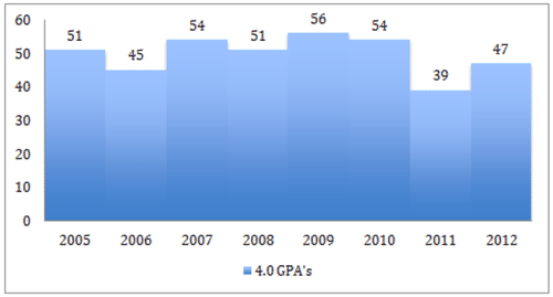
::1. 从下列数据创建直方图:Year Number of 4.0 G.P.A.'s 2005 51 2006 45 2007 54 2008 51 2009 56 2010 54 2011 39 2012 47 The data in this table is already conveniently arranged for display as a histogram. Note that there are only 8 intervals of 1 year each and a single frequency count for each interval. The only thing we need to identify before we actually place this data into a histogram is the frequency range.
::本表格中的数据已经方便地安排为直方图显示。 请注意, 每个间隔只有8个间隔为 1 年, 每个间隔只有一个频率计数 。 在我们实际将这些数据放入直方图之前, 我们唯一需要确认的是频率范围 。The lowest frequency on the table is 39, in year 2011. The highest frequency is 56, in year 2009. That means we have a vertical range of . Let’s plan to label the frequencies from 0 to 60 up the left side of our histogram.
::表中的最低频率是2011年的39个,最高频率是2009年的56个,这意味着我们的垂直射程为56-39=17个单位。 我们计划将频率在直方图左侧的0至60个频率上贴上标签。To convert this table into a histogram, all we need to do is create a chart with the intervals (the years 2005 through 2012) across the bottom along the -axis, and the frequencies (the number of 4.0 G.P.A.’s each year) up the side.
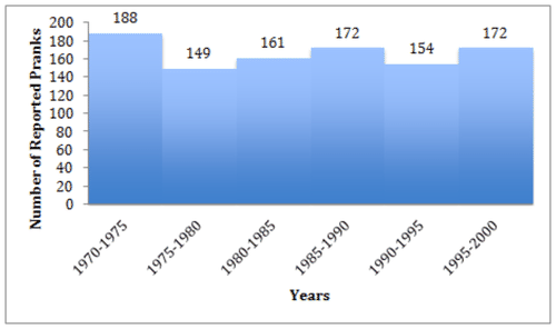
::为了将这个表格转换成直方图,我们需要做的就是绘制一张图,图中以X轴横跨底部(2005年至2012年)和侧侧频率(每年4.0 G.P.A.的频率)为间隔段(2005年至2012年)。2. Create a histogram demonstrating the number of prank calls reported over time using the data below.
::2. 利用以下数据建立直方图,显示一段时间以来报告的恶作剧电话数量。Year Number of Pranks Year Number of Pranks 1970 24 1985 24 1971 42 1986 28 1972 38 1987 38 1973 42 1988 40 1974 42 1989 42 1975 27 1990 26 1976 25 1991 39 1977 37 1992 32 1978 27 1993 26 1979 33 1994 31 1980 25 1995 36 1981 32 1996 37 1982 40 1997 38 1983 38 1998 28 1984 26 1999 33 This table has much more data than Example A. If we were to follow the same procedure, we would end up with 30 intervals, which would make a rather crowded and confusing histogram. We can solve this by binning the data before we import it into our histogram.
::这个表格的数据比例A要多得多。 如果我们遵循同样的程序, 我们最后会每隔30个间隔, 这将使直方图变得相当拥挤和混乱。 我们可以在将数据输入直方图之前,通过将数据输入到直方图中来解决这个问题 。Binning data means to group the given intervals or categories into broader ranges (bins) in order to limit the number of different intervals. In this case, we have a total of 30 data points, so our ‘square-root rule of thumb’ would suggest 5-6 bins . If we opt for 5 bins, we would have years per bin, and if we opt for 6 bins, we would have years per bin. 5-year intervals are common, and will be easy for your audience to understand. If we group our original data into 5-year intervals, it looks like this:
::Binning 数据意味着将给定的间隔或类别分组为更广泛的范围( bins) , 以限制不同间隔的数量。 在这种情况下, 我们共有30个数据点, 因此我们的“ 平方根拇指规则” 将显示5-6 个文件夹。 如果我们选择了 5 个桶, 我们每个箱子有 305=6 年, 如果我们选择了 6 个桶, 我们每个箱子有 306 =5 年。 5 年间隔是常见的, 观众很容易理解 。 如果我们将原始数据分组为 5 年间隔, 它看起来是这样的 :Interval Number of Pranks 1970 - 1975 1975 - 1980 1980 - 1985 1985 - 1990 1990 - 1995 1995 - 2000 Now we can take our binned data and display it as a histogram with our 5-year intervals along the bottom and number of reported pranks (the frequencies) up the side:
::以直方图显示数据, 以五年间隔, 沿着底部和报告的恶作剧次数(频率),3. Create a histogram to display the number of shoe types in several price ranges, using data from the table below:
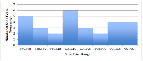
::3. 利用下表的数据,创建直方图,以显示若干价格范围的鞋类数量:Shoe Type Price Shoe Type Type sandals $25 loafers $44 sneakers $63 high heels $28 sneakers $43 boots $26 sneakers $38 high heels $43 loafers $62 sandals $62 sneakers $45 loafers $30 sneakers $56 high heels $51 sneakers $25 sneakers $58 loafers $44 high heels $63 boots $30 loafers $43 high heels $36 loafers $31 loafers $29 sneakers $56 loafers $62 boots $54 loafers $48 high heels $55 sneakers $45 sandals $40 The first step is to identify your categories or intervals. In this situation, we are expected to compare the frequency of shoe types in price range intervals, so we will need to decide what our intervals should be by dividing up the price ranges appropriately.
::第一步是确定您的类别或间隔。 在这种情况下,我们预期会在价格范围间隔中比较鞋类种类的频率,因此我们需要决定我们之间的间隔,适当划分价格幅度。The lowest price in the data set is $25, and the highest is $63. This gives us a range of $38, so we can round that up to $40. $40 divides conveniently by 5, so we could go with 8 intervals of $5 each. That may be a bit more detailed than we really need since there are only 30 data points, which would suggest 5 or 6 intervals rather than 8, but we are still under 10, and the $5 intervals will be easy for our audience to identify with.
::数据集中最低价格为25美元,最高价格为63美元。这给了我们38美元的范围,这样我们就可以将40美元左右。 40美元可以方便地在5美元之前进行计算。 40美元可以方便地在5美元之前进行计算,这样我们可以在8个间隔之间每5美元进行计算。 这可能比我们真正需要的要详细一些,因为只有30个数据点,这意味着每隔5个或6个间隔,而不是8个间隔,但我们仍然在10美元以下,5美元间隔对于我们的听众来说很容易识别。
Next we need to identify a range of frequencies for our selected intervals, which means we will need to count the number of entries in each interval using our question data. At this point we can either ‘hunt through’ the data, counting as we go, or we can re-organize the original data by price to simplify the counting process. Since we are not actually using the data regarding the names of each shoe type, only the frequency based on price, we can just organize the prices in dollars by ascending order:
::接下来,我们需要确定我们选定间隔的频率范围,这意味着我们需要用我们的问题数据来计算每个间隔的条目数量。 此时此刻,我们可以要么通过数据“搜寻 ” , 逐个进行计数,要么通过价格重组原始数据以简化计数过程。 由于我们实际上没有使用每只鞋类型名称的数据,只有以价格为基础的频率,我们可以通过上调顺序将价格按美元排列:25, 25, 26, 28, 29, 30, 30, 31, 36, 38, 40, 43, 43, 43, 44, 44, 45, 45, 48, 51, 54, 55, 56, 56, 58, 62, 62, 62, 63, 63
Then we can group the list according to our chosen interval of $5:
::然后,我们可以按照我们所选择的5美元间隔对清单进行分组:25, 25, 26, 28, 29 | 30, 30, 31 | 36, 38 | 40, 43, 43, 43, 44, 44 | 45, 45, 48 | 51, 54 | 55, 56, 56, 58 | 62, 62, 62, 63, 63
By convention, a value equal to the lower limit of an interval is included, but a value equal to the upper limit is not (upper and lower interval limits are also called class limits ). For example, a $40 entry is included in the $40-$45 interval since $40 is the lower limit of that interval, but the two $45 entries are included in the next interval up ($45-$50), since $45 would be the upper limit of the $40-$45 interval.
::按惯例,包含一个等于一个间距下限的值,但不包含一个等于上限的值(上限和下限也称为等级限制),例如,40美元间隔包括一个40美元条目,因为40美元是该间隔的下限,但两个45美元条目包括在下一个间隔(45美元-50美元),因为45美元将是40美元-45美元间隔的上限。Finally, we take the grouped data and summarize by frequency in each interval:
::最后,我们按每个间隔的频率对数据进行分组和总结:Interval (Price range) Frequency (Number of shoe types) $25-$30 5 $30-$35 3 $35-$40 2 $40-$45 6 $45-$50 3 $50-$55 2 $55-$60 4 $60-$65 4 Finally we construct our histogram frame with intervals along the bottom and frequencies up the side:
::最后,我们建造直方图框架,在底部和侧侧频率上间隔:Earlier Problem Revisited
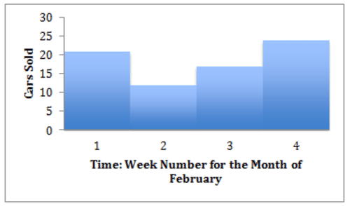
::重审先前的问题Consider the data from a previous lesson regarding the number of cars sold during each week of a particular February:
::考虑从以往经验中得出的有关2月份每星期售出的汽车数量的数据:Week Cars 1 21 2 12 3 17 4 24 How would you go about displaying this data as a histogram?
::你会如何用直方图显示这些数据?Compared to the examples you completed during the lesson, this is a piece of cake! The data is already organized into 4 convenient bins, and the number of cars sold has been totaled for each bin. Just create your histogram with weeks across the bottom and number of cars sold up the side:
::与您在课程中完成的示例相比, 这是一块蛋糕! 数据已经编成4个方便的垃圾桶, 每个垃圾桶的售车量已经全部计算。 只需创建您在底部的周数和侧面售车数的直方图 :Examples
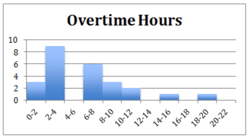
::实例The head of human resources wants to know how many of the department heads work overtime in a given month. The data is displayed in the following histogram. Use it to answer examples 1 - 3.
::人力资源主管想知道每个月有多少部门主管加班。数据以直方图显示,用来回答例子1-3。Example 1
::例1What do the numbers on the horizontal axis represent?
::水平轴上的数字代表什么?The horizontal axis shows intervals of hours worked overtime.
::水平轴显示加班时数间隔。Example 2
::例2What do the numbers on the vertical axis represent?
::垂直轴上的数字代表什么?The vertical axis displays the number of department heads falling within each interval.
::垂直轴显示每个间隔范围内的部门主管人数。Example 3
::例3What percent of department heads work 6 or more hours of overtime in a given month?
::哪个部门主管在一个月内加班6小时或6小时以上?52%. The histogram displays information about 25 employees. Out of these 25 employees 13 worked more than 6 hours overtime. We divide and come up with .52, or 52% who work more than 6 hours of overtime
::52. 直方图显示大约25名雇员的信息,其中13名雇员加班超过6小时,13名雇员加班超过6小时,1325分1325分52分,52%的雇员加班超过6小时。Example 4
::例4Here are the driving scores of 15 new drivers. Create a histogram from their scores:
::以下是15名新司机的驾驶分数。88, 48, 60, 51, 57, 85, 69, 75, 97, 72, 71, 79, 65, 63, 73
First we should determine how to break the range of values into intervals. In this instance, since our data set consists of driving scores, it would make sense to choose intervals of 10 points: 40-50, 50-60, ... 90-100, since most tests are determined by a certain percentage. By counting how many of the 25 observations fall in each of the intervals, we get the following table:
::首先,我们应确定如何将数值范围分成间隔。在此情况下,由于我们的数据集包括驾驶分数,选择10点的间隔:40-50,50-60,...90-100是合情合理的,因为大多数测试由一定百分比确定。通过计算每个间隔中25次观测中有多少次,我们得到以下表格:Driving Scores Score Count [40-50) 1 [50-60) 2 [60-70) 4 [70-80) 5 [80-90) 2 [90-100] 1 To construct the histogram from this table, we plot the intervals on the -axis, and represent the number of observations in each interval (the frequency of the interval) on the -axis, by the height of a rectangle located above the interval:
::为了从此表格构建直方图, 我们绘制 X 轴上的间隔, 并代表Y 轴上每个间隔( 间隔的频率) 的观测次数, 以距离上方矩形的高度 :Example 5
::例5What percentage didn't pass?
::哪个百分数没有通过?47% - First we must find the total number of people who took the driving test. It looks like this: . 15 people took the test. Now we identify how many received below 70 %, . To find out the percentage, we divide the number of people who earned less than 70%, or 7, by the total number of people who took the driver’s test, 15. . We can say that 47% of the people who took the driver’s test did not pass.
::47 % - 首先,我们必须找到参加驾驶考试的总人数。 看起来是:1+2+4+5+5+2+1=15。 15人参加了考试。 现在,我们确定有多少人接受了低于70%的考试,1+2+4=7。 为了了解百分比,我们把收入低于70%或7的人除以参加驾驶考试的总人数,15 715=47。 我们可以说,参加驾驶考试的人中有47%没有通过考试。Review
::回顾The following numbers need to be used in creating a histogram. Use this data to answer questions 1-4
::创建直方图时需要使用下列数字。使用此数据回答问题 1-49.3, 10.6, 10.6, 10.6, 10.2, 10.7, 9.9, 10.5, 10.4, 8.8, 9.6, 9.8, 9.2, 10.9, 10.0, 11.4, 10.8, 8.9, 10.4, 8.9, 9.6, 8.4, 11.2, 10.3, 10.1, 9.6, 11.1, 9.4, 9.4, 10.6, 8.9, 10.8, 9.2.
1. Identify the range for the above data.
::1. 确定上述数据的范围。2. Based on the data, what would be an appropriate number of Intervals?
::2. 根据数据,什么是适当数目的间隔期?- 7-10
- 11-15
- 13-20
3. If the width of an interval is .4, and the lowest reading is 8.4, it is the starting point. What will be the upper end of the first interval? The second, third and so on?
::3. 如果一个间隔的宽度为 4, 最低读数为 8.4, 则为起点。 第一个间隔的上端是什么? 第二个间隔, 第三个间隔等等 ?4. Create a histogram for the data set above. Remember that numbers that fall on the high end of one interval and the low end of the next interval should be placed in the lower interval. For instance in the interval 8.4 – 8.8, only 8.4, 8.5, 8.6, and 8.7 belong, 8.8 would be the lowest value in the next interval.
::4. 为上面的数据集创建直方图:记住,一个间距高端和下一个间距低端的数字应放在较低间距内,例如,在8.4-8、只有8.4、8.5、8.6和8.7的间距内,8.8将是下一个间距内最低值。5. The following table shows a cumulative frequency distribution of the ages of tri-athletes. Convert the data to standard frequencies, and create a histogram to graph the absolute frequencies.
::5. 下表显示了三个民族年龄的累积频率分布。将数据转换为标准频率,并创建直方图以图示绝对频率。Cumulative Frequency Distribution of Tri-Athelete Ages Age Group Total 20-29 8 20-39 18 20-49 25 20-59 31 20-69 35 6. The quiz scores for a job placement math assessment for the 10 applicants were: 61, 67, 81, 83, 87, 88, 89, 90, 98, and 100. Using the table below create a histogram to graph the data.
::6. 对10名申请人进行职位安排数学评估的测验分数是:61、67、81、83、87、88、89、90、98和100。Interval Frequency 61-70 2 71-80 0 81-90 6 91-100 2 7. Create a Histogram using the following list of overnight lows:
::7. 使用下列隔夜低谷清单创建直方图:41°, 58°, 61°, 54°, 49°, 46°, 52°, 58°, 67°, 43°, 47°, 60°, 52°, 58°, 48°, 44°, 59°, 66°, 62°, 55°, 44°, 49°, 62°, 61°, 59°, 54°, 57°, 58°, 63°, 60°
And the following intervals:
::和以下间隔:40-44
45-49
50-54
55-59
60-64
65-69
8. The following represents scores that a class received on their most recent Biology test. Create a histogram from the scores.
::8. 以下为一个班级在最近一次生物学测试中获得的分数,从分数中创建直方图。58, 79, 81, 99, 68, 92, 76, 84, 53, 57, 81, 91, 77, 50, 65, 57, 51, 72, 84, and 89.
::58、79、81、99、68、92、76、84、53、57、81、91、77、50、65、57、51、72、84和89。Use 10-point intervals starting with the interval 50-59.
::从50-59间隔开始,使用10点间隔。9. James received the following scores on his quizzes in US History over the course of 1 year. Create a histogram from the scores.
::9. James在一年中在美国历史的测验中获得以下分数,从分数中创建直方图。85, 72, 97, 81, 77, 93, 100, 75, 86, 70, 96, and 80.
::85、72、97、81、77、93、100、75、86、70、96和80。10. Sue competed in a time trial for the 400-meter run at the state finals. She ran against 14 others. Their times have been recorded in the table below. Complete the chart and create a histogram to represent the data.
::10. Sue参加州决赛400米赛跑时间试验比赛,她与其他14人比赛,时间记录在下表,完成图表并创建直方图以代表数据。400 Meter Run Time Trials Interval Tally Frequency 50.0-50.9 51.0-51.9 52.0-52.9 53.0-53.9 54.0-54.9 11. The following data is the weight of 30 adults, in pounds, who participated in a study on weight loss. Use the data to create a cumulative frequency table. Determine appropriate intervals for the weights given.
::11. 下列数据是30名成年人(磅)的体重,他们参加了关于体重减重的研究,利用这些数据来编制累计频率表,确定加权的适当间隔。195, 206, 100, 98, 150, 210, 195, 106, 195, 168, 180, 212, 104, 195, 100, 216, 195, 209, 112, 99, 206, 116, 195, 100, 142, 100, 135, 98, 160, 155
12. The following table shows the weights in pounds for students attending a “Get Fit” summer program. Create a histogram to graph the data.
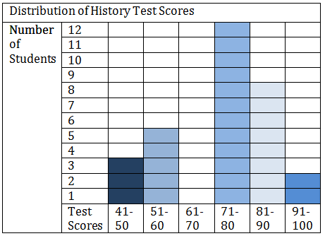
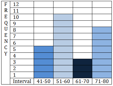
::12. 下表显示了参加 " 健身 " 暑期方案的学生的磅体重,创建直方图绘制数据图。Interval Frequency 91-100 6 101-110 3 111-120 0 121-130 3 131-140 0 141-150 2 151-160 2 13. The graph below shows the distribution of scores of 30 students on a history exam. Complete the frequency table below it using the data.
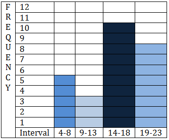
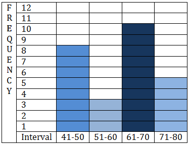
::13. 下图显示了参加历史考试的30名学生的分数分布情况,用数据填写下表的频率。Test Scores Frequency 91-100 81-90 71-80 61-70 51-60 41-50 14. Which one of the following histograms represents the data in the table below?
::14. 以下哪个直方图代表下表中的数据?Interval Frequency 4-8 8 9-13 3 14-18 10 19-23 5 A teacher was asked how many students they had to ask to stop texting on their cell phones during each of their class periods on a given day.
::一名教师被问到,他们不得不要求有多少学生在一天的上课期间停止在手机上发短信。The following data was collected.
::收集了以下数据。Class Period Frequency 1 16 2 11 3 5 4 3 5 1 15. Convert the data to a histogram.
::15. 将数据转换成直方图。16. How many class periods did a teacher have to ask less than 9 times?
::16. 教师要求的班级时间少于9次,需要多少次?17. How many times total did the teacher have to ask students to stop texting?
::17. 教师总共要求学生停止发短信多少次?Review (Answers)
::回顾(答复)Click to see the answer key or go to the Table of Contents and click on the Answer Key under the 'Other Versions' option.
::单击可查看答题键, 或转到目录中, 单击“ 其他版本” 选项下的答题键 。