线条关联
章节大纲
-
Statistics is largely concerned with how a change in one variable relates to changes in a second variable. Bivariate data is two lists of data that are paired up. Is there any relationship between the following data? If there is, does it mean that doctors cause cancer?
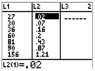
::统计主要涉及一个变量的变化与第二个变量的变化有何关联。 双变量数据是两个相配的数据列表。 以下数据之间是否有任何关系? 如果有,这是否意味着医生致癌?Number of Doctors 27 30 36 60 81 90 156 221 347 Cancer Rate 0.02 0.07 0.16 0.20 0.43 0.87 1.21 2.80 3.91 Correlation
::关联关系A scatterplot creates an ( x , y ) point from each data pair. When making a scatterplot, you can try to assign the independent variable to x and the dependent variable to y ; however, it will often not be obvious which variable is the dependent variable, so you will just have to pick one.
::撒布点从每个数据配对中创建一个点( x,y) 。 当绘制撒布点时, 您可以尝试将独立变量指定为 x , 并将依附变量指定为 y; 但是, 通常并不明显哪个变量是依附变量, 所以您只需要选择一个变量 。Once you plot the data and zoom appropriately you will see the points scattered about. Sometimes there will be a clear linear relationship and sometimes it will appear random . The correlation coefficient , r , is a number that quantifies two aspects of the relationship between the data:
::一旦您适当绘制了数据并缩放, 您就会看到数据分布的点。 有时会有一个清晰的线性关系, 有时它会随机出现。 相关系数 r 是一个数, 它量化了数据之间关系的两个方面 :-
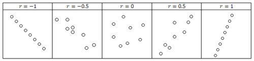
The correlation coefficient is either negative, zero or positive. This tells you whether the data is negatively correlated, uncorrelated or positively correlated.
::相关系数是负的、零的或正的。 这表明数据是负相关、 不相关还是正相关。 -
The correlation coefficient is a number between
−
1
≤
r
≤
1
indicating the strength of
correlation
. If
r
=
1
or
r
=
−
1
then the data is perfectly linear. Note that a perfectly linear relationship includes lines with slopes other than 1.
::相关系数是- 1 和 1 之间的数, 表示相关强度。 如果 r= 1 或 r 1, 则数据完全线性。 请注意, 完全线性关系包括与除 1 外的斜坡的线条。
Consider the examples below to see what different correlation coefficients will look like in data:
::考虑以下实例,看数据中不同相关系数的外观:In PreCalculus you will not learn how to calculate the correlation coefficient (you will if you take future statistics courses!). For now, the calculator will calculate it for you and your job will be to interpret the result.
::在预考前,您将无法学习如何计算相关系数(如果您选择未来的统计课程,您将学习计算相关系数 ! ) 。 目前,计算器将为您计算该系数,而您的工作将是解释结果 。If the data is sufficiently linear, then your calculator can perform a regression to produce the equation of a line that attempts to model the trend of the data. The regression line may actually pass through all, some or none of the data points. This regression line is represented in statistics by:
::如果数据足够线性,那么您的计算器可以进行回归以生成试图模拟数据趋势的线的方程。 回归线实际上可能通过所有数据点, 包括部分数据点或无数据点。 该回归线在统计数据中以下列方式表示:ˆ y = a + b x
::y=a+bxThe symbol ˆ y is pronounced “ y -hat” and is the predicted y value based on a given x value. Occasionally, you may also calculate the predicted x value given a y value, however this is less mathematically sound. Also notice that the linear regression model is simply a rearrangement of the standard equation of a line, y = m x + b .
::符号 y 表示“ y-hat ” , 是基于给定 x 值的预测 y 值。 有时, 您也可以计算给给定 y 值的预测 x 值, 但是这在数学上不太合理 。 另外请注意, 线性回归模型只是线性线条标准方程的重新排列, y=mx+b 。Examples
::实例Example 1
::例1Earlier, you were asked about the relationship between the two sets of data:
::之前有人问过你们这两组数据之间的关系:Number of Doctors 27 30 36 60 81 90 156 221 347 Cancer Rate 0.02 0.07 0.16 0.20 0.43 0.87 1.21 2.80 3.91 Enter the data onto lists in your calculator:
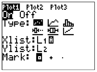
::在您的计算器中将数据输入到列表中 :Turn the [STAT PLOT] on that compares the two lists of data:
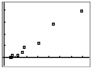
::打开[STATPLOT],比较两个数据清单:You should note that the data is extremely linear with a positive correlation coefficient:
::请注意,这些数据极直线,具有正相关系数:A naïve conclusion would be to say that doctors cause cancer. One of the most misunderstood concepts in statistics is that correlation does not imply causation . Just because there is a correlation between the number of doctors and the cancer rate doesn’t mean that the number of doctors causes the cancer. There are dozens of reasons why more doctors might correlate with higher cancer rates. In general, remember that correlation is not the same as causation. Be careful before making any conclusions about change in one variable causing change in another variable.
::一个天真的结论是说医生导致癌症。 统计数据中最误解的概念之一是相关性并不意味着因果关系。 仅仅因为医生人数和癌症发病率之间存在关联并不意味着医生人数导致癌症。 有很多原因说明更多的医生可能与癌症发病率高有关。 总的来说,记住相关性与因果关系不同。 在就导致另一个变量变化的一个变量的变化做出任何结论之前要小心谨慎。Example 2
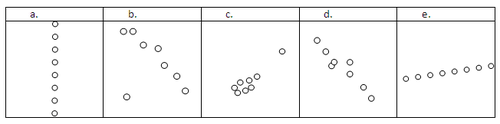
::例2Estimate the correlation coefficient for the following scatterplots.
::估计下列散点的相关系数。-
r
≈
0
. Because the height
">
(
y
)
does not seem to be dependent on the
x
, the data is uncorrelated. Another way to see this is that the slope appears to be undefined.
::r0. 由于高度似乎并不取决于 x, 数据是不相干的。 另一种看到这一点的方法是, 斜坡似乎没有定义 。
-
r
≈
−
0.7
. If the solo point in the bottom left is an
outlier
, you could choose to not include it in the data. Then, the
r
value would be closer to -1.
::r++++++++++++++++++++++++++++++++++++++++++++++++++++++++++++++++++++++++++++++++++++++++++++++++++++++++++++++++++++++++++++++++++++++++++++++++++++++++++++++++++++++++++++++++++++++++++++++++++++++++++++++++++++++++++++++++++++++++++++++++++++++++++++++++++++++++++++++++++++++++++++++++++++++++++++++++++++++++++++++++++++++++++++++++++++++++++++++++++++++++++++++++++++++++++++++++++++++++++++++++++++++++++++++++++++++++++++++++++++++++++++++++++++++++++++++++++++++++++++++++++++++++++++++++++++++++++++ -
r
≈
+
0.8
. The clump of data seems to be slightly positive correlated and the single point in the upper left has a strong effect indicating positive slope.
::r0.8. 数据组合似乎略为正相关,左上角的单点具有强烈效果,表明正斜坡。 -
r
≈
−
0.8
. The data seems to be fairly strongly negatively correlated.
::r0.8. 数据似乎具有相当强烈的负相关关系。 -
r
≈
1
. The data seems to be perfectly linearly correlated.
::r1. 数据似乎完全线性相关。
Example 3
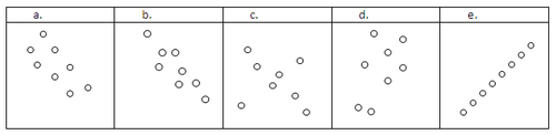
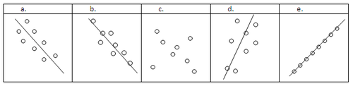
::例3Estimate the regression line through the following scatterplots.
::通过下列散点估计回归线。Visualize and sketch the “line of best fit” for each set of points.
::每一组点的“最合适线”的可视化和草图。Note that in part a, the regression line does not touch any point. Instead, it captures the general trend of the data. In part c, the correlation is not high enough in any direction to produce a regression line. The calculator may give a regression line for scatterplots that look like part c, but you need to be very skeptical that there is actually a relationship between the two variables.
::请注意, 在 a 部分, 回归线不触动任何点。 相反, 它会捕捉数据的一般趋势。 在 c 部分, 相关关系在任何方向上都不足以产生回归线。 计算器可能会给看起来像 c 部分的撒布点提供一个回归线, 但您需要非常怀疑这两个变量之间实际上存在某种关系 。Example 4
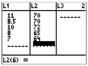
::例4Use your calculator to perform a linear regression on the following data. Then, predict the height of someone who has shoe size 9.
::使用计算器对以下数据进行线性回归。然后,预测鞋尺寸为9的人的高度。Shoe Size Height (in) 11 70 8.5 70 10 72 8 65 7 64 First enter the data.
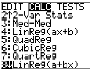
::首先输入数据。Next perform the regression. Notice that the calculator can perform linear regression in two ways that are essentially the same. To keep consistent with ˆ y = a + b x , use linear regression. This is option 8 in the [STATS], [CALC] menu.
::下一步执行回归。 请注意, 计算器可以用两种基本相同的方式进行线性回归。 要与 {y=a+bx 保持一致, 请使用线性回归。 这是 [STATS] 菜单中的选项 8, [CACLC] 菜单中的选项 8 。Now you need to tell the calculator to perform the regression on the two lists you want and where to copy the equation. The syntax is:
::现在您需要告诉计算器在您想要的两个列表上进行回归,并在哪里复制公式。 语法是 :-
LinReg
(
a
+
b
x
)
L
1
,
L
2
,
Y
1
::LinReg(a+bx)L1、L2、Y1
Note: to find Y1, go to -- [VARS], [Y-VARS], [FUNCTION], [Y1].
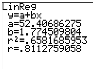
::注:找到Y1, 转到 -- [瓦 、[Y-VARS]、[发 [Y1]、[Y1]。Notice that the r value is about 0.8. This indicates that there is a fairly strong positive correlation between shoe size and height. If you calculator does not display the r and r 2 lines then you need to go into the catalog and run the program “DiagnosticOn”. This will enable the display of the correlation coefficient.
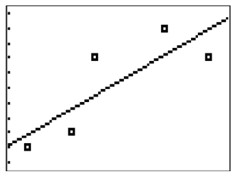
::注意 r 值约为 0. 0. 。 这表示鞋大小和高度之间有相当强烈的正相关关系。 如果您计算器不显示 r 和 r2 线, 您需要进入目录并运行“ 诊断 On ” 程序。 这将允许显示相关系数 。You can then graph the scatterplot and the regression line:
::然后您可以绘制散射图和回归线 :The regression equation is:
::回归方程式是:ˆ y = 52.4069 + 1.7745 x
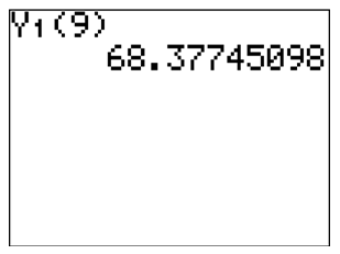
::y=52.4069+1.7745xWhere x represents shoe size and ˆ y represents predicted height. The predicted height for someone with size 9 shoe is 68.3774:
::x 代表鞋大小, y 代表预测高度。 9 号鞋的预期高度为 68. 3774 :ˆ y = 52.4069 + 1.7745 ⋅ 9 = 68.3774
::y=52.4069+1.7745_9=68.3774An easy way to use the power of the calculator is to use function notation from the home screen:
::使用计算器功率的一个简单方法是使用主屏幕上的函数符号:Example 5
::例5Shaquille O’Neal has size 23 shoes. What, if anything can you infer about his vocabulary? Does a larger shoe size cause a larger vocabulary?
::Shaquille O’Neal有23码的鞋子。你能推断一下他的词汇吗? 更大的鞋子是否会引起更大的词汇?Shaquille’s shoe size is significantly beyond the scope of the data that the model is based on. The data relates to elementary school students and a size 23 shoe is beyond the relevant domain. This means it wouldn’t make sense to use this model to predict Shaquille’s shoe size. Shoe size does not cause vocabulary, but the two variables are strongly correlated because over time both tend to grow.
::Shaquille的鞋尺寸大大超出了模型所依据的数据范围。 数据涉及小学生,23号鞋的尺寸超出了相关领域。 这意味着使用这一模型来预测Shaquille的鞋尺寸是没有道理的。 鞋的尺寸不引起词汇,但这两个变量密切相关,因为随着时间的推移,两者都呈增长趋势。Summary -
Bivariate data
consists of two lists of paired data, often used to analyze the relationship between two variables.
::双变量数据由两个配对数据列表组成,通常用于分析两个变量之间的关系。 -
A
scatterplot
is a graphical representation of bivariate data, with one variable plotted on the x-axis and the other on the y-axis.
::散射图是双变量数据的图形表示,一个变量绘制在 x 轴上,另一个绘制在 y 轴上。 -
The
correlation coefficient (r)
quantifies the relationship between the data, indicating whether it is negatively correlated, uncorrelated, or positively correlated, and its strength (ranging from -1 to 1).
::相关系数(r)量化了数据之间的关系,表明数据是负相关、无关联还是正相关,及其强度(从-1至1不等)。 -
If the data is sufficiently linear, a regression line can be calculated to model the trend of the data, represented by
ˆ
y
=
a
+
b
x
,
where
ˆ
y
is the predicted y value based on a given
x
value.
::如果数据足够线性,则可以计算回归线,以 y=a+bx 表示的数据趋势为模型,其中 y 是基于给定 x 值的预测值y。
Review
::回顾For each correlation coefficient, describe what it means for data to have that correlation coefficient and sketch a scatterplot with that correlation coefficient.
::对于每一相关系数,请说明数据具有相关系数的含义,并用该相关系数绘制散射图。1. r = 1
::1. r=12. r = − 0.5
::2. r0.53. r = − 1
::3 r 14. r = 0
::4. r=05. r = 0.8
::5. r=0.8The data below shows the SAT math score and GPA for 7 different students.
::以下数据显示了7名不同学生的SAT数学分数和GPA。SAT math score 595 520 715 405 680 490 565 GPA 3.4 3.2 3.9 2.3 3.9 2.5 3.5 6. Use your calculator to perform a linear regression that models the data. What is the regression equation? What is the correlation coefficient?
::6. 使用计算器进行线性回归,以模拟数据。回归方程是什么?关联系数是什么?7. Use the equation from #6 to predict the GPA for a student with an SAT score of 500. Does this prediction seem reasonable given the data? Why or why not?
::7. 利用第6号方程式预测GPA为成绩为500沙特德士古德的学生预测GPA,根据数据,这一预测是否合理?为什么或为什么不?8. What is the relevant domain of this data?
::8. 这些数据的相关领域是什么?9. Does a high SAT math score cause a high GPA?
::9. 高SAT数学分数是否导致高GPA?The data below shows scores from two different quizzes for 10 different students.
::以下数据显示了10名不同学生从两个不同的测验中得分。Quiz 1 Score 15 12 10 14 10 8 6 15 16 13 Quiz 2 Score 20 15 12 18 10 13 12 10 18 15 10. Use your calculator to perform a linear regression that models the data. What is the regression equation? What is the correlation coefficient?
::10. 使用计算器进行线性回归,以模拟数据。回归方程是什么?关联系数是什么?11. Use the equation from #10 to predict the Quiz 2 score for a student with a Quiz 1 score of 19. Does this prediction seem reasonable given the data? Why or why not?
::11. 利用10号的方程来预测一个学生的Quiz 2分是19分的Quiz 1分是19分,根据数据,这一预测似乎合理吗?为什么或为什么没有?12. What conclusions can you make about this data?
::12. 你能对这些数据得出什么结论?13. Explain in your own words the difference between causation and correlation.
::13. 用你自己的话解释因果关系和相关性之间的区别。14. Explain in your own words what the correlation coefficient measures.
::14. 请用您自己的语言解释相关系数的衡量标准。15. Explain why a larger sample size will cause a more accurate correlation coefficient.
::15. 解释为什么较大的样本规模将产生更准确的关联系数。Review (Answers)
::回顾(答复)Click to see the answer key or go to the Table of Contents and click on the Answer Key under the 'Other Versions' option.
::单击可查看答题键, 或转到目录中, 单击“ 其他版本” 选项下的答题键 。 -
The correlation coefficient is either negative, zero or positive. This tells you whether the data is negatively correlated, uncorrelated or positively correlated.