11.5 条形图
章节大纲
-
Mr. Davison has a number of students who do really well in his English class and some who don't seem very interested at all. He is coming up with a plan for an amazing field trip to reignite his class's interest. To get a good idea of what the current level of engagement is, Mr. Davison wants to visualize the grade distribution and he thinks a bar graph is the best way to do this.
::Davison先生有一些学生在英语班上成绩很好,有些学生似乎完全不感兴趣。他正在计划一次惊人的实地考察,以重新激发他班级的兴趣。为了很好地了解目前的参与程度,Davison先生想想象一下年级分配情况,他认为用一个条形图来做这件事是最好的办法。Mr. Davison's English Class Grades Grade Number of Students A 15 B 24 C 33 D 9 F 6 How can Mr. Davison create a bar graph?
::Davison先生怎么能制作一个条形图呢?In this concept, you will learn how to create and read bar graphs.
::在这个概念中,你会学会如何创建和阅读条形图。Creating and Reading Bar Graphs
::创建和阅读栏图表Data is a set of numerical or non-numerical information. Data can be analyzed in many different ways. In this concept you will analyze numerical data using a bar graph.
::数据是一组数字信息或非数字信息。数据可以多种不同方式分析。在此概念中,您将使用条形图分析数字数据。One way to display data is in a bar graph. A bar graph shows the relationship between different values of data. Each data value is represented by a column in the graph. The categories of different kinds of data are listed along the horizontal, or axis. The quantity or amount of data is listed along the vertical, or axis.
::显示数据的一种方法是在条形图中显示数据。条形图显示数据不同值之间的关系。每个数据值由图表中的一列表示。不同类别数据的类别按水平轴或 x 轴排列。数据的数量或数量按垂直轴或 y 轴排列。Let's look at an example.
::让我们举个例子。A seventh grade class recorded their favorite after school activity in a table. Create a bar graph to display the data from the table. Then, list two conclusions that can be made about the data.
::七年级的班级在表格中记录了他们在学校活动后最喜爱的课后活动。创建了一张条形图以显示表格中的数据。然后,列出两个可以对数据做出的结论。Seventh Graders' Favorite Activities Favorite Activity: Number of Students: Watching T.V. 9 Playing sports/exercising 6 Reading 7 Hanging out with friends 5 Babysitting 3 First, draw the horizontal ( ) and vertical ( ) axes.
::首先,绘制水平轴(x)和垂直轴。
Next, label the horizontal axis. The horizontal axis lists the different categories of data. In this case, the category will be "favorite activity."
::下一步,标签水平轴。水平轴列出数据的不同类别。在此情况下,该类别将是“最喜爱的活动”。Next, label the vertical axis. The vertical axis lists the quantity or amount of the data. In this case, the category will be "Number of Students."
::接下来,标签垂直轴。垂直轴列出数据的数量或数量。在此情况下,分类为“学生人数”。Next, title the graph. The title of the graph should be short and clear. It should explain what data is presented in the graph. In this case, the title will be “Seventh Graders’ Favorite Activities.”
::接下来的标题是图表。 图表的标题应该简短明了。 它应该解释图表中显示的数据。 在这种情况下, 标题将是“ 第七年级学生最喜爱的活动 ” 。Then, determine the units on the vertical axis. To do this, start by reviewing the smallest and largest values in the table. The smallest value is 3 and the largest is 9. Based on these values label the vertical axis from 0-10. Further, since the values are whole numbers and between 3 and 9, a unit of 1 should be used. Therefore, the vertical axis will start at 0 and go to 10 by increments of 1.
::然后确定垂直轴上的单位。 为此, 首先从审查表中最小和最大的值开始。 最小值为 3, 最大值为 9。 根据这些值, 从 0- 10 标记垂直轴。 此外, 由于这些值是整数, 3- 9 之间应该使用 1 的单位。 因此, 垂直轴将从 0 开始, 到 10 增加 1 。Next, draw the vertical columns. To do this, write each activity along the horizontal axis. Be sure to leave space between each one. Then draw the column vertically until it reaches the quantity for that activity. For example, draw a vertical column to the number “9” for the activity “Watching T.V.”
::接下来绘制垂直列。 要做到这一点, 请沿着水平轴写下每个活动。 请确定每个活动间距。 然后垂直绘制列, 直至它达到该活动的数量。 例如, 为“ 观察 T. V ” 活动绘制一个垂直列到“ 9 ” 数字的“ 9 ” 。Lastly, state two conclusions from the graph. To do this, analyze the data presented in the table by comparing the heights of the bars. The first conclusion is that watching T.V. is the most common favorite activity among seventh graders because the column is the highest. A second conclusion is that babysitting is the least most common favorite activity because it is the shortest column in the graph.
::最后,请从图表中列出两个结论。要做到这一点,请通过比较栏杆的高度来分析表格中的数据。第一个结论是,观看T.V.是七年级学生中最常见的活动,因为栏目是最高的。第二个结论是,保姆是最不常见的活动,因为这是图表中最短的栏目。The first answer is the graph should look like the one below. The second answer is two conclusions that can be made from the data are: watching T.V. is the most common favorite activity among seventh graders and babysitting is the least most common favorite activity among seventh graders.
::第一个答案是图表应该像下面的图表。第二个答案是从数据中得出的两个结论:看T.V.是七年级学生中最常见的最受欢迎的活动,保姆是七年级学生中最不喜欢的活动。Examples
::实例Example 1
::例1Earlier, you were given a problem about Mr. Davison, who wants to illustrate the grade distribution of all seventh grade students in English using a bar graph.
::早些时候,Davison先生给你一个问题, Davison先生想用一个条形图来说明所有七年级学生英语的年级分布情况。He organized the data into the following table.
::他将数据整理成下表。Mr. Davison's English Class Grades Grade Number of Students A 15 B 24 C 33 D 9 F 6 To make the bar graph, first Mr. Davison will draw the horizontal ( ) and vertical ( ) axes.
::为了绘制条形图,Davison先生首先将绘制水平轴(x)和垂直轴Next, he will label the horizontal axis. The horizontal axis lists the different categories of data. In this case, the category will be "grade."
::接下来, 他将标记水平轴。 水平轴将列出不同的数据类别。 在此情况下, 分类将是“ 等级 ” 。Next, he will label the vertical axis. The vertical axis lists the quantity or amount of the data. In this case, the category will be "Number of Students."
::接下来, 他将标注垂直轴。 垂直轴列出数据的数量或数量。 在此情况下, 分类为“ 学生数量 ” 。Next, he will title the graph. The title should explain what data is presented in the graph. In this case, the title will be “Seventh Grader’s English Grade.”
::接下来,他将为图表命名。 标题应该解释图表中显示的数据。 在这种情况下,标题将是“ 第七年级英语年级 ” 。Then, he will determine the units on the vertical axis. To do this, determine the smallest and largest values in the table. The smallest value is 6 and the largest is 33. Based on these values label the vertical axis from 0-35. Since the values are whole numbers and have some distance between them a unit of 5 should be used. Therefore, the vertical axis will start at 0 and go to 35 by increments of 5.
::然后,他将确定垂直轴上的单位。 为此, 他将确定表中最小和最大的值。 最小值为 6, 最大值为 33 。 基于这些值, 0-35 的垂直轴标记为 0-35 。 由于这些值是整数, 彼此之间有一定距离, 因此应该使用 5 的单位。 因此, 垂直轴将从 0 开始, 以 5 的递增为 35 。 因此, 垂直轴将从 0 开始, 以 5 的 递增为 35 。Next, draw the vertical columns. To do this, write each grade along the horizontal axis, leaving space between each one. Then draw each column vertically until it reaches the quantity for that grade. For example, draw a vertical column to the number “15” for the grade “A.”
::然后绘制垂直列。要做到这一点,请在水平轴上写入每个等级,在每个等级之间留有间距。然后垂直绘制每一列,直到达到该等级的数量。例如,将“A”级的“15”的垂直列划为“A”级的“15”数字。The graph should look like the one below.
::图表应该跟下面的图一样Example 2
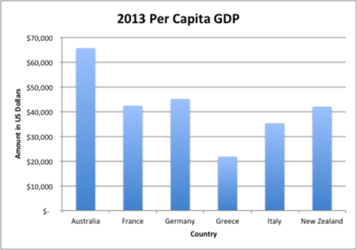
::例2The graph below shows the six countries per capita GDP for 2013. List three conclusions that can be made about the data.
::下图显示了2013年6个国家的人均国内生产总值。The answer is three conclusions that can be made from the graph are: Australia has the highest per capita GDP of the countries listed; Greece has the lowest per capita GDP of the countries listed; and the range of the per capita GDP is approximately $44,000.
::从图中可以得出以下三个结论:澳大利亚的人均国内生产总值是所列国家中最高的;希腊的人均国内生产总值是所列国家中最低的;人均国内生产总值的范围约为44 000美元。Example 3
::例3The table below shows the recommended number of hours of sleep people need each day by age. Create a bar graph to display the data from the table. Then, state one conclusion that can be made about the data.
::下表显示按年龄分列的人们每天需要睡眠的推荐小时数。 创建一个条形图以显示表格中的数据。 然后, 给出一个可以对数据做出的结论 。Recommended Hours of Sleep Per Day Age Group: Recommended Hours of Sleep: Infants (0–1 years old) 15 hours Children (2–5 years old) 13 hours Children (6–11 years old) 11 hours Teens 9 hours Adults 8 hours First, create the bar graph. To do this, draw the horizontal ( ) and vertical ( ) axes.
::首先,创建条形图。要做到这一点,请绘制水平(x)和垂直Next, label the horizontal axis. The horizontal axis lists the different categories of data. In this case, the category will be "age group."
::下一步,标签水平轴。水平轴列出数据的不同类别。在此情况下,该类别将是“年龄组”。Next, label the vertical axis. The vertical axis lists the quantity or amount of the data. In this case, the category will be "hours."
::下一步标签垂直轴。 垂直轴列出数据的数量或数量。 在这种情况下, 分类将是“ 小时 ” 。Next, title the graph. The title of the graph should be short and clear. It should explain what data is presented in the graph. In this case, the title will be “Recommended Hours of Sleep Per Day.”
::下一个标题是图表。 图表的标题应该简短清晰。 它应该解释图表中显示的数据。 在这种情况下, 标题将是“ 推荐的一天睡觉时数 ” 。Then, determine the units on the vertical axis. To do this, start by reviewing the smallest and largest values in the table. The smallest value is 8 and the largest is 15. Based on these values label the vertical axis from 0-16. Since the values are whole numbers and are less than 16, a unit of 2 can be used. Therefore, the vertical axis will start at 0 and go to 16 by increments of 2.
::然后,确定垂直轴上的单位。要做到这一点,首先审查表中最小和最大的值。最小值为8,最大值为15。基于这些值,将垂直轴标为 0-16。由于这些值为整数,且小于16,因此可以使用2 的单位。因此,垂直轴将从 0 开始,再增加 2 增加到 16。Next, draw the vertical columns. To do this, write each age group along the horizontal axis, leaving space between each one. Then draw the column vertically until it reaches the quantity for that age group. For example, draw a vertical column to the number “15” for the age group “Infants (0-1 years old).”
::接下来绘制垂直列。 要做到这一点, 请沿着水平轴写下每个年龄组, 并在每个年龄组之间留下空间。 然后垂直绘制列, 直至达到该年龄组的数量。 例如, 为“ Infants (0-1岁) ” 年龄组的“ 15” 数字绘制一个垂直列 。Finally, state one conclusion from the graph. To do this, analyze the data presented in the table by comparing the heights of the bars.
::最后,请从图表中说明一个结论。为此,通过比较栏杆的高度,分析表格中的数据。The first answer is the graph should look like the one below. The second answer is: one conclusion that can be made from the graph is that as people age the number of recommended hours of sleep per day decreases.
::第一个答案是图表应该像下面的图表。第二个答案是:从图表中可以得出一个结论,即随着人们年龄的老化,建议的每天睡眠时数会减少。Example 4
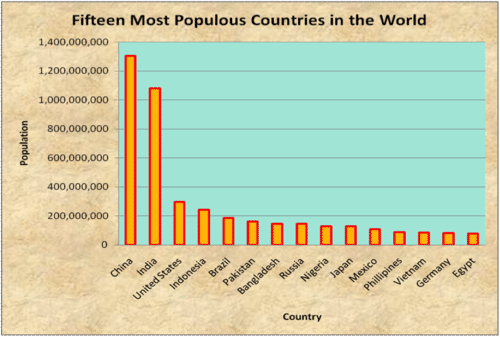
::例4The graph below shows the fifteen most populous countries in the world. List three conclusions that can be made about the data.
::下图显示世界上人口最多的15个国家,列出对数据可以作出的三项结论。The answer is three conclusions that can be made from the graph are: China is the most populated country in the world, India is the second most populated country in the world, and Egypt is ranked last in the top fifteen most populous countries in the world.
::从图中可以得出以下三个结论:中国是世界上人口最多的国家,印度是世界上第二人口最多的国家,埃及在世界上人口最多的15个国家中名列最后。Example 5
::例5The graph below shows the estimated number of diabetes cases in 2000. List three conclusions that can be made from the graph.
::下图显示了2000年糖尿病病例的估计数量,并列出了可从图中得出的三项结论。First, analyze the graph by comparing the heights of the columns.
::首先,通过比较列的高度来分析图表。The answer is three conclusions that can be made from the graph are: Brunei Darussalam had the greatest number of estimated diabetes cases in 2000 at 18,000; Andora and Belize had the same number of estimated diabetes cases in 2000 at 6,000; and Antigua and Barbuda had the smallest number of estimated diabetes cases in 2000.
::从图中可以得出以下三个结论:文莱达鲁萨兰国2000年的糖尿病估计病例数最多,为18 000例;安多拉和伯利兹2000年的糖尿病估计病例数相同,为6 000例;安提瓜和巴布达2000年的糖尿病估计病例数最少。Review
::回顾Use the bar graph to answer the following questions.
::使用条形图回答下列问题。-
How many different types of vegetables are on the graph?
::图表上有多少种不同种类的蔬菜? -
What is the range of the data?
::数据的范围是什么? -
What vegetable was the most popular?
::最受欢迎的蔬菜是什么? -
Which one was the least popular?
::哪个最不受欢迎? -
How many carrots were picked?
::摘了多少胡萝卜? -
How many potatoes?
::多少个土豆? -
How many squash?
::多少个壁球? -
If ten more zucchini was picked, how would this change the data?
::如果再选到10个,这又会如何改变数据呢? -
If each category doubled, what would the new values be?
::如果每一类别翻一番,新值会是什么? -
If each category was divided in half, what would the new values be?
::如果将每一类别一分为二,新数值是什么? -
What was the total number of vegetables picked?
::采摘的蔬菜总数是多少? -
What is the difference between carrots and zucchini picked?
::胡萝卜和胡萝卜有什么区别? -
What scale was used for this graph?
::此图表使用什么比例尺 ? -
What interval was used in the scale?
::比例尺使用的间隔是多少? -
What is the difference between carrots and potatoes?
::胡萝卜和土豆有什么区别?
Review (Answers)
::回顾(答复)Click to see the answer key or go to the Table of Contents and click on the Answer Key under the 'Other Versions' option.
::单击可查看答题键, 或转到目录中, 单击“ 其他版本” 选项下的答题键 。Resources
::资源 -
How many different types of vegetables are on the graph?