11.6 多条形图
章节大纲
-
In this concept, you will learn how to create and read multiple bar graphs.
::在这个概念中,你会学会如何创建和阅读多个条形图。For Rachel's history project she wants to create a graph that illustrates the population growth (in millions) of the countries listed in the table below.
::对于Rachel的历史项目,她想建立一个图表,说明下表所列国家(以百万计)的人口增长情况。Populations Over Time (millions) Country 1980 1990 2000 France 55 56 65 United Kingdom 50 53 63 Mexico 65 78 80 Nigeria 60 82 85 Pakistan 57 65 74 How can Rachel create a graph to illustrate the data over time?
::瑞秋如何能创建图表来说明一段时间内的数据?In this concept, you will learn how to create and read multiple bar graphs.
::在这个概念中,你会学会如何创建和阅读多个条形图。Creating and Reading Multiple Bar Graphs
::创建和阅读多条条图Data is a set of numerical or non-numerical information. Data can be analyzed in many different ways. In this concept you will analyze numerical data using multiple bar graphs.
::数据是一组数字信息或非数字信息。数据可以多种不同方式分析。在此概念中,您将使用多个条形图分析数字数据。One way to display data is in a multiple bar graph . A multiple bar graph shows the relationship between different values of data. Each data value is represented by a column in the graph. In a multiple bar graph, multiple data points for each category of data are shown with the addition of columns. The categories of different kinds of data are listed along the horizontal, or x , axis. The quantity or amount of data is listed along the vertical, or y , axis. Lastly, the legend, or key, states what each column represents.
::显示数据的一种方式是多条条形图。多条形图显示数据不同值之间的关系。每个数据值由图表中的一列表示。在多条形图中,显示每个数据类别的多个数据点,并加列。不同类别数据的类别按水平或 x 轴排列。数据的数量或数量按垂直或 y 轴排列。最后,图例或键表示每一列代表的内容。Let's look at an example.
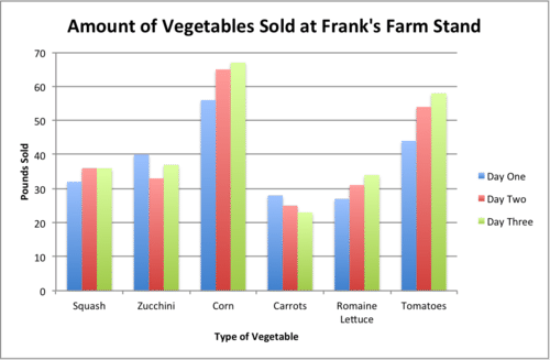
::让我们举个例子。Frank's Farm Stand kept track of the number of pounds of vegetables sold over a three-day period. The results are listed on the table below. Create a multiple bar graph to display the data. Then, list three conclusions that can be made about the data.
::Frank's Farm Stand 记录了三天期间蔬菜销售的磅数。 结果列在下面的表格中。 创建一个多个条形图以显示数据。 然后, 列出关于数据的三个结论 。Frank's Vegetable Sales Type of Vegetable: Pounds Sold: Day One Pounds Sold: Day Two Pounds Sold: Day Three Squash 32 lbs. 36 lbs. 36 lbs. Zucchini 40 lbs. 33 lbs. 37 lbs. Corn 56 lbs. 65 lbs. 67 lbs. Carrots 28 lbs. 25 lbs. 23 lbs. Romaine Lettuce 27 lbs. 31 lbs. 34 lbs. Tomatoes 44 lbs. 54 lbs. 58 lbs. First, create the multiple bar graph. To do this, draw the horizontal ( x ) and vertical ( y ) axes.
::首先,创建多条形图。要做到这一点,请绘制水平(x)和垂直轴。
Next, label the vertical axis. The vertical axis lists the quantity or amount of the data. In this case, the category will be "Pounds Sold."
::下一步标签垂直轴。 垂直轴列出数据的数量或数量。 在此情况下, 类别为“ 售出 ” 。Next, title the graph. The title of the graph should be short and clear. It should explain what data is presented in the graph. In this case, the title will be “Amount of Vegetables Sold at Frank's Farm Stand.”
::下一个标题是图表。 图表的标题应该简短清晰。 它应该解释图表中显示的数据。 在这种情况下, 标题将是“ Frank's Farm Stand出售的蔬菜数量 ” 。Then, determine the units on the vertical axis. To do this, start by reviewing the smallest and largest values in the table. The smallest value is 23 and the largest is 65. Based on these values label the vertical axis from 0-70. Since the values are whole numbers and are relatively spread out, a unit of 10 can be used. Therefore, the vertical axis will start at 0 and go to 70 by increments of 10.
::然后确定垂直轴上的单位。 为此, 首先从审查表中最小和最大的值开始。 最小值为23, 最大值为65。 根据这些值标出 0- 70 的垂直轴。 由于这些值是整数, 并且相对分散, 因此可以使用一个 10 的单位。 因此, 垂直轴将从 0 开始, 以 10 递增为 70 。Next, draw the vertical columns. To do this, write each type of vegetable along the horizontal axis, leaving space between each one. Each type of vegetable will have three columns, one for each day. These should be drawn in different colors. To start, draw the amount of squash sold on day one. To do this draw a column vertically until it reaches the quantity 32. Then draw the amount of squash sold on day two. To do this draw the column vertically until it reaches 36. Complete the columns for squash by drawing the amount for day three, 36, in a vertical column. Continue this pattern for the other vegetables.
::接下来, 绘制垂直列。 要做到这一点, 请沿着水平轴写下每类蔬菜, 并留下每类蔬菜之间的间距。 每类蔬菜将拥有三列, 每天一列。 这些将用不同的颜色绘制 。 要开始, 请绘制第一天出售的壁球数量 。 要绘制一列, 直至达到数量 。 然后绘制第二天出售的壁球数量 。 要绘制一列, 请垂直绘制, 直至达到36 。 在垂直列中绘制第三、 36 日的金额, 完成壁球列 。 继续为其他蔬菜绘制此图案 。Next, create the legend, or key. Each column for each category represents a different day. The legend must represent this by denoting which color is for day one, day two, and day three.
::接下来,创建传说, 或键。 每一类的每列代表不同的一天。 传说必须标明第一天、 第二天和第三天的颜色, 来代表这个颜色 。Finally, state three conclusions from the graph. To do this, analyze the data presented in the table by comparing the heights of the bars.
::最后,请从图表中列出三个结论。为此,通过比较栏杆的高度,分析表格中的数据。The first answer is the graph should look like the one below. The second answer is three conclusions that can be made from the graph are: corn was the vegetable that sold the greatest amount each day; the amount of carrots decreased each day from days one to three; and squash, corn, romaine lettuce, and tomatoes saw an increase in amounts sold across each day.
::第一个答案是图表应该看起来像下面的图。第二个答案是可以从图中得出的三个结论:玉米是每天销售量最大的蔬菜;胡萝卜数量从一天减少到三天;南瓜、玉米、萝卜生菜和番茄每天销售量增加。Examples
::实例Example 1
::例1Earlier, you were given a problem about Rachel and her graph.
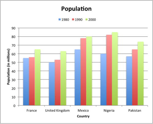
::早些时候,你得到一个问题 关于瑞秋和她的图表。Rachel wants to create a graph that displays the population growth (in millions) in the table below.
::Rachel想在下表中建立一个图表,显示人口增长(以百万计)情况。Populations Over Time (millions) Country 1980 1990 2000 France 55 56 65 United Kingdom 50 53 63 Mexico 65 78 80 Nigeria 60 82 85 Pakistan 57 65 74 First, Rachel will create a multiple bar graph because there are multiple years of data for each country. To do this, she will draw the horizontal and vertical axes.
::首先, Rachel 将创建一个多个条形图, 因为每个国家的数据都存在多年。 为此, 她将绘制水平轴和垂直轴 。Next, she will label the horizontal axis. The horizontal axis lists the different categories of data. In this case, the category will be "Country."
::接下来, 她将标记水平轴。 水平轴将列出不同的数据类别。 在此情况下, 分类将是“ 国家 ” 。Next, she will label the vertical axis. The vertical axis lists the quantity or amount of the data. In this case, the category will be "Population (in millions)."
::接下来, 她将标出垂直轴。 垂直轴列出数据的数量或数量。 在此情况下, 分类为“ 人口( 以百万计) ” 。Next, she will title the graph. The title of the graph should be short and clear. It should explain what data is presented in the graph. In this case, the title will be “Population.”
::接下来, 她将给图表标题命名。 图表标题应该简短明了。 它应该解释图表中显示的数据。 在这种情况下, 标题将是“ 人口 ” 。Then, she will determine the units on the vertical axis. To do this, start by reviewing the smallest and largest values in the table. The smallest value is 50 and the largest is 85. Based on these values label the vertical axis from 0-90. Since the values are whole numbers and relatively spread out, a unit of 10 can be used. Therefore, the vertical axis will start at 0 and go to 90 by increments of 10. (Remember that the values are in millions.)
::然后,她将确定垂直轴上的单位。 为此, 首先从审查表中最小和最大的值开始。 最小值为50, 最大值为85。 根据这些值标出 0- 90 的垂直轴。 由于这些值是整数, 并且相对分散, 因此可以使用一个10 的单位。 因此, 垂直轴将从 0 开始, 递增值为 10 , 到 90 。 (记住这些值是 百万 。 )Next, draw the vertical columns. To do this, write each country along the horizontal axis, leaving space between each one. Each country will have three columns, one for each year. These should be drawn in different colors. To start, draw the population for France in 1980. To do this draw a column vertically until it reaches the quantity 55. Then draw the population for 1990 and 2000. To do this draw the column vertically until it reaches 56 and 65 respectively. Continue this pattern for the remaining countries.
::接下来, 绘制垂直列。 为此, 请沿着横向轴写出每个国家, 每一条之间留下空间。 每个国家将拥有三列, 每年一列。 这些列应该以不同颜色绘制 。 首先, 在1980 年绘制法国的人口。 要绘制一列, 直至达到数量 。 然后绘制1990 和 2000 年的人口 。 要绘制一列, 直划到分别达到 56 和 65 个 。 继续为其余国家绘制此图案 。Next, create the legend, or key. Each column for each country represents a different year. The legend must represent this by denoting which color is for 1980, 1990, and 2000.
::接下来,创建传说,或键。每个国家的每列代表不同的年份。传说必须用标明1980、1990和2000年的颜色来表示。The answer is the graph should look like the one below.
::答案是图表应该看起来像下面的图。Example 2
::例2The graph below shows the populations of the major cities in UAE in years 1995 and 2003. List three conclusions that can be made from the graph.
::下图显示了阿联酋1995年和2003年主要城市的人口情况,并列出了可从图中得出的三项结论。First, analyze the graph by comparing the heights of the columns.
::首先,通过比较列的高度来分析图表。The answer is three conclusions that can be made from the graph are: Dubai has the largest population in both years, 1995 and 2003; Dubai saw the greatest increase in population from years 1995 to 2003; and all cities saw a growth in population from years 1995 to 2003.
::从图中可以得出以下三个结论:迪拜是1995年和2003年人口最多的年份;迪拜的人口从1995年到2003年增长最大;所有城市的人口从1995年到2003年都有增长。Example 3
::例3The table below shows the World Health Organization's estimated number of diabetes cases. Create a bar graph to display the data from the table. Then, state three conclusions that can be made about the data.
::下表显示了世界卫生组织糖尿病病例的估计数量。创建一个条形图以显示表中的数据。然后,请说明对数据可以作出的三项结论。WHO's Diabetes Prevalence Estimates Country 2000 Estimate 2030 Estimate Antigua and Barbuda 3000 5000 Cook Islands 700 1300 Marshall Islands 2000 4000 Monaco 2000 3000 Nauru 2000 4000 Palau 1000 2000 Saint Kitts and Nevis 2000 2000 San Marino 2000 3000 Sao Tome-Principe 1000 2000 Tuvalu 300 800 First, create the multiple bar graph. To do this, draw the horizontal ( x ) and vertical ( y ) axes.
::首先,创建多条形图。要做到这一点,请绘制水平(x)和垂直Next, label the vertical axis. The vertical axis lists the quantity or amount of the data. In this case, the category will be "Number of Cases."
::接下来,标签垂直轴。垂直轴列出数据的数量或数量。在此情况下,类别将是“案件数量”。Next, title the graph. The title of the graph should be short and clear. It should explain what data is presented in the graph. In this case, the title will be “WHO Estimated Diabetes Cases for 2000 and 2030.”
::接下来的标题是图表。图表的标题应该简短明了。它应该解释图表中的数据。在这种情况下,标题将是“世卫组织2000年和2030年糖尿病估计病例 ” 。Then, determine the units on the vertical axis. To do this, start by reviewing the smallest and largest values in the table. The smallest value is 300 and the largest is 5000. Based on these values label the vertical axis from 0-5000. Since the values are whole numbers and relatively spread out, a unit of 500 can be used. Therefore, the vertical axis will start at 0 and go to 5000 by increments of 500.
::然后确定垂直轴上的单位。 为此, 首先从审查表中最小和最大的值开始。 最小值为300, 最大值为5000。 基于这些值, 0-5000 将垂直轴标为 0-5000 。 由于这些值是整数, 并且相对分散, 因此可以使用500 的单位。 因此, 垂直轴将从 0 开始, 以500 的递增值向5000 。Next, draw the vertical columns. To do this, write each country along the horizontal axis, leaving space between each one. Each country will have two columns, one for each year. These should be drawn in different colors. To start, draw the number of cases for Antigua and Barbuda for 2000. To do this draw a column vertically until it reaches the quantity 3000. Then draw the number of cases for 2030. To do this draw the column vertically until it reaches 5000. Continue this pattern for the remaining countries.
::绘制垂直列。 要做到这一点, 请沿着水平轴写出每个国家, 每一条之间留下空间。 每个国家将拥有两列, 每年一列。 这些列应该以不同颜色绘制。 要开始, 请绘制安提瓜和巴布达2000年的病例数 。 要绘制此列, 请垂直绘制一列, 直至达到数量 3000 。 然后绘制2030 年的病例数 。 要垂直绘制一列, 直至达到 5000 。 继续为其余国家绘制此图案 。Next, create the legend, or key. Each column for each country represents a different year. The legend must represent this by denoting which color is for 2000 and 2030.
::接下来,创建传说, 或键。 每个国家的每列代表不同的年份。 传说必须用标记2000 和 2030 的颜色来表示 。Finally, state three conclusions from the graph. To do this, analyze the data presented in the table by comparing the heights of the bars.
::最后,请从图表中列出三个结论。为此,通过比较栏杆的高度,分析表格中的数据。The first answer is the graph should look like the one below. The second answer is three conclusions that can be made from the graph are: Saint Kitts and Nevis did not see an increase in the number of diabetes cases between 2000 and 2030; Antigua and Barbuda has the greatest number of estimated cases for 2030; and Tuvalu has the smallest number of estimated cases for both years 2000 and 2030.
::第一个答案是图表应该像下图。第二个答案是可以从图中得出的三个结论:圣基茨和尼维斯在2000年至2030年期间没有看到糖尿病病例增加;安提瓜和巴布达在2030年的估计病例数量最多;图瓦卢在2000年和2030年的估计病例数量最少。Example 4
::例4The graph below shows the number of mobile phone subscribers for the years 2006, 2007, and 2009. List three conclusions that can be made from the graph.
::下图显示了2006年、2007年和2009年移动电话用户的数量。First, analyze the graph by comparing the heights of the columns.
::首先,通过比较列的高度来分析图表。The answer is three conclusions that can be made from the graph are: all countries had over 7 million subscribers in 2009; all countries saw an increase in the number of mobile phone subscribers from years 2007 to 2009; and the USA saw a decline in the number of subscribers from 2006 to 2007.
::从图表中可以得出以下三个结论:2009年,所有国家都有700多万用户;2007年至2009年,所有国家移动电话用户数量都有所增加;2006年至2007年,美国用户数量下降。Example 5
::例5The graph below shows the number of university students enrolled in business majors in Saudi Arabia, Kuwait, and Qatar. List two conclusions that can be made from the graph.
::下图显示了沙特阿拉伯、科威特和卡塔尔在商学院注册的大学生人数,列出可从图中得出的两个结论。Review (Answers)
Click to see the answer key or go to the Table of Contents and click on the Answer Key under the 'Other Versions' option.
::回顾(答复)