10.4 频率表和直方图
章节大纲
-
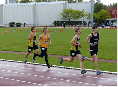
The coach of the Markwell Cougars track team wants to compare the heights of his team to that of their rivals, the Sampson Hawks. He was wondering if there is a correlation between speed and height.
::马克韦尔美洲狮队球队教练想将球队的高度与对手桑普森霍克队的高度进行比较。他想知道速度和身高之间是否有关联。The coach wrote the following heights from smallest to largest.
::教练写下从最小到最大的以下高度。Markwell Cougars:
::马克韦尔美洲狮:170, 172, 175, 176, 176, 176, 178, 181, 182, 183, 183, 183, 185, 185, 187, 188, 188, 189, 190, 195
Sampson Hawks:
::桑普森鹰:169, 175, 176, 176, 178, 179, 180, 183, 183, 186, 186, 186, 187, 187, 187, 187, 187, 188, 190, 191, 192
Create a visual display of this data .
::创建此数据的视觉显示 。In this concept, you will learn to use frequency tables and histograms.
::在此概念中,您将学会使用频率表和直方图。Frequency
::频率频率频率A visual display is used to show data. Each type of visual tool has advantages and the best type of plot or graph depends on the situation. Indeed, sometimes it is a matter of preference as many different graphs could be used to illustrate the same data.
::视觉显示用于显示数据。 每一种视觉工具都有其优点,而最佳的图案或图案类型取决于情况。 事实上,有时这是一个偏好问题,因为许多不同的图表可以用来说明相同的数据。Let’s take a look at frequency tables and histograms.
::让我们看看频率表和直方图。Frequency is a measure of how often something occurs. A frequency table is used to measure and visually show how often a data value occurs.
::频率是衡量某事发生频率的尺度。使用频率表测量和直观显示数据值发生频率。Let’s look at an example.
::让我们举个例子。A teacher is preparing for parent conferences. In order to provide parents with the most information possible about their children, he wants to organize the grades of the class so that they can compare the grades to the rest of the class.
::教师正在准备家长会议,为了向家长提供尽可能多的关于其子女的信息,他想安排班级的年级,以便他们能够将年级与其他班级的年级作比较。The math percentages have been calculated and his students earned the following grades:
::计算了数学百分比,他的学生获得以下分数:88, 86, 92, 65, 72, 75, 81, 84, 85, 93, 99, 50, 78, 80, 86, 76, 74, 95, 81, 87, 90, 72, 76, 61, 85, 84, 78, 83.
Grades are determined by percent where 0-59% is an F, 60-69% is a D, 70-79% is a C, 80-89% is a B, and 90-100% is an A. These values make the most logical intervals. Intervals are always chosen depending on the range of the data. He will make a frequency table to illustrate the information.
::0-59%为F级,60-69%为D级,70-79%为C级,80-89%为B级,90-100%为A级,这些数值得出最符合逻辑的间隔。根据数据范围,总是选择间隔。他将制作一个频率表来说明信息。First, for each student who scored in the given range, he puts an X. Sometimes, frequency tables use X’s and other times, they can use lines for tally marks.
::首先,对于在给定范围内得分的每个学生,他设置了一个X。有时,频率表使用X,有时则使用其他时间,他们可以使用线条进行计数。Frequency Tables of Grades Interval Tally Frequency 90 - 100 XXXXX 5 80 - 89 XXXXXXXXXXXX 12 70 - 79 XXXXXXXX 8 60 - 69 XX 2 0 - 59 X 1 This tally is useful in the sense that it communicates to parents how many students in the class scored in the A range, B range, etc. It would not be as important for the parents to see the individual scores of each student as it would be to see the total number of students in each interval. That way, if their child earned a B, then they would know that the child falls in a category that most other students scored in. If a child earned a D, for example, it would indicate that they are below the general level of the other students and might need additional help.
::这种计算是有用的,因为它向家长传达了班级中有多少学生在A范围、B范围等中得分。 父母看到每个学生的分数并不象看到每个间隔的学生总数那样重要。 这样,如果其子女挣得B,那么他们就会知道孩子属于大多数其他学生得分的类别。 例如,如果孩子得分为D,这将表明他们低于其他学生的一般水平,可能需要额外的帮助。Next, he creates a histogram . A histogram is similar to a bar graph in that it uses columns to illustrate data on - and -axes. In a histogram, you can use the same intervals as you did for the frequency table. The bars in the histogram will have no space between them.
::然后,他创建直方图。直方图与条形图相似,因为它使用列来说明 x 和 y 轴的数据。在直方图中,您可以使用与频率表相同的间隔。直方图中的条形图将没有它们之间的空间。The histogram shows the same information as the frequency table does. However, the histogram is a type of graph, meaning that it is visual representation. The bars on the histogram are interpreted more easily by size than numerical data .
::直方图显示的信息与频率表显示的信息相同。 然而,直方图是图表的一种类型, 这意味着它是直观的表示。直方图上的条条比数字数据更容易用大小来解释。Examples
::实例Example 1
::例1Earlier, you were given a problem about the track teams and the heights of the runners.
::早些时候,有人给了你一个问题 关于赛马队和跑者高度的问题。The coach is comparing the heights of his team, the Markwell Cougars to the rival team, the Sampson Hawks. You need to create a double histogram for the data. The data collected is:
::教练正在比较他的球队的高度 马克韦尔美洲狮队和对手队 桑普森鹰队Markwell Cougars:
::马克韦尔美洲狮:170, 172, 175, 176, 176, 176, 178, 181, 182, 183, 183, 183, 185, 185, 187, 188, 188, 189, 190, 195
Sampson Hawks:
::桑普森鹰:169, 175, 176, 176, 178, 179, 180, 183, 183, 186, 186, 186, 187, 187, 187, 187, 187, 188, 190, 191, 192
First, create a frequency table for the data. Since you are comparing two sets of data, you have to put both data sets into the frequency table.
::首先,为数据创建一个频率表。由于您正在比较两组数据,所以您必须将两组数据放入频率表。Markwell Cougars Sampson Hawks Interval Tally Frequency Tally Frequency 160 - 169 1 170 - 179 7 5 180 - 189 11 12 190 - 199 2 3 Next, use this data to create a histogram that compares the data.
::接下来,使用此数据创建直方图以比较数据 。You can see from the histogram that both teams have more players in the 180 - 189 interval. However, while the Cougars have more players in the 170 - 179 interval, the Hawks have slightly more in the taller interval. The Hawks have a slight height advantage.
::从直方图可以看出,在180 - 189的间距内,两队都有更多的球员。然而,虽然美洲狮队在170 - 179的间距内有较多球员,但鹰队在高一点的间距内略多一些。鹰队在高一点的高度上有优势。Example 2
::例2Create a histogram of the mass of geodes found at a volcanic site. Scientists measured 24 geodes in kilograms and got the following data:
::科学家测量了24个以公斤计的大地测量,并获得以下数据:0.8, 0.9, 1.1, 1.1, 1.2, 1.5, 1.5, 1.6, 1.7, 1.7, 1.7, 1.9, 2.0, 2.3, 5.3, 6.8, 7.5, 9.6, 10.5, 11.2, 12.0, 17.6, 23.9, and 26.8.
::0.8、0.9、1.1、1.1、1.2、1.5、1.5、1.6、1.7、1.7、1.7、1.9、2.0、2.3、5.3、6.8、7.5、9.6、10.5、11.2、12.0、17.6、23.9和26.8。First, let’s think about intervals.
::首先,让我们考虑一下间隔。The minimum item is 0.8 kg and the maximum is 26.8. To get a good idea of the data, you could use intervals that encompass perhaps 4 kg intervals, 5 kg intervals, or 6 kg intervals. Let’s try intervals of 5 kg.
::最小物品为0.8公斤,最大物品为26.8公斤。 要很好地了解数据,您可以使用可能包括4公斤间隔、5公斤间隔或6公斤间隔的间隔。让我们试一下5公斤间隔。Begin with a frequency table.
::从一个频率表开始。Interval Tally Frequency 0 - 5 14 5.1 - 10 4 10.1 - 15 3 15.1 - 20 1 20.1 - 25 1 25.1 - 30 1 Next, create a histogram for this data.
::下一步,为此数据创建直方图 。Example 3
::例3True or false: An interval is the frequency that an event happens.
::真实的或虚假的: 间隔是事件发生的频率 。The answer is false.
::答案是虚假的。Intervals are always chosen depending on the range of the data.
::总是根据数据的范围选择间隔。Example 4
::例4True or false: To create a histogram, you first need a frequency table.
::真实的或假的:要创建直方图,您首先需要一个频率表。The answer is true.
::答案是真实的。Example 5
::例5True or false: If I wanted to create a histogram on the number of people who went to the town movie theater on the weekend, I would first need to figure out how many people went to the movies on each weekend day and night.
::不管是真实的还是假的:如果我想制作一个有关周末去市电影院的人数的直图, 我首先需要弄清楚每个周末日夜有多少人去看电影。The answer is true.
::答案是真实的。The data collected would help create a frequency table and then you could create your histogram.
::收集的数据有助于创建频率表,然后可以创建直方图。Review
::回顾Use what you have learned about histograms to answer each question.
::使用你所学的直方图来回答每个问题。Hours Slept Each Night Number of Hours Slept Tally Frequency 5 I 1 6 I I 2 7 I I I I 4 8 I I I 3 9 I I I 3 10 I I I 3 11 I I 2 12 I I 2 1. Create a histogram that illustrates this data.
::1. 创建直方图,以显示这一数据。2. What can you interpret from your histogram?
::2. 你能用直方图解释什么?Compare the stem-and-leaf plot to the histogram of Melanie’s Christmas gift expenses below. She told her husband, “Most of the gifts cost more than $60."
::将干叶图与梅兰妮圣诞礼物支出的直图相比较。 她告诉丈夫,“大部分礼物花费超过60美元。 ”3. Is she telling the truth?
::3. 她说的是实话吗?4. Which tool is more useful in making a decision about her truthfulness?
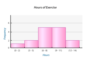
::4. 在决定她的真实性时,哪一种工具更有用?5. Looking at this histogram, can you conclude that most people exercise between 6 - 11 hours per week?
::5. 看一下这个直方图,你能得出结论,大多数人每周运动6至11小时吗?6. What is the fewest number of hours?
::6. 最小的小时数是多少?7. What is the range of hours?
::7. 小时范围是多少?8. Conduct your own survey and collect data. Choose attendance rates in your class or vacation days per year for example. Then create a frequency table, histogram and analyze your data. Explain why you chose the interval that you did and which data set had the greatest and least results.
::8. 进行自己的调查并收集数据。例如,每年选择班级或休假日的出勤率;然后创建一个频率表、直方图和分析数据;解释为什么选择你做的间隔和哪些数据集的结果最大、最小。Review (Answers)
::回顾(答复)Click to see the answer key or go to the Table of Contents and click on the Answer Key under the 'Other Versions' option.
::单击可查看答题键, 或转到目录中, 单击“ 其他版本” 选项下的答题键 。