10.7 制作一个显示数据的散列以显示数据
Section outline
-
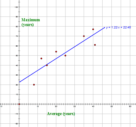
The table shows the average and maximum longevity of various animals in captivity.
::下表显示了各种动物被囚禁的平均寿命和最长寿命。Longevity (years) Average 12 25 15 8 35 40 41 20 Maximum 47 50 40 20 70 77 61 54 Construct a scatter plot for the above data .
::构造上述数据的散射图 。Predict the maximum life span in captivity if the average life span was 30 years.
::如果平均寿命为30年,则预测被囚禁的最长寿命。In this concept, you will learn to make a scatterplot to represent data.
::在此概念中, 您将学会制作一个撒布图来代表数据 。Scatterplots
::散列In the real world, many things are related to each other. Many fields try to find relationships between two variables. One tool that helps you to accomplish this is the scatterplot .
::在现实世界中,许多事情是相互联系的。许多领域试图找到两个变量之间的关系。帮助你实现这一点的一个工具是散射图。A scatterplot is a type of graph where corresponding values from a set of data are placed as points on a coordinate plane. A relationship between the points is sometimes shown to be positive, negative, strong, or weak.
::散射图是一种图表类型,其中将一组数据的相应值作为坐标平面上的点。 有时显示各点之间的关系是正、负、强或弱。Sometimes a scatterplot shows that there is no relationship at all. Aside from finding relationships, scatterplots are useful in predicting values based on the relationship that was revealed.
::有时,散射图显示根本没有任何关系。 除了寻找关系外,散射图还有助于根据所披露的关系预测数值。Let’s look at how a scatterplot can be applied to a situation.
::让我们看看如何将撒布点应用于某种情况。A student had a hypothesis for a science project. He believed that the more students studied math, the better their math scores would be. He took a poll in which he asked students the average number of hours that they studied per week during a given semester. He then found out the overall percent that they received in their math classes. His data is shown in the table below:
::一个学生对一个科学项目有一个假设。 他认为,学生学习数学越多,他们的数学分数就越好。他参加了一次民意测验,向学生询问他们在某一学期每周学习的平均时数。然后,他发现了他们在数学课中获得的总百分比。他的数据见下表:Study Time (hours) 4 3.5 5 2 3 6.5 0.5 3.5 4.5 5 1 1.5 3 5.5 Math Grade (percent) 82 81 90 74 77 97 51 78 86 88 62 75 70 90 In order to understand this data, he decided to make a scatterplot.
::为了了解这些数据,他决定做一个撒布点。The independent variable , or input data , is the study time because the hypothesis is that the math grade depends on the study time. That means that the math grade is the dependent variable, or output data . The input data is on the -axis and the output data is on the -axis.
::独立的变量或输入数据是研究时间,因为假设数学等级取决于学习时间。这意味着数学等级是依附变量或输出数据。输入数据在x轴上,输出数据在y轴上。The scales and intervals on the axes will be determined by the data. Since the greatest value on the -axis is 6.5, you can use intervals of 1 until you reach 7. On the -axis, the greatest value is 97 and, since it is a percent, you can use intervals of 10 until you reach 100.
::轴上的尺度和间隔将由数据决定。由于x轴的最大值为6.5,您可以使用1的间隔,直到达到7。Y轴的最大值为97,如果是百分之一,您可以使用10的间隔,直到达到100。Now you can graph the points on the scatterplot. In order to plot the points, you will show each one as an ordered pair (hours, percent). The first ordered pair, then, is (4, 82). Plot each of the 14 points. Remember, it takes two pieces of data to make a single point.
::现在您可以绘制分布图上的点数。 为了绘制点数, 您将显示每个点数为一对定购的对数( 小时, 百分比 ) 。 第一个定购的对数是 ( 4, 82) 。 绘制14 个点中的每个点。 记住, 要绘制一个点, 需要两块数据 。You can see that there is a relationship between the independent and dependent values of the chart.
::您可以看到,图表的独立值和依附值之间存在某种关系。Scientists in the real world rarely create scatterplots on a piece of paper and compute equations by hand. They use computer programs that can approximate the trend line much more accurately.
::现实世界中的科学家很少在纸上制造散射图,并用手计算方程式。 他们使用计算机程序可以更准确地接近趋势线。You can make scatterplots on your graphing calculator, if you have one. Then, you can compute the trend line called the linear regression in some models. Your graphing calculator can put the equation in form or form, depending on the mode you choose. Then, you can choose any input values for which your calculator will tell you the output values.
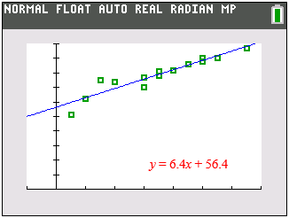
::您可以在图形化计算器上绘制散射图, 如果您有的话。 然后, 您可以计算一些模型中称为线性回归的趋势线。 您的图形化计算器可以根据您选择的模式, 将方程式放在 y=mx+b 窗体或 Ax+By=C 窗体中。 然后, 您可以选择任何输入值, 您的计算器会告诉您输出值 。If you use a graphing calculator for the example above you would get a similar image on your calculator. This image was completed on a TI-84C.
::如果您为上述示例使用图形计算计算器, 计算器上就会有类似的图像。 此图像是在 TI- 84C 上完成的 。Examples
::实例Example 1
::例1Earlier, you were given a problem about animals and their longevity. You were given data about the average and maximum longevities of various animals. You need to construct a scatterplot of the data and then predict the maximum life span if the average life span was 30 years. The data is below.
::早些时候, 您被给出了动物及其寿命的问题。 您得到了关于各种动物平均和最大寿命的数据。 您需要构建数据散落点, 然后预测平均寿命为30年的最长寿命。 数据在下面 。Longevity (years) Average 12 25 15 8 35 40 41 20 Maximum 47 50 40 20 70 77 61 54 First, construct the scatterplot. The average life span is the independent variable and the maximum life span is the dependent variable.
::首先,构建散射图。平均寿命是独立的变量,最长寿命是独立的变量。Next, use the graph to find the maximum life span if the average life span was 30 years.
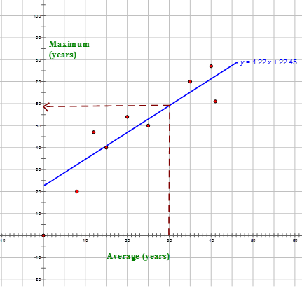
::接下来,用图来寻找平均寿命为30年的最长寿命。Using the trend line, if you draw a line up from 30 and over to the axis, you can find the predicted maximum longevity with an average value of 30 years.
::使用趋势线,如果从30岁和30岁以上划线到y轴,可以找到平均30年的预测最大寿命。The answer is 59 years.
::答案是59年。Example 2
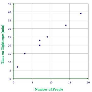
::例2Create a scatterplot of the data.
::创建数据散射图 。After a circus class, the following data was collected. It tracks the number of people who could balance on a tightrope for specific lengths of time.
::在马戏团课后,收集了以下数据。它跟踪了能够按具体时间在钢丝上保持平衡的人数。
::1人=7分钟
::3人=15分钟
::7人=20分钟
::9人=25分钟
::14人=32分钟
::18人=39分钟Here is the scatterplot of the data.
::这是数据散射图 。Answer the following questions about scatterplots.
::回答下列问题:关于撒布地的问题。Example 3
::例3If the points on a scatterplot do not show a pattern, is there a connection between the data?
::如果散点上的点没有显示模式, 数据之间是否有关联 ?The answer is no.
::答案是否定的。When there is no pattern there is no correlation between the independent and dependent values.
::如果没有模式,独立价值和依附价值之间就没有任何关联。Example 4
::例4If the points on a scatterplot trend up to the right, is there a connection between the data?
::如果向右的散射点趋势上的点, 数据之间是否有关联 ?The answer is yes.
::答案是肯定的。If the pattern is a trend to the right it is positive. Therefore there is a positive correlation between the independent and dependent values.
::如果模式是右边的趋势,它就是积极的,因此独立价值和依附价值之间有正相关关系。Example 5
::例5If the points on a scatterplot trend down and to the left, is there a connection between the data?
::如果散射图向下和向左的点, 数据之间是否有关联 ?The answer is yes.
::答案是肯定的。If the pattern is a trend to the left it is negative. Therefore there is a negative correlation between the independent and dependent values.
::如果图案是左侧的趋势,则呈负值,因此独立值和依附值之间有负相关关系。Review
::回顾Use what you have learned to answer each question or complete each task.
::使用你学到的东西回答每个问题或完成每一项任务。1. Make a scatterplot to display the data set in the table:
::1. 绘制一个散射图以显示表格中的数据集:23 18 30 24 29 45 10 17 27 39 32 40 21 14 62 72 54 60 57 30 79 65 55 34 48 41 68 76 What type of relationship would you predict for the following variables, positive, negative, or no relationship?
::你会预测以下变量的哪类关系, 积极的,消极的,还是没有关系?2. Altitude vs. the amount of oxygen in the atmosphere
::2. 高度相对于大气中的氧量3. Number of customers vs. profit
::3. 客户与利润之比4. Number of siblings vs. grade point average
::4. 兄弟姐妹人数与职等平均点5. Hours of studying vs. test score
::5. 学习时数与考试分数6. Hours of driving vs. distance traveled
::6. 驾驶时数与行驶距离7. Speed of a car vs. distance traveled
::7. 汽车速度与行驶距离8. Hours at work vs. amount of money made
::8. 工作时间与所挣金额之比Use this scatterplot to answer the following questions.
::使用此散射图回答下列问题 。9. True or false. This data shows a positive correlation.
::9. 真实的或虚假的,这一数据表明了正相关关系。10. True or false. This data shows a negative correlation.
::10. 真实的或虚假的,该数据表明存在负相关关系。11. True or false. This data shows no correlation.
::11. 真实的或虚假的,该数据表明没有相关关系。12. True or false. Data is graphed on a scatterplot by using ordered pairs.
::12. 真实的或虚假的,数据用定购的配对用散射图绘制。13. True or false. An example of a negative correlation could be the amount of time in school and an increase in intelligence.
::13. 真实的或虚假的,负相关关系的一个实例可以是在校时间和情报的增加。Review (Answers)
::回顾(答复)Click to see the answer key or go to the Table of Contents and click on the Answer Key under the 'Other Versions' option.
::单击可查看答题键, 或转到目录中, 单击“ 其他版本” 选项下的答题键 。Resources
::资源