10.10 使用数据显示
章节大纲
-
The scores for the two strongest players on the school bowling team are as follows:
::学校保龄球队中两个最强球员的得分如下:Alex 173, 166, 156, 183, 190, 161, 258, 169, 170, 146, 247, 176, 162, 151, 212, 191 Thomas 165, 196, 168, 194, 189, 197, 211, 194, 189, 204, 220, 211, 211, 172, 238, 186 -
Make a double stem-and-leaf or box-and whisker (whichever is the better to choose) with one axis to compare both sets of
data
.
::做一个双干叶或盒式和卷轴(最好选择哪一个),用一个轴比较两套数据。 -
Describe any differences in their patterns of scores.
::描述他们的得分模式的任何差异。 -
If you had to choose one of these people to represent the school, why might you choose Alex? Why might you choose Thomas?
::如果你不得不选择其中一人代表学校,为什么你选择亚历克斯?你为什么选择托马斯?
In this concept, you will learn to use data displays.
::在此概念中,您将学会使用数据显示。Data
::数据数据数据数据数据数据数据数据数据数据数据数据数据数据数据数据数据数据数据数据数据数据数据数据数据数据数据数据数据数据数据数据数据数据数据数据数据数据数据数据数据数据数据数据数据数据数据数据数据数据数据数据数据数据数据数据数据数据数据数据数据数据数据数据数据数据数据数据数据数据数据数据数据数据数据数据数据数据数据数据数据数据数据数据数据数据数据数据数据数据数据数据数据数据数据数据数据数据数据数据数据数据数据数据数据数据数据数据数据数据数据数据数据数据数据数据数据数据数据数据数据数据数据数据数据数据数据数据数据数据数据数据数据数据数据数据数据数据数据数据数据数据数据数据数据数据数据数据数据数据数据数据数据数据数据数据数据数据数据数据数据数据数据数据数据数据数据数据数据数据数据数据数据数据数据数据数据数据数据数据数据数据数据数据数据数据数据数据数据数据数据数据数据数据数据数据数据数据数据数据数据数据数据数据数据数据数据数据数据数据数据数据数据数据数据数据数据数据数据数据数据数据数据数据数据数据数据数据数据数据数据数据数据数据数据数据数据数据数据数据数据数据数据数据数据数据数据数据数据数据数据数据数据数据数据数据数据数据数据数据数据数据数据数据数据数据数据数据数据数据数据数据数据数据数据数据数据数据数据数据数据数据数据数据数据数据数据数据数据数据数据数据数据数据数据数据数据数据数据数据数据数据数据数据数据数据数据数据数据数据数据数据数据数据数据数据数据数据数据数据数据数据数据数据数据数据数据数据数据数据数据数据数据数据数据数据数据数据数据数据数据数据数据数据数据数据数据数据数据数据数据数据数据数据数据数据数据数据数据数据数据数据数据数据数据数据数据数据数据数据数据数据数据数据数据数据数据数据数据数据数据数据数据数据数据数据数据数据数据数据数据数据数据数据数据数据数据数据数据数据数据数据数据数据数据数据数据数据数据数据数据数据数据数据数据数据数据数据数据数据数据数据数据数据数据数据数据数据数据数据数据数据数据数据数据数据数据数据数据数据数据数据数据数据数据数据数据数据数据数据数据数据数据数据数据数据数据数据数据数据数据数据数据数据数据数据数据数据数据数据数据数据数据数据数据数据数据数据数据数据数据数据数据数据数据数据数据数据数据数据数据数据数据数据数据数据数据数据数据数据数据数据数据数据数据数据数据数据数据Data can exist in many forms. A frequent goal of collecting data is drawing conclusions based on the data. The best conclusions correspond with trends that the data shows. Depending on the data you have, certain types of displays are more appropriate, or more effective, than others. You must make good choices of displaying data in a logical way. Of course, in a world so full of data, it must be collected and organized carefully to aid in appropriate decision-making.
::收集数据的一个经常目标是根据数据得出结论,最佳结论与数据显示的趋势相符。根据你掌握的数据,某些类型的显示方式比其他类型的显示方式更合适,或更有效。你必须以合乎逻辑的方式做出显示数据的良好选择。当然,在一个充满数据的世界中,必须仔细收集和组织,以协助适当的决策。Sometimes two people look at the same graph and draw completely different conclusions. Graphs can show us many things but the conclusions that we draw based upon the graphs is oftentimes more a matter of opinion. The idea of graphs is, in part, to make inferences. Those inferences must be based on the data.
::有时,两个人看同一个图表,然后得出完全不同的结论。图表可以向我们展示许多东西,但我们根据图表得出的结论往往更多地是一个意见问题。图表的想法部分是为了推断。这些推论必须以数据为基础。Take a look at this situation.
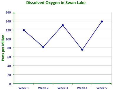
::看看这个情况。Some scientists from the EPA were studying the amount of dissolved oxygen in a lake over several weeks. This graph was created by the data they found.
::来自环保局的一些科学家几周来一直在研究一个湖中的溶解氧量。这个图是根据他们发现的数据创建的。They studied the graph and came up with the following conclusions:
::他们研究了图表,得出了以下结论:-
The amount of dissolved oxygen fluctuated over the 5 weeks.
::溶解氧量在5周内波动。 -
The
average
amount of dissolved oxygen has been about 110 parts per million over 5 weeks.
::溶解氧气的平均含量在5周内约为百万分之110。 -
The dissolved oxygen in Week 6 will be about 60 parts per million.
::第6周的溶解氧气约为百万分之60。
Do you agree with their conclusions?
::你同意他们的结论吗?The first two conclusions are clearly shown by the data.
::数据清楚显示了头两个结论。However, the prediction about Week 6, conclusion number 3, is not convincingly shown. The level of dissolved oxygen does seem to fluctuate and has gone slightly higher over time and then lower, but it is not enough evidence to be sure that the Week 6 dissolved oxygen will go even lower.
::然而,关于第6周第3号结论的预测并没有令人信服地显示出来。 溶解氧气的水平似乎确实在波动,并且随着时间的流逝而略有上升,随后又有所下降,但光凭证据还不足以确定第6周第3号结论会进一步下降。Here is another example.
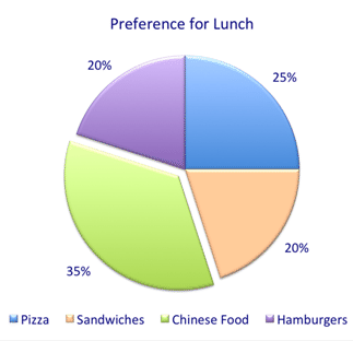
::下面是另一个例子。The boss at an office took a survey of people’s preference for lunch because he wanted to treat the office to a lunch for the holidays. His data is shown below.
::一家办公室的老板调查了人们是否喜欢吃午餐,因为他想在假日把办公室用午餐招待。 他的数据如下:He ponders the following conclusions:
::他考虑以下结论:-
A lot of people like Chinese food.
::很多人喜欢中国菜 -
Nobody likes Italian food.
::没人喜欢意大利菜 -
If I order sandwiches, then 80% of the staff will be unhappy.
::如果我点了三明治 80%的员工都会不高兴 -
If I get some pizzas and some Chinese food, the majority will have their preference.
::如果我得到一些比萨和一些中国食品, 大多数人会有他们的偏好。
Do you agree with his conclusions?
::你同意他的结论吗?According to the graph, Conclusion 1 is supported because the largest number of people selected Chinese food.
::根据图表,结论1得到支持,因为选择中国食品的人数最多。The graph does not support Conclusion 2. Perhaps Italian food was not an option on the survey. Also, just because you have a preference does not mean you don’t like the other choices.
::图表并不支持结论2:也许意大利食品在调查中不是选项。 此外,仅仅因为你偏好并不表示你不喜欢其他选择。For the same reason, Conclusion 3 is not supported, either. Just because you may prefer Chinese food does not mean you do not like sandwiches.
::出于同样的原因,结论3也没有得到支持。 仅仅因为你喜欢中国菜,并不意味着你不喜欢三明治。For the same reason, Conclusion 3 is not supported, either. Just because you may prefer Chinese food does not mean you do not like sandwiches
::出于同样的原因,结论3也没有得到支持。 仅仅因为你可能喜欢中国菜,并不意味着你不喜欢三明治。Conclusion 4 is supported because 25% prefer sandwiches and 35% prefer Chinese food so 60%, a majority, will have their preference.
::结论4得到支持,因为25%的人更喜欢三明治,35%的人更喜欢中国食品,因此,60%的人,即大多数人,将更喜欢中国食品。There are many ways to display data so how do you know which is the best way to display given data? Some choices are simply preferential but most types of data have types of displays that suit them best.
::显示数据有很多方法, 所以您如何知道哪种是显示给定数据的最佳方法? 有些选择只是首选, 但大多数类型的数据都有最适合它们的显示类型 。Two major types of data are categorical data and numerical data .
::两大类数据是绝对数据和数字数据。Categorical data refers to data to which the independent variable is assigned a name, not a number. For example, you may take data based on the months May, June, July, and August or you may tally people based on males and females. Sometimes categories can be numbers that are used to name the categories. For example, players on a team are given numbers on their shirts. Those numbers are only used to clarify who is who. It would not make sense to use mathematical operations with the numbers. Generally, categorical data is simply tallied.
::分类数据指独立变量被指定名称的数据,而不是数字。例如,您可以接受基于5月、6月、7月和8月的数据,也可以根据男性和女性进行统计。有时,分类可以是用来命名类别的数字。例如,团队中的玩家在衬衫上被给定了数字。这些数字仅用于澄清谁是谁。用数字来使用数学操作是没有道理的。一般而言,绝对数据只是进行统计。Numerical data measures some characteristic of the variable. Examples of data that is measured numerically are time, height, weight, length, volume, density, force, etc. Anything that can be measured with a numerical system is numerical data.
::数值数据测量变量的某些特征。数字数据的例子为时间、高度、重量、长度、体积、密度、强度等。用数字系统可以测量的任何数据都是数字数据。You can use different data displays depending on the data. You can use, for example, line graphs, scatterplots, circle graphs, bar graphs, stem-and-leaf plots, box-and whisker plots, and histograms.
::您可以根据数据使用不同的数据显示。例如,可以使用线形图、散射图、圆形图、条形图、干叶图、框形和刻图以及直方图。Although there are few exact rules about data displays, each type of display has certain instances for which it is ideal. Also, there are instances where certain displays are inappropriate. Furthermore, the best display of data depends on what information you hope to get from it.
::尽管关于数据显示的精确规则很少,但每种显示都有其理想的某些例子。此外,有些显示不合适。此外,数据的最佳显示取决于您希望从中获取什么信息。Line graphs are generally used to show change over time.
::直线图通常用于显示随时间变化的变化。Scatterplots are used to show a trend or a relationship (correlation) between two variables.
::散列用于显示两个变量之间的趋势或关系(关系)。Circle graphs are best to show data that represents parts of one whole or one hundred percent of something.
::圆形图形最好显示代表整个或百分之百某物部分的数据。Bar graphs are excellent for categorical data.
::条形图对绝对数据来说是极佳的。Stem-and-leaf plots are useful to represent ranges and can be used to illustrate ranges of two variables.
::Stem-and-leaf地块有助于代表范围,可用于说明两个变量的范围。Box-and-whisker plots are used to show how spread out data is and where the bulk of the data lies.
::纸箱和小费的地块用来显示数据是如何分散的,以及大部分数据在哪里。Examples
::实例Example 1
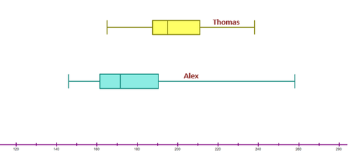
::例1Earlier, you were given a problem about the two bowlers. You need to create a data display to show their scores from the table below.
::早些时候, 您遇到两个保龄球员的问题。 您需要创建数据显示, 以显示他们从下表中的得分 。Alex 173, 166, 156, 183, 190, 161, 258, 169, 170, 146, 247, 176, 162, 151, 212, 191 Thomas 165, 196, 168, 194, 189, 197, 211, 194, 189, 204, 220, 211, 211, 172, 238, 186 First, you have to make a double stem-and-leaf or box-and whisker (whichever is the better to choose) with one axis to compare both sets of data.
::首先,你必须制作一个双干叶或箱式和螺旋(最好选择哪一个),用一个轴来比较两套数据。Stem-and-leaf plots are useful to represent ranges and can be used to illustrate ranges of two variables. Box-and-whisker plots are used to show how spread out data is and where the bulk of the data lies. Both of these graphs would allow you to clearly compare the scores. Let’s draw a double box and whisker.
::Stem-and-leaf 地块可以用来代表范围,也可以用来说明两个变量的范围。 方块和断层图用来显示数据是如何分散的,大部分数据在哪里。 这两个图表都允许您对得分进行清晰的比较。 让我们画一个双框,然后画一个胡须。Next, you need to describe any differences in their patterns of scores.
::接下来,你需要描述一下他们的分数模式上的任何差异。Alex’s scores are more spread, less consistent, have a lower mean, (188) and the highest score 258.
::亚历克斯的得分比较分散,比较不连贯,平均值较低(188分),最高得分为258分。Thomas’s scores are more consistent, less spread, have a higher mean (196.5) and the highest score 220
::Thomas的得分比较一致,传播较少,平均值较高(1965年),得分最高(220)If you had to choose one of these people to represent the school, why might you choose Alex? Why might you choose Thomas?
::如果你不得不选择其中一人代表学校,为什么你选择亚历克斯?你为什么选择托马斯?Alex would be chosen if the team needs one high scoring game.
::如果团队需要高分比赛 亚历克斯会被选中Thomas would be chosen because he is more consistent and reliable.
::选择托马斯 因为他更加一致和可靠Example 2
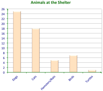
::例2A tally of the animals at a local shelter was taken so that children visiting on a field trip could see.
::当地收容所的动物计数被取走,让到外地探亲的儿童可以看到。Here are the results.
::以下是结果。When children looked at the bar graph , they shouted out:
::当儿童看着条形图时,他们大喊:Bobby: “Nobody likes dogs!”
::Bobby:“没有人喜欢狗!”Lisa: “I didn’t know that hamsters and rats were the same thing!”
::“我不知道仓鼠和老鼠是一回事!”Miguel: “Everyone must have taken all the turtles!”
::米格尔:“每个人都必须带走所有乌龟!”Mona: “They must have mostly food for dogs and cats!”
::莫娜:“他们必须主要为狗和猫提供食物!”How could a teacher respond? Were the conclusions of the children accurate?
::教师如何回应?孩子的结论准确吗?The teacher responded to their comments:
::老师回应他们的评论:“Bobby, just because they have a lot of dogs doesn’t mean people don’t like them. Since dogs are the most common pet, it makes sense that there would be more dogs at the shelter.”
::“Bobby,仅仅因为他们有许多狗并不代表人们不喜欢它们。 由于狗是最普通的宠物,所以在收容所里会有更多狗是有道理的。 ”“Lisa, it looks like hamsters and rats were tallied in the same category, maybe because they are kept in the same cage or given similar food. This bar graph does not mean they are the same, though.”
::“丽莎,看来仓鼠和大鼠被归入同一类别,也许因为他们被关在同一个笼子里,或者得到类似的食物。 虽然这个条形图并不表示它们是一样的。 ”“Miguel, since turtles are a less common pet, the shelter probably has fewer turtles. It doesn’t mean that they had a lot that were taken already.”
::“密戈尔,由于海龟是较不常见的宠物,避难所的海龟可能更少。 这并不意味着它们拥有的海龟已经很多了。 ”“Yes, Mona. It does make sense that having so many dogs and cats compared to other animals requires much more food for them than for the other animals. Also, they are bigger animals than the others, generally, so they eat more, too. Don’t they?”
::“是的,莫娜。 与其它动物相比,有这么多的狗和猫比其他动物要多得多的食物是有道理的。 此外,它们比其他动物要大得多,一般说来,它们比其他动物大得多,所以它们也吃得更多。 不是吗? ”Once again, a data display was used to make connections. The children used the graph from the animal shelter to draw conclusions.
::再一次,数据显示被用来建立联系,孩子们用动物收容所的图表得出结论。Example 3
::例3Which data display is best for categorical data?
::哪种数据显示最适合绝对数据?The answer is that bar graphs are best for categorical data.
::答案是,条形图对绝对数据最好。Example 4
::例4Which data display is best for showing how data changes over time?
::哪些数据显示最适合显示数据随时间变化的情况?The answer is that line graphs are best for showing data changes over time.
::答案是线条图是显示数据随时间变化的最佳方法。Example 5
::例5If I had data that was in the 10’s, 20’s, 40’s, 50’s and 60’s, which display would be best?
::如果我有10年代、20年代、40年代、50年代和60年代的数据,The answer is that scatterplots would best display this data.
::答案是,散射图最好显示这些数据。Review
::回顾Answer each question about data displays.
::回答关于数据显示的每个问题。1. What is considered numerical data?
::1. 什么是数字数据?2. What is considered categorical data?
::2. 哪些数据被视为绝对数据?3. If you were looking for a relationship between two values, would you use a scatterplot or a line graph?
::3. 如果您在寻找两个值之间的关系, 您会使用散射图或直线图吗 ?4. If there was a relationship between the data would you have a positive correlation or a negative correlation?
::4. 如果数据之间有关系,你会有正相关关系还是负相关关系?5. The words positive correlation and negative correlation are associated with which type of data display?
::5. 与哪类数据显示相联的词是正相关和负相关?6. If you had an outlier, then would you have a scatterplot or a box-and-whisker plot?
::6. 如果你有一个外线,那么你会有一个撒布点或一个盒子和口哨的图谋吗?7. What is a quartile?
::7. 什么是四分位数?8. Which type of data display is a quartile associated with?
::8. 哪种类型的数据显示与哪类数据显示有关?9. If you were watching a trend over time would you use a line graph or a scatterplot?
::9. 如果你在观察一段时间的趋势,你会使用线条图或散射图吗?10. If you were comparing two trends and their results which data display would make the most sense?
::10. 如果比较两种趋势及其结果,哪一种数据显示最有意义?11. What is the mean?
::11. 这意味着什么?12. What is the median?
::12. 中位数是多少?13. What is the mode?
::13. 模式是什么?For the following graphs choose the conclusion that best represents the data.
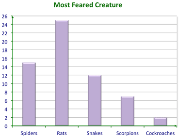
::以下图表选择最能代表数据的结论。14. Conclusion 1: Rats are the most feared creature.
::14. 结论1:老鼠是最可怕的生物。Conclusion 2: Rats are the most dangerous creature.
::结论2:老鼠是最危险的生物。Conclusion 3: Nobody is afraid of bats.
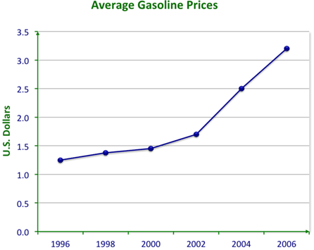
::结论3:没有人害怕蝙蝠。15. Conclusion 1: Prices have increased every year for 10 years.
::15. 结论1:价格十年来逐年上涨。Conclusion 2: Prices of gasoline increased more rapidly after 2000.
::结论2:汽油价格在2000年之后较快地上涨。Conclusion 3: Prices will be even higher in 2008.
::结论3:2008年的价格将更高。Review (Answers)
::回顾(答复)Click to see the answer key or go to the Table of Contents and click on the Answer Key under the 'Other Versions' option.
::单击可查看答题键, 或转到目录中, 单击“ 其他版本” 选项下的答题键 。 -
Make a double stem-and-leaf or box-and whisker (whichever is the better to choose) with one axis to compare both sets of
data
.