2.11柱状图
Section outline
-

Judy has planted a garden in her backyard. She decided to keep track of how many vegetables were growing each month in her garden. The data table below shows the amounts of vegetables she grew in July and August.
::Judy在她的后院种植了一个花园,她决定跟踪她的花园每月种植多少蔬菜,下表显示她在7月和8月种植多少蔬菜。July August 30 carrots 60 carrots 10 tomatoes 20 tomatoes 25 zucchini 30 zucchini 15 squash 25 squash 10 potatoes 20 potatoes Judy wants to visually display her data in a way that she can show the community board to earn recognition for her growing garden. She wants the data to be easy to read and understand.
::Judy想用视觉显示她的数据,让社区董事会看到她种植的花园获得认可。她希望数据易于阅读和理解。In this concept, you will learn how to create a bar graph from data and answer questions about the data represented.
::在此概念中,您将学会如何从数据中创建条形图,并回答关于所代表数据的问题。Bar Graphs
::条边图Bar graphs are created from a set of data. It is called a bar graph because it is a visual display of data using bars. The number of items tells us how many bars the graph will have. The amount of each item tells us how long each bar will be. Look at the following data. A bar graph can be used to represent the data, which tells how many hours students in the fifth, sixth, seventh, and eighth grade classes volunteered in a month.
::条形图是用一组数据创建的。它称为条形图,因为它是用条形图显示数据。项目数量告诉我们图形将有多少条条形。每个项的量告诉我们每个条条的长度。看看下面的数据。可以使用一个条形图来代表数据,它显示五个、六、七、八年级学生在一个月内自愿参加学习多少小时。Class Number of Hours 51 88 75 39 You can see that this information has been written in the form of a frequency table . It shows us how many hours each class has worked.
::您可以看到此信息是以频率表的形式写入的。 它显示每个班级工作了多少小时 。Now a bar graph can be created to display the information.
::现在可以创建一个条形图来显示信息。A bar graph contains two axes. One axis represents the items, which goes across the bottom on what is called the X-axis . The other represents the amounts of each item, which goes along the side on what is called the Y-axis . The “items” in this case are each class. The amounts are the number of hours the classes worked. Axes always need to be labeled to show what each axis represents.
::条形图包含两个轴。一个轴代表项目,在所谓的 X 轴上横穿底部。另一个轴代表每个项目的数量,在叫做 Y 轴的侧面。“ 项” 是每个类。 数量是分类工作小时数。 轴总是需要标签以显示每个轴代表什么。Next, a scale needs to be chosen for the amounts on the left side of the bar graph. Scales of 1, 2, 5, 10, 20, 50, 100, 1,000, or more a typically used because they are easy numbers to count by. To choose the scale, look at the amounts you’ll be graphing, especially the largest amount. In the example, the greatest value is 88. If a scale of 100 is used, the scale marks on the left side of the graph would be 0, 100, 200, and so on. It would be very difficult to read most of the amounts on this scale because it is too big. On the other hand, if a small scale is used, such as 5, the graph would have to be very large to get all the way up to 90 (since the greatest value is 88).
::其次,需要为条形图左侧的数量选择一个比例尺。 比例尺为 1, 2, 5, 10, 20, 50, 100, 100, 1,000, 或更多, 因为这些数量很容易计算。 要选择比例尺, 请查看您将要绘制的数字, 特别是最大的数量。 例如, 最大值为 88 。 如果使用一个比例尺, 图形左侧的标值为 0, 100, 200 等。 很难读取这个比例尺上的大部分数量, 因为规模太大了。 另一方面, 如果使用小比例尺, 如 5, 则图表必须非常大才能达到 90 ( 因为最大值是 88 ) 。It makes the most sense to use a scale that goes from 0 to 90 counting by 10’s. That way each value can easily represent the hours that each class worked.
::使用从0到90的乘以10的乘以90的乘以最合理。 这样,每个值就可以很容易地代表每个班的工作时间。Here is what the graph looks like with the scale filled in.
::这里的图表与填满的缩放表相似 。Now the bars can be drawn in to represent each number of hours that the students worked.
::现在,这些栏杆可以用来代表学生工作的每一小时。Examples
::实例Example 1
::例1Earlier, you were given a problem about Judy and her growing garden that she wants to display to the community board.
::早些时候,你得到一个问题 朱迪和她种植的花园 她想展示给社区董事会。She kept track of the amounts of vegetables that grew in her garden each month and she now wants to visually display that data. A bar graph is a great way to represent her data.
::她每个月都追踪花园里种植的蔬菜数量,现在她想用视觉显示这些数据。一个条形图是代表她数据的一个很好的方法。First, Judy collects and organizes her data. In July, Judy grew:
::首先,朱迪收集整理数据。7月,朱迪成长为:30 carrots
::30胡萝卜10 tomatoes
::10西番茄25 zucchini
::2515 squash
::15 壁球 15 壁球10 potatoes
::10 马铃薯Next, Judy can make the bar graph. Her amounts range from 10 to 30, so she can start her graph at 0 and use a scale that has increments of five. Here is the bar graph.
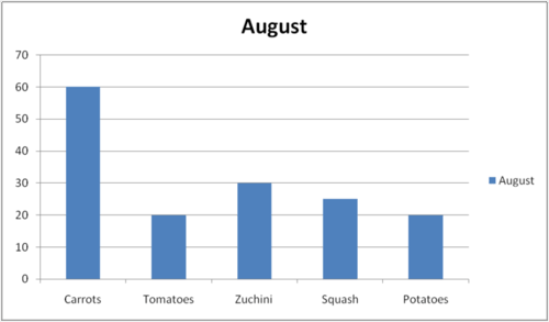
::接下来,朱迪可以绘制条形图。她的数量在10到30之间, 这样她就可以以0开始她的图表, 并且使用一个递增为5的尺度。 这是条形图。Judy can do the same thing with her data from August.
::朱迪可以用她八月的数据做同样的事情60 carrots
::60胡萝卜 6020 tomatoes
::20西番茄30 zucchini
::3025 squash
::25 壁球 25 壁球20 potatoes
::20 马铃薯Judy has a range of 20 to 60 in her August data, so she uses a different scale in her August bar graph. She uses increments of 10 on her Y-axis up to 70.
::朱迪的八月数据在20到60之间, 所以她在八月的条形图中使用了不同的比例。 她的Y轴加10到70。Then, Judy can display her data to the board and prove her garden is growing and producing vegetables that would earn her the recognition she is seeking. The board may ask her questions, or Judy can make conclusions using the data in her graph such as:
::然后,Judy可以向董事会展示她的数据,证明她的花园正在种植和生产蔬菜,从而获得她寻求的认可。 董事会可以询问她的问题,或者Judy可以使用她的图表中的数据做出结论,例如:In both months, Judy grew the most carrots of any vegetable in her garden. Judy could also exactly explain the amount of carrots that were grown in both months by reading the Y-axis next to the carrots data bar.
::在这两个月中,朱迪在花园里种植了任何蔬菜中最多的胡萝卜。 朱迪也可以通过阅读胡萝卜数据栏旁边的Y轴来解释两个月中生长的胡萝卜数量。Example 2
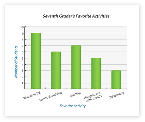
::例2What number of 7th graders have a favorite activity of watching television?
::有多少七年级学生有喜欢看电视的活动?First, look for the column that refers to television. This is the activity that the question is referring to; therefore, is the data you are targeting.
::首先,请查看电视的栏目。这是问题所指的活动;因此,是您正在瞄准的数据。Next, look at the vertical axis. This will show you where the data falls on the scale representing the number of students who enjoy that activity.
::接下来,请看垂直轴。 这将显示数据在比例表上的位置, 代表享受该活动的学生人数 。Then, answer the question with the exact number for the Y-axis that matches up with the bar in the graph representing television.
::然后,回答问题 准确的Y轴的号码 与显示电视的图纸上的 条吻合The answer is 9 seventh graders have "watching TV" as their favorite activity.
::答案是九年级七年级学生将“看电视”作为他们最喜欢的活动。Example 3
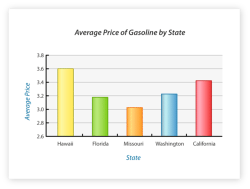
::例3Which state has the highest average price for gasoline?
::哪个州的平均汽油价格最高?First, look at the bar graph to determine the longest bar in the graph (which would represent the highest price for gas).
::首先,看看条形图以确定图中最长的条形(这是天然气的最高价格)。Next, look at the X-axis to see which state the longest bar belongs to. Also check the Y-axis to make sure that bar in the graph is matched to the highest amount on the Y-axis.
::下一步, 请查看 X 轴以查看属于哪个最大条的状态 。 还要检查 Y 轴, 以确保图表中的条与 Y 轴上的最高值匹配 。Then, answer the question with the data bar that you found to have the highest price of gasoline as represented in the graph.
::然后,用数据栏回答问题,你发现该数据栏显示的汽油价格最高。The answer is Hawaii.
::答案是夏威夷Example 4
::例4Using the same bar graph above, which state has the lowest average price?
::使用上面相同的条形图,哪个州的平均价格最低?First, look at the bar graph to determine the shortest bar in the graph.
::首先,看看条形图以确定图中最短的条形。Next, look at the X-axis to see which state is represented by the shortest bar. Check the Y-axis as well to make sure the bar is matched to the lowest amount of all states on the graph.
::下一步, 看看 X 轴, 看看哪个状态代表最短的条。 请检查 Y 轴, 并确保该条与图中所有状态中的最低数量匹配 。Then, answer the question with the data bar that displays the lowest price of gasoline.
::然后用显示汽油价格最低的数据栏回答问题。The answer is Missouri.
::答案是密苏里州Example 5
::例5Using the same bar graph above, which state has the second highest average price?
::使用上面相同的条形图,哪个州的平均价格是第二高?First, look at the graph to find not the highest or lowest price, but the 2nd highest bar in the graph. The highest price is in Hawaii, so then look for the bar that is next highest to Hawaii.
::首先,看看图表,以找到不是最高或最低的价格,而是图中第二高的一栏。最高的价格在夏威夷,然后寻找夏威夷第二高的一栏。Next, look at the X-axis to see which state is represented by the bar that is 2nd highest.
::接下来,看看X轴 看看哪个州代表的是第二高的栏杆。Then, answer the question with the data you find on X-axis that shows which state has 2nd highest gasoline prices.
::然后,用您在X轴上找到的数据回答问题,这些数据显示哪个州汽油价格是第二高的。The answer is California.
::答案是加利福尼亚州。Review
::回顾Use the bar graph to answer the following questions.
::使用条形图回答下列问题。-
How many students were asked if they have summer jobs?
::问了多少学生是否有暑期工作? -
What is the range of the data?
::数据的范围是什么? -
What are the three jobs that students have?
::学生的三项工作是什么? -
How many students do not have a summer job?
::有多少学生没有暑期工作? -
How many students babysit?
::有多少学生照看孩子? -
How many students do yard work in the summer?
::夏季有多少学生在院子里工作? -
How many students work at an ice cream stand in the summer?
::有多少学生夏天在冰淇淋摊工作? -
If ten more students got a job this summer, how many students would have summer jobs?
::如果今年夏天再有十个学生找到工作 有多少学生会有暑假工作? -
If each category had double the number of students in it, how many students would have summer jobs?
::如果每一类别的学生人数是该类别学生人数的两倍,有多少学生会从事暑期工作? -
How many students would babysit?
::有多少学生会照顾孩子? -
How many students would work at an ice cream stand?
::有多少学生会在冰淇淋摊工作? -
How many students wouldn’t have a summer job?
::有多少学生没有暑期工作? -
What scale was used for this graph?
::此图表使用什么比例尺 ? -
What interval was used in the scale?
::比例尺使用的间隔是多少? -
What is the difference between working at an ice cream stand and doing yard work?
::在冰淇淋站工作与在院子里工作有什么区别?
-
How many students were asked if they have summer jobs?