2.13多条形图
章节大纲
-

A farmer takes his produce to the farmers market each weekend. The farmers market runs on three days (Friday, Saturday, Sunday). The farmer keeps track of the amount of produce he sells each day from each vegetable. Here is data from the weekend:
::农民每周末将农产品运往农民市场。农民市场在三天内(星期五、星期六、星期日)经营。农民每天从每个蔬菜中追踪他销售的农产品数量。以下是周末的数据:Type of Vegetable: Pounds Sold: Day One Pounds Sold: Day Two Pounds Sold: Day Three Squash 32 lbs. 36 lbs. 36 lbs. Zucchini 40 lbs. 33 lbs. 37 lbs. Corn 56 lbs. 65 lbs. 67 lbs. Carrots 28 lbs. 25 lbs. 23 lbs. Romaine Lettuce 27 lbs. 31 lbs. 34 lbs. Tomatoes 44 lbs. 54 lbs. 58 lbs. The farmer wants to compare his data and look for his best selling vegetable and which day that sale occurred, so he can be sure to plant more to sell. He will need to display his data and then compare.
::农民想比较他的数据,寻找他最好的蔬菜销售量,以及该销售发生哪天,这样他就可以种植更多的蔬菜销售量。 他需要展示他的数据,然后进行比较。In this concept, you will learn how to create multiple data set bar graphs and compare them to draw conclusions.
::在此概念中,您将学会如何创建多个数据集条形图,并比较它们以得出结论。Multiple Bar Graphs
::多条条图Sometimes there are more than two sets of data to be compared in a bar graph . In that case, a multiple bar graph can be used. A multiple bar graph compares as many sets of data you want. The process for creating a multiple bar graph is just like creating any other bar graph, only you will have more colors to represent different sets of data.
::有时在条形图中可以比较两组以上的数据。在这种情况下,可以使用多条形图。多条形图可以比较您想要的多组数据。创建多条形图的过程就像创建任何其他条形图一样,只有您会有更多的颜色来代表不同的数据集。To create a multiple bar graph:
::要创建多个条形图 :-
Draw the horizontal
and vertical
">
axis.
::绘制水平( x)和垂直( y) 轴。 -
Give the graph a title.
::给图表一个标题 。 -
Label the horizontal x axis.
::水平 X 轴标签 。 -
Label the vertical y axis.
::垂直 y 轴标签 。 -
Look at the
range
in data and decide how the
units
on the vertical axis
">
should be labeled.
::查看数据范围,并决定垂直轴上的单位应如何标签。
-
For each item on the horizontal
axis, draw a vertical column to the appropriate value however many times as you have sets of data. For example, if you are looking at 3 days worth of data, you will have 3 bars per item.
::对于水平( x) 轴上的每个项目,请将垂直列绘制为合适的值,无论数据组的倍数多。例如,如果查看3天的数据值,每个项目将有三个栏。 -
Choose three colors to represent each different data set. Make sure to label the data sets in a key alongside the graph.
::选择三个颜色代表每个不同的数据集。 一定要在图形旁边的密钥中标记数据集 。
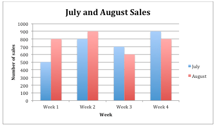
Sometimes comparing data can also be done by comparing data sets across multiple different bar graphs. The difference is the data is split versus all being compared in one graph. Either method allows you to analyze and compare the data being displayed.The following is an example of a bar graph showing ice cream sales in the months of July and August.Another bar graph displaying the ice cream sales in September and October can be compared to the sales in July and August.
::另一个显示9月和10月冰淇淋销售额的条形图可与7月和8月的销售额作比较。When you are comparing data across two bar graphs, keeping the scale the same will allow for better comparison. Below is the data set for September and October ice cream sales which can be turned into another .
::当您在两个条形图上比较数据时,保持同一比例将便于进行更好的比较。下面是9月和10月的冰淇淋销售数据组,可以转换为另一种。September October Week 1 600 400 Week 2 500 200 Week 3 400 100 Week 4 300 100 Examples
::实例Example 1
::例1Earlier, you were given a problem about the farmer and his produce that he sells at the farmers market.
::早些时候,你得到一个问题 关于农民和他的产品 他出售在农民市场。Here is the data he collected from the weekend at the market:
::以下是他从周末市场收集的数据:Type of Vegetable: Pounds Sold: Day One Pounds Sold: Day Two Pounds Sold: Day Three Squash 32 lbs. 36 lbs. 36 lbs. Zucchini 40 lbs. 33 lbs. 37 lbs. Corn 56 lbs. 65 lbs. 67 lbs. Carrots 28 lbs. 25 lbs. 23 lbs. Romaine Lettuce 27 lbs. 31 lbs. 34 lbs. Tomatoes 44 lbs. 54 lbs. 58 lbs. He now wants to display his data and figure out which vegetable sold the most pounds and on which day this occurred. He decides to display his data in a bar graph to compare each vegetable each day.
::他现在想展示他的数据,并找出哪些蔬菜出售的重量最大,以及发生在哪一天。他决定用一张条形图显示他的数据,每天对每个蔬菜进行比较。First, the farmer takes his data from the data table and creates a multiple bar graph. These are the steps he took.
::首先,农民从数据表格中提取数据,并制作一个多条形图。这是他所采取的步骤。-
Draw the horizontal
and vertical
">
axis.
::绘制水平( x)和垂直( y) 轴。 -
Give the graph the title “Frank’s Farm Stand.”
::给图中的标题是“弗兰克农场站 ” 。 -
Label the horizontal axis “Vegetables.”
::水平轴“ Vegeables” 标签 。 -
Label the vertical axis “Pounds Sold.”
::垂直轴“已售出”标签 。 -
Look at the range in data and decide how the units on the vertical axis
">
should be labeled. In this case, label the vertical axis 0 - 80 by tens.
::查看数据范围,并决定垂直轴 -
For each vegetable on the horizontal
axis, draw a vertical column to the appropriate value three times, one column representing day one, a second column for day two, and a third column for day three.
::对于水平( x) 轴上的每个蔬菜,请将垂直列绘制三次,一个列代表第一天,第二个列代表第2天,第三个列代表第3天。 -
Choose three colors, one to represent the values for day one, one for the values for day two, and finally one to represent the values for day three.
::选择三个颜色, 一个代表第1天的值, 一个代表第2天的值, 最后一个代表第3天的值。
Next, he looks for the bar in the graph that shows the highest amount sold in pounds. The highest amount sold according to the graph is the orange bar in the Corn column.
::接下来,他寻找图中显示以英镑出售的最高数额的条。根据图中的数字,出售的最高数额是玉米柱中的橙色条。Then, he uses the key in his graph to determine the day of the market in which that amount of corn sold. The orange bar represents Day 3 of the farmers market.
::然后,他用他的图表中的钥匙来确定玉米销售量的市场日。 橙色酒吧代表了农民市场的第3天。The answer is that the farmer sold the most corn of any produce on Day 3 of the market.
::答案是农夫在市场第3天出售了 任何农产品中最多的玉米。Use the following graph for the next few questions.
::下几个问题使用下图。Example 2
::例2Determine which month and week, of all total ice cream sales, was the highest amount sold.
::确定在冰淇淋销售总额中,哪个月和哪个星期的销售额最高。First, pick one graph to analyze first. For July and August, there is a tie of $900 of ice cream sales in August Week 2 and July Week 4.
::首先,先选一个图表分析。7月和8月,8月第2周和7月第4周的冰淇淋销售额高达900美元。Next, analyze the other graph. In September and October, the highest sales week was $600 in September Week 1.
::接下来分析另一张图。在9月和10月,9月第1周的最高销售周是600美元。在9月和10月,9月第1周。Then, compare the two findings to determine which month and week had the overall highest sales. September Week 1, while the highest sales in that graph, was lower in sales than August Week 2 and July Week 4.
::然后,比较这两个结果,以确定哪个月和哪个周的总销售额最高。 9月1周,虽然该图的销售额最高,但销售额低于8月2周和7月4周。The answer is both August Week 2 and July Week 4 had the highest ice cream sales.
::答案是8月第2周和7月第4周的冰淇淋销售量最高。Use the Ice Cream Sales data to answer the following questions.
::使用冰淇淋销售数据回答下列问题。Example 3
::例3Which week in the month of September had the best sales and what was the sale total?
::9月份哪个星期的销售额最高? 销售总额是多少?First, look for the graph which contains the data set in the question.
::首先,寻找含有问题中数据集的图表。Next, find the week in September (represented in blue) with the highest sales.
::9月的一周(蓝色代表)销售量最高。Then, look at the Y-axis to determine to total amount in sales for that highest week.
::然后,看看Y轴,确定 最高一周的销售总额。The answer is Week One with $600 in sales.
::答案是第一周,售价600美元。Example 4
::例4What conclusion can you draw about the direction of ice cream sales during the month of October?
::你能得出什么结论 冰淇淋10月份销售的方向?First, look for the graph which contains the data set being asked about.
::首先,寻找包含所询问的数据集的图表。Next, analyze the October data only (represented in red).
::接下来,只分析十月的数据(以红色表示)。Then, look at the pattern in the sales from Week 1 through Week 4. There is a decrease in sales each week as the month goes on.
::然后,看看从第1周到第4周的销售模式。 随着这个月的继续,每周的销售量会减少。The answer is ice cream sales in the month of October decreased steadily week by week.
::答案是,10月份的冰淇淋销售额每周稳步下降。Example 5
::例5Did week 2 in September or week 2 in July have better sales?
::9月第2周或7月第2周是否销售情况较好?First, look at the graphs that contain the data necessary to answer. This question compares both graphs, so both will need to be analyzed. Pick one to start with, for example, July Week 2, and check the Y-axis for sales total. July Week 2 sales totaled $800.
::首先, 请看看包含解答所需数据的图表 。 这个问题比较了两个图表, 因此两者都需要分析 。 请选择一个以七月周二为起点, 并检查 Y 轴的销售总额 。 七月周二的销售总额为 800 美元 。Next, look at the other graph and find September Week 2. Sales totaled $500 in September Week 2.
::接下来,看看另一张图表 找到9月2日的第二周 9月2日的销售额共计500美元Then, compare the two sets of data from each graph to determine which week and month had better sales. July Week 2 had $600 in sales versus September Week 2 having only $500 in sales.
::然后,比较每张图表的两组数据,以确定哪个周和哪个月的销售额较好。 7月2日周的销售额为600美元,而9月2日周的销售额仅为500美元。The answer is Week 2 in July.
::答案是7月的第2周。Review
::回顾Use this bar graph to answer the following questions.
::使用此条图回答下列问题。-
Which day had the greatest pounds of carrots sold?
::哪一天卖出最大的胡萝卜? -
Which vegetable was the most popular over all?
::哪个蔬菜最受欢迎? -
Which vegetable was the least popular over all?
::哪个蔬菜最不受欢迎? -
Which vegetable had the smallest difference between the number of pounds sold per day?
::哪些蔬菜的日售额与日售额相差最小? -
Which vegetable was the most popular on day one?
::第一天哪一种蔬菜最受欢迎? -
Which vegetable was the most popular on day two?
::第二天哪一种蔬菜最受欢迎? -
Which vegetable was the most popular on day three?
::哪个蔬菜在第三天最受欢迎? -
About how many pounds of zucchini were sold on day two?
::第二天卖了多少磅的肉? -
About how many pounds of tomatoes were sold on day one?
::第一天卖了多少磅西红柿? -
About how many pounds of carrots were sold on day three?
::第三天卖了多少磅胡萝卜? -
About how many pounds of squash was sold on day one?
::第一天卖了多少磅的壁球? -
How many total pounds of squash was sold on days 1, 2 and 3?
::第一、第二和第三天卖了多少磅的壁球? -
How many total pounds of zucchini was sold on days 1, 2 and 3?
::第一、二、三天一共卖了多少磅? -
How many total pounds of carrots was sold on days 1, 2, and 3?
::第一、第二和第三天一共卖了多少磅胡萝卜? -
How many total pounds of lettuce was sold on day 3?
::第3天一共卖了多少磅生菜?
-
Draw the horizontal
and vertical
">
axis.