2.16圆图
章节大纲
-

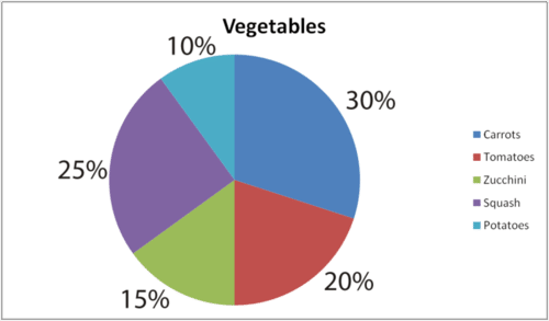
::[图1]Sue collected data over an entire year to show how many vegetables she grew.
::Sue收集了整整一年的数据,以显示她种植了多少蔬菜。Total vegetables = 400
::蔬菜共计=400Carrots = 120
::胡萝卜=120Potatoes = 40
::土豆=40Tomatoes = 80
::番茄=80Zucchini = 60
::Zucchini = 60Squash = 100
::Squash = 100She displays it in a circle graph to visually see which vegetables grew best in her garden and which vegetables grew the least.
::她用圆形图显示,以观察哪些蔬菜在她的花园中生长最好,哪些蔬菜种植最少。Sue can now analyze the circle graph to draw conclusions based on her data. She wants to rank her vegetables from least amount grown to most grown.
::Sue现在可以分析圆形图,以便根据她的数据得出结论。她想将她的蔬菜从最少种植到最多种植。In this concept, you will learn how to read circle graphs to answer questions.
::在此概念中,您将学习如何阅读圆形图解答问题。Circle Graphs
::圆形图Like bar graphs, line graphs, and other data displays, circle graphs are a visual representation of data.
::象条形图、线形图和其他数据显示,圆形图是数据的直观表示。In particular, a circle graphs are used to show the relationships between a whole and its parts. The whole might be a total number of people or items. It can also be decimals that add up to 1. Decimals are related to percentages , they are both parts of a whole. A circle graph will often show percents that add up to 100 percent .
::特别是,使用圆形图来显示整体及其部分之间的关系。 整个图中可能包含人或项目的总数。 也可能是小数数组, 相加到 1 。 十进制与百分比有关, 它们都是整体的一部分。 圆形图中往往显示百分率, 共加到100% 。Take a look at the circle graph below. It shows which pets the students in the sixth grade have.
::看看下面的圆形图,它显示了六年级学生的宠物。In order to interpret circle graphs, you first need to understand what “whole” and “parts” it represents. This information can be found in the graph’s title and labels of the parts.
::为了解释圆形图,您首先需要理解它代表的“ 整体” 和“ 部分 ” 。 此信息可以在图的标题和部分的标签中找到 。Each section is labeled according to a percentage. Each percentage is a part of a whole. The whole is the whole class or 100% of the students. The largest group would have the greatest percentage. In this case, dogs are the most popular pet with 40% of the kids in the sixth grade having dogs. The smallest group would have the smallest percentage. In this case, there are two groups that are the smallest or the least popular pet. In this circle graph, rabbits and birds are the smallest group. Since this is a graph about popularity, you can say that the least popular pets are rabbits and birds. The most popular pet is a dog.
::每个部分都按百分比进行标签。 每一百分比都是整体的一部分。 整体是整个班级或100%的学生, 最大群体将拥有最大比例。 在这种情况下, 狗是最受欢迎的宠物, 40%的六年级儿童有狗; 最小群体将拥有最小比例。 在这种情况下, 有两个群体是最小或最不受欢迎的宠物。 在这个圆形图中, 兔子和鸟类是最小群体。 由于这是关于受欢迎程度的图表, 您可以说最不受欢迎的宠物是兔子和鸟类。 最受欢迎的宠物是一只狗。Here is another example:
::以下是另一个例子:Circle graphs display data so that you can make generalizations about different components of the data. Circle graphs are also used to make predictions.
::圆形图显示数据,以便您能够对数据的不同组成部分进行概括化。圆形图也用于预测。This information can help to understand the likelihood that other people will choose the same categories based on the percentages that are greatest and least. Suppose, for instance, that a student was absent from the class when the poll was taken to see which kind of movie the students preferred. Which category would the absent student most likely choose based on the data shown in the graph?
::这种信息可以帮助理解其他人根据最大和最小的百分比选择相同类别的可能性。 比如,在进行民意调查以查看学生喜欢哪类电影时,学生缺席了班级。 缺席学生最有可能根据图表中的数据选择哪类?Because most of the students selected comedy as their favorite type of movie, it would be more likely that the absent student would also choose comedy. That is not a certain answer, just a prediction. Remember, a prediction is made based on an assumption or pattern but it is not an exact answer.
::因为大多数学生选择喜剧作为他们最喜欢的电影类型,所以缺席学生也更有可能选择喜剧。 这不是一个特定答案,而只是预测。 记住,预测是基于假设或模式做出的,但不是准确答案。Examples
::实例Example 1
::例1Earlier, you were given a problem about Sue and her vegetable garden.
::早些时候,你得到一个问题 关于苏和她的菜园。This is the data that Sue has collected over an entire year of growth in her garden:
::这是苏在她花园生长的整整一年里收集的数据:Total vegetables = 400
::蔬菜共计=400Squash = 100
::Squash = 100Zucchini = 60
::Zucchini = 60Potatoes = 40
::土豆=40Carrots = 120
::胡萝卜=120Tomatoes = 80
::番茄=80Sue created a circle graph to display her data visually.
::Sue创建了一个圆形图,以直观显示她的数据。Now, Sue wants to rank her vegetables from least amount grown to greatest amount grown. In order to do this, she needs to read and interpret her circle graph.
::现在,苏希望将蔬菜从最小数量种植到最大数量种植。为了做到这一点,她需要阅读和解读她的圆形图。First, Sue will rank the percentages of each vegetable from least to greatest. This gives her a start on ranking them correctly.
::首先, Sue 将把每种蔬菜的百分比从最小排到最高。 这样她就可以开始正确排在位次上。10%
15%
20%
25%
30%
Next, Sue matches up each percentage with the color that percentage represents.
::接下来,Sue将每一百分比与该百分比所代表的颜色相匹配。10% Light Blue
::10% 浅蓝色15% Green
::15% 绿20% Red
::20% 红25% Purple
::紫 25% 紫30% Blue
::30% 蓝色Then, Sue uses her key to match the sections in the circle graph with each of the vegetables in her garden. This will display her rank of least amount grown to greatest amount grown.
::然后,Sue用她的钥匙把圆形图中的各个部分 和花园里的每一种蔬菜匹配起来。这将显示她的军衔 最少,增长最多。10% Light Blue- Potatoes
::10% 浅蓝色土豆15% Green- Zucchini
::15% 绿色-Zucchini20% Red- Tomatoes
::20%红番茄25% Purple- Squash
::25% 紫-斯夸斯30% Blue- Carrots
::30% 蓝胡萝卜The answer is from least to greatest amount grown: Potatoes, Zucchini, Tomatoes, Squash, Carrots.
::答案从最少到最大的增长是:土豆、Zucchini、番茄、Squash、胡萝卜。Sue can also conclude that Potatoes grew the least in her garden which Carrots grew the most.
::Sue也可以得出这样的结论:土豆在她的花园中生长最少,胡萝卜生长最多。Example 2
::例2Look at this graph and answer the following question.
::看看这个图表,回答下面的问题。Based on the graph, what is the most popular student activity?
::根据图表,最受欢迎的学生活动是什么?First, look for the largest colored section of the graph. It is represented in blue.
::首先, 查找图表中最大的彩色部分。 它以蓝色表示 。Next, look for the percentage next to that section to make sure it is the greatest percentage represented in the graph. This section represents 55%, which is the greatest section in the graph.
::下一步, 查找该节旁边的百分率, 以确保它是图中代表的最大百分率。 此节代表55%, 这是图中最大的一节 。Then, look at the key to determine which activity is represented by the 55% blue section. The blue section represents sports.
::然后,看看确定哪些活动由55%的蓝色部分代表的关键。蓝色部分代表体育。The answer is that sports is the most popular activity.
::答案是,体育是最受欢迎的活动。Use the circle graph on movie data to answer the following questions.
::使用电影数据上的圆形图回答下列问题。Example 3
::例3Which type of movie is the most popular?
::哪一种电影最受欢迎?First, look for the colored section that is the greatest section of the graph. It is blue.
::首先, 寻找图中最美的彩色部分。 它是蓝色的 。Next, check the percentage to see if it also represents the greatest percentage in the graph.
::接下来,请检查百分比,看看是否也是图中最大的百分比。Then, look at the key to determine which movie type is represented by the blue section.
::然后,看看确定哪类电影由蓝色部分代表的钥匙。The answer is comedy movies are the most popular.
::答案是喜剧电影最受欢迎Example 4
::例4Which type of movie is the least popular?
::哪一种电影最不受欢迎?First, look for the section of the graph that is the smallest section. It is green.
::首先,寻找图中最小的一节。它是绿色的。Next, check the percentage to make sure that is the least percentage represented in the graph as well.
::下一步,请检查百分比,以确保这个百分比也是图表中代表最小的百分比。Then, look at the key to determine which movie type is represented by green in the graph.
::然后,看看确定哪类电影在图表中代表绿色的钥匙。The answer is horror movies are the least popular.
::答案是恐怖电影是最不受欢迎的Example 5
::例5What percentage of students would choose a romance movie?
::选择浪漫电影的学生比例是多少?First, look at the key to see which color represents romance movies.
::首先,看看看什么颜色代表浪漫电影的钥匙。Next, find that colored section on the graph.
::接下来,在图表中找到彩色部分。Then, look at the percentage that labels that part of the graph.
::然后,看看贴在图中那个部分的百分率。The answer is 15% of students choose romance movies.
::答案是15%的学生选择浪漫电影。Review
::回顾Use the circle graph to answer the following questions.
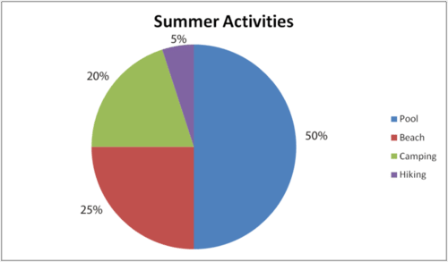
::使用圆形图回答下列问题。This circle graph shows the results of a survey taken of sixth graders about their favorite things to do in the summer. Use the graph to answer the following questions.
::此圆形图显示对六年级学生在夏季要做的事情的普查结果。 使用此图回答下列问题 。-
What percent of the students enjoy the pool in the summer?
::有多少学生在夏天享受游泳池? -
What percent of the students enjoy camping?
::有多少学生喜欢露营? -
What percent of the students enjoy hiking?
::有多少学生享受徒步旅行? -
What percent of the students enjoy going to the beach?
::有多少学生喜欢去海滩? -
What percent of the students do not enjoy camping?
::哪些学生不喜欢露营? -
What percent of the students enjoy being near or in the water?
::哪些学生喜欢在水中或靠近水面? -
What percent of the students enjoy camping and hiking?
::有多少学生喜欢露营和徒步旅行? -
What percent of the students did not choose hiking as a summer activity?
::有多少学生没有选择徒步旅行作为暑期活动? -
Which section has the majority of the votes?
::哪个部分拥有多数票? -
If a new student’s opinion was added to the survey, which category would the new student most likely choose?
::如果在调查中增加新的学生意见,新学生最可能选择哪类学生?
This circle graph shows the results of a survey taken among students about their favorite school lunches. Use the graph to answer the following questions.
::此圆形图显示了在学生中调查他们最喜欢的学校午餐的结果。 使用此图回答下列问题 。-
What percent of the students enjoy soup as a lunch?
::有多少学生在午餐时享受汤? -
What is the favorite choice of students for school lunch?
::学校午餐时,学生们最喜欢选择什么? -
What is the least favorite choice?
::最不受欢迎的选择是什么? -
What percent of the students enjoy salad?
::有多少学生享受沙拉? -
What percent of the students did not choose salad as a favorite choice?
::有多少学生没有选择沙拉作为首选? -
What percent of the students chose either pizza or tacos as their favorite choice?
::有多少学生选择披萨或玉米饼作为他们最喜欢的选择? -
What percent of the students chose chicken sandwich or pizza as their favorite choice?
::有多少学生选择鸡肉三明治或比萨饼作为他们最喜欢的选择? -
What percent of the students did not choose chicken or pizza?
::有多少学生没有选择鸡肉或比萨饼? -
What is your favorite choice for lunch?
::你最喜欢吃什么午餐? -
If you could add a food choice to this survey, what would it be?
::如果你能为这次调查增加一个食物选择,那会是什么?
Review (Answers)
::回顾(答复)Click to see the answer key or go to the Table of Contents and click on the Answer Key under the 'Other Versions' option.
::单击可查看答题键, 或转到目录中, 单击“ 其他版本” 选项下的答题键 。Resources
::资源
-
What percent of the students enjoy the pool in the summer?