10.11圆形图显示数据
章节大纲
-
Glenda is a reporter for the local television station and she is writing a story about the recent election for mayor. The percentages of the total votes received by each candidate are:
::Glenda是当地电视台的记者,她正在撰写关于最近市长选举的报道。John Williams – 43%
::John Williams - 43%Rachel Clark – 26%
::瑞秋·克拉克 — — 26%Roger Parks – 19%
::罗杰公园 — — 19%Paul Taylor – 12%
::保罗·泰勒 — — 12%How can Glenda display these results on a graph that will allow viewers to quickly compare the results?
::Glenda 如何在图表上显示这些结果, 让观众能快速比较结果?In this concept, you will learn to display data using circle graphs.
::在此概念中,您将学会使用圆形图显示数据。Circle Graphs
::圆形图A circle graph , sometimes called a pie graph, is a visual way to display data using circles and parts of a circle. In fact, circle graphs are one of the most popular means of displaying real-world data.
::圆形图,有时被称为饼图,是使用圆圈和圆圈部分显示数据的直观方式。事实上,圆形图是显示真实世界数据最受欢迎的手段之一。In a circle graph, the entire circle represents 100% and each section of the circle represents some part out of 100.
::在圆形图中,整个圆为100%,圆的每个部分为100中的一部分。The circle graph below shows how a graph is divided into sections according to the data. Data Set 1 is 25% of the graph. This is displayed numerically as well as visually. Notice that the green section of the circle is one-fourth, or 25%, of the circle.
::下面的圆形图显示图表如何根据数据分为几个部分。数据组1是图的25%。此图以数字和视觉两种方式显示。请注意,圆的绿色部分是圆的四分之一,或圆的25%。Data Set 2 is 50% or one-half of the entire circle. Again, this is represented numerically and by the proportion of the circle it occupies.
::数据集 2 是整个圆的 50% 或 半。 数据组 2 以数字表示, 以其所占据圆圈的比例表示 。Data Set 3, with 10%, and Data Set 4, with 15%, account for a total of one-fourth, or 25%, of the circle.
::数据集3为10%,数据集4为15%,共占圆圈的四分之一,即25%。You can use circle graphs to easily answer questions about data and to compare and contrast sections of data with other sections and against the whole data set.
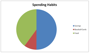
::您可以使用圆形图来方便地回答关于数据的问题,并与其他部分和整个数据集比较和对比数据部分。The circle graph below displays data about the spending habits of a teenager.
::下面的圆形图显示了青少年消费习惯的数据。Even though this graph does not contain any numerical data , the way it is sectioned, you can estimate that 50% of this teen’s money went into savings, while 40% was spent on food and 10% of his money was spent on baseball cards.
::即使这个图表没有包含任何数字数据, 也按分类方式, 你可以估计这个十几岁的钱有50%是储蓄的, 40%花在食物上, 10%花在棒球卡上。Examples
::实例Example 1
::例1Earlier, you were given a problem about the election results from the mayor’s race.
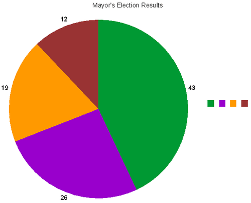
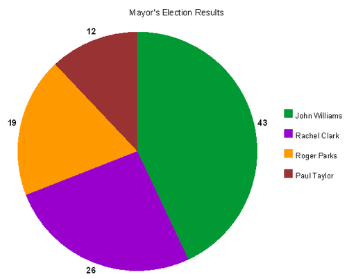
::更早之前, 市长的竞选结果引发了选举问题。Glenda has decided to display the results of the mayor’s race in a circle graph to accompany her story. She uses a program on her computer to design the circle graph. Now, she has to display the results on the graph. The results of the election are below.
::Glenda决定用圆形图显示市长的竞选结果,以配合她的故事。 她用电脑上的一个程序设计圆形图。 现在,她必须在图上显示结果。 选举结果如下:John Williams – 43%
::John Williams - 43%Rachel Clark – 26%
::瑞秋·克拉克 — — 26%Roger Parks – 19%
::罗杰公园 — — 19%Paul Taylor – 12%
::保罗·泰勒 — — 12%How should the sections of the graph be proportioned and labeled so that viewers will be able to quickly compare the data?
::如何对图中的各节进行比例和标签,以便观众能够迅速比较数据?First, take another look at Glenda’s data. The data is arranged and ordered.
::首先,再看看Glenda的数据。数据是安排和订购的。John Williams – 43%
::John Williams - 43%Rachel Clark – 26%
::瑞秋·克拉克 — — 26%Roger Parks – 19%
::罗杰公园 — — 19%Paul Taylor – 12%
::保罗·泰勒 — — 12%Next, Glenda needs to create a circle graph with sections corresponding to the numerical data.
::接下来, Glenda 需要创建一个圆形图, 包含与数字数据相对应的章节 。Then, she needs to add labels to help readers readily identify the data.
::然后,她需要添加标签 帮助读者方便地识别数据。This is what Glenda’s finished circle graph should look like.
::Glenda 完成的圆形图应该像这个样子。Example 2
::例2Answer the following question about the data displayed in this circle graph.
::回答以下关于此圆形图中显示的数据的问题。What percent of the students aspire to work in science and research?
::有多少学生希望从事科学和研究工作?To figure this out, look at the whole of the circle and remember that it is equal to 100%.
::要弄清楚这一点, 看看整个圆圈, 并记住它等于100% 。First, note the known percentages.
::首先,注意已知的百分比。20% want a career in healthcare.
::20%的人想要在医疗保健领域有职业前途。15% want a career in the legal field.
::15%的人想要法律领域的职业10% want a career in law enforcement.
::10%的人想要在执法部门工作5% want a career in the military.
::5%的人想在军队中谋职30% want a career in computers.
::30%的人想在电脑上找到职业Then, there is an unknown percent of the students that want to work in science / research.
::然后,有未知比例的学生 想要在科学/研究领域工作。Next, add the known percentages and subtract the total from 100 percent.
::接下来加上已知的百分比,从100%中减去总数。The answer is 20% of the students want a career in science and research.
::答案是,20%的学生希望从事科学和研究事业。Take a look at the circle graph below and answer the questions in the following examples.
::看一下下面的圆形图,在下面的例子中回答问题。Example 3
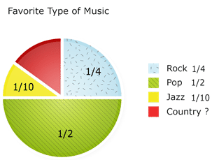
::例3What is the most popular music selection?
::什么是最流行的音乐选择?First, look at the circle and choose the largest section.
::首先,看看圆圈,选择最大的部分。Pop music covers half of the circle.
::流行音乐覆盖了半个圆圈The answer is pop music.
::答案是流行音乐。Example 4
::例4What percent of the students chose jazz music?
::有多少学生选择爵士音乐?First, find the section on the graph corresponding to jazz music.
::首先,找到与爵士音乐相对应的图表部分。The yellow-shaded area represents jazz music.
::黄色阴影区域代表爵士音乐。The answer is one tenth, or 10 percent.
::答案是十分之一,即10%。Example 5
::例5What percent of the students chose country music?
::有多少学生选择乡村音乐?To figure this out, look at the whole of the circle and remember that it is equal to 100%.
::要弄清楚这一点, 看看整个圆圈, 并记住它等于100% 。First, note the known percentages.
::首先,注意已知的百分比。One quarter is the same as 25%, so 25% represents Rock music.
::四分之一等于25% 所以25%代表摇滚音乐One tenth is the same as 10%, so 10% represents Jazz music.
::十分之一与10%相同 所以10%代表爵士乐One half is the same as 50%, so 50% represents pop music.
::一半等于50% 所以50%代表流行音乐There is an unknown percent of the students that enjoy country music.
::享受乡村音乐的学生比例不详。Next, add the known percentages and subtract the total from 100 percent.
::接下来加上已知的百分比,从100%中减去总数。
The answer is 15% of the students favor country music.
::答案是15%的学生喜欢乡村音乐。Review
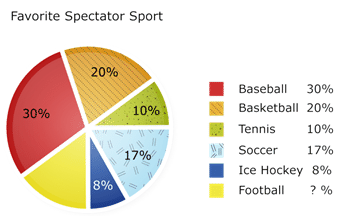
::回顾Use the results of the survey, which is displayed in the circle graph, to answer each question.
::使用在圆形图中显示的普查结果回答每个问题。A survey of 300 people asked them to name their favorite spectator sport. The results are shown in the circle graph below.
::对300人的调查要求他们说出自己最喜欢的观光运动的名称,结果见以下圆形图。-
What was the most favorite spectator sport of the people surveyed?
::受访者最喜爱的观众运动是什么? -
What was the least favorite spectator sport of the people surveyed?
::受访者最不喜欢的观众运动是什么? -
What percent of the people surveyed said that football was their favorite spectator sport
::接受调查的人中有多少人说足球是他们最喜欢的观众运动 -
How many people said that basketball was their favorite spectator sport?
::有多少人说篮球是他们最喜欢的观众运动? -
How many more people said that soccer was their favorite sport than ice hockey?
::有多少人说足球是他们最喜欢的运动 而不是冰球? -
What percent of the people chose baseball and soccer as their favorite sports?
::有多少人选择棒球和足球作为他们最喜欢的运动? -
What percent of the people did not choose baseball?
::有多少人没有选择棒球? -
What percent of the people did not choose hockey?
::有多少人没有选择曲棍球? -
What percent of the people chose tennis or soccer as their favorite sports?
::有多少人选择网球或足球作为其最喜欢的运动? -
What percent of the people did not choose basketball or tennis?
::有多少人没有选择篮球或网球? -
What percent of the people did choose tennis as a favorite sport?
::有多少人选择网球作为最受欢迎的运动? -
What percent of the people did not choose football?
::有多少人没有选择足球?
The table shows the how much money the students in the seventh grade have raised so far for a class trip. Make a circle graph that shows the data.
::表格显示了七年级学生到目前为止为课堂旅行筹集了多少钱。 绘制一个显示数据的圆形图 。Fundraiser Amount Car Wash $150 Book sale $175 Bake sale $100 Plant sale $75 -
Make a list of 5 popular ice cream flavors. Then survey your classmates asking them which of the 5 flavors is their favorite ice cream flavor. Use the data to make a circle graph.
::列出五种流行的冰淇淋口味。 然后调查你的同学们,问他们哪一种口味是他们最喜欢的冰淇淋口味。使用这些数据来绘制圆形图。 -
Use a newspaper to locate a circle graph of some data. Then write five questions about the data.
::使用报纸查找一些数据的圆形图。 然后写五个关于数据的问题 。 -
Now create your own circle graph. Share it with a partner.
::现在创建您自己的圆形图。 与伙伴共享它 。
-
What was the most favorite spectator sport of the people surveyed?