线回归
Section outline
-
The Purpose of this Lesson
::本课程的目的In this lesson, you will analyze and interpret data in two variables. From given ordered pairs you'll determine if the relationship is linear. If the relationship is linear, you'll find the best linear model for the data.
::在此课中, 您将用两个变量来分析和解释数据 。 从给定的有顺序的对子中, 您将决定此关系是否线性 。 如果此关系是线性, 您将会找到数据的最佳线性模型 。Introduction: Bivariate Data
::导言:双重数据So far in chapter 5, the practice of statistics has been restricted to single variables. You've considered the heights of basketball players, the number of green candies in samples, and the prices of espressos at various cafes. In each case, you worked with a single set of values representing variations of a single quantity. You could say you've only worked with univariate data so far. Now you are going to work with bivariate data.
::到目前为止,第5章的统计实践仅限于单一变量。 您已经考虑了篮球运动员的高度、 样本中的绿色糖果数量, 以及不同咖啡厅的咖啡价格。 在每种情况下, 您都使用一组代表单个数量变化的单一值。 您可以说, 您目前只使用单项数据。 现在您要使用双轨数据 。Bivariate data involves two variables. The data set is a set of ordered pairs. There is an essential question that statistics can help us answer about bivariate data:
::双变量数据包含两个变量。 数据集是一组有顺序的对对。 关键的问题是统计能帮助我们解答双变量数据:An Essential Question About Bivariate Data
::关于双重数据的基本问题How much of the variation in one variable can be explained by variation in the other?
Activity 1: Approximating the Line of Best Fit
::活动1:接近最佳适应线Example 1-1
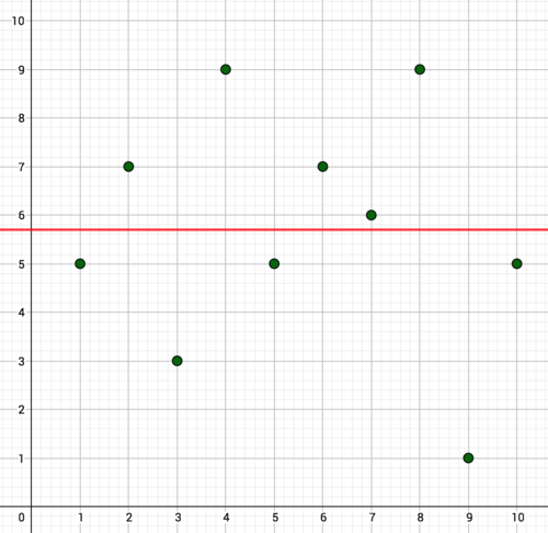
::例1-1Katlyn is a basketball player. She has kept track of her performance in the first half of the 20 game season. She wonders how much her performance has varied over the first 10 games, and if the passage of time has influenced her performance. Below is a graph of her points scored in each of the first 10 games. Determine the average points per game over the 10 games and graph it as a horizontal line. Determine the differences between the points she scored per game and the average. These values are called residuals , and they tell us how far from reality our linear model is.
::Katlyn 是一个篮球运动员。 她跟踪了20个赛季前半场的成绩。 她想知道在前10场比赛中,她的成绩有多么不同, 以及时间的流逝是否影响了她的成绩。 下面是她在前10场比赛中每一场得分的图表。 确定每场比赛的平均分数, 然后用水平线条绘制。 确定每场比赛得分和平均分之间的差异。 这些数值被称为剩余值, 并告诉我们我们的线性模型离现实有多远 。-
Based on the graph, does it appear that the variation in her scores is explained by the passage of time? Explain.
::根据图表,她得分的变化似乎是因为时间的流逝而解释的吗?请解释。 -
Based on the residuals, is this line a good fit for the data? Explain.
::根据残留物,这条线是否适合数据?解释一下。
Solution: Katlyn's average was 5.7 points per game. The graph of this line is shown below. The residuals are in the table below. Based on the graph, it doesn't appear that the variation in points is explained by the passage of time. There is quite a lot of variation in her points, but the change in points doesn't happen in any pattern with respect to time. The horizontal line is a measure of center for the single variable of Katlyn's points. It shows no change over time. The residuals are large and without pattern, showing that this line does a poor job modeling the data.
::解答 : Katlyn 的平均值是每场游戏5. 7 点。 此行的图解显示如下。 剩余部分在下表 。 根据此图, 点的变化似乎不是由时间的流逝来解释的。 她的点有很大的差异, 但点的变化不会在任何时间模式中发生。 水平线是 Katlyn 点的单个变量的中间线。 它显示时间不变。 剩余部分很大, 没有模式, 显示此行对数据做了差的工作模型 。
::255-570.7777-5.7=1.333-35.72.7499-5.7=3.355-5.70.7677-5.7=1.376-5.7=1.3766-5.7=0.3899-5.7=0.3899-5.7=3.3911-5.74.7.555-5.70.7Interactive
::交互式互动The last example was based on bivariate data without pattern. It was evident from the graph that the wild variation in Katlyn's scoring was not explained by the passage of time. The large residuals demonstrated that the horizontal line measure of center was not good for modeling the non-existent relationship between time and scoring. The horizontal line was the average of Katlyn's scores, and it was only useful as a statistic for summarizing the single variable of Katlyn's scores.
::最后一个例子是基于没有模式的双轨数据。 从图表中可以明显看出,Katlyn的得分的野外变化不是时间的推移所解释的。 大量的残留物表明,中间的横向线测量不利于模拟时间和评分之间不存在的关系。 水平线是Katlyn的得分平均值, 它只是用于总结Katlyn得分的单一变量。But Katlyn's performance in the second half of the season was a different story. The interactive below shows the graph of her points scored in this second set of 10 games. Based on the graph, does it appear that the variation in her scores is explained by the passage of time? Explain. Use the sliders to adjust the and -intercept to create an approximate line of best fit for the data. The residuals are graphed as well. Notice that the residuals move as you change the line, while the points representing Katlyn's scores do not. If you are doing a good job fitting the line to the data, the residuals will be as close as possible to 0. That means they will be as close as possible to the -axis. Write the equation for your line of best fit. Interpret the slope in the context of the scenario.
::但Katlyn在赛季后半段的表现则不同。 下面的互动显示她在第二组10场比赛中得分的图表。 根据这个图表, 她得分的变化似乎由时间的流逝来解释吗? 解释一下。 使用滑动器来调整分数和y- intercept 来创建最适合数据的大致线。 剩余部分也用图表绘制。 注意剩余部分随你改变行数而移动, 而代表Katlyn得分的分则不会移动。 如果您做的很好, 则剩余部分将尽可能接近于 0 。 这意味着它们将尽可能接近 x- 轴 。 写出最适合数据行数的方程式 。 在情景中解释斜度 。INTERACTIVELinear Regression 1-
Use the sliders to adjust the slope and
y
-intercept to create an approximate
line of best fit
for the data.
::使用滑动器调整斜坡和 Y 界面,以创建最适合数据的近似线。
+Do you want to reset the PLIX?It does appear that the change in her points scored is explained by the passage of time. T here is a steady increase in her points scored as a function of time. The line of best fit is approximately The graph of the line, and the graph of the residuals, is shown below. The magnitude of the residuals is visualized as vertical segments. The slope represents Katlyn's approximate increase in points per game. Her scoring improved by about 0.96 points per game.
::看来她的分数的变化是时间的流逝所解释的。 她的分数因时间的函数而稳步增加。 最佳的分数大约为y=0. 96x+5. 73。 线的图解和剩余部分的图解如下。 剩余部分的大小可视化为垂直段。 斜坡代表了Katlyn每场比赛的分数大约增加。 她的分数每场比赛增加了大约0. 96个百分点。Approximating the Line of Best Fit
::接近最佳适应线The line of best fit roughly approximates the data set as a line.
::最适合的线大致接近数据集的线。Residuals are the difference between the values of the data set and the corresponding coordinates of the line of best fit.
::残余值是指数据集的y值与最适合线对应的y坐标之间的差。The line of best fit roughly minimizes the magnitude of the residuals.
::最合适的线大致将残留物的大小降到最低。Interactive
::交互式互动Use the interactive below to find the approximate line of best fit for the given points for 10 games . Try to reduce the magnitude of the residuals so they are as close to 0 as possible. Write the equation for your line. Interpret the slope in the context of the data.
::使用下面的交互线来找到适合 10 个游戏的给定点的近似线。 尝试缩小剩余点的大小, 使其尽可能接近 0 。 为您的线写方程式。 在数据背景中解释斜度 。INTERACTIVELinear Regression 2-
Move the red points
to
find
the approximate line of best fit for the given
points for 10 games
.
::移动红点以找到适合 10 场游戏中给定点的近似线 。
+Do you want to reset the PLIX?PLIX Interactive
::PLIX 交互式互动
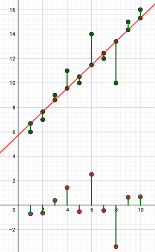
Activity 2: Not All Lines of Best Fit Are Good Models for Data
::活动2:并非所有最适合的线条都是数据的良好模型Interactive
::交互式互动The line of best fit for a data set very nearly minimizes the residuals compared to other lines you can draw. But think of the line of best fit like a hammer. It works well for nails, but it's terrible for screws, and is absolutely useless for nuts and bolts. You can draw a line of best fit for any data set, but that doesn't mean the line actually fits the data, and it doesn't mean that the relationship between the variables is linear.
::最适合数据集的线条几乎可以将剩余数据与您可以绘制的其他线条相比最小化。 但想象一下最适合的线条就像锤子一样。 它对钉子很有效, 但对螺钉来说是可怕的, 对螺丝和螺栓来说是完全没用的。 您可以为任何数据集绘制最适合的线条, 但这并不意味着线条实际上符合数据, 也不意味着变量之间的关系是线性的。Use the interactive below to find the approximate line of best fit. Write the equation for your line. Do you think the relationship between the variables is linear? Why or why not? Look at the residuals. Is there a pattern to the residuals? Interpret the significance of this pattern.
::使用下面的交互效果来找到最合适的近似线条 。 为您的线条写入方程 。 您认为变量之间的关系是线性关系吗? 为什么或为什么? 看看剩余部分。 剩余部分是否有模式? 解释这个模式的意义 。INTERACTIVELinear Regression 3-
Use the interactive to find the approximate line of best fit. Write the equation for your line.
::使用互动来找到最合适的近似线条。 为您的线条写入方程 。 -
Do you think the relationship between the variables is linear? Why or why not?
::你认为变量之间的关系是线性关系吗?为什么或为什么不是? -
Look at the residuals. Is there a pattern to the residuals? Interpret the significance of this pattern.
::看看残留物 残留物是否有模式?
+Do you want to reset the PLIX?The line of best fit is approximately but the relationship between the variables does not seem linear. There is not a constant slope - the slope appears to be increasing. It might be best modeled by an exponential or quadratic function. The residuals show a pattern. This means that there is some relationship between the variables that is not being modeled by this linear function. The pattern in the residuals represents a relationship between the variables that the linear function failed to take into account. That means the linear function is a poor model for the data.
::最合适的线条大约为 y= 2.02x- 3.06, 但变量之间的关系似乎并不线性。 没有恒定的斜坡, 斜坡似乎正在增加。 最好是以指数或二次函数为模型。 剩余部分显示一个模式。 这意味着变量之间有些关系不是以线性函数为模型的。 剩余部分的图案代表了线性函数没有考虑到的变量之间的关系。 这意味着线性函数对数据来说是一个差的模型。Assessing if a Linear Model is the Best Fit
::评估线性模型是否最合适If the plot of the residuals shows a pattern, it means there is a relationship between the variables that the linear function failed to take into account.
::如果残余物的绘图显示一个模式,这意味着线性函数没有考虑到的变量之间存在某种关系。That means a linear model is not the best fit for the data.
::这意味着线性模型不适合数据。Interactive
::交互式互动Use the interactive below to find the approximate line of best fit. Write the equation for your line. Do you think the relationship between the variables is linear? Why or why not? Look at the residuals. Is there a pattern to the residuals? Interpret the significance of this pattern.
::使用下面的交互效果来找到最合适的近似线条 。 为您的线条写入方程 。 您认为变量之间的关系是线性关系吗? 为什么或为什么? 看看剩余部分。 剩余部分是否有模式? 解释这个模式的意义 。INTERACTIVELinear Regression 4-
Move the red sliders to approximate the line of best fit.
::将红色滑块移动到最合适的直线 。
+Do you want to reset the PLIX?Work it Out
::工作出来Although just averaging -values is insufficient for finding the line of best fit, there is an interesting relationship between the line of best fit, the average of the -values and the average of the -values The point is always on the true (not approximate) line of best fit.
::尽管平均 y 值不足以找到最合适的线,但最合适的线、x 值的平均值(x ) 和y 值的平均值(y ) 之间存在一种有趣的关系。 点(x y ) 总是在最合适的真正(非近似)线上。Gladys is a high school student. Below is a chart showing the amount she studied prior to each quiz, and her grade on the corresponding quiz. Graph. Find Visually approximate the -intercept that would create the line of best fit. Find the slope of this line, and find its equation. Discuss the significance of the slope and -intercept in the context of the scenario.
::Gladys 是高中学生。 下面是一张图表, 显示她在每次测验前学习的金额, 以及相应测验中的分数。 图 。 查找 (x, y ) 。 从视觉上大致了解 y 调出最合适的线。 找到这条线的斜度, 并找到它的方程 。 讨论斜度和 y 调在情景中的重要性 。
::Quiz 57010751575 1580208020852575258030953090Finding the Line of Best Fit with Averages
::寻找最适合平均值的线条If is the average of the values and is the average of the values:
::如果 x 是 x 值的平均值, y 是 y 值的平均值:is a point on the true line of best fit.
:x,y,y,) 是一个点 在真正的一线 最合适的。
Activity 3: Finding the True Line of Best Fit
::活动3:寻找最佳适应的正确路线So far you've used two different methods to approximate the line of best fit:
::到目前为止,你用两种不同的方法 来接近最合适的线条:-
Using an interactive to visualize and graph an
approximate
line of best fit by visualizing and minimizing the residuals.
::使用互动方式,通过可视化和尽量减少残留物,以可视化和绘制最合适的近似线形图。 -
Finding
and visually approximating a
-intercept for a visually approximate line of best fit.
::寻找(x,y,y),在视觉上近似于 Y 界面,以显示最合适的近似直线。
Both these methods rely on visual approximation. There is in fact a way to find the true line of best fit. The method is too complex for this course, but it involves
::这两种方法都依靠直观近似。 事实上, 有一种方法可以找到最合适的真线。 方法对于这个过程来说太复杂了, 但是它涉及到 (x, y ) 。 方法可以最小化剩余方形的总和。 这与最小化剩余物的大小并不完全相同, 但是它很接近, 它返回了最合适的真线参数 。Because the formula is complex and tedious to work with, you will use graphing or solving technology to find the line of best fit. The method is called linear regression .
::由于公式复杂且烦琐,您将使用图形化或解析技术找到最适合的线条。这种方法被称为线性回归。Linear Regression
::线回归Linear regression is a method for finding the parameters for the true line of best fit.
::线性回归是找到最合适真实线的参数的方法。It is best completed with graphing or solving technology.
::最好用图表绘制或解决技术来完成这项工作。Work it Out
::工作出来Following is a table showing the mass and corresponding fuel efficiency of selected vehicles. Use graphing or solving technology to find the line of best fit. Interpret the slope in the context of the scenario.
::下表显示选定车辆的质量及相应的燃料效率。使用图表绘制或解析技术找到最合适的路线。根据情景解释斜坡。Type of Car kg mpg Mercedes Benz SL550 2018 16 Chevrolet Cobalt 1276 25 Pontiac G5 GT 1286 26 Acura TSX 1549 25 Mitsubishi Lancer 1392 24 Volkswagen Rabbit 1348 24 Chevrolet Malibu 1577 25 Mazda 6 1628 23 Toyota Camry 1498 25 KIA Rondo 1543 22 Nissan Titan 2WD 2389 14 Cadillac SRX 1913 18 GMC Envoy 1962 16 Nissan Armada 2564 14 PLIX Interactive
::PLIX 交互式互动
Activity 4: Assessing the Quality of Fit
::活动4:评估适合性的质量Remember, the line of best fit is like a hammer that works well for nails but not so well for other things. Not every bivariate data set can be modeled with a line, because not every relationship between two variables is linear. If there is a pattern in the graph of the residuals then a line is not the best model. But you don't want to have to graph the residuals and look for patterns every time you complete a linear regression. There must be a better way to assess the quality of fit.
::记住, 最合适的线是像锤子一样对钉子有效, 但对其它东西则不那么好。 不是每个双变量数据集都可以用线建模, 因为不是两个变量之间的每一个关系都是线性。 如果在残值图中有一个模式, 那么一条线并不是最好的模式。 但是, 您不需要在每次完成线性回归时都绘制残值图和查找模式。 必须有一个更好的方法来评估匹配质量 。Fortunately, l inear regression also returns a value that assesses how well the line of best fit actually fits the data. This value is called the correlation coefficient . "Correlation" is another word for "relationship." As was the case with linear regression, the method for calculating the correlation coefficient is too complex for this course. But the same graphing or solving technology that you used for your linear regression will return the corresponding correlation coefficient.
::幸运的是, 线性回归还返回一个值, 该值用来评估最合适的线条实际上与数据相匹配的程度。 这个值被称为相关系数。 “ 校正” 是“ 关系” 的另一个词。 和线性回归一样, 计算相关系数的方法对于这个过程来说过于复杂。 但是, 您用于线性回归的相同的图形或解析技术将会返回相应的相关系数 。The correlation coefficient is represented with the variable
::相关系数与变量r代表。Interactive
::交互式互动Use the following interactive to explore how changing the positions of points affects the correlation coefficient. Create each of the described scenarios to observe the corresponding changes in the fitness of the line. Observe, discuss, and record the corresponding changes in the correlation coefficient.
::使用以下互动方式来探索点位置的变化如何影响相关系数。 创建每种描述的假设情景来观察线的适合性的相应变化。 观察、 讨论并记录相关系数的相应变化 。-
Adjust the points so they form a horizontal line.
::调整点数以形成水平线。 -
Adjust the points from their last positions so that the residuals have increased.
::调整他们最后阵地的点数,使剩余部分增加。 -
Adjust the points so they form a line with a positive slope.
::调整点数,使其形成正斜度线条。 -
Adjust the points from their last positions so that the residuals have increased.
::调整他们最后阵地的点数,使剩余部分增加。 -
Adjust the points so they form a line with negative slope.
::调整点数,使其形成负斜度线条。 -
Adjust the points from their last positions so that the residuals have increased.
::调整他们最后阵地的点数,使剩余部分增加。 -
Adjust the points so that they appear to be modeled by an exponential or quadratic function.
::调整点数,使其看起来以指数或二次函数为模型。 -
Adjust the points so that it appears that none of the variation in y is explained by variation in x.
::调整点数,使y的变异似乎没有以x的变异来解释。
INTERACTIVECorrelation Coefficient-
Move the red points to see how their positions affect the correlation coefficient,
@$r.@$
::@$r. @$@$
+Do you want to reset the PLIX?The Correlation Coefficient
::关联节能The correlation coefficient, is a measure of the fitness of the line of best fit.
::相关系数(r)是衡量最合适线是否适合的尺度。The range of the correlation coefficient is:
::相关系数的范围是:-11。The significance of the correlation coefficient is indicated below:
::相关系数的重要性说明如下:
::区域解释 - 1<r/ 0.7Strong负相关。 - 0.7r0.3Modeal 负相关。 -0.3r < 0Weak负相关。 0<r0.3Weak正相关。Correlation coefficients of 0 represent no correlation between the variables. Correlation coefficients of represent perfect correlations .
::0的关联系数代表变量之间没有相互关系,-1或1的关联系数代表完美的相互关系。Work it Out
::工作出来The chart below shows global coffee production versus corn production in the United States. (Do not use the year as a variable here.) Use graphing and solving technology to find the line of best fit. Interpret the slope in the context of the scenario. Find and interpret the correlation coefficient.
::下图显示全球咖啡产量与美国玉米产量的对比。 (此处不使用当年变量。 )使用图表绘制和解析技术找到最适合的线。 在假设情景中解释斜坡。 查找和解释相关系数 。Year US Corn Production (billions of bushels) World Coffee Production (millions of bags) 1995 7.4 83 1996 9.2 102 1997 9.2 100 1998 9.8 107 1999 9.4 130 2000 9.9 111 2001 9.5 108 2002 9.0 121 2003 10.1 106 2004 11.8 115 Summary
::摘要-
Statistics can be used to analyze bivariate data, and answer the question: How much of the variation in one variable can be explained by the other?
::统计可用于分析双变量数据,并回答问题:一个变量的差异有多少可以由另一个变量解释? -
The line of best fit can be approximated by roughly minimizing the magnitude of the residuals.
::可将残留物的大小大致减少到最低程度,可以大致接近最佳适用线。 -
The true line of best fit can be found through linear regression, and its fitness assessed with the correlation coefficient.
::通过线性回归和以相关系数评估其是否适合,可以找到最合适的真正直线。 -
Although the line of best fit can always be computed, not all data is best modeled by a line.
::虽然始终可以计算出最适合的线,但并非所有数据都是用线作模型的最佳模式。
PLIX Interactive
::PLIX 交互式互动 -
Based on the graph, does it appear that the variation in her scores is explained by the passage of time? Explain.