可视化虹膜数据集的特征(Visualising the Features of the Iris Data Set)
章节大纲
-
特征数据是四维的,但我们可以通过简单的直方图或散点图一次性可视化其中的一到两个维度。
Pythonfrom sklearn.datasets import load_iris iris = load_iris() # 打印 target 为 1 的前 5 个样本数据 print(iris.data[iris.target==1][:5]) # 打印 target 为 1 的前 5 个样本的第 0 个特征 print(iris.data[iris.target==1, 0][:5])输出:
[[7.  3.2 4.7 1.4]
 [6.4 3.2 4.5 1.5]
 [6.9 3.1 4.9 1.5]
 [5.5 2.3 4.  1.3]
 [6.5 2.8 4.6 1.5]]
[7.  6.4 6.9 5.5 6.5]
特征直方图
我们可以使用直方图来可视化单个特征的分布,并按类别进行区分。
Pythonimport matplotlib.pyplot as plt fig, ax = plt.subplots() x_index = 3 # 选择要可视化的特征索引 (例如:3 代表花瓣宽度) colors = ['blue', 'red', 'green'] # 遍历每个类别并绘制直方图 for label, color in zip(range(len(iris.target_names)), colors): ax.hist(iris.data[iris.target==label, x_index], label=iris.target_names[label], color=color) ax.set_xlabel(iris.feature_names[x_index]) # 设置 x 轴标签为特征名称 ax.legend(loc='upper right') # 显示图例 fig.show()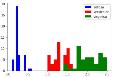
练习
请查看其他特征(即花瓣长度、萼片宽度和萼片长度)的直方图。
两个特征的散点图
散点图可以同时展示两个特征在同一张图中的关系:
Pythonimport matplotlib.pyplot as plt fig, ax = plt.subplots() x_index = 3 # x 轴特征索引 (例如:3 代表花瓣宽度) y_index = 0 # y 轴特征索引 (例如:0 代表萼片长度) colors = ['blue', 'red', 'green'] # 遍历每个类别并绘制散点图 for label, color in zip(range(len(iris.target_names)), colors): ax.scatter(iris.data[iris.target==label, x_index], iris.data[iris.target==label, y_index], label=iris.target_names[label], c=color) ax.set_xlabel(iris.feature_names[x_index]) # 设置 x 轴标签 ax.set_ylabel(iris.feature_names[y_index]) # 设置 y 轴标签 ax.legend(loc='upper left') # 显示图例 plt.show()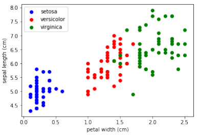
练习
在上面的脚本中改变
x_index和y_index,找到一个能够最大程度地区分这三个类别的两个参数组合。
泛化
我们现在将所有特征组合在一个综合图中进行展示:
Pythonimport matplotlib.pyplot as plt n = len(iris.feature_names) # 特征数量 fig, ax = plt.subplots(n, n, figsize=(16, 16)) # 创建 n x n 的子图网格 colors = ['blue', 'red', 'green'] # 遍历所有特征组合 for x in range(n): for y in range(n): xname = iris.feature_names[x] yname = iris.feature_names[y] # 遍历每个类别并绘制散点图 for color_ind in range(len(iris.target_names)): ax[x, y].scatter(iris.data[iris.target==color_ind, x], iris.data[iris.target==color_ind, y], label=iris.target_names[color_ind], c=colors[color_ind]) ax[x, y].set_xlabel(xname) # 设置 x 轴标签 ax[x, y].set_ylabel(yname) # 设置 y 轴标签 ax[x, y].legend(loc='upper left') # 显示图例 plt.show()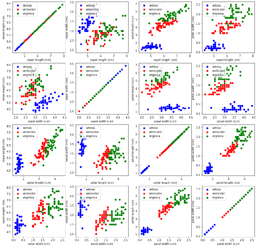
The feauture data is four dimensional, but we can visualize one or two of the dimensions at a time using a
simple histogram or scatter-plot.
from sklearn.datasets import load_iris
iris = load_iris()
print(iris.data[iris.target==1][:5])
print(iris.data[iris.target==1, 0][:5])
[[7. 3.2 4.7 1.4]
[6.4 3.2 4.5 1.5]
[6.9 3.1 4.9 1.5]
[5.5 2.3 4. 1.3]
[6.5 2.8 4.6 1.5]]
[7. 6.4 6.9 5.5 6.5]
HISTOGRAMS OF THE FEATURES
import matplotlib.pyplot as plt
fig, ax = plt.subplots()
x_index = 3
colors = ['blue', 'red', 'green']
for label, color in zip(range(len(iris.target_names)), colors):
ax.hist(iris.data[iris.target==label, x_index],
label=iris.target_names[label],
color=color)
ax.set_xlabel(iris.feature_names[x_index])
ax.legend(loc='upper right')
fig.show()
23
EXERCISE
Look at the histograms of the other features, i.e. petal length, sepal widt and sepal length.
SCATTERPLOT WITH TWO FEATURES
The appearance diagram shows two features in one diagram:
import matplotlib.pyplot as plt
fig, ax = plt.subplots()
x_index = 3
y_index = 0
colors = ['blue', 'red', 'green']
for label, color in zip(range(len(iris.target_names)), colors):
ax.scatter(iris.data[iris.target==label, x_index],
iris.data[iris.target==label, y_index],
label=iris.target_names[label],
c=color)
ax.set_xlabel(iris.feature_names[x_index])
ax.set_ylabel(iris.feature_names[y_index])
ax.legend(loc='upper left')
plt.show()
24
EXERCISE
Change x_index and y_index in the above script
Change x_index and y_index in the above script and find a combination of two parameters which maximally
separate the three classes.
GENERALIZATION
We will now look at all feature combinations in one combined diagram:
import matplotlib.pyplot as plt
n = len(iris.feature_names)
fig, ax = plt.subplots(n, n, figsize=(16, 16))
colors = ['blue', 'red', 'green']
for x in range:
for y in range
xname = iris.feature_names[x]
yname = iris.feature_names[y]
for color_ind in range(len(iris.target_names)):
ax[x, y].scatter(iris.data[iris.target==color_ind,
x],
iris.data[iris.target==color_ind, y],
label=iris.target_names[color_ind],
c=colors[color_ind])
25
ax[x, y].set_xlabel(xname)
ax[x, y].set_ylabel(yname)
ax[x, y].legend(loc='upper left')
plt.show()