圆图制作条形图
章节大纲
-

Carrie took a poll of 400 students in her high school to see what their favorite candy choice is. Here is the outcome of her poll displayed in a circle graph :
::Carrie在高中里进行了400名学生的民意测验,看他们最喜欢的糖果选择是什么。Carrie wants to display the information in a bar graph , too. The problem is, she lost her data table that shows the exact number of students that liked each candy. She only has the percentages from her circle graph to help her. She will need to convert the percentages to actual number amounts in order to create a bar graph.
::Carrie也想在条形图中显示信息。 问题是, 她丢失了显示喜欢每颗糖果的学生的确切人数的数据表。 她只有圆形图中的百分比来帮助她。 她需要将百分比转换为实际数字, 以便创建条形图 。In this concept, you will learn how to use data from a circle graph to find number amounts from percentages to create a bar graph of the same data.
::在此概念中,您将学习如何使用圆形图中的数据从百分比中找到数字,以创建相同数据的条形图。Circle Graphs to Bar Graphs
::圆形图到条形图Circle graphs are just one of many different ways to display and organize data in a form that is easy to interpret. Circle graphs are most useful when comparing parts of a whole or total.
::圆形图形只是以易于解析的形式显示和组织数据的许多不同方法之一。 圆形图形在比较整体或总计部分时非常有用。Bar graphs also make comparisons easily. Unlike most circle graphs, bar graphs compare exact amounts. Circle graphs are used when dealing with percentages, and the percentages of the pieces add up to 100 percent . In a bar graph, however, a scale is used to show the exact amount of each category.
::条形图也比较容易。 与大多数圆形图不同, 条形图比较准确的数量。 处理百分比时使用圆形图, 碎片的百分比加起来达到100%。 但是, 在条形图中, 使用一个比例表来显示每一类别的确切数量 。Take a look at the two graphs below.
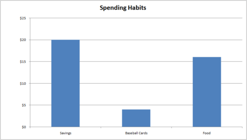
::看看下面的两张图。Both graphs show how Trey spends the he earns each month delivering papers.
::两张图都显示Trey如何花他每月挣的40美元来送文件。The circle graph gives this information in percentages.
::圆形图以百分比表示这一信息。Trey spends 40 percent of his money on food and 10 percent on buying baseball cards. He saves the other 50% for his new bike.
::Trey40%的钱花在食物上,10%的钱花在买棒球卡上。他为他的新自行车节省了另外50%的钱。The bar graph shows the same results but in a different format. The “parts” in the circle graph are represented by bars on the bar graph. The categories of how Trey spends his money are shown across the bottom. Along the side, a scale gives actual amounts of money. The height of each category bar tells exactly how much money Trey spends on that category. The food bar shows that Trey spent $16 on food and $4 on baseball cards. He saves $20 each week to put towards the new bike.
::条形图显示相同的结果,但格式不同。圆形图中的“ parts” 以条形图上的条形表示。 Trey 如何花钱的类别显示在底部。 一边是比例表, 给出实际金额。 每个类别的条形的高度可以准确显示 Trey 在那类中花多少钱。 食品条显示, Trey 花了16美元在食品上, 4美元在棒球卡上。 他每周节省20美元, 用于新自行车上。Examples
::实例Example 1
::例1Earlier, you were given a problem about Carrie and her data on favorite candy.
::早些时候,你得到一个问题 关于Carrie和她的数据 关于最喜欢的糖果。She lost her data table that showed the exact number of students that liked each candy. She only has the percentages of each candy choice and the total number of students she polled, which was 400. She wants to create a bar graph displaying her data.
::她失去了她的数据表,该表显示了喜欢每颗糖果的学生的确切人数。她只有每个糖果选择的百分比和她所选的学生总数,即400人。她想创建一张显示她数据的条形图。First, Carrie needs to convert each percentage to a number amount by using proportions.
::首先,卡莉需要使用比例将每个百分比转换成一个数量。Snickers-
::内裤...KitKat-
::基特凯特...M&M's-
::M&M的 --Milky Way-
::银河系 --Skittles-
::水壶...Next, Carrie can set up a bar graph with an X-axis containing each candy and a Y-axis containing a range of 40-120 by 20's starting at 0. This scale will keep the graph not too large but keep the representation accurate.
::接下来, Carrie 可以设置一个条形图, 包含每个糖果的 X 轴和一个 Y 轴, 范围在 40 - 120 到 20 秒以 0 开始 。 这个比例表可以保持图表的大小, 但可以保持表达的准确性 。Then, Carrie inputs all her data into the graph to create her final bar graph to represent her data.
::然后Carrie将她的所有数据输入图中 来创建她最后的条形图 来代表她的数据Here is Carrie's final bar graph displaying her data.
::这是Carrie展示数据的最后一张条形图Example 2
::例2In the example above, monetary amounts that Trey spent were figured out from the percentages displayed in the circle graph. The way to convert that data is to create a proportion.
::在上文的例子中,Trey所花的货币数额是从圆形图中显示的百分比中算出。转换数据的方法是生成一个比例。Look at the first piece of data-Trey spent 40% of $40.00 on food.
::看看第一张数据 - - 特雷花费了40%的40美元 用于食物。To figure out how much 40% of $40.00 is, write a proportion. A proportion compares two fractions.
::要知道40.00的40%是多少,请写一个比例。一个比例与两个比例比较。First, convert the percentage to a fraction:
::首先,将百分比转换为分数 :Next, write a second fraction with the total number of dollars Trey has to spend on the bottom, and a variable on top to represent the part of his total money you want to know:
::接下来,写下第二个分数, 加上Trey必须花在底部的美元总数, 还有上面的一个变量, 来代表他所有的钱的一部分,你想知道:Then, set up the proportion and solve for the variable by cross multiplying.
::然后设置变量的比重并通过乘法来解析变量。The answer is Trey spent $16 of his $40.00 on food.
::答案是Trey在食物上花了他40美元中的16美元。If you look back at the bar graph, you can see that this is the actual amount from the bar graph.
::如果你回顾一下图标图,你可以看到这是从图标图中得出的实际数额。This process of converting percentages to number amounts is used when converting a circle graph to a bar graph. This concept is an important piece to understanding the relationship between these two types of a graph.
::在将圆形图转换为条形图时,使用将百分比转换为数字数额的过程。这个概念对于理解这两类图表之间的关系非常重要。Example 3
::例3John spent 15% of $20.00 on candy. How much did he spend?
::John花了20块的15%花在糖果上 他花了多少钱?First, convert the percentage to a fraction.
::首先,将百分比转换为分数。Next, write a second fraction with the total amount on the bottom and a variable to represent the unknown amount on top.
::下一步,写第二个分数,总金额在底部,并写一个变量,以表示上方未知金额。Then, set up the proportion and solve for the variable by cross multiplying.
::然后设置变量的比重并通过乘法来解析变量。The answer is $3.00 of John's $20 was spent on candy.
::答案是约翰20美元的3美元 花在糖果上Example 4
::例4Susan ate 45% of 20 carrots. How many did she eat?
::Susan吃了20块胡萝卜的45% 她吃了多少?First, convert the percentage to a fraction.
::首先,将百分比转换为分数。Next, write a second fraction with the total amount on the bottom and a variable to represent the unknown amount on top.
::下一步,写第二个分数,总金额在底部,并写一个变量,以表示上方未知金额。Then, set up the proportion and solve for the variable by cross multiplying.
::然后设置变量的比重并通过乘法来解析变量。The answer is Susan ate 9 carrots out of 20.
::答案是苏珊吃了20块中的9块胡萝卜Example 5
::例5Kelly sold 55% of 60 zucchini. How many did she sell?
::Kelly卖了60苏奇尼的55% 她卖了多少?First, convert the percentage to a fraction.
::首先,将百分比转换为分数。Next, write a second fraction with the total amount on the bottom and a variable to represent the unknown amount on top.
::下一步,写第二个分数,总金额在底部,并写一个变量,以表示上方未知金额。Then, set up the proportion and solve for the variable by cross multiplying.
::然后设置变量的比重并通过乘法来解析变量。The answer is 33 zucchini out of 60 were sold.
::答案是60人中有33人被卖掉。Review
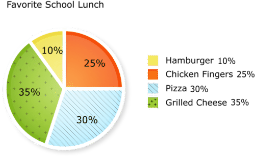
::回顾Use the following circle graph and proportions to answer each question.
::使用以下圆形图和比例回答每个问题。Three hundred students were surveyed to find out their favorite school lunch.
::调查了300名学生,以了解他们最喜欢的学校午餐。-
How many students chose hamburgers as their favorite lunch?
::有多少学生选择汉堡作为他们最喜欢的午餐? -
How many students chose chicken fingers as their favorite lunch?
::有多少学生选择鸡手指作为其最爱的午餐? -
How many students did not choose hamburgers?
::有多少学生没有选择汉堡包? -
How many students chose pizza as their favorite lunch?
::有多少学生选择披萨作为他们最喜欢的午餐? -
How many students chose grilled cheese as their favorite lunch?
::有多少学生选择烤奶酪作为他们最喜欢的午餐? -
How many students did not choose grilled cheese or pizza?
::有多少学生没有选择烤奶酪或披萨? -
How many students did not choose chicken fingers as their favorite lunch?
::有多少学生没有选择鸡手指作为其最爱的午餐? -
How many students were undecided?
::有多少学生没有决定? -
Given your answers to numbers 1 - 8, what interval would make sense to use as the vertical axis of the bar graph?
::鉴于您对数字1-8的回答,用什么间隔作为条形图的垂直轴是有道理的? -
What is the range of the data?
::数据的范围是什么? -
What would you use to label the horizontal axis of the bar graph?
::您要用什么标签条形图的水平轴 ? -
Would the bar graph use numbers of students or percents?
::条形图会使用学生或百分数的数字吗? -
True or false. Bar graphs use actual numbers and circle graphs use percents.
::条形图使用实际数字,圆形图使用百分比。
-
How many students chose hamburgers as their favorite lunch?