数据显示选择
章节大纲
-
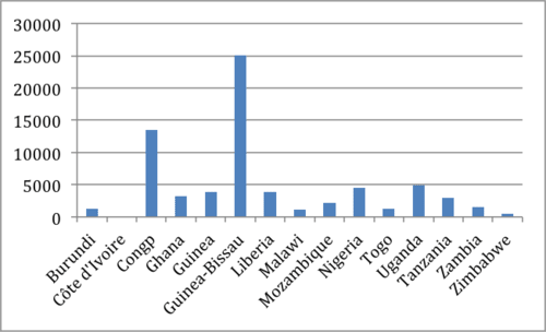
For Alma's social studies class, she is creating a presentation on the number of homeless people in her city and two other nearby cities. She has collected data on the number of homeless people for the past 50 years in Lancaster, Columbus, and Starkville. Alma doesn't know the best way to display her data. How can she determine the best type of display?
::在阿尔玛的社会研究班上,她正在就她所在的城市和其他两个相邻的城市的无家可归者人数发表演讲。她收集了过去50年来兰开斯特、哥伦布和史塔克维尔无家可归者人数的数据。阿尔玛不知道展示数据的最佳方式。她如何确定最佳的展示形式?In this concept, you will learn how to determine which kind of data display is best for a given set of data.
::在此概念中,您将学会如何确定哪类数据显示最适合某一组数据。Choosing Data Displays
::选择数据显示Data is a set of numerical or non-numerical information. Data can be analyzed in many different ways. In this concept you will determine the best type of graphical display for different types of numerical data .
::数据是一组数字信息或非数字信息。数据可以多种不同方式分析。在此概念中,您将确定不同类型数字数据的最佳图形显示类型。Graphs are visual representations of data. Different types of graph represent different types of data. For example, line graphs are best for representing data trends over time. Bar graphs are best for showing relationships between data.
::图表是数据的直观表示。不同的图表类型代表不同的数据类型。例如,直线图表最能反映一段时间内的数据趋势。条形图表最能显示数据之间的关系。A stem-and-leaf plot shows the distribution of the data. Data values in a stem-and-leaf plot are split into a stem and leaf, which require data values to share stems. This display is best used to list data.
::干叶图显示数据分布。 干叶图中的数据值被分割成干叶和叶, 这需要数据值来分享根。 此显示最能用于列出数据 。A box-and-whisker plot illustrates the distribution of a data set in quartiles. Box-and-whisker plots are best used to display data in quartiles to analyze the distribution of data.
::方框和小费图示用四分位数显示数据集的分布。 框和小费图示最能用来在四分位数显示数据以分析数据的分布 。A line graph shows the relationship between independent and dependent variables over time. In the graph, each data value is represented by a point in the graph, which are connected by a line. Line graphs are best used when showing changes over time.
::直线图显示独立变量和依附变量之间的关系。在图形中,每个数据值由图形中的某个点表示,该点由直线连接。在显示随时间变化时,最好使用直线图。A bar graph shows the relationship between different values of data, with each value represented by a column in the graph. Bar graphs are best used when comparing between groups or changes over time.
::条形图显示数据不同值之间的关系,每个值在图形中以列表示。在比较组或随时间变化时,最好使用条形图。A histogram is a vertical bar graph that illustrates the frequency of the data. Histograms are best used to show the distribution or frequency of data graphically.
::直方图是一个垂直条形图,显示数据的频率。直方图最能用图形显示数据的分布或频率。When determining what type of display to use, consider what type of data is being represented.
::在确定应使用何种类型的显示时,应考虑所代表数据的类型。Let's look at an example.
::让我们举个例子。What kind of data display is best to represent the world population over time, from 1750 to 2000?
::从1750年到2000年,哪一种数据显示最能代表一段时间的世界人口?First, consider what type of data will be displayed. In this case, the data are numerical values over time.
::首先,考虑将显示何种类型的数据。在此情况下,数据是一段时间内的数字值。Next, consider if the data best shown graphically or in another kind of display? In this case, the data are best represented graphically.
::下一步, 请考虑数据是用图形显示, 还是用另一种显示方式显示? 在这种情况下, 数据最好用图形表示 。Next, since the data does not represent frequencies, either a bar or line graph is best. Since the data are showing a trend over time, the amount of population, a line graph is best.
::其次,由于数据不代表频率,因此无论是条形图还是线条图都是最好的。由于数据显示的是一段时间内的趋势,人口数量,因此,线条图是最好的。The answer is the data should be displayed with a line graph.
::答案是数据应该用直线图显示。Examples
::实例Example 1
::例1Earlier, you were given a problem about Alma and her presentation on homelessness.
::之前,你遇到一个问题 关于Alma和她关于无家可归的演讲。Alma has data on the number of homeless people in three cities for the past 50 years. She must decide what is the best way to display this data in a presentation.
::阿尔玛拥有关于过去50年来三个城市无家可归者人数的数据,她必须决定以何种最佳方式在介绍中展示这一数据。First, Alma must consider what type of data she will display. In this case, the data are numerical values that compare different cities, or groups, over time.
::首先,Alma必须考虑她将显示何种类型的数据。 在这种情况下,数据是数字值,可以比较不同城市或群体,并随时间推移而进行比较。Next, Alma must consider if the data best shown graphically or in another kind of display? In this case, the data are best represented graphically given the large number of data points.
::其次,Alma必须考虑数据是用图形显示的最佳数据还是另一种显示方式显示的?在这种情况下,鉴于数据点很多,数据是用图形表示的最佳数据。Next, since Alma's data does not represent frequencies, either a bar or line graph is best. Since the data are comparing three groups over time, a multiple bar graph is best.
::其次,由于Alma的数据并不代表频率,因此最好要么是条形图,要么是条形图,要么是条形图。由于数据是随着时间推移而比较的,因此,多条形图是最好的。The answer is the data should be displayed with a multiple bar graph.
::答案是数据应该用多个条形图显示。Example 2
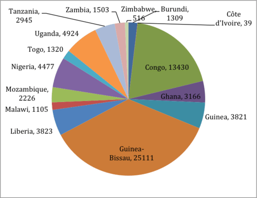
::例2Which of the following charts should be used to show the number of cholera cases in 2005? Explain your reasoning.
::以下哪些图表应用来显示2005年霍乱病例数?解释一下你的推理。First, consider what type of data is being displayed. In this case, the data are the number of cholera cases by country.
::首先,考虑显示何种类型的数据,在这种情况下,数据是按国家分列的霍乱病例数。Next, consider whether the data is best represented in columns or in a pie chart . In this case, the data is best represented in columns because it is comparing values.
::接下来,请考虑数据在列中或在一个派图中的最佳表示方式。在此情况下,数据在列中的最佳表示方式是比较数值。The answer is the data should be displayed with the bar graph. Since the data compares the number of cholera cases between countries, this type of data is best displayed in a bar graph. In addition, the data does not represent the total number of cholera cases in the world, which would be best shown with a pie chart.
::答案是数据应该与条形图一起显示。由于数据比较国家间霍乱病例的数量,这种类型的数据最好在条形图中显示。此外,数据并不代表世界上霍乱病例的总数,最好用一个饼形图来显示。Example 3
::例3The Emirate of Abu Dhabi wants to make a chart that compares the number of females to males born over the last 10 years. What is the best way to display this information?
::阿布扎比酋长国想要绘制一张图表,将过去十年中出生的女性人数与男性人数进行比较。 展示这些信息的最佳方式是什么?First, consider what type of data will be displayed. In this case, the data are numerical values being compared over time.
::首先,考虑将显示何种类型的数据。在此情况下,数据是长期比较的数字值。Next, consider if the data best shown graphically or in another kind of display? In this case, the data are best represented graphically.
::下一步, 请考虑数据是用图形显示, 还是用另一种显示方式显示? 在这种情况下, 数据最好用图形表示 。Next, since the data does not represent frequencies, either a bar or line graph is best. Since the data are comparing two groups over time, the number of females and males, a multiple bar graph is best.
::其次,由于数据不代表频率,最好不是条形图或线条图。由于数据是随着时间的推移比较两个组,即女性和男性的人数,最好有一个多条形图。The answer is the data should be displayed with a multiple bar graph.
::答案是数据应该用多个条形图显示。Example 4
::例4A hundred people were asked how much time they spend exercising daily. What is the best way to display this data?
::一百人被问及他们每天练习多少时间。 展示这些数据的最佳方式是什么?First, consider what type of data will be displayed. In this case, the data are numerical values that represent the amount of time people spend exercising each day.
::首先, 考虑显示哪类数据。 在此情况下, 数据是数字值, 代表人们每天练习的时间 。Next, consider if the data best shown graphically or in another kind of display? In this case, since there is a large number of data values, the data are best represented graphically.
::接下来,请考虑数据是用图形显示,还是用另一种显示方式显示?在这种情况下,由于有大量的数据值,数据最好用图形表示。Next, since the data can be used to show the frequency that people exercise, a histogram is the best type of graph.
::其次,由于数据可用于显示人们锻炼的频率,直方图是最佳的图表类型。The answer is the data should be displayed with a histogram.
::答案是数据应该用直方图显示 。Example 5
::例5What is the best type of display to represent the distribution of English exam scores for all 7th graders?
::显示所有七年级学生英语考试分数的分布的最佳显示类型是什么?First, consider what type of data will be displayed. In this case, the data are numerical values that represent grades on an exam.
::首先, 考虑显示哪类数据。 在此情况下, 数据是代表考试等级的数字值 。Next, consider if the data is best shown graphically or in another kind of display? In this case, the data is best represented graphically.
::下一步, 请考虑是否最好用图形显示数据, 还是用另一种显示方式显示数据? 在这种情况下, 数据最好用图形表示 。Next, since the data should be displayed to shown the distribution of exam scores, a box-and-whisker plot is best.
::其次,由于数据应该显示为考试分数的分布,所以最好用纸盒和口哨图来显示。The answer is the data should be displayed with a box-and-whisker plot.
::答案是,数据应该用一个纸箱和口哨图来显示 。Review
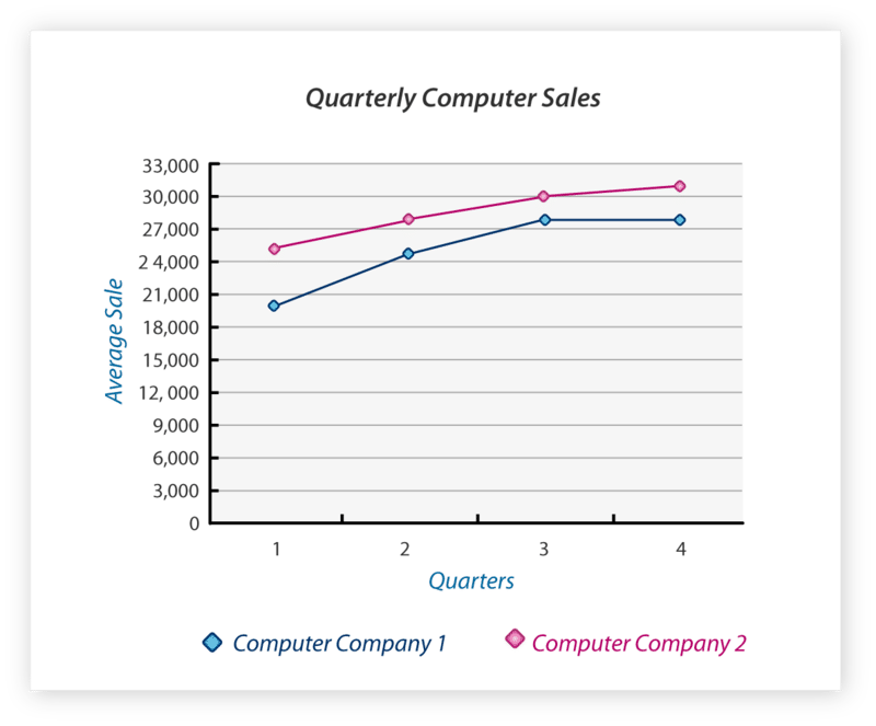
::回顾The graph below depicts the quarterly sales for two competing computer companies. Use the information on the graph to answer the question below.
::下图说明两个相互竞争的计算机公司的季度销售情况。-
True or false. Each company has increased its computer sales each quarter.
::每个公司每季都增加电脑销售量 -
True or false. One company has had a more significant increase in sales between quarters one and two, than the other.
::一家公司的销售额在第一和第二季度之间比另一家公司的销售额增长幅度更大。 -
If the statement from the previous question is true, which company has had a more significant increase in sales?
::如果上一个问题的陈述属实,哪家公司的销售额增加幅度更大? -
What were the average sales for Computer Company 1 in quarter 3?
::计算机公司第1季第3季度的平均销售额是多少? -
What were the average sales for Computer Company 2 in quarter 4?
::第四季度计算机公司2号的平均销售额是多少? -
Which company did not show much of a change in profits from quarter 3 to quarter 4?
::哪家公司的利润从第3季度到第4季度没有多少变化?
The data table below depicts the final score for ten football games played this past season.
::以下数据表说明了上个赛季10场足球赛的最后得分。-
What is the most appropriate display for the data?
::最合适的数据显示方式是什么? -
Create a display of that data.
::创建该数据的显示。
The data below depicts the number of hours students in seventh grade spent working on a science project.
::以下数据说明了七年级学生在科学项目上工作的时间数。-
Create a bar graph of the data.
::创建数据中的条形图。 -
Create a line graph of the data.
::创建数据行图 。
The data table below depicts the amount of weekly allowance received by fifteen teenagers.
::下表列出了15名青少年每周领取津贴的数额。-
Create a frequency table of the data.
::创建数据频率表。 -
Create a histogram of the data.
::创建数据直方图 。 -
Create a box-and-whisker plot of the data.
::创建数据框和简略图 。
The data table below depicts the magnitude of the last ten earthquakes that occurred in Sacramento, California.
::以下数据表描述了加利福尼亚萨克拉门托最近十次地震的规模。-
Create a stem-and-leaf plot of the data.
::创建数据干页图 。 -
Create a histogram of the data.
::创建数据直方图 。
Review (Answers)
::回顾(答复)Click to see the answer key or go to the Table of Contents and click on the Answer Key under the 'Other Versions' option.
::单击可查看答题键, 或转到目录中, 单击“ 其他版本” 选项下的答题键 。Resources
::资源 -
True or false. Each company has increased its computer sales each quarter.