解释给定的条形图
章节大纲
-
Katie is a member of the Young Entrepreneurs and she must present a proposal for a summer job. She decides to operate an ice cream stand during summer vacation. If her proposal is chose as the one “most likely to succeed” then her startup costs will be covered by the Young Entrepreneurs. Katie begins by asking people to name their favorite ice cream flavor.
::凯蒂是青年企业家的成员,她必须提出暑期工作建议。 她决定在暑假期间经营一个冰淇淋摊位。 如果她的求婚被选为“最有可能成功 ” , 她的创业费用将由青年企业家承担。 凯蒂首先要求人们点出他们最喜欢的冰淇淋口味。The results of her survey are displayed on the following bar graph .
::她的调查结果见下图。What information can Katie present to the Young Entrepreneurs from this graph? If the ice cream freezer holds ten gallons of ice cream, how can the chart help Katie when she has to place her first order?
::如果冰淇淋冰淇淋冰箱有10加仑的冰淇淋,当凯蒂必须首先点菜时,图表如何帮助凯蒂?In this concept, you will learn how to recognize and interpret the data displayed on a bar graph.
::在此概念中,您将学会如何识别和解释在条形图中显示的数据。Bar Graphs
::条边图In the real world, you are expose to data every day. If you watch the weather forecast on TV you are presented with information about the weather for the day as well as information about the weather for the entire week ahead. When you receive your report card you are given data about your marks and your attendance.
::在现实世界中,您每天都会接触数据。如果您在电视上看到天气预报,您将会看到当天天气的信息以及未来一周的天气信息。当您收到报告卡时,您会收到关于您的成绩和出勤的数据。Data is simply collected information. This information often takes the form of a collection of numbers which can be visually displayed in a table or on a graph.
::数据只是收集的信息,这种信息通常采取数字收集的形式,可以在表格或图表中显示。When you conduct a survey, measure how changes occur over time or study changes in trends , the recorded information is data. The data should be analyzed, organized and visually displayed. One type of visual display is a bar graph.
::当您进行调查、测量时间变化或研究趋势变化时,记录的信息是数据。数据应加以分析、整理和视觉显示。一种视觉显示是条形图。A bar graph is probably the type of graph that you have worked with most often over the years. Do you remember what a bar graph is and what purpose it serves as a visual display of information?
::条形图可能是您多年来最经常使用的图形类型。 您是否记得一个条形图是什么, 它作为信息的直观显示目的是什么 ?A bar graph is a visual way of showing information in which quantities corresponding to particular categories are represented by rectangular bars of equal width. The lengths or heights of the rectangular bars compare the quantities in different categories.
::条形图是一种直观的方式,用以显示与特定类别相对应的数量由相同宽度的矩形条表示的信息。矩形条的长度或高度比较不同类别的数量。If you are going to display your recorded data using a bar graph then the graph must have a title clearly stating what the graph is about. One axis of the chart must be labeled so as to show the categories being compared and the other axis must have a label and a suitable scale to represent the quantity being displayed. A bar graph can have either vertical bars or horizontal bars.
::如果您要使用条形图显示已记录的数据, 则图形必须有一个标题, 清楚显示图表的要旨。 图表的一条轴必须贴上标签, 以便显示要比较的类别, 而另一条轴必须有一个标签和合适的比例, 以表示显示的数量。 条形图可以有垂直的条形, 也可以有水平的条形 。Below is a bar graph representing the average monthly rainfall in the capital city for the first six months of the year 2014.
::以下是2014年前6个月首都城市月平均降雨量的条形图。In the above bar graph the title is clearly shown above the graph and both axes are labeled. The vertical bars compare the average amount of rainfall for each of the six months. This same bar graph can also be displayed using horizontal bars as shown below.
::在上面的条形图中,标题清楚地显示在图形上方,两个轴都贴上标签。垂直条比较6个月中每个月的平均降雨量。同样的条形图也可以使用以下水平条显示。Remember that a bar graph displays collected data and this data can lead you to discussions and allow you to draw conclusions. Let’s use the above bar graph to answer some questions.
::记住, 条形图显示收集的数据, 而这些数据可以引导您进行讨论, 并允许您得出结论。 让我们使用上面的条形图回答一些问题 。In which month did the most amount of rain fall?
::哪个月降雨量最大?First, look at the horizontal bars on the graph and find the longest bar. The longest bar is the one that extends farthest to the right.
::首先,看看图表上的水平条, 并找到最长的条。 最长的条是向右最远的条 。Then, look to the left of this longest bar to see the month represented by this bar.
::然后,看看这个最长的酒吧的左边,看看这个酒吧所代表的月份。The answer is May.
::答案是五月What was the average rainfall for the month of February?
::二月份的平均降雨量是多少?First, look on the vertical axis and find the month of February.
::首先,看看垂直轴,找到2月份。Next, follow the horizontal bar for this month to the right until you reach the end of the bar.
::接下来,沿着这个月的水平条向右走,直到你到达酒吧的尽头。Then, find the value on the horizontal axis labeled ‘Rainfall (mm)’ that corresponds with the end of the bar.
::然后,在标有“射线(mm)”的横轴上找到与条尾相对应的数值。The answer is 65 mm.
::答案是65毫米Which month had the lowest average rainfall?
::哪个月的平均降雨量最低?First, look at the horizontal bars on the graph and find the shortest bar. The shortest bar is the one that extends least to the right.
::首先,看看图表上的水平条,找到最短的条。最短的条是最不伸向右边的条。Then, look to the left of this longest bar to see the month represented by this bar.
::然后,看看这个最长的酒吧的左边,看看这个酒吧所代表的月份。The answer is June.
::答案是六月。Examples
::实例Example 1
::例1Earlier, you were given a problem about Katie and her presentation to the Young Entrepreneurs.
::早些时候,你遇到了一个问题 关于凯蒂和她的演讲 青年企业家。The tallest vertical bar is above ‘Bubble Gum’ ice cream and it is the favorite flavor. The second tallest bar is the vertical bar above ‘Cotton Candy’ and it is the second favorite flavor. She should order three gallons of each of these flavors. The third tallest vertical bar is the one above ‘Hoof Prints’. She should order two gallons of this flavor. The last two flavors of ‘Chocolate’ and ‘Vanilla are the least favorite flavors so one gallon of each of these should be ordered.
::最高的垂直条纹高于 " 泡泡甘油 " 冰淇淋,这是最喜爱的口味。第二高的条纹是 " Cottton Candy " 上面的垂直条纹,是第二受欢迎的口味。她应该每口味订购三加仑。第三高的垂直条纹是上面的 " Hoof Prints " 。她应该订购两加仑的这种口味。最后两口味的 " Chocolat " 和 " Vanilla " 是最不喜欢的口味,每口味都要订购一加仑。Example 2
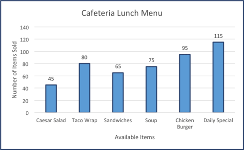
::例2Use the bar graph below to answer the questions presented below the graph.
::使用下方的条形图回答下方的问题。The bar graph below compares the lunch options available in the school cafeteria to the number sold during one week.
::下面的条形图将学校食堂提供的午餐选择与一周内售出的数量作比较。Which item was purchased the least from the cafeteria?
::从自助餐厅购买的物品最少吗?First, look at the vertical bars on the graph and find the shortest bar. The shortest bar indicates the item that was bought the least.
::首先,看看图表上的垂直条, 找到最短的条。 最短的条表示购买的物品最少 。Next, look below this bar and find the name of the item represented by this bar.
::下一步,请看此栏下方并找到此栏所代表项目的名称 。The answer is Caesar Salad.
::答案是凯撒沙拉The Daily Special is always available in the cafeteria. The remaining items will only remain on the menu if 75 or more of that item are sold. Which items will remain on the menu?
::《每日特刊》总是可以在自助餐厅买到,剩下的物品只有出售75件或更多才留在菜单上。菜单上还保留哪些物品?First, look at the vertical bars on the graph and find the numbers above each bar. This number represents the number of sales for the item.
::首先,看看图表上的垂直条, 并找到每个条以上的数字。 此数字代表项目的销售量 。Next, find all the bars that have a top number equal to or greater than 75.
::接下来,找到所有最大数字等于或大于75的栏杆。The answer is Soup and Chicken Burger.
::答案是汤和鸡汉堡How many items were sold in the cafeteria altogether?
::餐厅里一共卖了多少东西?First, look at the vertical bars on the graph and record the numbers above each bar.
::首先,看看图表上的垂直条,记录每个条上方的数字。Then, calculate the sum of the numbers you have recorded.
::然后,计算你所记录的数字的总和。The answer is 475.
::答案是475Example 3
::例3A bar graph is often drawn with two or more bars in each category. These bars compare same quantities in one category. The following bar graph displays the temperature in degrees Fahrenheit for the third week of May for the years 2000 and 2015 respectively. Use the bar graph to answer the questions presented below the graph.
::条形图通常在每个类别中用两个或两个以上的条形图绘制。这些条形图在一个类别中比较相同的数量。以下的条形图分别显示2000年和2015年5月第三周华氏度的温度。使用条形图回答图下的问题。What was the highest recorded temperature in the year 2000?
::2000年的最高记录温度是多少?First, look at the bar graph to determine which color bar represents the year 2000.
::首先,看看条形图,以确定哪个彩色条代表2000年。Next, look at the temperatures above each bar for the year 2000 and record the highest number.
::接下来,看看2000年每条栅栏上方的温度,并记录了最高的温度。The answer is 70 degrees Fahrenheit.
::答案是华氏70度What is the lowest temperature recorded for the year 2015?
::2015年记录的最低温度是多少?First, look at the bar graph to determine which color bar represents the year 2015.
::首先,看看条形图,以确定2015年的颜色条代表哪个颜色条代表哪个颜色条。Next, look at the temperatures above each bar for the year 2015 and record the lowest number.
::接下来,看看2015年每条铁条上方的温度,并记录最低的温度。The answer is 60 degrees Fahrenheit.
::答案是华氏60度What is the average daily temperature for the week displayed on the bar graph for each year?
::每年在条形图上显示的一周平均日温度是多少?First, begin with the year 2000 and record the seven temperatures displayed on the bar graph.
::首先,从2000年开始 记录在条形图上显示的七度温度Next, calculate the sum of the recorded temperatures.
::接下来,计算记录温度的总和。Then, divide the sum by the number of days to determine the average daily temperature.
::然后,将总和除以天数,以决定平均日温度。The answer is 61.1 degrees Fahrenheit for the year 2000.
::答案是2000年华氏61.1度。Next, repeat the steps for the year 2015.
::接下来,重复2015年的步骤。The answer is 65.7 degrees Fahrenheit for the year 2015.
::答案是2015年华氏65.7度。Example 4
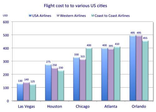
::例4The bar graph below compares the air travel costs to fly to various U.S. cities from Oakland, California on three different Airlines. Use the information displayed on the bar graph to answer the questions presented below the graph.
::下面的图标图比较了从加利福尼亚州奥克兰乘坐三家不同航空公司飞往美国各个城市的机票费用。使用图标图上显示的信息回答图下的问题。For which cities did all three Airlines have a similar price?
::所有三家航空公司的哪个城市价格相似?First, look at the tops of the bars. The numbers displayed represent the cost in US dollars charged by each of the Airlines to fly from Oakland, California to the city named below the vertical bars.
::首先,请看酒吧的顶端。显示的数字代表了航空公司从加利福尼亚奥克兰飞往垂直酒吧下方的城市的费用,从加利福尼亚州奥克兰以美元计价。Next, subtract the lowest value displayed above the group of bars from the highest value to determine the range in US dollars between the costs of the three airlines. Remember to record your results.
::接下来,从最高值中减去一组条上方显示的最低值,以决定三家航空公司成本之间的美元范围。请记住记录您的结果。The answer is Las Vegas and Atlanta.
::答案是拉斯维加斯和亚特兰大Which Airline had the lowest price for three of the five cities?
::五座城市中,哪个航空公司的价格最低?First, look at the three vertical bars above each city. Record the value displayed above the shortest bar for each city.
::首先, 看看每个城市上方的三个垂直栏杆。 记录每个城市最短的栏杆上方显示的值 。Next, record the name of the airline that corresponds to the value above each of the shortest bars.
::接下来,记录每个最短的条子上方价值相等的航空公司名称。Next, determine which airline name appears most in your list.
::下一步,确定哪个航空公司名称在您的列表中最明显。Then, match the name of the city with the airline offering the lowest price.
::然后把城市的名字 和提供最低价格的航空公司匹配起来The answer is Coast to Coast Airlines.
::答案是海岸呼叫海岸航空公司For which city did Western Airlines and Coast to Coast Airlines have a difference in price of forty dollars?
::Western Airlines and Coast to Coast Airlines 在哪个城市的西海岸航空公司和海岸航空公司 价格有40美元的差额?First, look at the three vertical bars above each city. Use the legend presented above the bar graph to find the vertical bars for Western Airline and Coast to Coast Airlines.
::首先,看看每个城市上方的三条垂直栅栏。 使用条形图上方的图例来找到西航空和海岸至海岸航空公司的垂直栅栏。Next, record the cost values above these two vertical bars for travel to each of the cities.
::接下来,记录前往每个城市旅行的这两个垂直栏以上的成本值。Next, subtract the values to determine the difference in cost charged by each of the two airlines.
::其次,减去数值,以确定两家航空公司各自收取的费用差额。Then, match the difference of forty dollars with the corresponding city named below the bars.
::然后将四十美元的差额 和酒吧下面的对应城市相匹配The answer is Orlando.
::答案是奥兰多Review
::回顾The following bar graph compares the average price of gasoline in five US states. Use the information displayed in the graph to answer the questions that follow.
::以下的条形图比较了五个美国州汽油的平均价格。 使用图中显示的信息回答下面的问题 。1. What was the average price of gasoline in Hawaii?
::1. 夏威夷汽油的平均价格是多少?2. What was the average price in Florida?
::2. 佛罗里达的平均价格是多少?3. Which state had the lowest average price per gallon?
::3. 哪个州拥有每加仑最低平均价格?4. Which state had the highest average cost per gallon?
::4. 哪个州每加仑的平均成本最高?5. If the average cost in Missouri is $3.00 per gallon, what would 15 gallons cost you in Missouri?
::5. 如果密苏里州的平均费用是每加仑3.00美元,那么在密苏里州,15加仑的价格是多少?6. Would it be cheaper to buy ten gallons in Hawaii?
::6. 在夏威夷买10加仑会更便宜吗?7. How much would it cost you to purchase the ten gallons in Hawaii?
::7. 在夏威夷买十加仑要花多少钱?8. If the average cost is $3.40 per gallon in California, what would be the difference between ten gallons in Hawaii and ten gallons in California?
::8. 如果加利福尼亚的平均费用是每加仑3.40美元,那么夏威夷的10加仑与加利福尼亚的10加仑之间的差额是多少?9. What is the average price per gallon in Washington State?
::9. 华盛顿州每加仑的平均价格是多少?10. Based on the bar graph, which state has a cheaper price per gallon, Florida or Washington?
::10. 根据巴图,哪个州每加仑(佛罗里达州或华盛顿州)价格更便宜?The following bar graph shows how the number of teams participating in the Iditarod Sled Dog Race has changed over time. Use the information displayed in the bar graph to answer the questions presented below the graph.
::下面的条形图显示了参加Iditarod Sled Dog Rance 的球队数量随时间变化。使用条形图中显示的信息回答图下的问题。11. About how many teams participated in 2006?
::11. 关于2006年有多少小组参加?12. Which year had the highest participation?
::12. 哪一年的参与率最高?13. If the number of teams in 2008 had doubled in 2010, how many teams would have participated in 2010?
::13. 如果2008年的小组数目在2010年翻了一番,那么2010年有多少小组会参加?14. True or false. There has been a steady increase in participation from 2007 to 2010.
::14. 真实的或虚假的,2007年至2010年,参与人数稳步增加。15. If the participation in 2011 increased 10 mushers from the number counted in 2010, how many mushers would be participating?
::15. 如果2011年的参与比2010年的计算数字增加了10名穆斯林,那么有多少穆斯林将参加?16. True or false. There were less mushers participating in 2006 compared with 2007.
::16. 与2007年相比,2006年参加选举的穆斯林人数较少。17. Which statement best describes the participation in 2009?
::17. 哪一项声明最能说明2009年的参与情况?-
It was better than in 2007.
::比2007年好。 -
There were less than 80 mushers registered.
::注册的穆斯林不到80人。 -
It was the smallest number of mushers recorded on the graph.
::这是图中记录到的最小的母鲸数量。 -
Both B and C.
::B和C都一样
Review (Answers)
::回顾(答复)Click to see the answer key or go to the Table of Contents and click on the Answer Key under the 'Other Versions' option.
::单击可查看答题键, 或转到目录中, 单击“ 其他版本” 选项下的答题键 。 -
It was better than in 2007.