绘制散块和寻找最适合的平方
章节大纲
-
You might be familiar with calorie requirements for males, like the ones shown in the table below. What type of correlation is exhibited by the data ?
::您可能熟悉男性的卡路里要求, 如下表所示。 数据显示了哪类相关关系 ?Calorie Requirements (Male), 1-59 years
::Calorie 需求(男),1-59岁Variable Values Age Range , 1-3 4-6 7-10 11-14 15-18 19-59 Calorie Needs, 1230 1715 1970 2220 2755 2550 The age is measured in years.
::年龄以岁数衡量。Scatterplots and Equation of Best Fit
::散货区和最佳适合的平方A scatterplot is a set of points that represent data. We plot these points and try to find equations that best approximate their relationship. Because data is not always perfect, not every point will always fit on the line of best fit . The line of best fit is the line that is the closest to all the data points. It can be used to approximate data within the set or beyond the set. Scatterplots almost always represent a real-life situation.
::散射点是代表数据的一组点。 我们绘制这些点, 并尝试找到最接近它们关系的方程式。 因为数据并不总是完美, 不是每个点总是符合最合适的线条。 最合适的线条是最接近所有数据点的线条。 它可以用来估计集内或集外的数据。 散射点几乎总是代表现实生活状况 。Scatterplots can have positive correlation if the and values tend to increase together. They can have negative correlation if tends to decrease as tends to increase. And, if the points have no sort of linear pattern, then the data would have relatively no correlation. Think of the type of correlations referring to the slope of the line that would best fit that data.
::如果 x 值和 y 值同时增加, 散射点可能会有正相关关系。 如果 y 倾向于随着 x 的增加而减少, 它们可能会有负相关关系 。 而且, 如果点没有线性模式, 那么数据就不会有相对相关关系 。 想想最符合该数据的直线斜坡的对应关系类型 。Let's describe the type of correlation shown in the scatterplot and explain the answer.
::让我们描述散射图中显示的关联类型, 并解释答案 。Source: CNN
::资料来源:CNN。This is a negative correlation. As the years get larger, the sales go down. This could be because in the boom of online/digital and pirated music.
::这是一个负相关关系。随着岁月的扩大,销售量会下降。这可能是因为在线/数字音乐和盗版音乐的兴旺。Now, let's find the linear equation of best fit for the data set above.
::现在,让我们找到最适合上面数据集的线性方程。First, it can be very difficult to determine the “best” equation for a set of points. In general, you can use these steps to help you.
::首先,很难确定一组点的“最佳”等式。 一般来说,你可以使用这些步骤来帮助你。Step 1: Draw the scatterplot on a graph.
::步骤 1: 在图表中绘制散射图 。Step 2: Sketch the line that appears to most closely follow the data. Try to have the same number of points above and below the line.
::第2步: 将似乎最密切跟踪数据的线条拉平。 尽量在线上和线下有相同数目的点 。Step 3: Choose two points on the line and estimate their coordinates. These points do not have to be part of the original data set.
::第3步:在线上选择两点并估计其坐标。这些点不一定是原始数据集的一部分。Step 4: Find the equation of the line that passes through the two points from Step 3.
::第4步:找出从第3步经过两点的线的方程式。Let’s use these steps on the graph above. We already have the scatterplot drawn, so let’s sketch a couple lines to find the one that best fits the data.
::让我们在上面的图表上使用这些步骤。 我们已经绘制了散射图, 因此让我们绘制几条线来找到最适合数据的行。From the lines in the graph, it looks like the purple line might be the best choice. The red line looks good from 2006-2009, but in the beginning, all the data is above it. The green line is well below all the early data as well. Only the purple line cuts through the first few data points, and then splits the last few years. Remember, it is very important to have the same number of points above and below the line.
::从图表中的线条看,紫线似乎是最好的选择。 红线从2006-2009年看起来不错, 但一开始, 所有的数据都高于它。 绿线也远远低于所有早期的数据。 只有紫线通过前几个数据点的切分, 然后将过去几年分割开来。 记住, 在线上和线下有相同数量的点非常重要 。Using the purple line, we need to find two points on it. The second point, crosses the grid perfectly at (2000, 14). Be careful! Our graph starts at 1999, so that would be considered zero. Therefore, (2000, 14) is actually (1, 14). The line also crosses perfectly at (2007, 10) or (8, 10). Now, let’s find the slope and intercept.
::使用紫色线, 我们需要找到两点。 第二点, 在(2000, 14) 时完全跨过网格 (2000, 14) 。 请注意 ! 我们的图表从1999年开始, 这样算为零 。 因此, (2000, 14) 实际上是(1, 14) 。 这条线在(2007, 10) 或 (8, 10) 或 (8, 10) 时也完全跨过。 现在, 让我们找到斜坡和 y- intercut 。
::m=14 - 101 - 8 - 8 47
::y+47x+b14+47(1)+b14+0.57+b14.57=bThe equation of best fit is .
::最合适的方程式是y47x+14.57。However, the equation above assumes that starts with zero. In actuality, we started with 1999, so our final equation is .
::然而,上述方程式假设x开头为零。实际上,我们从1999年开始,所以我们的最后方程式是y47(x-1999)+14.57。Using the line of best fit above, what would you expect music sales to be in 2010?
::使用上面最合适的一行, 你会期待2010年的音乐销售会是什么?In this problem , we are using the line of best fit to predict data. Plug in 2010 for and solve for .
::在此问题上,我们正在使用最合适的线来预测数据。 2010年x的插件和y的解答。
::y47(2010-2019年)+14.57y47(11)+14.57y=8.3It is estimated that music industry will make $8.3 billion in music sales in 2010.
::据估计,2010年,音乐行业的音乐销售额将达到83亿美元。Examples
::实例Example 1
::例1Earlier, you were asked to find the type of correlation that is exhibited by the data.
::早些时候,你被要求找到数据显示的关联类型。If you draw a scatter plot of the data, you see that the x and y values tend to increase together. Therefore the data exhibits positive correlation. That is, as age increases so do calorie requirements.
::如果您绘制数据散射图, 您就会看到 x 和 y 值会同时增加。 因此, 数据显示出正相关关系。 也就是说, 随着年龄增长, 卡路里的需求也会增加 。Use the table below to answer the following questions.
::使用下表回答下列问题。Sleep Requirements, 0-3 years
::0-3年睡眠要求,0-3年Age, 1 3 6 9 12 18 24 36 Sleep, 16 15 14.25 14 13.75 13.5 13 12 The age is measured in months and sleep is measured in hours.
::年龄以月计,睡眠以小时计。Source: BabyCenter
::资料来源:婴儿中心。
::例2Draw a scatterplot with age across the axis and sleep along the axis. Count by 3’s for the values and by 2’s for the values.
::绘制横跨 x - 轴的散射图, 并沿 y - 轴 睡觉。 x - 值的计数为 3 , y - 值的计数为 2 。Here is the scatterplot.
::这是散射图。Example 3
::例3Find the line of best fit.
::找到最合适的线Two points that seem to be on the red line are (3, 15) and (24, 13).
::红线上似乎有两点(3、15)和(24、13)。
::=15-133-2422115221(3)+b150.29+b15.29=bThe equation of the line is .
::线的方程式是y221x+15.29。Example 4
::例4Determine the amount of sleep needed for a year old and a 5 year old.
::确定212岁和5岁儿童所需的睡眠量。First, you need to change the age to months so that it corresponds with the units used in the graph. For a 2.5 year-old, 30 months, s/he should sleep hours. For a 5-year-old, 60 months, s/he should sleep hours.
::首先,您需要将年龄改为月数,以便与图表中使用的单位相符。对于2.5岁、30个月的人,S/他应该睡觉y221(30)+15.2912.4小时;对于5岁、60个月的人,S/他应该睡觉y221(60)+15.299.6小时。Review
::回顾Determine if the scatterplots below have positive, negative, or no correlation.
::确定下面的散块是否有正、负或无关联关系。Plot each scatterplot and then determine the line of best fit.
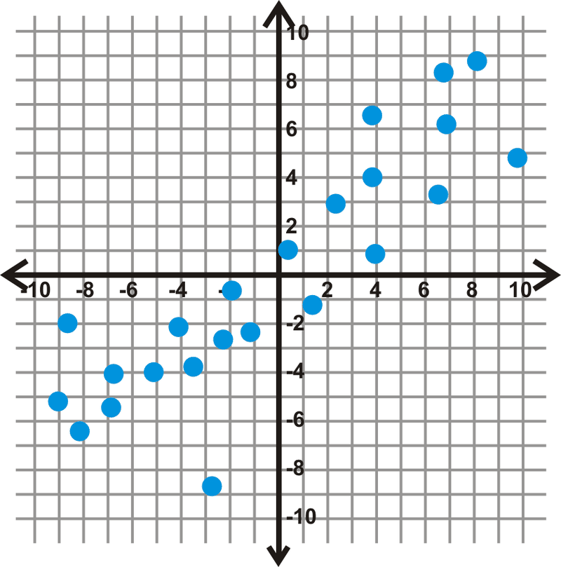
::绘制每个散点,然后确定最适合的线条。- .
1 2 3 5 7 8 1 3 4 3 6 7 - .
10 9 7 6 5 2 5 6 4 3 3 2 Use the data below to answer questions 6-8.
::使用以下数据回答问题6-8。The price of Apple stock from Oct 2009 - Sept 2011 source: Yahoo! Finance
::2009年10月至2011年9月苹果股票价格来源:Yahoo!10/09 11/09 12/09 1/10 2/10 3/10 4/10 5/10 6/10 7/10 8/10 9/10 $181 $189 $198 $214 $195 $208 $236 $249 $266 $248 $261 $258 10/10 11/10 12/10 1/11 2/11 3/11 4/11 5/11 6/11 7/11 8/11 9/11 $282 $309 $316 $331 $345 $352 $344 $349 $346 $349 $389 $379 -
Draw the scatterplot for the table above. Make the
axis the month and the
axis the price.
::绘制上面表格的散点图。 使 x - 轴为月份, y - 轴为价格 。 -
Find the linear equation of best fit.
::找到最合适的线性方程式 -
According to your equation, what would be the predicted price of the stock in January 2012?
::根据你的等式,2012年1月股票的预计价格是多少?
Use the data below to answer questions 9-11.
::使用以下数据回答问题9-11。Total Number of Home Runs Hit in Major League Baseball, 2000-2010 source: Baseball Almanac
::2000-2010年主要联盟棒球击打家庭跑总次数, 资料来源:棒球阿尔马纳克(Baseball Almanac)2000 2001 2002 2003 2004 2005 2006 2007 2008 2009 2010 5693 5458 5059 5207 5451 5017 5386 4957 4878 4655 4613 -
Draw the scatterplot for the table above. Make the
axis the year and the
axis the number of home runs.
::绘制上面表格的散点图。将 X - 轴改为年份,将 y - 轴改为主运行次数。 -
Find the linear equation of best fit.
::找到最合适的线性方程式 -
According to your equation, how many total home runs should be hit in 2011?
::根据你的等式,2011年应击败多少全垒打?
Review (Answers)
::回顾(答复)Click to see the answer key or go to the Table of Contents and click on the Answer Key under the 'Other Versions' option.
::单击可查看答题键, 或转到目录中, 单击“ 其他版本” 选项下的答题键 。 -