解析散放绘图和线图
章节大纲
-
Steve is playing a stock market simulation game in his social studies class. He has chosen to invest in Apple Inc., Amazon.Com Inc., Walt Disney Company and Microsoft. He originally bought all four stocks in the 10th day of the month. Now he needs to choose one of them to sell. Based on the recent performance of each of them as shown in the line graphs below, which would you recommend he choose and why?
::史蒂夫在社交研究课上玩股票市场模拟游戏。 他选择投资苹果公司、亚马逊. Com公司、 Walt Disney公司和微软公司。 他最初在月十日购买了所有四股股票。 现在他需要选择其中一家股票出售。 如下线图所示, 他建议他选择哪家股票, 为什么?Seem a bit daunting? It certainly can be! We will return to this question at the end of the lesson to review the situation.
::似乎有点令人望而却步?当然可以!我们将在总结教训后再讨论这个问题,以审查局势。Interpreting Scatter Plots and Line Graphs
::解析散放绘图和线图The primary use for scatter plots and line graphs is to demonstrate or evaluate the correlation between two variables. Though the two are similar in many ways, there are distinct differences, and specific situations in which one is appropriate and the other is not.
::散射图和线条图的主要用途是显示或评价两个变量之间的相互关系。 虽然这两个变量在许多方面是相似的,但存在不同的差异,在特定情况下,一种是合适的,另一种是不合适的。-
A
scatter plot
is generally used when displaying
data
from two variables that may or may not be directly related, and when neither of the variables is under the direct control of the researcher. The primary function of a scatter plot is to visualize the strength of correlation between the two plotted variables. The number of sunburned swimmers at the local pool each day for a month would be an example of a
data set
that would best be displayed as a scatter plot, since neither the weather nor the number of swimmers present is under the control of the researcher.
::散射图通常用于显示两个变量的数据,这两个变量可能直接相关,也可能不直接相关,而且这两个变量均不在研究人员的直接控制之下。散射图的主要功能是直观两个绘图变量之间的相关性强度。一个月内当地游泳池每天晒太阳游泳的人数将是一个数据集的例子,该数据集最好作为散射图显示,因为无论是天气还是现有游泳者的人数都不受研究人员的控制。 -
A
line graph
is appropriate when comparing two variables that are believed to be related, and when one of the variables is under the direct control of the researcher. The primary use of a line graph is to determine the
trend
between the two graphed variables. The mileage of a particular car compared to speed of travel would be a good example, since the mileage is certainly correlated to the speed and the speed can be directly controlled by the researcher.
::当比较两个被认为相关的变量时,当其中一个变量在研究人员的直接控制之下时,线条图是合适的。线条图的主要用途是确定两个图表变量之间的趋势。特定车辆的里程与旅行速度相比将是一个很好的例子,因为里程肯定与速度相关,而速度可以由研究人员直接控制。
In later lessons we will discuss methods of quantifying the level of correlation between two variables and calculating a line of best fit , but for now we will focus on identifying specific examples of weak or strong correlation and identifying different types of trends .
::在以后的教训中,我们将讨论用数量表示两个变数之间相互关系水平的方法,并计算出一条最适合的线,但现在我们的重点将是确定薄弱或密切关联的具体例子,并查明不同类型的趋势。-
SCATTER PLOTS:
-
Two variables with a
strong correlation
will appear as a number of points occurring in a clear and recognizable linear pattern. The line does not need to be straight, but it should be consistent and not exactly horizontal or vertical.
::两个具有强烈相关性的变量将表现为以清晰和可识别的线性模式出现的若干点。 线条不需要直线,但它应该是一致的,而不是完全横向或垂直的。 -
Two variables with a
weak correlation
will appear as a much more scattered field of points, with only a little indication of points falling into a line of any sort.
::两个关联薄弱的变数将看起来是一个分散得多的点领域,只略微表明点点跌入任何类型的线条。
::SCATTER 插件:两个具有强烈相关性的变量将出现在一个清晰和可识别的线性模式下的若干点上。该线条不需要直线,但应该一致,而不是完全水平或垂直。 两个关联性弱的变量将看起来是一个分散得多的点块,只有一点迹象表明点点会掉入任何类型的线条。 -
Two variables with a
strong correlation
will appear as a number of points occurring in a clear and recognizable linear pattern. The line does not need to be straight, but it should be consistent and not exactly horizontal or vertical.
-
LINE GRAPHS:
-
A
linear relationship
appears as a straight line either rising or falling as the independent
variable
values increase. If the line rises to the right, it indicates a
direct relationship
.
If the line falls to the right, it indicates an
inverse relationship.
::线性关系显示为直线线, 要么随着独立的变量值的增加而上升, 要么下降。 如果线性关系向右上升, 它表示一种直接关系。 如果线性关系向右上升, 它表示一种反向关系 。 -
A
non-linear relationship
may take the form of any number of curved lines, and may indicate a squared relationship (dependent variable is the square of the independent), a square root relationship (dependent variable is the square root of the independent), an inverse square (dependent variable is one divided by the square of the independent), or many other possibilities.
::非线性关系可以采取任何若干曲线线的形式,并可以表示平方关系(依赖变量是独立的方形)、平方根关系(依赖变量是独立的平方根)、反方方(依赖变量是独立的平方形除以独立的平方形)或许多其他可能性。
::LINE GRAPHS: 线性关系显示为直线, 随独立变量值的增加而上升或下降。 如果线性关系向右上升, 它表示直接关系 。 如果线性关系向右上升, 它表示反向关系 。 非线性关系的形式可以是任何多条曲线线, 并且可以表示平方关系( 独立变量的正方形) , 平方根关系( 独立变量的平方根) , 反方关系( 独立变量的平方根) , 或者许多其他可能性 。 -
A
linear relationship
appears as a straight line either rising or falling as the independent
variable
values increase. If the line rises to the right, it indicates a
direct relationship
.
If the line falls to the right, it indicates an
inverse relationship.
-
BOTH:
-
A
positive correlation
appears as a recognizable line with a positive
slope
. A line has a positive slope when an increase in the independent variable is accompanied by an increase in the dependent variable (the line rises as you move to the right).
::一个正相关关系似乎是与正斜坡的可识别直线。 当独立变量的增加伴随着依附变量的增加(该直线随着向右移动而上升)时,该直线有一个正斜度。
::BUTH:正相关关系显示为正斜坡的可识别直线。 当独立变量的增加伴随着依附变量的增加(向右移动时直线上升)时,正相关关系显示为正斜线。 当独立变量的增加伴随着从属性变量的增加(向右移动时直线上升)时,正斜线显示正斜度。 -
A
positive correlation
appears as a recognizable line with a positive
slope
. A line has a positive slope when an increase in the independent variable is accompanied by an increase in the dependent variable (the line rises as you move to the right).
-
-
A
negative correlation
appears as a recognizable line with a negative slope. As the independent variable increases, the dependent variable decreases (the line falls as you move to the right).
::负相关关系似乎是与负斜坡的可识别直线。随着独立的变量的增加,依附变量的减少(该直线随着向右移动而下降 ) 。
::负相关关系似乎是与负斜坡的可识别直线。随着独立的变量的增加,依附变量的减少(该直线随着向右移动而下降 ) 。 -
A
negative correlation
appears as a recognizable line with a negative slope. As the independent variable increases, the dependent variable decreases (the line falls as you move to the right).
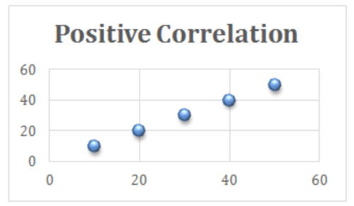
Identifying Relationships
::确定关系What type of relationship is indicated by the line graph below?
::下面的直线图说明了哪类关系?The line is straight, indicating a linear relationship. It rises from left to right, meaning that the dependent variable increases as the independent variable increases, indicating a positive correlation.
::直线是直线, 表示线性关系。 它从左向右上升, 意指随独立变量增长而增加的依附变量, 表明正相关关系 。Identifying Negative Correlation
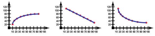
::识别负关联Which image shows a non-linear graph with a negative correlation?
::哪个图像显示非线性图与负相关关系?-
The first image is of a curved line that rises from left to right, this is a non-linear positive correlation
::第一个图像是一条从左向右上升的曲线线, 这是非线性正对应关系 -
The second image is a straight line that falls from left to right, this is a linear negative correlation
::第二张图像是一条从左向右的直线, 这是线性负对应关系 -
The third image is a curved line that falls from left to right, this is a nonlinear negative correlation and is the correct image as described by the question.
::第三张图像是一条从左向右的弯曲线,这是非线性负相关关系,是问题所描述的正确图像。
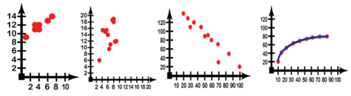
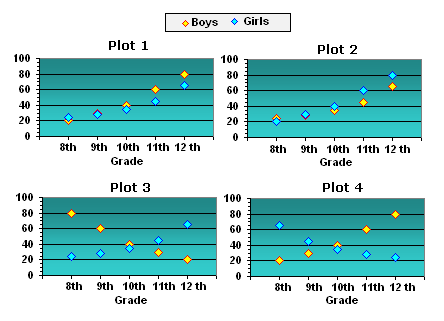
Recognizing Types of Correlation
::承认关系类型-
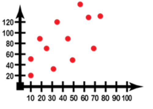
Which graph(s) indicate(s) a weak correlation?
::哪个图表显示关系薄弱? -
Which one(s) indicate(s) a strong correlation?
::哪一个表示有很强的相互关系? -
Which graph(s) indicate positive correlation(s)?
::哪个图表显示正相关关系?
-
Only graph 2 indicates a weak correlation, since it is the only one with points that are not clearly arranged in a linear fashion.
::只有图2表明存在薄弱的关联,因为只有图2表明存在薄弱的关联性,因为图2中只有点数没有以线性方式明确排列。 -
Graphs 1, 3, and 4 all indicate strong correlations, as evidenced by the high percentage of points obviously organized in a line. Graph 4 is obviously a very strong correlation as a clear non-horizontal or vertical line connects all of the points.
::图1、图3和图4都显示了强烈的相互关系,一行中明显有高百分点证明了这一点。 图4显然具有很强的关联性,因为清晰的非横向或垂直线连接了所有点。 -
Graphs 1, 2, and 4 are all positive correlations as all three rise from left to right. Another way to put it is that those three graphs have a positive slope (though graph 4 does not have a consistent slope, anywhere on the curve the slope is estimated it would still be positive).
::图1、2和4都是正相关关系,因为这三个图都是从左向右上升的。 另一种方式是这三个图有正斜度(尽管图4没有一致的斜度,但是在曲线的任何地方,斜度估计仍将是正。 )
Earlier Problem Revisited
::重审先前的问题Which stock(s) should Steve sell if he needs to make a profit right away?
::如果Steve需要立即获利,他应该出售哪些股票?By looking at the lines on each of the four graphs, we can see that it is important to note that Steve purchased the stocks on the 10 th , since only the Walt Disney CO and Amazon are currently valued more highly than they were on the 10 th . Both Apple and Microsoft are going up in value now, at the end of the month, but neither has made it back up to where they were on the 10 th .
::通过查看四个图的每条线,我们可以看到,重要的是要注意到史蒂夫在第10次购买股票,因为目前只有沃尔特·迪斯尼公司和亚马逊公司的价值高于第10次。 苹果公司和微软公司现在都在价值上扬,在月底,但它们都没有回到第10次市场。If Steve wants to make a profit right now, he should sell Walt Disney or Amazon or both.
::如果史蒂夫现在想赚钱 他应该卖掉沃尔特·迪斯尼 或者亚马逊 或者两者兼而有之Examples
::实例Example 1
::例1Describe the relationship indicated by the graph:
::描述图中显示的关系:This is a very strongly correlated (all the points connected by a line), negative (the line falls from left to right), nonlinear (not a straight line) relationship.
::这是一个非常密切关联的关系(所有点都与一条线相连)、负(线从左向右)、非线性(不是直线)关系。Example 2
::例2Describe the relationship indicated by the graph:
::描述图中显示的关系:This is a weekly correlated (significant scattering of the points), positive (points generally increase in value from left to right), linear (a straight line of fit could be drawn) relationship.
::这是一种每周相关关系(各点分布得相当大)、正关系(从左到右的数值普遍增加)、线性关系(可以划出直线适配线)。Example 3
::例3Describe the graph that would result from a strongly correlated positive non-linear relationship. Give an example of a function that could result in such a graph.
::描述因紧密关联的正非线性关系而形成的图形。 举一个例子, 说明可能导致此图的函数 。A strongly correlated positive non-linear relationship would appear as well-defined curve of points rising from left to right.
::密切关联的正非线性关系似乎是从左向右上升点的明确界定的曲线。Example 4
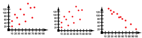
::例4Which scatter plot below indicates the most strongly correlated variables?
::下面哪些散射图显示最紧密相关变量?The right plot is the most strongly correlated, evidenced by the much cleaner line formed by the data points. Incidentally, this is a negative linear relationship.
::右边的地块是关系最密切的地块,以数据点形成的更清洁的线条为证据。顺便提一下,这是一个负线性关系。Example 5
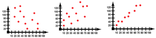
::例5Which plot below indicates a weakly correlated positive linear relationship?
::以下哪些图示关系密切的正线关系?The left hand plot is weakly correlated, but negative. The right hand plot is positive, but strongly correlated. The center plot is weakly correlated and positive, so it is the one matching the question definition.
::左手图与左手图有微弱关联, 但为负。 右手图是正的, 但具有强烈关联性 。 中心图与右手图有微弱关联和正的, 因此它符合问题定义 。Review
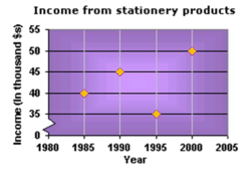
::回顾1. What sort of trend is shown in the scatter plot below?
::1. 下面的散射地块显示了何种趋势?2. A door to door vacuum cleaner sales man plots a scatter diagram of how much he has earned over the years. In which year was his income the highest?
::2. 一扇门到门的真空更清洁的销售人员绘制一张他多年来挣得多少的散射图,哪一年的收入最高?3. The number of children in two different day care centers, and the types of lunch they eat is represented in the table below. Pick the appropriate scatter plot for the data.
::3. 下表列出了两个不同的日托中心的儿童人数及其午餐类型。Lunch Served Center 1 (Yellow) Center 2 (Blue) Hamburger 20 25 Mac and Cheese 30 28 Pizza 40 35 Tuna Salad 60 45 Burritos 80 65 4. The plot shown gives the relationship between the demand and price of a trendy consumer good. What trend does the plot follow?
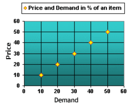
::4. 所显示的图案提供了一种有趋势的消费者商品的需求和价格之间的关系,图案遵循何种趋势?5. The plot represents the relationship between the price and supply of an item. What type of trend does the graph illustrate?
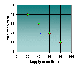
::5. 该图表示物品的价格和供应之间的关系,图中说明何种趋势?6. Katie recorded the following data relating to how long it took to fill up a horse trough. She measured the depth every two minutes after she began filling it, until it was full. Which scatter plot accurately represents the data?
::6. Katie记录了以下关于填充马槽需要多长时间的数据,在填充马槽后,她每两分钟测量一次深度,直到填满时为止,哪个散射图准确代表了数据?Time (in minutes) Dept (in inches) 2 7 4 8 6 13 8 19 10 20 12 24 14
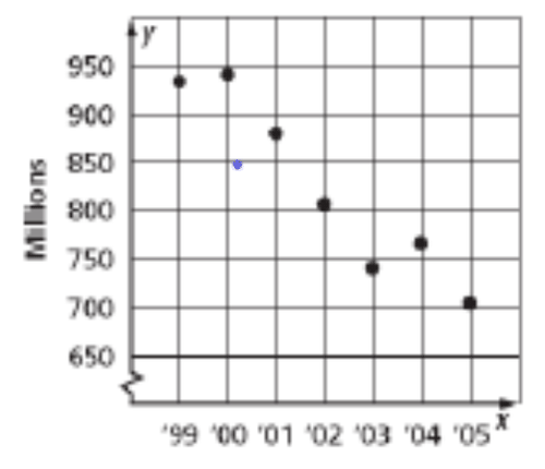
32 16 37 18 38 20 41 22 47 7. The Scatter Plot below question 8 shows the number of DVD’s sold (in millions) from 2001-2007. Based on the data, about how many DVD’s will be sold in 2009?
::7. 问题8下面的散射图显示了2001-2007年DVD销售量(以百万计),根据数据,2009年将出售多少DVD?8. What sort of trend is shown in the scatter plot?
::8. 散射地块显示了何种趋势?9. The table below shows a relationship between the weight of a car and its average gas mileage. Which plot best represents the data?
::9. 下表显示了汽车重量与平均气里程之间的关系,哪些地块最能代表数据?Type of Car Weight MPG 1 3750 29 2 4125 23 3 3100 33 4 5082 18 5 3690 20 6 4640 21 7 5380 14 8 3241 25 9 3895 31 10 4669 17 10. Which scatter plot shows no relationship between test scores received by Greg, and the temperature that the classroom was at while taking the test? Why?
::10. 哪些散射地块显示Greg收到的测试分数与教室在进行测试时的温度没有关系? 为什么?11. Which scatter plot shows a positive relationship between the weight of a mango, and the number of seeds it contains?
::11. 哪些散射地显示了芒果重量与其中种子数量之间的积极关系?Roy was doing research for a research paper. He questioned students throughout his high school, asking them how much time they spent doing homework and how much time they spent watching TV the previous evening. The following scatter plot shows his results. Based on the information answer the questions that follow.
::罗伊正在研究一篇研究论文。他在整个高中询问学生们,问他们做功课花了多少时间,前天晚上看电视花了多少时间。接下来的散射图展示了他的结果。根据信息回答接下来的问题。

Choose the best of the 4 points, A, B, C, or D to represent the student’s statements below.
::选择以下4点中A、B、C或D的最佳表示语句。12. “I worked on homework almost all night, I only had time to watch my favorite sitcom.”
::12. “我几乎整晚都在做功课,我只有时间看最喜爱的喜剧。”13. “Last night was about half and half for me”
::13. " 昨晚对我来说大约是一半半 " 。14. “Last night didn’t have anything on the screen I wanted to watch, and homework was so light, that I ended up going out.”
::14. “昨晚,我想看的屏幕上没有任何东西,功课太轻,我最后出去。”15. Write a statement that correlates to the 4 th point.
::15. 撰写与第四点相关的声明。Review (Answers)
::回顾(答复)Click to see the answer key or go to the Table of Contents and click on the Answer Key under the 'Other Versions' option.
::单击可查看答题键, 或转到目录中, 单击“ 其他版本” 选项下的答题键 。 -
A
scatter plot
is generally used when displaying
data
from two variables that may or may not be directly related, and when neither of the variables is under the direct control of the researcher. The primary function of a scatter plot is to visualize the strength of correlation between the two plotted variables. The number of sunburned swimmers at the local pool each day for a month would be an example of a
data set
that would best be displayed as a scatter plot, since neither the weather nor the number of swimmers present is under the control of the researcher.