创建饼图表
Section outline
-
Kalena’s cheerleading squad is raising money for prom by selling candy at school football games. After a month of sales, the squad is running low on candy and decides to review the sales so far to help them decide what to order when they restock.
::卡莱纳的啦啦队队在学校足球赛中出售糖果,为舞会募集资金。 经过一个月的销售后,球队的糖果销售量越来越少,决定到目前为止再审查销售量,以帮助他们决定何时重新装配。The table below describes the sales that the girls have recorded. How could the girls create a visual representation of the data so they can more easily present their findings to the purchasing committee? Ideally, they would like to order more of the item that is proving the most profitable, and so they want to present the data to the committee in a way that highlights this. We will review this question after the lesson.
::下面的表格描述了女孩的销售情况,女孩如何能对数据进行直观描述,以便更容易地向采购委员会提交调查结果?理想的情况是,她们希望订购更多的证明最有利可图的物品,因此她们希望以突出这一点的方式向委员会提交数据。我们将在课后审查这个问题。Item # of Sales Popsicles $1 ea 850 Chocolate Bars $0.85 ea 1300 Bag of Lemon Drops $1.25 ea 340 Ice Cream Bars $1 ea 670 Creating Pie Charts
::创建饼图表Pie charts are an excellent way to compare multiple values that make up parts of a whole. Each piece of the pie is called a sector, and each sector encompasses an angle that is proportional to the frequency of the data it represents. The formula relating the angle of a sector to frequency is:
::馅饼图表是比较构成整体组成部分的多个值的极好方法。 馅饼的每一部分被称为一个部门, 每个部门包含一个与其所代表的数据的频率成正比的角度。 将一个部门的角度与频率相联系的公式是:
::扇形 角度 = 样本x360 数据总频率中的数据In order to construct an accurate pie chart , you will need to calculate the sector angles for each of the categories or intervals in your sample , verifying that they total .
::为了构建准确的派图,您需要计算样本中每个类别或间隔的区段角度,以核实其总数360。Once you know the angles for each sector construct a circle and mark the sectors within it with lines running from the center of the circle to the edge (radii). Make sure that the angle between the lines is equal to the calculated sector angle for each category.
::一旦您知道每个区段的角, 每个区段将构造一个圆圈, 并用从圆圈中心到边缘( radi) 的线条标记其中的区段。 确保线条之间的角等于每个区段的计算角 。Finally you need to either label the sectors directly or create a key similar to the one in the concept question above so your audience can easily identify which sector corresponds to each category in your sample.
::最后,您需要直接给部门贴上标签,或者创建与以上概念问题中类似的关键,以便您的受众能够方便地识别哪个部门与样本中的每个类别对应。Constructing a Pie Chart
::构建饼图1. In Karen’s school, there were 480 students in 1997, 540 students in 2000, 710 students in 2003, and 900 students in 2006. Construct a pie chart to represent the relative numbers of students each year.
::1. 在克伦学校,1997年有480名学生,1997年有540名学生,2000年有540名学生,2003年有710名学生,2006年有900名学生。First, calculate the total number of students over all four categories (years):
::首先,计算所有四类学生(年)的总数:
::学生总数=480+540+710+900=2 630Now calculate the angle of each sector with
::现在计算每个部门的角度, 以扇形 角度= 数据在扇形 数据总频率中的比例 。-
1997:
::1997年:部门角度=4802630x360. 183x36066 -
2000:
::2000: 角度= 5402630x360 2.05×36074 -
2003:
::2003年:部门角度=7102630x360.270x36097 -
2006:
::2006年:区角=9002630x360342×360}123
Verify that your degree measures total :
::校验你的学位能测得360:Finally, construct your circle and draw the internal angles equal to the calculated sector angles, and color-code and/or directly label each sector:
::最后,构建您的圆, 并绘制与计算到的扇区角度相等的内部角度, 以及颜色代码和/ 或直接标记每个扇区 :2. Create a pie chart to display the data from the table below:
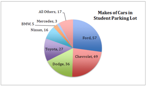
::2. 创建一个馅饼图表,以显示下表的数据:Makes of Student Cars in Parking Lot Ford 57 Chevrolet 49 Dodge 36 Toyota 27 Nissan 16 BMW 5 Mercedes 3 All Others 17 First total the number of cars in the entire population :
::总人口中汽车数量第一:Now find the degree measure of each sector using:
::现在找到每个部门使用的度量 :
::扇形 角度 = 样本x360 数据总频率中的数据-
Ford:
::福特: 角度= 57210x360} -
Chevrolet:
::切夫罗莱特: 角度=49210×36084 -
Dodge:
::道奇: 角度= 36210×36062 -
Toyota:
::丰田: 盎格勒= 27210×36046 -
Nissan:
::尼桑:安格尔=16210×36027 -
BMW:
::BMW: 角=5210x360}9 -
Mercedes:
::奔驰: 角度=3210×360}5 -
All Others:
::其他所有:Agle=1721036029
Verify that the total is :
::校对:98846246279529360Construct a circle with sectors representing each degree measure and label directly or create a key:
::构造一个圆, 包括代表每个度的区块, 以及直接的测量和标签或创建密钥 :Using Technology
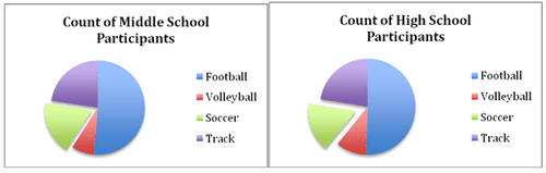
::使用技术Use a spreadsheet or compass and protractor to create two related pie charts of the data in the table below. If using a modern spreadsheet, create a 3-D graph. Highlight the data from the soccer participants in both graphs.
::使用电子表格或指南针和减号来创建下表数据的两个相关的派图。如果使用现代电子表格,请创建三维图表。在两个图表中突出显示足球参与者的数据。Sport Count of Middle School Participants Count of High School Participants Football 186 279 Volleyball 28 57 Soccer 66 92 Track 82 124 By now you are familiar with creating charts using a pencil and paper, so let’s walk through creating a chart in a modern spreadsheet.
::使用铅笔和纸纸来制作图表, 现在你们已经熟悉了, 所以让我们在现代电子表格中先绘制一张图表。If you do not have spreadsheet software on your computer, you can download the free ‘Open Office Calc’ spreadsheet software from from Open Office's website. The process described here is essentially the same in any modern spreadsheet software such as Open Office Calc, Microsoft Excel or Numbers.
::如果您的计算机上没有电子表格软件, 您可以从 Open Office Calc 网站上下载免费的“ Open Office Calc” 电子表格软件。 这里描述的过程基本上与 Open Office Calc、 Microsoft Excel 或 Numbers 等任何现代电子表格软件一样。First, highlight and copy the two columns of data under ‘Sport’ and ‘Count of Middle School Participants’ from the table in the question, include the column headers.
::首先,从问题表中突出和复制 " 体育 " 和 " 中学学员人数 " 两栏数据,包括栏页眉。Now open a blank spreadsheet in your software and paste the two columns of data.
::现在打开软件中的空白电子表格,并粘贴两列数据。Highlight the data in the spreadsheet (including the headers), and either choose ‘Charts : Pie’ from the toolbar or click the icon that looks like a bar graph and choose ‘Pie.’
::突出显示电子表格中的数据(包括页眉),或者从工具栏中选择“图表:派”或者单击看上去像条形图的图标并选择“派”。The data will be immediately converted to a pie chart for you! Now pick a 3-D style (since that is what was specified in the question), and press ‘enter’ to get a chart like the one below.
::数据将立即转换为用于您的馅饼图表 。 现在选择一个 3D 样式( 因为问题中指定了这个样式) , 按“ 输入” 键获取一个像下面那样的图表 。To highlight the soccer data, simply select the sector representing the soccer participants and drag it away from the center of the circle just slightly. Finally, select the entire chart in the spreadsheet and copy/paste it into your answer document or print it out to turn it in.
::为了突出显示足球数据,只需选择代表足球参与者的部门,然后将其从圆圈中心略微拖走。最后,在电子表格中选择整个图表,然后将其复制/粘贴到您的答复文档中,或者打印出来将其上交。To create the chart for the high school data, just copy the data from the single ‘Count of High School Participants’ category and paste it right overtop of the Middle School column in your spreadsheet and repeat the steps above to convert the revised table into a chart.
::为了创建高中数据的图表,只需复制单一的 " 高中入学人数 " 类别的数据,并在表格中将数据贴在中学生专栏的上方,并重复以上步骤,将订正表格转换成图表。The two final products should look something like these:
::两个最终产品应该像这些:Earlier Problem Revisited
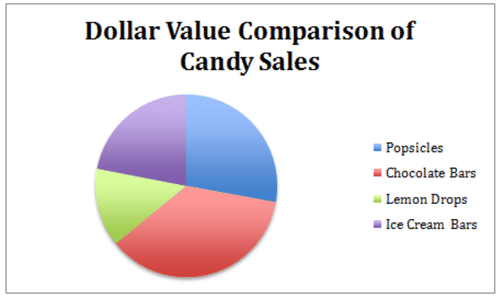
::重审先前的问题Create a pie chart that compares the income from each product for the cheerleading squad. Use the data in the table of candy sales.
::创建一个馅饼图表, 比较啦啦队队每件产品的收入。 使用糖果销售表中的数据 。In the example problems, the first step was to total the number of items sold. However, in this problem, we need to compare the dollar value of the items rather than just the number of items. That means we need to first evaluate the dollar value of each product sale, and then calculate the angle of each slice based on a comparison of the dollar value of each product with the total income from sales. Just to keep things neat, let’s add another column to the original table called “dollar value”, and another row at the bottom for the total.
::在例子问题中,第一步是总卖出物品的数量。 但是,在这个问题中,我们需要比较物品的美元价值,而不仅仅是物品的数量。 这意味着我们需要首先评估每次产品销售的美元价值,然后根据对每件产品美元价值与销售总收入的比较来计算每一切片的角。 为了保持整洁,让我们在原始表格中再增加一列“美元价值 ” , 而在底端再加一行“ 美元价值 ” 。Item # of Sales $ Value Popsicles $1 ea 850 $850.00 Chocolate Bars $0.85 ea 1300 $1,105.00 Bag of Lemon Drops $1.25 ea 340 $425.00 Ice Cream Bars $1 ea 670 $670.00 TOTAL 3160 $3,050.00 Now we can use the formula to calculate the angle of each slice:
::现在我们可以使用公式来计算每个切片的角度:-
Popsicles:
::冰球: 角=850美元 3 050x360100 -
Chocolate Bars:
::巧克力棒: 角= 1,105美元 3, 050x360130 -
Lemon Drops:
::柠檬水滴: 角度=425美元 3 050x36050 -
Ice Cream Bars:
::冰红条: 角=670美元 3 050x36079
Finally, we construct our circle and mark the divisions of the sectors based on the angles we have calculated, label the sectors, and label the graph.
::最后,我们根据我们计算的角度来构建我们的圆圈,并标出各部门的划分,标出各部门的标签,标出图表。Examples
::实例Example 1
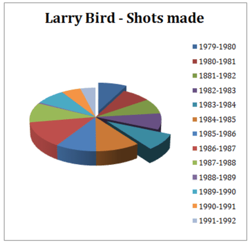
::例1Larry Bird was a well know basketball player. He played for the Boston Celtics. Use the following information to create a pie chart.
::Larry Bird是个很熟悉的篮球选手 他为波士顿凯尔特人队打球Season: # of Points Scored 1979-1980 1745 1980-1981 1741 1981-1982 1761 1982-1983 1867 1983-1984 1908 1984-1985 2295 1985-1986 2115 1986-1987 2076 1987-1988 2275 1988-1989 116 1989-1990 1820 1990-1991 1164 1991-1992 908 Example 2
::例2What percent of his career points came from the 1988 season?
::他的职业分数中有多少来自1988年季节?First we must find the total number of baskets Larry made in the portion of his career represented by the chart. The answer is 21,792. This number represents 100 percent of our chart. To find what percentage of those shots were made in 1988, we write an algebraic word problem that looks this:
::首先,我们必须找到拉里在其职业生涯中以图表为代表的那一部分的篮子总数。答案是21,792。这个数字代表了我们图表的100%。为了找到1988年拍摄的篮子中的百分比,我们写了一个代数字问题,它看起来是这样的:What percent of 21,792 is 2275? As an equation:
::21,792是2275,占21,792的几率是多少? 方程式:? ×21,792=2275}? =22752792}?=10.4%。Pecent of career shots made in 1988 is 10.4%
::1988年职业射击率为10.4%Example 3
::例3What percent of his career points came from the the 1980 season?
::1980年季节他的职业分数是多少?Calculate this the same way:
::以同样方式计算 : x\\\\\\\\\\\\\\\\\\\\\\\\\\\\\\\\\\\\\\\\\\\\\\\\\\\\\\\\\\\\\\\\\\\\\\\\\\\\\\\\\\\\\\\\\\\\\\\\\\\\\\\\\\\\\\\\\\\\\\\\\\\\\\\\\\\\\\\\\\\\\\\\\\\\\\\\\\\\\\\\\\\\\\\\\\\\\\\\\\\\\\\\\\\\\\\\\\\\\\\\\\\\\\\\\\\\\\\\\\\\\\\\\\\\\\\\\\\\\\Percent of shots made in his career in 1980 is 8%
::1980年他职业生涯中拍摄的镜头占8%Example 4
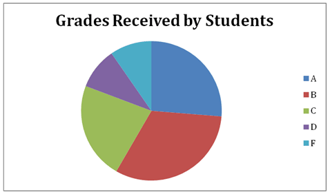
::例4The following table shows the grades achieved by 30 pupils in their end of year exam.
::下表显示30名学生在年终考试中达到的年级。Grade A B C D F Frequency 8 10 7 3 3
Based on the number of pupils, how many degrees of a circle graph are allotted per student? What percentage of the pie chart is allotted to "C" grades?
::根据学生人数,每个学生分到圆形图的几度?派图中有多少百分比分到“C”级?There are 31 total grades, 7 of which are “C’s”. To find percentage, just divide: , and then multiply by 100 to get percentage. “C” grades make up 22.5% of the chart .
::共有31个年级,其中7个是 " C " 级。 要想找到百分比,只需区分:731=225,然后乘以100以获得百分比。 " C " 级占图表的22.5%。Example 5
::例5Create a pie chart for the information from the previous example.
::为上一个示例的信息创建饼图 。Your pie chart should look something like the image below, with sectors measuring:
::你的馅饼图表应该像下面的图像一样, 部门测量 :-
Grade A:
Convert to degrees:
::A级:831=26=26% 转换为学位:26×36094 -
Grade B:
Convert to degrees:
::B级:1031=32=32% -
Grade C:
Convert to degrees:
::C级:731=225=23% -
Grade D:
Convert to degrees:
::D级:331=0.97=10% 转换为度:.097x360=35*____________________________________________________________________________________________________________________________________________________________________________________________________________________________________________________________________________________________________________________________________________________________________________________________________________________________________________________________________________________________________________________________________________________________________________________________________________________________________________________________________________________________________________________________________________________________________________________________________________________________________________________________________________________________________________________________________________________________________________________________________________________________________________________________________________________________________________________________________________________________________________________________________________________________________________________________________________________________________________________________________________________ -
Grade F:
Convert to degrees:
::F级:331=0.97=10% 转换为度:.097x360=35*____________________________________________________________________________________________________________________________________________________________________________________________________________________________________________________________________________________________________________________________________________________________________________________________________________________________________________________________________________________________________________________________________________________________________________________________________________________________________________________________________________________________________________________________________________________________________
Review
::回顾1. What is each part of a pie chart called?
::1. 馅饼图表的每个部分叫什么?2. What part of the circle represents the whole relationship?
::2. 圆圈的哪一部分代表整个关系?3. Based on the data in the table below, which candy sold the most, and which the least?
::3. 根据下表的数据,哪些糖果销售最多,哪些卖最少?Candy Bar Number sold at the school store Percentage of Total Sales Number of Degrees on a Pie Chart Heath 151 M&M 191 Snickers 61 Skittles 107 Almond Joy 91 4. Fill in the chart above with percentages of each candy type sold.
::4. 填写上图,列出销售的每类糖果的百分比。5. Fill in the chart with degrees of a circle required to represent this amount on a pie chart.
::5. 在图表中填写一个圆度,以在饼图上代表这一数额。6. Create a Pie Chart to represent this data.
::6. 创建用于显示此数据的 " 饼图 " 。7. Based on the data in the table below, which stock has the greatest potential for making money for the investor who owns the stock?
::7. 根据下表的数据,哪些股票最有可能为拥有股票的投资者赚钱?Company Shares Owned Percentage of Total Portfolio Number of Degrees on a Pie Chart Hostess 8 Pepsi 11 Dell 5 Conoco 7 Ford Motor 19 8. Fill in the chart with relative percentages of each type of stock.
::8. 填写图表,列出每一类库存的相对百分比。9. Fill in the chart with degrees of a circle required to represent this amount on a pie chart.
::9. 在图表中填写一个圆度,以在饼图上代表这一数额。10. Create a Pie Chart to represent this data.
::10. 创建用于显示此数据的《派图》。Use the data presented in questions 11-15 to create pie charts for each:
::利用在问题11-15中提供的数据,为每个问题绘制饼形图:11. Julie runs for one hour per day, reads for two and sleeps nine. She spends about two hours eating, at least one hour on the phone with friends. She hangs out with her family on average 4 hours a day, and spends at least five hours a day studying.
::11. Julie每天跑一个小时,读两个字,睡九个小时,她约吃两个小时,与朋友通电话至少一个小时,每天平均与家人在一起4小时,每天至少学习五个小时。12. Mrs. Garcia makes $1200.00 a month. She puts 10% in savings, spends 20% on her car payment and insurance, and another 20% on groceries. She likes clothes, so 10% of her income goes towards her wardrobe. Of her remaining money she spends 30% on her mortgage, and the remainder on miscellaneous expenses. Determine exactly how much Mrs. Garcia spends in each category. What percent of her income goes to miscellaneous expenses?
::12. Garcia夫人每月收入1200.00美元,她拿出10%的储蓄,20%的汽车付款和保险,另外20%的杂货,她喜欢衣服,所以10%的收入用于衣柜,其余的30%用于抵押贷款,其余用于杂项开支。确定Garcia夫人在每个类别支出的确切数额。她收入的多少用于杂项开支?13. Katie earned 500.00 doing odd jobs for people in her neighborhood. She spent of her money on the movies, she spent of her money going out with friends. She spent on clothes, and the remainder on books. How much money did Katie spend on movies? What percentage was spent on books?
::13. Katie挣了500.00美元,为附近的人做散装工作,她在电影上花费了116美元,与朋友一起花费了38美元,在衣服上花费了12美元,在书籍上花费了其余部分。Katie在电影上花费了多少钱?在书上花费了多少百分比?14. The state of Colorado receives 28 inches of precipitation a year. The winter is when it gets most of it, but it does not see it until it melts and runs off in the spring. However, inches are counted when they accumulate, and so they represent precipitation for Colorado based on a 4 season year. Colorado receives of its precipitation in the winter, in the spring and the rest in the summer and fall months.
::14. 科罗拉多州每年降水量为28英寸,冬季是大部分降水量的季节,但直到春季融化和消失才见,不过,在积聚时计数英寸,因此根据4个季节的降水量代表科罗拉多的降水量,科罗拉多州冬季降水量为35分,春季为310分,夏季和秋季为310分。15. Students were preparing to go on a field trip, and their teacher let them choose the destination. There were 36 students in the class. 44.4% choose the Nature Preserve, 25% chose an Art Gallery. Half as many students wanted to go to the Symphony as the Nature Preserve, and the rest wanted to go to the Museum of Nature and Science. How many more students were there that wanted to go to the Nature Preserve than wanted to go to the Museum of Nature and Science?
::15. 学生准备参加实地考察,教师让他们选择目的地,班级有36名学生,44.4%选择自然保护区,25%选择美术馆,有一半学生想参加交响乐团,而其余学生想参加自然保护区,其余学生想参加自然和科学博物馆,有多少学生想参加自然保护区,而不是想参加自然和科学博物馆?Review (Answers)
::回顾(答复)Click to see the answer key or go to the Table of Contents and click on the Answer Key under the 'Other Versions' option.
::单击可查看答题键, 或转到目录中, 单击“ 其他版本” 选项下的答题键 。 -
1997: