11.7 直线图
章节大纲
-
For Jose's economics class he wants make a graph that illustrates the number of persons employed in the U.S. who were 16 years and older in 2011. He has organized his data into the following table.
::说明2011年美国16岁及16岁以上就业人数, 他将数据整理为下表。Jose's Data Month Num. of People Jan 153250 Feb 153302 Mar 153392 Apr 153420 May 153700 Jun 153409 Jul 153358 Aug 153674 Sep 154004 Oct 154057 Nov 153937 Dec 153887 How can Jose make a graph to illustrate the data over time?
::Jose如何绘制图表来说明一段时间内的数据?In this concept, you will learn how to create and read line graphs.
::在此概念中,您将学会如何创建和阅读行图 。Creating and Reading Line Graphs
::创建和阅读行图Data is a set of numerical or non-numerical information. Data can be analyzed in many different ways. In this concept you will analyze numerical data using line graphs.
::数据是一组数字信息或非数字信息。数据可以多种不同方式分析。在此概念下,您将使用行图分析数字数据。One way to display data is in a line graph. A line graph shows the relationship between independent and dependent values of data, and are usually used to show trends over time. In the graph each data value is represented by a point in the graph that are connected by a line. The independent variable is listed along the horizontal, or x , axis and the quantity or value of the data is listed along the vertical, or y , axis.
::显示数据的一种方法是在线条图中。线条图显示数据独立值和依附值之间的关系,通常用于显示时间变化趋势。在图中,每个数据值用图表中与线条相连的点表示。独立的变量按水平或x、轴排列,数据的数量或值按垂直或y轴排列。Let's look at an example.
::让我们举个例子。Kelsey works at an arboretum and tracks tree growth over time. Kelsey collected the growth data of one tree over five years and organized her data into the table below. Create a line graph that represents the data over time. Then state two conclusions about the data.
::Kelsey在阿博雷顿工作,跟踪树木的生长时间。Kelsey在五年内收集了一棵树的生长数据,并将她的数据整理成下表。创建一条代表长期数据的线条图。然后对数据提出两个结论。Year Size of Tree (in feet) 2003 2 2004 2.5 2005 3.5 2006 8.5 2007 14 First, create the line graph. To do this, draw the horizontal ( x ) and vertical ( y ) axes.
::首先,创建行图。要做到这一点,请绘制水平(x)和垂直轴。
Next, label the vertical axis. The vertical axis lists the dependent variable and represents the quantity of the data. In this case, the dependent variable is feet and the label will also be "feet."
::下一步,标签垂直轴。垂直轴列出从属性变量,并代表数据的数量。在这种情况下,从属性变量是脚,标签也将是“feet”。Next, title the graph. The title of the graph should be short and clear. It should explain what data is presented in the graph. In this case, the title will be “Tree Growth.”
::下个标题是图表。 图表的标题应该简短清晰。 它应该解释图表中显示的数据。 在这种情况下, 标题将是“ 树增长 ” 。Then, determine the units on the vertical axis. To do this, start by reviewing the smallest and largest values in the table. The smallest value is 2 and the largest is 14. Based on these values label the vertical axis from 0-16. Since the values are whole numbers and are relatively spread out, a unit of 2 can be used. Therefore, the vertical axis will start at 0 and go to 16 by increments of 2.
::然后确定垂直轴上的单位。 为此, 首先从审查表中最小和最大的值开始。 最小值为 2, 最大值为 14 。 根据这些值标出 0-16 的垂直轴。 由于这些值是整数, 并且相对分布, 因此可以使用 2 的单位。 因此, 垂直轴将从 0 开始, 以 2 递增为 16 。Next, draw the data points. To do this, write the years along the horizontal axis, leaving space between each. Each year will have one point representing the height of the tree. To start, draw a point for the the height in 2003. To do this find 2003 on the horizontal axis and go up until 2, then draw a point. Then draw the point for the height in 2004. Continue drawing the points for all the years.
::绘制数据点 。 要做到这一点, 请沿着水平轴写上年数, 间隔为每年。 每年将有一个点代表树的高度 。 要开始, 请为2003 年的高度绘制一个点 。 要在水平轴上找到 2003 点, 然后到 2 点 。 然后绘制一个点 。 然后绘制2004 年的高度 点 。 继续绘制所有年份的点 。Next, draw the line. To do this, start with the point on the far left of the graph and connect the points with one line from 2003 to 2007.
::接下来,绘制线条。要做到这一点,从图的远左点开始,用2003年至2007年的一条线连接点。Then, state two conclusions from the graph. To do this, analyze the graph by comparing the steepness of the line between each point.
::然后,请从图表中列出两个结论。要做到这一点,请通过比较每一点之间的直线的陡度来分析图表。The first answer is the graph should look like the one below. The second answer is two conclusions that can be made from the graph are: the greatest amount of growth occurred between 2006 and 2007 and from 2005 to 2006 the tree's height more than doubled.
::第一个答案是图表应该看起来像下面的图。第二个答案是可以从图中得出的两个结论:2006至2007年和2005至2006年,树的高度增长翻了一番以上,增长幅度最大。Examples
::实例Example 1
::例1Earlier, you were given a problem about Jose and his economics class.
::早些时候,你被问及何塞和他的经济学课的问题。Jose needs to create a graph that illustrates the number of people employed in the U.S. who were 16 years or older in 2011. Jose's data is presented in the table below.
::Jose需要建立一个图表,说明2011年美国16岁或16岁以上就业人数,Jose的数据见下表。Jose's Data Month Num. of People Jan 153250 Feb 153302 Mar 153392 Apr 153420 May 153700 Jun 153409 Jul 153358 Aug 153674 Sep 154004 Oct 154057 Nov 153937 Dec 153887 First, draw the horizontal and vertical "> axes.
::首先,绘制水平(x)和垂直Next, label the horizontal axis. The horizontal axis lists the independent variable. In this case, the independent variable is the month and the axis will be labeled "Month."
::下一步,标签水平轴。水平轴列出独立的变量。在此情况下,独立的变量是月份,轴将被标记为“月”。Next, label the vertical axis. The vertical axis lists the dependent variable and represents the quantity of the data. In this case, the dependent variable is the number of persons employed and the label will be "Number of Persons."
::下一步,标签垂直轴。垂直轴列出从属变量,并代表数据的数量。在这种情况下,从属变量是受雇人数,标签是“人数”。Next, title the graph. The title of the graph should be short and clear. It should explain what data is presented in the graph. In this case, the title will be “Number of Persons Employed in the U.S. Aged 16+ Years in 2011.”
::接下来是图表的标题。图表的标题应该简短清晰。 它应该解释图表中显示的数据。 在这种情况下, 标题将是“ 2011年美国16岁及16岁以上就业人数 ” 。Then, determine the units on the vertical axis. To do this, start by reviewing the smallest and largest values in the table. The smallest value is 153250 and the largest is 154057. Based on these values label the vertical axis from 153000 to 154250. Since the values are whole numbers and are relatively close, a unit of 250 can be used. Therefore, the vertical axis will start at 153000 and go to 154250 by increments of 250.
::然后,确定垂直轴上的单位。 为此, 首先审查表中最小和最大的值。 最小值为 153250, 最大值为 154057。 根据这些值, 垂直轴标签为 153,000 至 154250。 由于这些值是整数, 并且相对接近, 因此可以使用 250 的单位。 因此, 垂直轴将从 153,000 开始, 以 250 递增为 154250 。Next, draw the data points. To do this, write the months along the horizontal axis, leaving space between each. Each month will have one point representing the number of people employed. To start, draw a point for the number of people employed in January. To do this find January on the horizontal axis and go up until 153250, then draw a point. Next, draw the point for the people employed in February. Continue this pattern for all months.
::下一步, 绘制数据点 。 要做到这一点, 请沿着水平轴写几个月, 间隔每个月。 每个月将有一个点代表受雇人数 。 要开始, 请为1月份的受雇人数绘制一个点 。 要在水平轴上找到 1 月, 然后到 153250, 然后绘制一个点 。 下一步, 为2月份的受雇人绘制一个点 。 继续这个模式, 持续数月 。Next, draw the line. To do this, start with the point on the far left of the graph and connect the points with one line from January to December.
::下一步绘制线条。要做到这一点,首先从图的远左点开始,然后从1月至12月用一条线连接点。The graph should look like the one below.
::图表应该跟下面的图一样Example 2
::例2The line graph below shows the temperature over seven days in July in Missouri. List two conclusions that can be made from the graph.
::下面的线图显示了密苏里7月7天的温度,列出可以从图中得出的两个结论。First, analyze the graph by comparing the shape of the line between the points.
::首先,通过比较点之间的线条形状来分析图表。The answer is two conclusions can be made from the graph: three dates, July 20-22, all had the same temperature of 86 degrees and the temperature is rising from July 22 to July 24.
::答案是从图中得出两个结论:三个日期,7月20日至22日,所有日期的温度均为86度,从7月22日至7月24日温度都在上升。Example 3
::例3The population for the city of Los Angeles is organized in the table below. Create a line graph to that represents the population change over time. Then state one conclusion about the data.
::洛杉矶市的人口组织如下表所示。创建一个直线图,显示人口随时间变化。然后对数据做出一个结论。Year: Approximate Population (in millions): 1950 2 1960 2.5 1970 2.8 1980 3 1990 3.5 2000 3.7 First, make the line graph. To do this, draw the horizontal and vertical "> axes.
::首先,绘制线形图。要做到这一点,请绘制水平轴(x)和垂直轴Next, label the horizontal axis. The horizontal axis lists the independent variable. In this case, the independent variable is the year and the axis will be labeled "Year."
::下一步,标签水平轴。水平轴列出独立的变量。在此情况下,独立的变量是年份,轴将被标记为“年份”。Next, label the vertical axis. The vertical axis lists the dependent variable and represents the quantity of the data. In this case, the dependent variable is the population and the label will be "Population (in millions)."
::接下来,标签垂直轴。 垂直轴列出从属变量, 并代表数据的数量。 在此情况下, 依属变量是人口, 标签是“ 人口( 以百万计) ” 。Next, title the graph. The title of the graph should be short and clear. It should explain what data is presented in the graph. In this case, the title will be “Population of Los Angeles (in millions).”
::接下来的标题是图表。图表的标题应该简短明了。它应该解释图表中显示的数据。在这种情况下,标题将是“洛杉矶人口(以百万计 ) ” 。Then, determine the units on the vertical axis. To do this, start by reviewing the smallest and largest values in the table. The smallest value is 2 and the largest is 3.7. Based on these values label the vertical axis from 0-4. Since the values include decimals and are relatively close, a unit of 0.5 can be used. Therefore, the vertical axis will start at 0 and go to 4 by increments of 0.5.
::然后,确定垂直轴上的单位。要做到这一点,首先审查表中最小和最大的值。最小值为2,最大值为3.7。根据这些值,将垂直轴标为 0-4。由于这些值包括小数,并且相对接近,因此可以使用0.5 的单位。因此,垂直轴将从0 开始,以0.5 递增为4。Next, draw the data points. To do this, write the years along the horizontal axis, leaving space between each. Each year will have one point representing the population. To start, draw a point for the the population in 1950. To do this find 1950 on the horizontal axis and go up until 2, then draw a point. Next, draw the point for the population in 1960. Continue this pattern for all the years.
::绘制数据点 。 要做到这一点, 请沿着水平轴写出年数, 每段间间距。 每年将有一个代表人口点 。 要开始, 请为1950年的人口绘制一个点 。 要在水平轴上找到 1950 , 然后到 2 点, 然后绘制一个点 。 下一步, 绘制1960 年的人口点 。 继续这个模式 。Next, draw the line. To do this, start with the point on the far left of the graph and connect the points with one line from 1950 to 2000.
::接下来,绘制线条。要做到这一点,首先从图的远左点开始,然后从1950年至2000年将点与一条线连接起来。Then, state one conclusion from the graph. To do this, analyze the graph by comparing the steepness of the line between the points.
::然后,从图表中列出一个结论。要做到这一点,通过比较两点之间的直线的陡度来分析图表。The first answer is the graph should look like the one below. The second answer is one conclusion that can be made from the graph is: the population of Los Angeles has increased from the years 1950 to 2000 and it is estimated that it will continue to increase for the future.
::第一个答案是图表应该看起来像下面的图表。第二个答案是从图表中得出一个结论:洛杉矶的人口从1950年到2000年有所增加,估计今后还会继续增加。Example 4
::例4The Electronic Energies Alliance recorded the average cost of one gallon of gasoline in the United States for the years 2000-2007. The graph below represents their data. List three statements about the data.
::电子能源联盟记录了2000-2007年美国一加仑汽油的平均成本,下图是其数据,列出了关于数据的三个说明。First, analyze the graph by comparing the shape of the line.
::首先,通过比较线条的形状来分析图表。The answer is three statements can be made about the graph: there was a drop in the price of gas from 2000 to 2001 and again from 2006 to 2007, the price of gas increased from the years 2001 to 2006, and the price of gas increased the most from 2005 to 2006.
::答案是该图的三种说法:2000年至2001年天然气价格下降,2006年至2007年再次下降,2001年至2006年天然气价格上升,2005年至2006年天然气价格上升幅度最大。Example 5
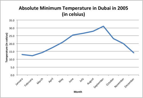
::例5The graph below illustrates the absolute minimum temperature in Dubai in 2005 in celsius. List two statements that can be made about the data.
::下图以celcius表示2005年迪拜的绝对最低温度,列出关于数据的两个说明。First, analyze the graph by comparing the shape of the line.
::首先,通过比较线条的形状来分析图表。The answer is two statements can be made about the graph: the greatest minimum temperature occurred in September and was approximately 31 degrees celsius, and the absolute minimum temperatures increased from the months of February to September.
::答案是对图作两个说明:9月份的最低温度最高,约为31摄氏度,2月至9月份,绝对最低温度上升。Review
::回顾Use this line graph to answer the following questions.
::使用此行图回答下列问题 。The vertical axis shows the number of vegetables harvested each year. This is recorded as vegetable growth. The horizontal axis shows the years vegetable growth was recorded.
::垂直轴显示每年收获的蔬菜数量,记录为蔬菜增长,横向轴显示蔬菜增长年数。-
How many vegetables were harvested in 2005?
::2005年收获了多少种蔬菜? -
How many vegetables were harvested in 2006?
::2006年收获了多少种蔬菜? -
What is the difference in growth from 2005 to 2006?
::2005年至2006年的增长有何差别? -
How many vegetables were harvested in 2007?
::2007年收获了多少种蔬菜? -
What is the difference in vegetable growth from 2006 to 2007?
::2006至2007年蔬菜增长有何差别? -
What is the vegetable growth in 2008?
::2008年蔬菜增长情况如何? -
What is the difference in vegetable growth from 2005 to 2008?
::2005年至2008年蔬菜增长有何差别? -
If the vegetable growth follows the same pattern from 2008 to 2011, what will the new total be?
::如果2008年至2011年蔬菜增长遵循同样的模式,那么新的植物种植总量将是什么? -
If there is a loss of 50 vegetables from 2008 to 2009, what will the new total be?
::如果2008年至2009年损失了50种蔬菜,新的总数会是多少? -
If there is a gain of 100 vegetables from 2008 to 2009, what will the new total be?
::如果从2008年至2009年增加100种蔬菜,新增加的蔬菜总数会是多少? -
If there is a loss of 50% from 2008 to 2009, what will the new total be?
::如果2008年至2009年损失50%,新的总数会是多少? -
True or false. A bar graph shows the same data as a line graph?
::线条图显示与线条图相同的数据? -
True or false. A line graph must show how data changes over time.
::线性图表必须显示数据随时间变化的方式。 -
Use a newspaper to find two line graphs. The business section is a good place to start. Examine the data and explain what the line graph represents to a friend.
::使用报纸查找两个线条图。 商业部分是一个良好的起点。 检查数据并解释线条图对朋友的表示 。
Review (Answers)
::回顾(答复)Click to see the answer key or go to the Table of Contents and click on the Answer Key under the 'Other Versions' option.
::单击可查看答题键, 或转到目录中, 单击“ 其他版本” 选项下的答题键 。Resources
::资源 -
How many vegetables were harvested in 2005?