11.8 多直线图
Section outline
-
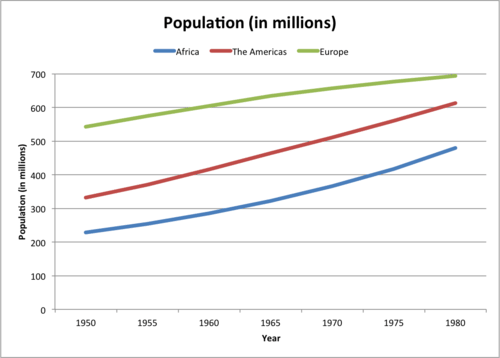
Aaron is giving a presentation on population growth in his history class. He has organized the population (in millions) of different continents. He wants to create a graph that illustrates the data in the table below.
::Aaron正在介绍他历史课的人口增长情况。 他组织了不同大陆的人口( 以百万计) 。 他想创建一个图表来说明下表的数据 。Population (in millions) (Sub)continent 1950 1955 1960 1965 1970 1975 1980 Africa 228 254 285 322 366 417 479 The Americas 331 370 416 464 511 561 613 Europe 543 574 605 634 657 677 694 How can Aaron make a graph?
::亚伦怎么能做一个图表?In this concept, you will learn how to create and read multiple line graphs.
::在此概念中,您将学会如何创建和阅读多行图表。Creating and Reading Multiple Line Graphs
::创建和阅读多行图Data is a set of numerical or non-numerical information. Data can be analyzed in many different ways. In this concept you will analyze numerical data using line graphs.
::数据是一组数字信息或非数字信息。数据可以多种不同方式分析。在此概念下,您将使用行图分析数字数据。One way to display data is in a multiple line graph. A multiple line graph shows the relationship between independent and dependent values of multiple sets of data. Usually multiple line graphs are used to show trends over time. In the graph, each data value is represented by a point in the graph that are connected by a line. In a multiple line graph, there are two or more lines in the graph connecting two or more sets of data points. The independent variable is listed along the horizontal, or x , axis and the quantity or value of the data is listed along the vertical, or y , axis. Lastly, the legend, or key, states what each line represents.
::显示数据的一种方式是多行图。多行图显示多组数据的独立值和依赖值之间的关系。通常使用多行图来显示时间趋势。在图形中,每个数据值由图表中的一个点表示,该点由一行连接。在多行图中,在图形中有两个或两个以上线连接两个或两个以上数据集。独立变量按水平或x、轴排列,数据的数量或值按垂直或y、轴排列。最后,图例或关键表示每一行代表什么。Let's look at an example.
::让我们举个例子。Full-time and part-time enrollment at California State University for fives years is recorded in the data table below. Create a multiple line graph to represent the information in the table. Then discuss the data presented in the graph.
::加利福尼亚州立大学五年的全日制和非全时入学率记录在以下数据表中。创建多行图表以显示表中的信息。然后讨论图表中的数据。Year: Number of Students Attending Full-Time: Number of Students Attending Part-Time: 2003 10,000 2,000 2004 9,500 2,100 2005 11,100 2,050 2006 12,000 2,700 2007 13,300 2,550 First, draw the horizontal and vertical "> axis.
::首先,绘制水平(x)和垂直轴。
Label the horizontal axis, it will represent the independent variable. In this example, the independent variable is the "Year".
::水平轴标签将代表独立的变量。在此示例中,独立的变量是“年份”。Next, label the vertical axis. The vertical axis lists the dependent variable and represents the quantity of the data. In this case, the dependent variable is number of students and the label will also be "Number of Students."
::下一步,标签垂直轴。垂直轴列出依附变量,并代表数据的数量。在此情况下,依附变量是学生人数,标签也将是“学生人数”。Next, title the graph. The title of the graph should be short and clear. It should explain what data is presented in the graph. In this case, the title will be “Enrollment at California State University.”
::接下来的标题是图表。图表的标题应该简短明了。它应该解释图表中显示的数据。在这种情况下,标题将是“加利福尼亚州立大学入学 ” 。Then, determine the units on the vertical axis. To do this, start by reviewing the smallest and largest values in the table. The smallest value is 2,000 and the largest is 13,300. Based on these values label the vertical axis from 0-14,000. Since the values are whole numbers and are relatively spread out, a unit of 1,000 can be used. Therefore, the vertical axis will start at 0 and go to 14,000 by increments of 1,000.
::然后,确定垂直轴上的单位。 为此, 首先从审查表中最小和最大的值开始。 最小值为2,000, 最大值为13,300。 根据这些值, 垂直轴标签为 0- 14000 。 由于这些值是整数, 并且相对分布, 因此可以使用1,000 的单位。 因此, 垂直轴将从 0 开始, 以 1,000 递增为 14,000 。Next, draw the data points. To do this, write the years along the horizontal axis, leaving space between each. Each year will have two points representing the number of students enrolled part-time and full-time. To start, draw a point for the part-time students in 2003. To do this find 2003 on the horizontal axis and go up until 2,000, then draw a point. Then draw the point for the full-time students. To do this find 2003 on the horizontal axis and go up until 10,000, then draw the point. Continue drawing the points for both part and full time students for all years.
::接下来, 绘制数据点 。 要做到这一点, 请沿着水平轴写上年数, 间隔时间间隔为每年。 每年将有两个点, 代表非全日制和全日制注册学生的数量。 要开始, 请为2003年的非全日制学生绘制一个点 。 要在水平轴上找到2003年的点, 然后到2000年, 然后绘制一个点 。 然后绘制全日制学生的点 。 要在水平轴上找到2003年的点, 然后到10000, 然后绘制点 。 继续为各个年的兼职和全日制学生绘制点 。Next, draw the lines. To do this, start with the point on the far left of the graph that represents part-time students in 2003, then connect the points with one line from 2003 to 2007. To draw the second line, start with the point on the far left of the graph that represents full-time students in 2003, then connect the points with one line from 2003 to 2007. There should be two different lines, each representing a different group of students (part and full time).
::要做到这一点,请先从2003年兼职学生图的远左端点开始,然后将2003年至2007年各点与一行连接起来。要绘制第二行,从2003年全时学生图的远左点开始,然后将2003年至2007年各点与一行连接起来。Next, create the legend, or key. Each line represents a different student group. The legend represents this by denoting which colored line is for part-time students and full-time students.
::接下来,创建传说或密钥。 每行代表不同的学生群体。 传说通过标明哪条彩色线代表非全日制学生和全日制学生。Then, discuss the graph. To do this, analyze the graph by comparing lines and their respective steepness.
::然后讨论图表。要做到这一点,通过比较线条和各自的陡度来分析图表。The first answer is the graph should look like the one below. The second answer is the discussion of the graph is: the number of full-time students enrolled increased by 3,300 students from 2003 to 2007, while full-time enrollment declined between 2003 and 2004, and then increased every other year; the number of part-time students enrolled increased by 550 students from 2003 to 2007; and the increase in full-time enrollment was greater than the increase in part-time enrollment.
::第一个答案是图表应该像下图那样。第二个答案是图表的论述:2003年至2007年全时注册学生人数增加了3,300人,而2003年至2004年全时注册学生人数下降,然后每隔一年增加一次;2003年至2007年非全日注册学生人数增加了550人;全日注册学生人数增加了超过非全日注册学生人数的增加。Examples
::实例Example 1
::例1Earlier, you were given a problem about Aaron and his history presentation.
::早些时候,你得到一个问题 亚伦和他的历史介绍。Aaron collected data on the population (in millions) of three countries into the table below. He wants to create a graph to display the data that can be included in his presentation.
::Aaron收集了三个国家人口(以百万计)的数据,将其放入下面的表格。 他想创建一个图表, 以显示可以包含在他的演示文稿中的数据 。Population (in millions) (Sub)continent 1950 1955 1960 1965 1970 1975 1980 Africa 228 254 285 322 366 417 479 The Americas 331 370 416 464 511 561 613 Europe 543 574 605 634 657 677 694 How can Aaron make a graph?
::亚伦怎么能做一个图表?First, Aaron must look at his data and determine the best graph to make to represent his data. Since Aaron has multiple countries and multiple data points for each country over time, a multiple line graph is the best way to represent his data.
::首先,亚伦必须查看他的数据,并确定能代表他的数据的最佳图表。 由于亚伦拥有多个国家和每个国家的多个数据点,多行图表是代表他的数据的最佳方法。Then, to make the multiple line graph, he must first draw the horizontal and vertical "> axes.
::然后,要绘制多行图,他必须首先绘制水平(x)和垂直Next, he must label the horizontal axis. The horizontal axis states the independent variable. In this case, the independent variable is the year and the axis will be labeled "Year."
::下一步, 他必须标出水平轴。 水平轴表示独立的变量。 在此情况下, 独立的变量是年份, 而轴将被标为“ 年份 ” 。Next, he must label the vertical axis. The vertical axis lists the dependent variable and represents the quantity of the data. In this case, the dependent variable is population (in millions) and the label will also be "Population (in millions)."
::其次,他必须标注垂直轴。 垂直轴列出依赖变量, 并代表数据的数量。 在此情况下, 依赖变量是人口( 以百万计) , 标签也将是“ 人口( 以百万计) ” 。Next, he must title the graph. The title of the graph should be short and clear. It should explain what data is presented in the graph. In this case, the title will be “Population (in millions).”
::其次,他必须给图表命名。 图表的标题应该简短明了。 它应该解释图表中显示的数据。 在这种情况下,标题将是“ 人口( 以百万计 ) ” 。Then, he must determine the units on the vertical axis. To do this, start by reviewing the smallest and largest values in the table. The smallest value is 228 and the largest is 694. Based on these values label the vertical axis from 0-700. Since the values are whole numbers and are relatively spread out, a unit of 100 can be used. Therefore, the vertical axis will start at 0 and go to 700 by increments of 100.
::然后,他必须确定垂直轴上的单位。 为此, 首先从审查表中最小和最大的值开始。 最小值为 228, 最大值为 694。 根据这些值, 从 0- 700 将垂直轴标为 0- 700 。 由于这些值是整数, 并且相对分布, 因此可以使用100 的单位。 因此, 垂直轴将从 0 开始, 以100 递增为 700 。Next, he must draw the data points. To do this, write the years along the horizontal axis, leaving space between each. Each year will have three points representing the population of the three continents. To start, draw a point for Africa. To do this find 1950 on the horizontal axis and go up to 228, then draw a point. Then draw the point for The Americas. To do this find 1950 on the horizontal axis and go up to 331, then draw the point. Then draw the point for Europe. To do this find 1950 on the horizontal axis and go up to 543, then draw the point. Continue drawing the points for all countries for the remaining years.
::接下来, 他必须绘制数据点 。 要做到这一点, 请沿着水平轴写上年数, 间隔间隔每一年。 每年将有三个代表三大洲人口的点 。 首先, 绘制一个非洲点 。 要在水平轴上找到 1950, 然后向上到 228, 然后绘制一个点 。 然后绘制美洲的点 。 要在水平轴上找到 1950, 然后向上到 331, 然后绘制点 。 然后绘制欧洲的点 。 要在水平轴上找到 1950, 然后向上到 543, 然后绘制点 。 继续为所有国家绘制剩余几年的点 。Next, he must draw the lines. To do this, start with the point on the far left of the graph that represents Africa, then connect the points with one line. To draw the second line, start with the point on the far left of the graph that represents The Americas, then connect the points with one line in a different color. To draw the third line, start with the point on the far left of the graph that represents Europe, then connect the points with one line in a different color. There should be three different lines, each representing a different country.
::接下来, 他必须绘制行。 要做到这一点, 首先从代表非洲的图的远左端点开始, 然后用一条线连接点。 要绘制第二条线, 从代表美洲的图的远左点开始, 然后用不同颜色将点与一条线连接。 要绘制第三条线, 从代表欧洲的图的远左点开始, 然后用不同颜色将点与一条线连接。 要绘制第二条线, 需要有三个不同的线, 每个线代表不同的国家 。Next, he must create the legend, or key. Since each line represents a different country, the legend will state which colors represent Africa, The Americas, and Europe.
::接下来,他必须创造传说,或者说关键。 因为每条线代表不同的国家, 传说将说明非洲、美洲和欧洲的颜色。The graph below represents Aaron's data.
::下图显示Aaron的数据。Example 2
::例2The graph below shows the absolute minimum and maximum temperatures in Celsius in Dubai for 2005. State three conclusions about the data.
::下图显示了2005年迪拜摄氏度的绝对最低温和最高温。The answer is three conclusions that can be made from the graph are: the minimum and maximum temperatures do not rise and fall with each other over the course of the year; the greatest minimum temperature occurred in September, whereas the greatest maximum temperature occurred in August; and the lowest maximum and minimum temperatures both occurred in January.
::从图中可以得出以下三个结论:一年中,最低和最高温度不会相互上升和下降;最起码的温度发生在9月份,最高温度发生在8月份;最低和最低的温度都发生在1月份。Example 3
::例3The number of people employed in the U.S. aged 16 years and over for the yeas 2010 and 2011 is represented in the table below. Create a multiple line graph to illustrate the data.
::2010年和2011年在美国就业的16岁及16岁以上人口数量见下表。创建多行图以说明数据。Month 2010 2011 Jan 153454 153250 Feb 153704 153302 Mar 153964 153392 Apr 154528 153420 May 154216 153700 Jun 153653 153409 Jul 153748 153358 Aug 154073 153674 Sep 153918 154004 Oct 153709 154057 Nov 154041 153937 Dec 153613 153887 First, draw the horizontal and vertical "> axes.
::首先,绘制水平(x)和垂直Next, label the vertical axis. The vertical axis lists the dependent variable and represents the quantity of the data. In this case, the dependent variable is number of people and the label will also be "Number of People."
::下一步,标签垂直轴。垂直轴列出依赖变量,并代表数据的数量。在此情况下,依赖变量是人数,标签也将是“人数”。Next, title the graph. The title of the graph should be short and clear. It should explain what data is presented in the graph. In this case, the title will be “Number of People Employed in the U.S. Aged 16+ Years.”
::接下来的标题是图表。图表的标题应该简短明了。它应该解释图表中显示的数据。在这种情况下,标题将是“美国16岁以上就业人数 ” 。Then, determine the units on the vertical axis. To do this, start by reviewing the smallest and largest values in the table. The smallest value is 153,250 and the largest is 154,528. Based on these values label the vertical axis from 152,500-15,500. Since the values are whole numbers and are relatively close, a unit of 500 can be used. Therefore, the vertical axis will start at 152,500 and go to 155,000 by increments of 500.
::然后确定垂直轴上的单位。 为此, 首先审查表中最小和最大的值。 最小值为 153, 250, 最大值为 154, 528。 根据这些值, 垂直轴标签为 152, 500-15, 500 。 由于这些值是整数, 并且相对接近, 因此可以使用500 的单位。 因此, 垂直轴将从 152, 500 开始, 以500 的递增率增加到 155, 000 。Next, draw the data points. To do this, write the months along the horizontal axis, leaving space between each. Each month will have two points representing the number of people employed in 2010 and 2011. To start, draw a point for the year 2010. To do this find January on the horizontal axis and go up until 153,454, then draw a point. Then draw the point for the 2011. To do this find January on the horizontal axis and go up until 153,250, then draw the point. Continue drawing the points for both years for all months.
::接下来, 绘制数据点。 为此, 请沿着水平轴写几个月, 间隔每个月。 每个月将有两个点, 代表2010年和2011年就业人数。 开始, 为2010年绘制一个点 。 要在水平轴上找到 1月, 并一直到 153, 454, 然后绘制一个点 。 然后绘制一个点 : 2011 年的点 。 要在水平轴上找到 1月, 并一直到 153, 250, 然后绘制点 。 继续绘制所有月份的两年的点 。Next, draw the lines. To do this, start with the point on the far left of the graph that represents 2010, then connect the points with one line. To draw the second line, start with the point on the far left of the graph that represents 2011, then connect the points with one line in a different color. There should be two different lines, each representing a different year.
::接下来,绘制行。要做到这一点,首先从2010年图的远左点开始,然后用一条线连接点。要绘制第二条线,首先从2011年图的远左点开始,然后用不同颜色将点与一条线连接。应该有两个不同的线,每个线代表不同的年份。Next, create the legend, or key. Since each line represents a different year, the legend will state which colors represent 2010 and 2011.
::接下来,创建传说, 或者关键。 因为每行代表不同的年份, 传说将显示2010 和 2011 的颜色 。The answer is the graph should look like the one below.
::答案是图表应该看起来像下面的图。Example 4
::例4The graph below shows the population in thousands for Aruba and Seychelles. List three statements about the data.
::下图显示阿鲁巴和塞舌尔以千计的人口,并列出有关数据的三个说明。The answer is three statements that can be made from the graph are: from years 2000 to 2006 Aruba's population was less than the Seychelles; Aruba saw a substantial increase in it's population in 2006; Aruba saw a steady increase from the years 2007 to 2011.
::从图中可以得出以下三种说法:从2000年至2006年,阿鲁巴的人口少于塞舌尔;阿鲁巴2006年人口大幅增加;阿鲁巴2007年至2011年稳步增长。Example 5
::例5The graph below shows the number of students enrolled in college whose major is business for the years 2001 to 2007. List three statements about the data.
::下图显示了2001年至2007年主要从事商业的大学注册学生人数。First, analyze the graph by comparing the shape of the line.
::首先,通过比较线条的形状来分析图表。The answer is three statements that can be made from the graph are: there was a drop in the number of business majors in Qatar and Bahrain in 2005; Oman has seen a reduction in the number of business majors from years 2003 to 2007; and the number of business majors in Bahrain has seen the greatest amount of fluctuation in enrollment.
::从图中可以得出以下三种说法:2005年卡塔尔和巴林的主要企业数量下降;2003年至2007年,阿曼的主要企业数量减少;巴林的主要企业数量波动最大。Review
::回顾The table below shows the number of tickets sold at the Phoenix Zoo and the Seattle Zoo since 1998.
::下表显示自1998年以来在凤凰动物园和西雅图动物园出售的机票数目。-
Create a multiple line graph using the data from the table.
::使用表格中的数据创建多行图形。
Year: Number of Tickets Sold at Phoenix Zoo: Number of Tickets Sold at Seattle Zoo: 1998 547,000 601,000 1999 562,000 602,500 2000 569,000 603,700 2001 566,000 605,000 2002 569,000 604,000 2003 572,000 605,100 2004 576,000 606,000 2005 575,500 605,800 2006 579,000 607,000 2007 580,000 608,000 -
Which zoo sold more tickets in 2003?
::哪个动物园在2003年卖了更多的票? -
Which zoo sold more tickets in 2005?
::2005年哪个动物园卖出更多票? -
Which was the best year for sales at the Phoenix zoo?
::在凤凰动物园销售的最好的年份是哪一年? -
Which was the best year for sales at the Seattle zoo?
::西雅图动物园哪一年销售最好的一年? -
Based on this information, can we say which zoo is more popular? Why?
::根据这些信息,我们可以说哪个动物园更受欢迎吗? -
Based on this data, will sales increase or decrease in 2008 at the Phoenix zoo?
::根据这些数据,2008年凤凰动物园的销售额会增减吗? -
Based on this data, will sales increase or decrease in 2008 at the Seattle zoo?
::根据这些数据,2008年西雅图动物园的销售额会增减吗? -
What is the difference in the quantity of tickets in 2005?
::2005年的机票数量有何不同? -
What is the difference in the quantity of tickets in 2000?
::2000年的机票数量有什么差别?
The data table below depicts the increase in cost of a movie ticket each year since 2000.
::下表显示2000年以来每年电影票价的增加情况。Year: Price of a Ticket: 2000 $5.50 2001 $5.75 2002 $6.00 2003 $6.25 2004 $6.50 2005 $7.25 2006 $8.00 2007 $9.25 -
Decide which type of graph, bar or line should be used to represent the information in the data table.
::决定应使用哪类图表、条条或线表示数据表格中的信息。 -
Then use the information on the data table to create the graph you’ve chosen.
::然后使用数据表格上的信息创建您选择的图形 。 -
True or false. A multiple line graph is the best choice for this data.
::真实或虚假。 多行图是此数据的最佳选择 。
The data table below depicts the number of newspapers in circulation (in millions) over a period of three days.
::下表数据表显示在三天内发行的报纸数量(以百万计)。-
Decide which type of graph, bar or line should be used to represent the information in the data table.
::决定应使用哪类图表、条条或线表示数据表格中的信息。 -
Then use the information on the data table to create the graph you’ve chosen.
::然后使用数据表格上的信息创建您选择的图形 。
Name of Newspaper Friday Saturday Sunday Los Angeles Times 55 58 60 New York Times 62 63 67 Chicago Sun 47 49 49 Orange County Register 39 41 42 San Francisco Chronicle 51 53 55 Review (Answers)
::回顾(答复)Click to see the answer key or go to the Table of Contents and click on the Answer Key under the 'Other Versions' option.
::单击可查看答题键, 或转到目录中, 单击“ 其他版本” 选项下的答题键 。 -
Create a multiple line graph using the data from the table.