11.12 直方图
章节大纲
-
Mrs. Alameda has given all her computer science classes an exam. She has created a frequency table for the scores, but needs a better way to display the data . How can she do this?
::阿拉梅达夫人为她所有的计算机科学课程做了一次考试。她为得分创建了一个频率表,但需要更好的方法来显示数据。她怎么能这样做呢?In this concept, you will learn how to create a histogram from a frequency table.
::在此概念中,您将学习如何从频率表创建直方图 。Creating a Histogram
::创建直方图Data is a set of numerical or non-numerical information. Data can be analyzed in many different ways. In this concept we will analyze numerical data using frequency tables.
::数据是一组数字或非数字信息。数据可以多种不同方式分析。在这个概念中,我们将使用频率表分析数字数据。A frequency table shows the frequency, or amount of occurrences, of specific groups of data called bins . Said another way, a frequency table shows the number of times that a group of data occurred. A frequency table has two columns, one for the bins (or categories) and the other for the number of occurrences.
::频率表显示特定数据组的频率或发生次数。换句话说,一个频率表显示数据组发生次数。一个频率表显示两个列,一个是文件夹(或类别)的频率表,另一个是发生次数的频率表。The range of a set of data is the difference between the largest and smallest values. The range identifies how far apart the values in the data set are.
::一组数据的范围是最大值和最小值之间的差别。该范围确定数据集中值的距离。A histogram is a vertical bar graph that illustrates the frequency of the data. A histogram is a graphical representation of a frequency table. In a histogram, the horizontal axis lists the bins, or categories, of the data. The vertical axis lists the frequency, or amount, of the occurrences, which is represented by the height of the columns. Unlike a bar graph, the columns within a histogram do not have space between them.
::直方图是一个显示数据频率的垂直条形图。直方图是一个频率表的图形表示。在直方图中,水平轴列出数据的文件夹或类别。垂直轴列出以列的高度表示的事件频率或数量。与条形图不同的是,直方图中的列没有它们之间的空间。Let's look at an example.
::让我们举个例子。The frequency table below shows the number of hours that twenty people said they slept each night. Create a histogram to display the data.
::下面的频率表显示20个人说他们每晚睡觉的小时数。 创建直方图以显示数据 。Hours Slept Bins: Number of Hours Slept Frequency 5 1 6 2 7 4 8 3 9 3 10 3 11 2 12 2 First, draw the horizontal and vertical "> axis.
::首先,绘制水平(x)和垂直轴。
Next, label the horizontal axis. The horizontal axis lists the different categories of data. In this case, the category will be "Hours."
::下一步,标签水平轴。水平轴列出数据的不同类别。在此情况下,分类为“小时”。Next, label the vertical axis. The vertical axis lists the quantity or amount of the data. In this case, the category will be "Frequency."
::下一步,标签垂直轴。垂直轴列出数据的数量或数量。在此情况下,类别为“数量”。Next, title the graph. The title of the graph should be short and clear. It should explain what data is presented in the graph. In this case, the title will be “Hours Slept Each Night.”
::下个标题是图表。 图表的标题应该简短清晰。 它应该解释图表中显示的数据。 在这种情况下, 标题将是“ 每晚睡一小时 ” 。Then, determine the units on the vertical axis. To do this, start by reviewing the smallest and largest frequencies in the table. The smallest value is 1 and the largest is 4. Based on these values label the vertical axis from 0-4. Since the frequency values are always whole numbers, the units should be whole numbers. Since the range is small, 4, the vertical axis should use a unit of 1.
::然后,确定垂直轴上的单位。要做到这一点,首先审查表格中最小和最大的频率。最小值为1,最大值为4。基于这些值,将垂直轴标为 0-4。由于频率值总是整数,单位应该是整数。由于范围小,4, 垂直轴应该使用1的单位。Next, draw the vertical columns. To do this, write each bin along the horizontal axis. Then draw each column vertically until it reaches the frequency for that time. For example, draw a vertical column to the number 1 for the bin 5. Do not leave spaces between each column.
::下一步, 绘制垂直列。 要做到这一点, 请在水平轴上写下每个文件箱。 然后垂直绘制每个文件箱, 直至达到该时间的频率。 例如, 将一个垂直列划到文件箱 5 的编号 1 上。 不要在每一文件箱之间留下空格 。The answer is the graph should look like the one below.
::答案是图表应该看起来像下面的图。Examples
::实例Example 1
::例1Earlier, you were given a problem about Mrs. Alameda and her computer science classes.
::之前,你被问及 阿拉梅达夫人和她的计算机科学课程Mrs. Alameda has created a frequency table representing the scores on the computer science exam for all her classes. The frequency table is difficult to read and interpret, so Mrs. Alameda wants to create a graphical display.
::阿拉梅达夫人创建了一个显示她所有班级的计算机科学考试分数的频率表。 频率表很难读和解释, 所以阿拉梅达夫人想要创建一个图形显示。Computer Science Test Scores Bins: Test Scores Frequency 0-50 17 51-60 9 61-70 35 71-80 81 81-90 123 91-100 81 Mrs. Alameda can make a histogram to represent the data. This is the best method for graphically illustrating frequency data.
::阿拉梅达夫人可以制作直方图来代表数据。 这是用图形显示频率数据的最佳方法 。To make a histogram, first draw the horizontal and vertical "> axes.
::要绘制直方图,请先绘制水平(x)轴和垂直Next, label the horizontal axis. The horizontal axis lists the different categories of data. In this case, the category will be "Scores."
::下一步,标签水平轴。水平轴列出数据的不同类别。在此情况下,该类别将是“共号 ” 。Next, label the vertical axis. The vertical axis lists the quantity or amount of the data. In this case, the category will be "Frequency."
::下一步,标签垂直轴。垂直轴列出数据的数量或数量。在此情况下,类别为“数量”。Next, title the graph. The title of the graph should be short and clear. It should explain what data is presented in the graph. In this case, the title will be “Computer Science Exam Scores.”
::下一个标题是图表。 图表的标题应该简短清晰。 它应该解释图表中显示的数据。 在这种情况下, 标题将是“ 计算机科学考试分数 ” 。Then, determine the units on the vertical axis. To do this, start by reviewing the smallest and largest frequencies in the table. The smallest value is 9 and the largest is 123. Based on these values label the vertical axis from 0-140. Since the range of the frequency values is large, the units should also be large. The vertical axis should use a unit of 20.
::然后,确定垂直轴上的单位。要做到这一点,首先审查表格中最小和最大的频率。最小值为9,最大值为123。根据这些值,标出 0-140 的垂直轴。由于频率值范围很大,单位也应该大。垂直轴应该使用20 的单位。Next, draw the vertical columns. To do this, write each bin along the horizontal axis. Then draw each column vertically until it reaches the frequency for that score. For example, draw a vertical column to the number 17 for the bin 0-50. Do not leave spaces between the columns.
::下一步, 绘制垂直列。 要做到这一点, 请在水平轴上写下每个文件箱。 然后垂直绘制每个文件箱, 直至达到该分数的频率。 例如, 为 bin 0- 50 绘制一个垂直列到数字 17 。 不要在列间留下空格 。The answer is the graph should look like the one below.
::答案是图表应该看起来像下面的图。Example 2
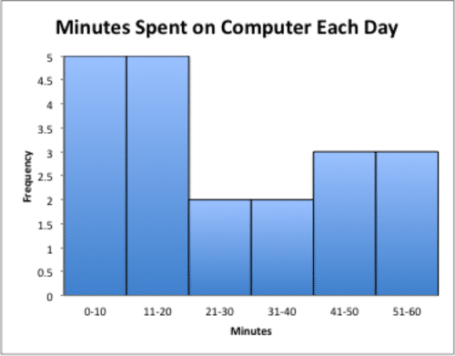
::例2The frequency table below shows the amount of time (in minutes) that 20 middle school students spend on a computer each day. Create a histogram to display the data.
::下表显示20名中学生每天花在一台计算机上的时间(以分钟计),创建直方图以显示数据。Computer Time Bins: Mins Spent on Computer Frequency 0-10 5 11-20 5 21-30 2 31-40 2 41-50 3 51-60 3 First, draw the horizontal and vertical "> axis.
::首先,绘制水平(x)和垂直Next, label the horizontal axis. The horizontal axis lists the different categories of data. In this case, the category will be "Minutes."
::下一步,标签水平轴。水平轴列出数据的不同类别。在此情况下,分类将是“最小值”。Next, label the vertical axis. The vertical axis lists the quantity or amount of the data. In this case, the category will be "Frequency."
::下一步,标签垂直轴。垂直轴列出数据的数量或数量。在此情况下,类别为“数量”。Next, title the graph. The title of the graph should be short and clear. It should explain what data is presented in the graph. In this case, the title will be “Minutes Spent on Computer Each Day.”
::下个标题是图表。 图表的标题应该简短清晰。 它应该解释图表中显示的数据。 在这种情况下, 标题将是“ 计算机每天花费的最小值 ” 。Then, determine the units on the vertical axis. To do this, start by reviewing the smallest and largest frequencies in the table. The smallest value is 2 and the largest is 5. Based on these values label the vertical axis from 0-5. Since the frequency values are always whole numbers, the units should be whole numbers. Since the range is small, 5, the vertical axis should use a unit of 1.
::然后,确定垂直轴上的单位。要做到这一点,首先审查表中最小和最大的频率。最小值为2,最大值为5。基于这些值,将垂直轴标为 0-5 。由于频率值总是整数,单位应该是整数。由于范围小,5, 垂直轴应该使用1 的单位。Next, draw the vertical columns. To do this, write each bin along the horizontal axis. Then draw each column vertically until it reaches the frequency for that time. For example, draw a vertical column to the number 5 for the bin 0-10. Do not leave spaces between the columns.
::下一步, 绘制垂直列。 要做到这一点, 请在水平轴上写下每个文件箱。 然后垂直绘制每个文件箱, 直至它达到该时间的频率。 例如, 为 bin 0- 10 绘制一个垂直列到数字 5 。 不要在列间留下空格 。The answer is the graph should look like the one below.
::答案是图表应该看起来像下面的图。Example 3
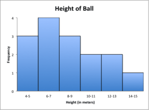
::例3The frequency table below shows the height (in meters) a ball bounced after being dropped. Create a histogram to display the data. Then state two conclusions about the data.
::下面的频率表显示一个球在投下后弹出的高度(米)。创建直方图以显示数据。然后对数据给出两个结论。Bounce Height Bins: Height (meters) Frequency 4-5 3 6-7 4 8-9 3 10-11 2 12-13 2 14-15 1 First, draw the horizontal and vertical "> axis.
::首先,绘制水平(x)和垂直Next, label the horizontal axis. The horizontal axis lists the different categories of data. In this case, the category will be "Height (in meters)."Next, label the vertical axis. The vertical axis lists the quantity or amount of the data. In this case, the category will be "Frequency."
::下一步,标签垂直轴。垂直轴列出数据的数量或数量。在此情况下,类别为“数量”。Next, title the graph. The title of the graph should be short and clear. It should explain what data is presented in the graph. In this case, the title will be “Height of Ball.”
::下个标题是图表。 图表的标题应该简短清晰。 它应该解释图表中显示的数据。 在这种情况下, 标题将是“ 八进制 ” 。Then, determine the units on the vertical axis. To do this, start by reviewing the smallest and largest frequencies in the table. The smallest value is 1 and the largest is 4. Based on these values label the vertical axis from 0-4. Since the range is small the vertical axis should use a unit of 1.
::然后,确定垂直轴上的单位。要做到这一点,首先审查表格中最小和最大的频率。最小值为1,最大值为4。根据这些值,垂直轴标签为0-4。由于范围小,垂直轴应该使用1的单位。Next, draw the vertical columns. To do this, write each bin along the horizontal axis. Then draw each column vertically until it reaches the frequency for that time. For example, draw a vertical column to the number 3 for the bin 4-5.
::下一步, 绘制垂直列。 要做到这一点, 请沿着水平轴写下每个文件箱。 然后垂直绘制每个文件箱, 直至达到该时间的频率。 例如, 将文件箱 4 - 5 的垂直列拖到数字 3 上 。The first answer is the graph should look like the one below. The second answer is two conclusions that can be made are: the most frequent bounce heights were between six and seven meters and the least frequent bounce heights were between fourteen and fifteen meters.
::第一个答案是图表应该看起来像下面的图。第二个答案是可以得出两个结论:最经常的弹跳高度在6米至7米之间,最不经常的弹跳高度在14米至15米之间。Example 4
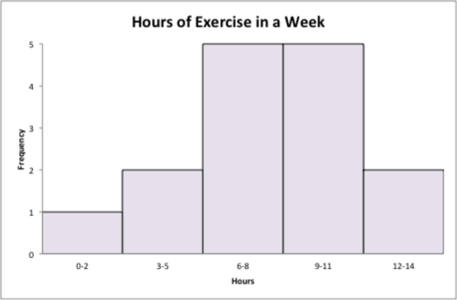
::例4A triathlon club asked it's members how many hours they exercise in a typical week. The data collected is below. Create a histogram to represent the data and then state three conclusions.
::一个三亚特隆俱乐部询问其成员在典型的一周里运动了多少小时。 收集的数据在下面。 创建直方图来代表数据, 然后陈述三个结论 。8, 2, 4, 7.5, 10, 11, 5, 6, 8, 12, 11, 9, 6.5, 10.5, 13
Histograms are made from frequency tables. Before making a histogram, a frequency table must be created.
::直方图由频率表制成。在绘制直方图之前,必须先创建频率表。To create a frequency table, first draw a two column table. The left hand column will be the hours exercised and the right will be the frequency, or the number of people who exercise the given amount.
::要创建频率表, 请先绘制两个列表 。 左手列将是工作时数, 右手列是频率, 或使用给定数额的人数 。Next, determine the size of the bins. The range of this data is from 2 to 13 minutes. Given this size of the range of data, create bins of size 3, starting at 0.
::下一步, 确定文件夹的大小。 此数据的范围为 2 至 13 分钟。 根据此数据范围, 创建大小为 3 的文件夹, 从 0 开始 。Weekly Exercise Bins: Hours of Exercise Frequency 0-2 3-5 6-8 9-11 12-14 Next, calculate the frequency of each bin. To do this, count up how many data points are between 0-2, and place this value in the right column of the table. Then count up how many data points are between 3-5, and place this value in the table. Continue until the entire table is complete.
::下一步计算每个文件夹的频率。 要做到这一点, 请计算 0-2 之间的数据点数, 并将此值放在表格的右列中。 然后计算3-5 之间的数据点数, 并将此值放在表格中。 继续直到整个表格完成 。Weekly Exercise Bins: Hours of Exercise Frequency 0-2 1 3-5 2 6-8 5 9-11 5 12-14 2 Next, create the histogram. To do this, first draw the horizontal and vertical "> axes.
::下一步,创建直方图。要做到这一点,首先绘制水平(x)和垂直Next, label the horizontal axis. The horizontal axis lists the different categories of data. In this case, the category will be "Hours."Next, label the vertical axis. The vertical axis lists the quantity or amount of the data. In this case, the category will be "Frequency."
::下一步,标签垂直轴。垂直轴列出数据的数量或数量。在此情况下,类别为“数量”。Next, title the graph. The title of the graph should be short and clear. It should explain what data is presented in the graph. In this case, the title will be “Hours of Exercise in a Week.”
::下个标题是图表。 图表的标题应该简短清晰。 它应该解释图表中显示的数据。 在这种情况下, 标题将是“ 一周的练习时间 ” 。Then, determine the units on the vertical axis. To do this, start by reviewing the smallest and largest frequencies in the table. The smallest value is 1 and the largest is 5. Based on these values label the vertical axis from 0-5. Since the range is small the vertical axis should use a unit of 1.
::然后,确定垂直轴上的单位。要做到这一点,首先审查表格中最小和最大的频率。最小值为1,最大值为5。根据这些值,垂直轴标签为0-5。由于范围小,垂直轴应该使用1的单位。Next, draw the vertical columns. To do this, write each bin along the horizontal axis. Then draw each column vertically until it reaches the frequency for that time. For example, draw a vertical column to the number 1 for the bin 0-2.
::下一步, 绘制垂直列。 要做到这一点, 请在水平轴上写下每个文件箱。 然后垂直绘制每个文件箱, 直至它达到该时间的频率。 例如, 将文件箱 0-2 的垂直列划到数字 1 。The first answer is the graph should look like the one below. The second answer is three conclusions that can be stated are: an equal number of people reported that they exercise between 6-8 and 9-11 hours in a typical week; two people reported they exercise between 3-5 hours in a typical week; and 0-2 hours a week has the smallest frequency.
::第一个答案是图表应该与下面的图表相似。第二个答案是可以说明的三个结论:相同数量的人报告说,他们在一个典型的周内在6-8至9-11小时之间进行锻炼;两个人报告说,他们在一个典型的周内在3-5小时之间进行锻炼;每周2-2小时的频率最小。Example 5
::例5The histogram below shows the number of sodas that students in Ms. Jones class drink in one day. Analyze the graph and state three conclusions about the data.
::下面的直方图显示琼斯女士班级学生在一天内喝的苏打水数量,分析该图表并给出关于数据的三个结论。First, analyze the graph by comparing the frequencies of the bins.
::首先,通过比较垃圾箱的频率来分析图表。The answer is three conclusions that can be made from the graph are: there are 20 students in Ms. Jones class; the greatest number of students drink between 0 and 3 sodas per day; and one quarter of the class drink 8 or more sodas per day.
::从图表中可以得出以下三个结论:琼斯女士班有20名学生;最多的学生每天喝0至3苏打水;四分之一的学生每天喝8或更多苏打水。Review
::回顾Use what you have learned to complete each dilemma.
::利用你学到的东西来完成每一个难题-
Create a histogram to display the data from the frequency table below.
::创建直方图以显示以下频率表的数据。
Monthly Internet Purchases Data Values Tally Frequency 0 – 3 I I I 3 4 – 7 I I I I 4 8 – 11 I 1 12 – 15 I I 2 Use the following data to answer question #2 and #3: 12, 3, 5, 9, 11, 2, 7, 5, 6, 8, 14, 4, 8, 7, 5, 10, 5, 9, 7, 15
::使用以下数据回答问题2和3:12、3、5、9、11、2、7、5、6、8、14、4、8、7、5、10、5、9、7、15-
The data collected depicts the number of letters in the last names of twenty people. Create a frequency table to display the data.
::所收集的数据以20人的最后姓名显示字母数。 创建一个显示数据的频率表 。 -
Create a histogram to display the data.
::创建直方图以显示数据。
Use the following data to answer questions #5 and #6: 7, 3, 10, 5, 12, 9, 8, 4, 3, 11, 3, 9
::使用以下数据回答问题5和6:7、3、10、5、12、9、8、4、3、11、3、9-
The data collected depicts the number of hours twelve families traveled this summer to their vacation destination. Create a frequency table to display the data.
::收集的数据描述了今年夏天前往度假目的地的十二个家庭小时数。 创建一个显示数据的频率表 。 -
Create a histogram to display the data.
::创建直方图以显示数据。 -
Write a few sentences to explain any conclusions that you can draw from the data.
::撰写几句话来解释您可以从数据中得出的任何结论。
-
Generate a question that you will use to survey twenty people.
::产生一个问题,用来调查20人。 -
Make a table to collect the answers.
::做一个收集答案的桌子 -
Display the data on a frequency table
::显示频率表格上的数据 -
Create a histogram to display the data histogram.
::创建直方图以显示数据直方图 。
Here is a list of the number of students who did not complete their homework in one month.
::以下是一个月内没有完成功课的学生人数清单。1, 1, 3, 3, 4, 3, 3, 5, 6, 1, 1, 1, 2, 2, 3
-
Create a frequency table of the data.
::创建数据频率表。 -
What is the most popular value?
::什么是最受欢迎的价值? -
What is the least popular value?
::什么是最不受欢迎的价值? -
What is the range of values?
::数值的范围是什么? -
What is the average?
::平均数是多少?
Review (Answers)
::回顾(答复)Click to see the answer key or go to the Table of Contents and click on the Answer Key under the 'Other Versions' option.
::单击可查看答题键, 或转到目录中, 单击“ 其他版本” 选项下的答题键 。Resources
::资源 -
Create a histogram to display the data from the frequency table below.