11.13 查明误导领导统计
章节大纲
-
Ashley has asked all the students in 8th grade whether they had eaten pizza in the last week. She organized her data into a table and then created the graph below.
::Ashley问了所有八年级的学生,他们上周有没有吃披萨。她将数据整理成一张表格,然后创建了下图。Ashley showed the graph to her friend, Lakki, who told her it was incorrect. What is wrong with Ashley's graph?
::Ashley把图表展示给她的朋友Lakki看,Lakki说这不正确。Ashley的图表有什么问题?In this concept, you will learn how to analyze and identify misleading statistics that are represented in graphical displays.
::在此概念中,您将学会如何分析和识别图形显示中的误导性统计数据。Identifying Misleading Statistics
::识别误导领导统计Graphs are visual representations of data. Graphs can be used to present, persuade, or even mislead the viewer. The same set of data can be presented on a graph in different ways. Sometimes, the way that a graph is drawn can present only one side of the statistics .
::图表是数据的直观表达。 图表可用于显示、 说服甚至误导查看者。 相同的数据集可以不同的方式在图表上显示。 有时, 绘制图表的方式只能显示统计数据的一面 。Graphs that are misleading either try to persuade the reader or inaccurately present data. For example, political groups may show graphs that show drastic economic changes, however upon careful inspection it becomes clear that the graph is poorly drawn or purposely misleading.
::误导性的图表要么试图说服读者,要么不准确地提供数据。 比如,政治团体可能显示显示经济急剧变化的图表,但是仔细检查后,可以明显看出,图表的绘制不力,或者有意误导。When reading, analyzing, and interpreting graphs, you should consider:
::当阅读、分析和解释图表时,你应该考虑:-
the type of graph used.
::使用的图表类型。 -
how the axes have been drawn, in particular the scale used.
::轴是如何绘制的,特别是所使用的比例尺。 -
the characteristics and similarity of the data presented.
::所列数据的特性和相似性。
Let's look at an example.
::让我们举个例子。The two graphs below show the average monthly water temperature in Hawaii. Compare the two graphs and determine which one presents the most reliable view of the data.
::以下两个图表显示了夏威夷的平均月水温度。比较这两个图表并确定哪一张显示的数据最可靠。First, compare and contrast the different graphs. Determine what is the same and what is different. Based on these characteristics, select which one is more reliable.
::首先,比较和对比不同的图表。确定什么是相同的,什么是不同的。根据这些特点,选择哪一个比较可靠。The answer is: graph 1 presents a more reliable view of the data. Graph 2 shows drastic changes in the temperature, which is not accurate. The change in temperature does not vary greatly from month to month and the graph should illustrate this.
::答案是:图1显示的数据比较可靠。图2显示的是温度的急剧变化,但并不准确。温度的变化每个月变化不大,图中应该说明这一点。Examples
::实例Example 1
::例1Earlier, you were given a problem about Ashley and her graph.
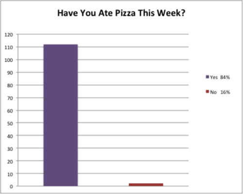
::早些时候,你得到一个问题 关于阿什利和她的图表。Ashley created the graph below after asking the other 8th graders if they ate pizza this week.
::Ashley在问其他八年级学生 这周他们有没有吃披萨后 创建了下图Ashley showed the graph to her friend, Lakki, who told her it was incorrect. What is wrong with her graph?
::Ashley向她的朋友Lakki展示了这张图,她的朋友Lakki告诉她这张图不正确。To answer this question, analyze the graph Ashley created.
::回答这个问题 分析Ashley创建的图表First, look at what the graph is saying. This graph should tell the reader how many people or what percent of people ate pizza this week. Ashley's graph actually says both, which is incorrect.
::首先,看看图表在说什么。这个图表应该告诉读者这个星期有多少人吃披萨,或者有多少人吃披萨。Ashley的图表实际上同时写道,这是不正确的。Next, compare the sizes of the columns to the information contained in the legend. This information should match, but in Ashley's graph it does not. This is incorrect.
::接下来, 比较列的大小和图例中包含的信息。 此信息应该匹配, 但在 Ashley 的图表中它不匹配。 这不正确 。The answer is Ashley's graph has two inaccuracies.
::答案是阿什利的图表有两个不准确之处The first inaccuracy is the information the graph is presenting. The graph should either say how many people ate pizza this past week or what percent of people ate pizza this past week. Ashley should change the data presented in her graph to reflect one of these questions. Ashley should also make sure the graph title is accurate and correct - "Have you ate pizza this week?" is grammatically incorrect.
::第一个不准确之处是图表所展示的信息。 图表应该说明上周有多少人吃披萨, 或上周有多少人吃披萨。 Ashley应该修改图表中的数据,以反映其中的一个问题。 Ashley还应该确保图表标题准确无误 — — “ 你这周吃披萨吗?” 语法错误。The second inaccuracy is the values represented in the columns and the legend. The legend states that the percent of people that didn't eat pizza was 16%, however the graph does not accurately show this in the red column. The two columns are not in proportion to each other, meaning that 16% should be closer to 20 than 0. Ashley should check her calculations to ensure the 16% is accurate. To correct this mistake, Ashley should either correct the red column to show the actual number of people that represent 16% or update the legend to reflect the true percent of people.
::第二个不准确之处是柱子和传说中的数值。 传说指出, 不吃比萨的人的百分比是16%, 但是图表没有准确地显示红色柱子中的这个比例。 两栏不相称, 意思是, 16%应该接近20比0。 Ashley应该检查她的计算以确保16%的准确性。 为了纠正这个错误, Ashley要么纠正红柱, 以显示代表16%的实际人数, 要么更新传说, 以反映真正的人口百分比 。Example 2
::例2Explain why the data compared on the bar graph below is misleading. Then propose how to correct the misleading information in the graph.
::解释一下为什么在下面的条形图上比较的数据具有误导性。 然后提出如何纠正图中误导信息的建议 。First, analyze the graph. Look at what kind of data is presented and if it's related, the values along the horizontal and vertical axes, and what kind of message the graph is trying to send.
::首先,分析图表。看看展示了什么样的数据, 如果数据是相关的, 水平轴和垂直轴的值, 以及图表试图发送的信息种类 。The answer is the graph is misleading because each state on the graph has a different size coastline. For example, Florida’s vast amount of coastline may contribute to the fact that it has a far higher incidence of shark attacks than any other U.S. state. As well, California, Florida, and Hawaii are all big beach destination states; therefore the incidence of shark attacks will be greater than sates such as Alabama. Lastly, the likelihood of sharks being off the stated coastlines must be considered. Sharks may be more likely to be off certain portions of the Florida coastline, than Alabama. To fix the graph, the data presented should be replaced by more comparable data. Specifically, data that compares the incidence of shark attacks among states that are more geographically similar.
::答案是图表有误导性,因为图表上的每个州都有不同的海岸线。 比如,佛罗里达州巨大的海岸线可能会导致其鲨鱼袭击发生率远高于其他美国州。 此外,加利福尼亚州、佛罗里达州和夏威夷州都是海滩目的地大国;因此鲨鱼袭击的发生率将高于阿拉巴马州等州。 最后,必须考虑鲨鱼在指定海岸线外被鲨鱼袭击的可能性。 鲨鱼可能比阿拉巴马州更可能远离佛罗里达州海岸线的某些部分。 为了修正图表,应用更可比的数据取代所提供的数据。 具体地说,比较地理上更相似的州之间鲨鱼袭击发生率的数据。Example 3
::例3The graph below illustrates the findings of a research study that investigated the success rate of small businesses. State two things that are misleading about this graph.
::下图说明了一项调查小企业成功率的研究结果。 说明对这个图有误导的两点。First, analyze the graph to determine what could be misleading about the data presented. Then write two statements describing the misleading characteristics.
::首先,分析图表,以确定对所提供的数据会产生哪些误导。然后写两个描述误导特性的语句。The answer is two characteristics that are misleading are:
::答案是具有误导性的两个特征:-
the vertical axis is broken off and does not begin at 0. When axes are drawn like this the data can look more spread out than it really is.
::垂直轴被折断,且不从 0 开始。当以这种方式绘制轴时,数据看起来会比实际数据更加分散。 -
the three studies reported collected data at different intervals. Said another way, study 1 collected data every year for 6 years, but studies 2 and 3 collected data every other year for 6 years. Study 1 shows a gradual decline in the percentage of small businesses open every year whereas studies 2 and 3 show greater declines every other year.
::研究报告1以另一种方式指出,研究报告1每年收集6年的数据,而研究报告2和研究报告3每年收集6年的数据,研究报告1显示每年开办小企业的百分比逐渐下降,而研究报告2和研究报告3显示,每年开办小企业的百分比下降幅度更大。
Example 4
::例4The graph below shows the average home prices from 2014 to 2015. What are two misleading characteristics of this graph?
::下图显示了2014年至2015年的平均房价。 这个图有两个误导性特征?First, analyze the graph to determine what could be misleading about the data presented. Then write two statements describing what is incorrect in the graph.
::首先,分析图表,以确定对所提供的数据会产生哪些误导。然后写两句话,描述图表中的不正确之处。The answer is two characteristics that are misleading are:
::答案是具有误导性的两个特征:-
the vertical axis is purposely drawn to show a great difference among the values $250,000 and $252,000. This difference is highlighted by the title of the graph, which states there was a huge spike in house prices.
::垂直轴是有意绘制的,以显示250 000美元和252 000美元之间的巨大差异。图的标题突出显示了这一差异,指出房价暴涨。 -
the data reported in the table is taken out of context. Housing prices can vary widely depending on where they are located. The graph does not provide any detailed information about the housing prices reported, such as location or home size.
::住房价格因地点不同而大不相同,没有提供关于所报住房价格的任何详细资料,如地点或住房大小。
Example 5
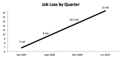
::例5The graph below shows the number of jobs lost by quarter. The describe three things that make this graph misleading.
::下图显示了按季度分列的失业岗位数量。描述三个使该图表产生误导的因素。First, analyze the graph to determine what could be misleading about the data presented. Then write three statements describing what is misleading about the data in the graph.
::首先,分析图表,以确定对所提供的数据会产生哪些误导。然后写三份说明,说明对图表中的数据会产生哪些误导。The answer is three characteristics that are misleading are:
::答案有三个具有误导性的特征:-
the data presented is by quarter, however the dates listed are not each quarter. For example, between December 2007 and September 2008 there are 3 quarters between, however between September 2008 and March 2009 there are 2 quarters.
::例如,2007年12月至2008年9月之间有3个季度,而2008年9月至2009年3月之间有2个季度。 -
the data is presented in a line, however the data does not increase by the same amount each time. For example, the difference between 7 mil and 9 mil is 2 mil, but the difference between 9 mil and 13.5 mil is 4.5 mil.
::数据是用一行表示的,但数据并非每次增加相同数量,例如,700万和900万之间的差额是2百万,但900万和13.5%之间的差额是4.5百万。 -
the vertical axis is broken off, it begins at 6 and ends just above 15. The line is meant to look like it is close to 0 and rises dramatically, however the data does not match this representation.
::垂直轴断开,从6点开始,到15点以上结束。 这条线旨在看起来像接近0, 并大幅上升, 但是数据与这个表达方式不符 。
Review
::回顾Answer each question regarding misleading data.
::回答关于误导数据的每个问题。-
What is one thing that makes this a misleading graph?
::是什么让这个图成为误导图? -
What is one thing that you could do to fix this graph?
::要修正这个图,你能做些什么?
The data table below depicts the amount of time students at different grade levels spend on homework and studying. Ensure that the second graph shows that time spent on homework in twelfth grade is triple that of sixth grade.
::下面的数据表描述了不同年级的学生在做功课和学习上花费的时间,确保第二个图表显示,十二年级在做功课上花费的时间是六年级的三倍。Grade Time 1.75 2 2.25 2.5 2.75 3 3.5 -
Use the above data to create an accurate bar graph.
::使用上述数据创建准确的条形图。 -
Recreate your bar graph from the previous problem but instead of having the vertical axis start at 0 hours, have the vertical axis begin at 1.70 and extend to 3.75 hours at the top.
::从上一个问题重建您的条形图, 而不是将垂直轴从 0 时开始, 将垂直轴从 1. 70 时开始, 延伸至顶部的3. 75 时 。 -
If the students doubled the time that they spend on homework in the
grade, how many hours would they be spending?
::如果学生们在七年级的功课上花费的时间翻了一番,他们要花多少小时? -
If the students in the
grade spent half as much time on homework, how many more hours of free time would they gain?
::如果11年级的学生花一半时间做功课,他们还能多多花点空闲时间呢? -
True or false. All students spend at least one hour on homework.
::不论真假,所有学生都至少花一个小时做功课
The data table below depicts the sales tax rate for several U.S. states.
::以下数据表说明了美国几个州的销售税率。State Sales Tax Rate (%) Alaska 0 Alabama 4.0 Arizona 5.6 California 6.25 New Jersey 7.0 -
Use the above data to create an accurate bar graph.
::使用上述数据创建准确的条形图。 -
Recreate your bar graph from the previous problem but instead of having the vertical axis start at 0% sales tax, have the vertical axis begin at 3% and extend to 7.5% sales tax at the top. Notice how this new graph is misleading compared to the previous.
::从上一个问题重建您的条形图, 而不是将垂直轴从0%的销售税开始, 而是将垂直轴从3%开始, 延伸至顶部的7.5%的销售税。 注意这个新图与上一个图表相比, 是如何误导的 。 -
Which state has the highest state tax?
::哪个州有最高的国家税?
The data below depicts the daily temperature in Juneau, Alaska for ten days.
::以下数据描述了阿拉斯加Junau十天的每日温度。-
Draw a line graph that depicts a sharp decrease in temperature.
::绘制显示温度急剧下降的线条图。 -
Draw another line graph that depicts the decrease accurately.
::绘制另一个精确显示下降的线条图。 -
What is the highest temperature on the list?
::清单上的最高温度是多少? -
What is the lowest temperature on the list?
::清单上的最低温度是多少? -
Look through a newspaper and choose three different graphs. Then write a few sentences about each one explaining how the data represented is or is not misleading and why.
::通过报纸查看并选择三个不同的图表。 然后对每个图表写几个句子, 解释显示的数据是否误导和为什么。
Review (Answers)
::回顾(答复)Click to see the answer key or go to the Table of Contents and click on the Answer Key under the 'Other Versions' option.
::单击可查看答题键, 或转到目录中, 单击“ 其他版本” 选项下的答题键 。Resources
::资源 -
the type of graph used.