1.2 理解和解释频率表和直方图
章节大纲
-
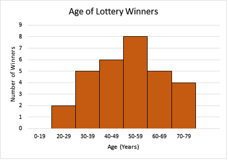
Scott has been buying one lottery ticket for every draw since the lottery began. After many years, he has finally won the bonus draw of one million dollars. Scott contacted the Lottery Commission for an up-dated histogram by ages of bonus draw winners over the past years. Scott has become a millionaire at the age of 42, and would like to know how many others have won the million dollar bonus draw and what percentage of the winners were in their forties. How can Scott use the histogram to figure this out?
::自彩票开始以来,Scott一直在为每张彩票买一张彩票。多年后,他终于赢得了100万美元的奖金。Scott在过去几年里与彩票委员会联系,要求按奖金获奖者的年龄来更新直方图。Scott在42岁时成为百万富翁,想知道有多少人赢得了100万美元奖金,以及40多岁的获奖者所占的百分比。Scott如何使用直方图来解决这个问题呢?In this concept, you will learn what a histogram is and how to interpret the information displayed on this type of graph.
::在这个概念中,你会知道直方图是什么,以及如何解释这类图表上显示的信息。Histograms
::直方图A histogram is very similar to a bar graph . It is a visual display of data in which equal intervals of data values are shown on the horizontal axis and the frequency associated with each interval is represented by vertical rectangular bars. There are no spaces between the bars of a histogram.
::直方图与一个条形图非常相似。它是一个数据直观显示器,在水平轴上显示相等的数据值间隔,每个间距的频率由垂直矩形条表示。直方图的两边之间没有空格。You will also learn to organize data by creating a frequency table . A frequency table organizes the data in three columns by displaying the intervals, a tally of the number of values within the interval, and a numerical value of the tally.
::您还将通过创建一个频率表来学习如何组织数据。一个频率表通过显示间隔、计算间隔内值数和计算数值,将数据分为三列。A tally is a mark made to keep count of the number of values within the interval. These tally marks are often grouped together in fives . The frequency table shows how often the values within the interval occur. The interval and frequency columns of the table are used to draw a histogram.
::计数是用来在间隔内计数数值的标记。这些计数标记通常分组为 5 () 。 频率表显示间隔内数值的发生频率。 表格的间隔和频率列用于绘制直方图 。Let’s use the ages of the lottery winners to create a frequency table such that each interval is a size 10.
::让我们用彩票中奖者的年龄来制作一个频率表,23 74 32 63 40 51 79 66 53 45 37 27 76 35 42 64 52 59 36 78 45 53 65 68 57 37 54 47 56 48 First, determine the range of the data values by subtracting the smallest value from the largest value.
::首先,通过从最大值中减去最小值,确定数据值的范围。Next, determine the number of intervals of size 10. Divide the range by the interval size.
::下一步,确定10号大小的间隔次数,将范围除以间隔大小。
::5610=5.6=6间隔You cannot have part of an interval so the number is rounded to 6.
::您不能有部分间隔, 所以数字四舍五入为 6 。Next, draw and label a table with three columns. Note: even though there are no values between 0 and 19, include it as an interval so it will be displayed on the histogram.
::下一步, 绘制并标出三列的表格 。 注意: 即使 0 和 19 之间没有值, 但也以间距将其包含在内, 以便将其显示在直方图上 。Interval Tally Frequency 0 - 19 0 20 - 29 2 30 - 39 5 40 - 49 6 50 - 59 8 60 - 69 5 70 - 79 4 The following frequency table represents the years that teachers from a small town have been employed in the teaching profession. Let’s use the data displayed in this frequency table to create a histogram.
::下面的频率表代表了小城镇教师受雇于教学行业的年份。 让我们使用这个频率表中显示的数据来创建直方图。Interval 1 - 5 6 - 10 11 - 15 16 - 20 21 - 25 26 - 30 31 - 35 Frequency 11 9 12 14 7 10 12 Drawing the histogram on grid or graph paper will make the task easier for you to complete
::在网格或图形纸上绘制直方图将使任务更容易完成First, draw the horizontal axis and the vertical axis.
::首先,绘制水平(x)轴和垂直轴。
Next, label the horizontal axis and place the intervals below the line.
::下一步,给水平轴贴上标签,并将间距置于线下。Next, label the vertical axis and place the values to the left of the line.
::下一步,给垂直轴贴上标签,并将数值置于线左侧。Next, label the graph with an appropriate title.
::下一步,将图表标上适当的标题。Then, above each interval draw the vertical bars the height of the corresponding frequency.
::然后,在每个间距上方绘制垂直线条,以相应频率的高度为准。From the histogram you can see that the largest number of teachers have been teaching for 16-20 years. The fewest number of teachers have been teaching for 21-25 years. The total number of teachers teaching in this town is the sum of the numbers above the bars.
::从直方图可以看出,16-20年来,教师人数最多,教师人数最少,有21-25年。 这个城市的教师总数是酒吧以上人数的总和。Let’s look at an example.
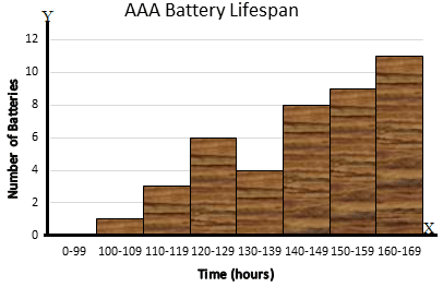
::让我们举个例子。A manufacturer of AAA batteries had their quality control department test the lifespan of their batteries. Forty-two batteries were randomly selected and tested, with the number of hours they lasted listed below.
::一家AAA电池制造商的质量控制部门对其电池的使用寿命进行了测试,对42个电池进行了随机挑选和测试,其持续小时数如下。108 125 137 110 167 158 142 168 163 121 134 146 135 163 148 153 169 154 156 142 160 147 119 124 145 167 161 155 138 126 149 168 151 129 157 115 124 165 152 159 144 163 -
Using an interval of size 10, construct a frequency table for the given data.
::使用大小为10的间隔,为给定数据构建一个频率表。 -
Draw a histogram to display the data.
::绘制直方图以显示数据。
First, calculate the number of intervals for the frequency table.
::首先,计算频率表的间隔次数。
::范围 = 最大值 - 最小值Range = 169 - 108Range = 61
::# 间距=Range 间距大小 # 间距= 6110= 6. 1# 间距= 7Next, draw and label the frequency table to display the data. The smallest value is 108 so the first interval could be from 100 – 109. Remember to insert the empty interval from 0 – 99.
::下一步, 绘制并标出显示数据的频率表。 最小值为 108 , 这样第一个间隔可以为 100 - 109. 。 记住要插入 0 - 99 的空间隔 。Intervals Tally Frequency 0 - 99 0 100 - 109 1 110 - 119 3 120 - 129 6 130 - 139 4 140 - 149 8 150 - 159 9 160 - 169 11 First, draw the horizontal axis and the vertical axis.
::首先,绘制水平(x)轴和垂直Next, label the horizontal axis and place the intervals below the line.
::下一步,给水平轴贴上标签,并将间距置于线下。Next, label the vertical axis and place the values to the left of the line.
::下一步,给垂直轴贴上标签,并将数值置于线左侧。Next, label the graph with an appropriate title.
::下一步,将图表标上适当的标题。Then, above each interval draw the vertical bars the height of the corresponding frequency.
::然后,在每个间距上方绘制垂直线条,以相应频率的高度为准。Examples
::实例Example 1
::例1Earlier, you were given a problem about Scott and his million dollar lottery win.
::早些时候,你被问及 斯科特和他百万的彩票赢家的问题。Scott can use the histogram to figure out the number of people who won the draw and the percentage of winners in their forties.
::Scott可以使用直方图来计算获奖人数和40年代获奖者的百分比。First, record the number of winners that corresponds to the top of each vertical bar on the histogram.
::首先,记录直方图上每个垂直栏的顶端的获胜者人数。2, 5, 6, 8, 5, 4
Next, find the sum of the recorded winners.
::接下来,找到有记录的赢家的总和。The answer is 30.
::答案是30岁Scott can use the histogram to find out the percentage of winners in their forties.
::Scott可以使用直方图 找出四十年代的赢家比例First, find the number of winners that corresponds to the top of the vertical bar above the 40-49 interval.
::首先,找到与超过40-49间隔的垂直栏顶部相对应的获胜者人数。Next, express this number as a fraction of the total number of winners.
::接下来,将这一数字作为获奖者总数的一小部分表示。Next, express the fraction as a decimal by dividing the denominator (30) into the numerator (6).
::下一步,将分数(30)除以分数(30)以小数表示成小数(6)。Then, express the decimal as a percent .
::然后,以百分比表示小数点。The answer is 20%.
::答案是20%。Only 20% of the recorded lottery winners have been aged between 40 and 49.
::只有20%的彩票获奖者年龄在40至49岁之间。Example 2
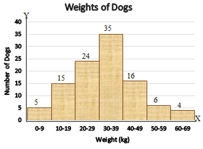
::例2The following histogram indicates the various weights of dogs entered at the annual Canine Obedience Olympics. Use this histogram to answer the questions presented below the histogram.
::以下直方图显示每年在警犬服从奥运会上输入的狗的各种重量。 使用直方图回答直方图下面的问题 。What is the size of the interval?
::间隔的大小是多少 ?First, look at the numbers at the beginning and end of the interval. These numbers and those between are all included in the size of the interval.
::首先,看看间隔的起始和结尾处的数字。这些数字和中间的数字都包含在间隔的大小中。Then count the numbers in the interval from 10 - 19.
::然后在10-19的间隔内计算数字。10, 11, 12, 13, 14, 15, 16, 17, 18, 19.
The answer is 10.
::答案是10个How many dogs were entered in the Olympics?
::有多少只狗进了奥运会?First, look at the numbers above each of the vertical bars. These values represent the number of dogs with a weight that fell into the interval below the vertical bar.
::首先,请看看垂直条上方的数字。这些数值代表着在垂直条下方间距内有重量的狗数量。Next, calculate the sum of these values.
::接下来,计算这些数值的总和。The answer is 105.
::答案是105Within what weight interval do the greatest number of dogs fall?
::最大几只狗跌落的间隔是多少?First, look at the histogram and locate the tallest vertical bar. Notice the number above the bar.
::首先,看看直方图,并找到最高垂直条。注意数字在条上方。Next, look below this bar to find the corresponding weight interval.
::下一步, 请看此栏下方找到相应的重量间隔 。The answer is 30-39 kg.
::答案是30 -39公斤Example 3
::例3The following data displays the height in centimeters of a group of Math 8 students.
::以下数据显示一组数学8学生的高度(厘米) 。158 177 175 183 159 172 160 168 169 167 161 157 162 164 168 176 156 179 174 165 163 170 173 180 174 181 176 174 180 167 182 169 Complete a frequency table and create a histogram for the data using an interval of size 5. Include all relevant information on your histogram.
::使用大小为5的间隔完成一个频率表,并为数据创建直方图。 包含所有与直方图有关的信息。First, calculate the number of intervals for the frequency table.
::首先,计算频率表的间隔次数。
::范围 = 最大值 - 最小值Range = 183-156Range = 27
::# 间隔 # = 间隔间距大小 # 间隔= 275= 5. 4# 间隔= 6Next, draw and label the frequency table to display the data. The smallest value is 156 so the first interval could be from 155 – 159. Remember to insert the empty interval from 0 – 154.
::下一步, 绘制并标出显示数据的频率表。 最小值为 156 , 这样第一个间隔可以是 155 - 159 。 记住要插入 0 - 154 的空间隔 。Intervals Tally Frequency 0 - 154 0 155 - 159 4 160 - 164 5 165 - 169 7 170 - 174 6 175 - 179 5 180 - 189 5 You can use the information displayed in the frequency table to construct the histogram to represent the given data.
::您可以使用频率表中显示的信息构建直方图以代表给定数据。First, draw the horizontal axis and the vertical axis.
::首先,绘制水平(x)轴和垂直Next, label the horizontal axis and place the intervals below the line.
::下一步,给水平轴贴上标签,并将间距置于线下。Next, label the vertical axis and place the values to the left of the line.
::下一步,给垂直轴贴上标签,并将数值置于线左侧。Next label the graph with an appropriate title.
::下个标签将图形标为适当的标题。Then, above each interval draw the vertical bars the height of the corresponding frequency.
::然后,在每个间距上方绘制垂直线条,以相应频率的高度为准。Review
::回顾The following frequency table shows the student scores on a History test. Use the frequency table to answer the questions presented below the table.
::下面的频率表显示了历史测试的学生分数。使用频率表回答下面的提问。Score (%) Tally Frequency [50 - 60) 4 [60 - 70) 6 [70 - 80) 11 [80 - 90) 8 [90 - 100) 4 For the above scores the last number in each interval counts in the next interval.
::对于以上各点,每一间隔中的最后数字在下一个间隔中计数。1. How many students total took the test?
::1. 参加考试的学生总数有多少?2. How many students scored between 70% and 80%?
::2. 有多少学生得分在70%至80%之间?3. What fraction of the students scored between 70% and 80%?
::3. 有多少学生得分在70%至80%之间?4. What percent of the students would that be rounded to the nearest tenth?
::4. 学生中有多少比例被四舍五入到最近的十分之一?5. How many students scored between 90% and 100%?
::5. 有多少学生得分在90%至100%之间?6. What fraction of the students scored between 90% and 100%?
::6. 学生中90%至100%的得分是多少?7. If failing is below 60%, how many students did not pass the test?
::7. 如果失败低于60%,有多少学生没有通过考试?8. True or false. The same number of students received the highest scores as did not pass the test.
::8. 真实的或虚假的,获得最高分的学生人数与没有通过考试的学生人数相同。A group of people were randomly selected and asked how many siblings they had. The results of the survey are displayed in the following histogram. Use the information shown on the histogram to answer the questions presented below the histogram.
::一组人随机挑选,询问他们有多少兄弟姐妹,调查结果以直方图显示,使用直方图显示的信息回答直方图下的问题。9. How many people surveyed have two siblings?
::9. 有多少接受调查的人有两个兄弟姐妹?10. How many people surveyed have three siblings?
::10. 有多少接受调查的人有三个兄弟姐妹?11. How many people are only children?
::11. 有多少人只是儿童?12. How many people have ten siblings?
::12. 有多少人有十个兄弟姐妹?13. How many people combined have four or five siblings?
::13. 有多少人加在一起有4个或5个兄弟姐妹?14. How many people have only one sibling?
::14. 有多少人只有一个兄弟姐妹?15. How many people have nine siblings?
::15. 有多少人有9个兄弟姐妹?Review (Answers)
::回顾(答复)Click to see the answer key or go to the Table of Contents and click on the Answer Key under the 'Other Versions' option.
::单击可查看答题键, 或转到目录中, 单击“ 其他版本” 选项下的答题键 。 -
Using an interval of size 10, construct a frequency table for the given data.