1.3 使用条形图、频率表和直方图代表真实世界问题
章节大纲
-
Andrei’s school has announced that they will be cancelling wood shop because not enough students are interested. Over the next few weeks, Andrei and his friends gathered data about wood shop. They learned that in 2008, there were 30 out of 100 seventh graders and 40 out of 100 eighth graders who had participated in wood shop. Then in 2009, the numbers had increased. There were 40 seventh graders and 58 eighth graders who had participated. Andrei and his friends believe the data suggests that wood shop is increasing in popularity and should not be cancelled. How can the students clearly show the information they have gathered on a chart?
::安德烈的学校宣布,他们将取消木材店,因为学生对木制商店的兴趣不够。 接下来的几周里,安德烈和他的朋友收集了木制商店的数据。 2008年,100名七年级学生中有30人参加了木制商店,100名八年级学生中有40人参加了木制商店。 2009年,这一数字有所增加。 40名七年级学生和58名八年级学生参加了这些商店。 安德烈和他的朋友认为,数据显示木制商店越来越受欢迎,不应该取消。 学生们如何在图表上清楚地显示他们收集的信息?In this concept, you will learn how to draw different types of graphs to display data.
::在此概念中,您将学会如何绘制不同类型的图表以显示数据。Bar Graphs, Frequency Tables and Histograms
::条形图、频率表和直方图Real-world data can be easily and accurately represented by using bar graphs, . Although the actual data values are lost when data is shown using one of the displays mentioned here, what the data represents is visual and clear to an observer.
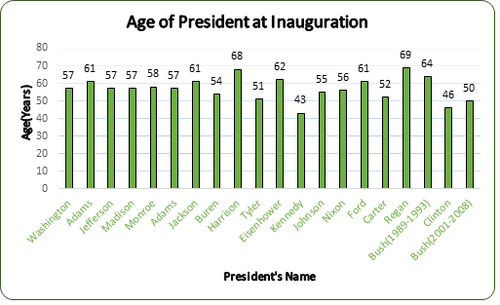
::使用条形图可以容易和准确地表示真实世界数据, 。 虽然在使用此处提到的显示显示显示显示数据时, 实际数据值会丢失, 但对于观察者来说, 数据代表的是视觉的和清晰的 。The data table below depicts the ages of twenty of our nation’s presidents at the time of their Inauguration. Create a bar graph , frequency table , and histogram to display the data.
::下面的数据表描述了我国总统在就职时的20岁年龄。 创建一个条形图、频率表和直方图来显示数据。President Age George Washington 57 John Adams 61 Thomas Jefferson 57 James Madison 57 James Monroe 58 Jon Quincy Adams 57 Andrew Jackson 61 Martin Van Buren 54 William Henry Harrison 68 John Tyler 51 Dwight D. Eisenhower 62 John F. Kennedy 43 Lyndon B. Johnson 55 Richard Nixon 56 Gerald Ford 61 Jimmy Carter 52 Ronald Regan 69 George W. Bush (1989 - 1993) 64 Bill Clinton 46 George W. Bush (2001 - 2008) 50 A bar graph consists of rectangular bars and a corresponding category. The above table of the ages can be used to create the bar graph.
::条形图由矩形条和相应的类别组成。上表的岁数可用于创建条形图。To create the bar graph:
::要创建条形图 :First, draw the horizontal axis and the vertical axis.
::首先,绘制水平(x)轴和垂直轴。
Next, label the horizontal axis (President’s Name) with their last names.
::接下来,将横向轴(总统姓名)与他们的姓氏标为“横向轴”。Next, label the vertical axis in increments of 10 with the Age (Years).
::其次,将垂直轴与年龄(岁)标为10的递增。Next, draw a vertical column with a height corresponding to the president’s age above each of the names.
::接下来,绘制一个垂直列,其高度与总统年龄在每一名以上相应。Then, enter the data value (age of the president) above each of the bars.
::然后输入每个栏以上的数据值( 总裁的年龄) 。Your bar graph should display the information shown below:
::您的图标图应该显示以下信息 :Now that you have created a bar graph, you can create a histogram to represent the data. To create a histogram the data must be displayed in a frequency table. Remember to include the three columns in your frequency table- Interval , Tally and Frequency.
::既然您已经创建了条形图, 您可以创建一个直方图来代表数据。 要创建直方图, 数据必须显示在频率表格中。 记住要将三列包含在您的频率表格 - 间、 间和频率中 。First, calculate the number of intervals you need for your table. Determine the range of the data by subtracting the smallest value from the largest value. Then divide the range by the interval size. For this table use an interval of size 4.
::首先,计算表格需要的间隔次数。通过从最大值中减去最小值来确定数据的范围。然后将范围除以间隔大小。本表格使用一个大小4的间隔。
::范围=最大值 - 最小值Range=69-43Range=26
::# 间隔= 间隔间距大小 # 间隔= 264= 6. 5# 间隔= 7Next, draw and label the frequency table.
::下一步,绘制频率表并贴上标签。Interval(Ages) Tally Frequency (Number of Presidents) Next, fill in the table with the correct information.
::下一张表格填写正确信息。Interval(Ages) Tally Frequency (Number of Presidents) 0-42 0 43-46 2 47-50 1 51-54 3 55-58 7 59-62 4 63-66 1 67-70 2 Then, use the interval and frequency columns to draw the histogram.
::然后,使用间隔和频率列来绘制直方图。First, draw a horizontal and vertical axis.
::首先,绘制水平(x)和垂直Next, label the horizontal axis with the intervals displayed on the frequency table.
::下一步,将水平轴与频率表格上显示的间隔标记为水平轴。Next, add a title to the horizontal axis.
::下一步,在水平轴中添加一个标题。Next, label the vertical axis by ones.
::下一步,将垂直轴标为垂直轴。Next, add a title to the vertical axis.
::下一步,在垂直轴中添加一个标题。Next, draw a vertical column to the appropriate value for each interval on the horizontal axis.
::下一步,将垂直列划为水平轴上每个间隔的适当值。Then, add a title to the histogram.
::然后在直方图上加一个标题。Displaying data using bar graphs, histograms and frequency tables can help us to understand information in a visual way. For people who are visual learners, a picture is worth a thousand words.
::使用条形图、直方图和频率表显示数据可以帮助我们以视觉方式理解信息。对于视觉学习者来说,图片值一千字。Now let’s practice interpreting a histogram to answer questions with respect to the histogram “Age of President at Inauguration.”
::现在让我们来解释直方图来回答有关直方图“就职总统时代”的问题。How many of the presidents were sixty-one years of age or older at the time of Inauguration?
::在就职时,有多少位总统已经61岁或超过61岁?First, locate the age of each president displayed at the top of each vertical bar.
::首先,确定每个总统的年龄 在每个垂直酒吧的顶端展示。Next, record the data values that are greater than or equal to sixty-one.
::接下来,记录大于或等于61的数据值。61, 61, 68, 62, 61, 69, 64
Then, count the number of values you have recorded.
::然后,计算您记录的值数 。The answer is 7.
::答案是7个What was the most popular age for a president at the time of inauguration?
::总统就职时最受欢迎的年龄是什么?First, locate the age of each president displayed at the top of each vertical bar.
::首先,确定每个总统的年龄 在每个垂直酒吧的顶端展示。Next, record the data values that appear more than once.
::接下来,记录不止一次出现的数据值。57, 57, 57, 57, 61, 61, 61
Then, count the number of each value you have recorded.
::然后,计算您记录的每个值的数 。The answer is 57.
::答案是57。What was the age of the youngest president? Who was it?
::最小的总统是几岁?First, locate the age of each president displayed at the top of each vertical bar.
::首先,确定每个总统的年龄 在每个垂直酒吧的顶端展示。Next, find the shortest vertical bar displayed on the graph.
::接下来,找到图中显示的最短的垂直条。43
Then, record the number at the top of the bar.
::然后,记录号码 在酒吧的顶部。The answer is 43.
::答案是43Then, look below this vertical bar and record the last name of the president that corresponds with the shortest bar.
::然后,看看这个垂直的栏杆下面 记录总统的姓 与最短的栏杆相对应The answer is President Kennedy.
::答案是肯尼迪总统Examples
::实例Example 1
::例1Earlier, you were given a problem about the students trying to save wood shop.
::早些时候,你被问及 学生们试图拯救木工场的问题。Andrei and his friends need to clearly show the data they collected. In 2008, 30 out of 100 seventh graders and 40 out of 100 eighth graders participated in wood shop. In 2009, 40 out of 100 seventh graders and 58 out of 100 eighth graders participated.
::2008年,100名七年级学生中有30名和100名八年级学生中有40名参加了木工,2009年,100名七年级学生中有40名和100名八年级学生中有58名参加了。First, draw the horizontal axis and the vertical axis.
::首先,绘制水平轴和垂直轴。Next, label the horizontal axis with the years 2008 and 2009.
::接下来,将横向轴标为2008年和2009年。Next, label the vertical axis with a scale to represent the number of students. Since there are 100 students in grade seven and 100 in grade eight use increments of 10 for your scale.
::接下来,将垂直轴标成一个比例,以代表学生人数。因为7年级有100名学生,8年级有100名学生,因此,你的比例将增加10人。Next, label the bar graph with a suitable title that tells what the bar graph represents.
::接下来,将条形图标签为合适的标题,显示条形图代表什么。Next, include a legend with your bar graph showing the color of the bar for 7 th grade and the color of the bar for 8 th grade.
::下一个, 包含一个图例, 显示您在七年级的条形图和八年级的条形图, 并显示该条形图的颜色 。Then, draw the bar graph such that each year has two bars displayed above it.
::然后绘制条形图, 每年在它上面显示两个条。This bar graph will show the administration that the student interest in wood shop is increasing each year.
::这个条形图将显示行政部门,学生对木材店的兴趣逐年增加。Example 2
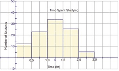
::例2The following histogram shows the data obtained in a survey regarding the time in hours that students spend studying each day.
::以下直方图显示一项调查获得的关于学生每天学习时数的数据。Use the information displayed on the histogram to determine how many students spend between one hour and one and one-half hours each day studying.
::利用直方图上显示的信息确定有多少学生每天学习一个小时到一个半小时。First, look at the horizontal axis to determine the increments of time used to display the hours spent studying.
::首先,看看水平轴,以确定用于显示学习时数的时间增量。Next, look at the vertical axis to determine the increments used to display the number of students.
::接下来,看看垂直轴,以确定用于显示学生人数的增量。Next, locate the interval on the horizontal axis from 1.0 – 1.5 hours.
::下一步,将水平轴的间隔定位在1.0至1.5小时之间。Then, move to the top of the bar above this interval and look to the vertical axis to determine the value that corresponds with the top of this vertical bar.
::然后,移动到此间距上方栏的顶部, 并查看垂直轴, 以确定与此垂直栏顶部对应的值 。The answer is 35.
::答案是35岁Example 3
::例3A company is considering advertising in local movie theatres. In order to determine if this is a worthwhile endeavor, the company collected the following data:
::为了确定这是否值得努力,该公司收集了以下数据:Movies Attended in Past Two Years
::过去两年参与的电影0-4 5-9 10-14 15-19 20-24 25-29 30-34 35-39 40+ Number of People 51 87 131 96 68 37 19 8 3 Using the information displayed in the frequency table, create a histogram to display the data.
::使用频率表中显示的信息,创建直方图以显示数据。First, draw a horizontal and vertical axis.
::首先,绘制水平(x)和垂直Next, label the horizontal axis with the intervals displayed on the frequency table.
::下一步,将水平轴与频率表格上显示的间隔标记为水平轴。Next, add a title to the horizontal axis.
::下一步,在水平轴中添加一个标题。Next, label the vertical axis by ones.
::下一步,将垂直轴标为垂直轴。Next, add a title to the vertical axis.
::下一步,在垂直轴中添加一个标题。Next, draw a vertical column to the appropriate value for each interval on the horizontal axis.
::下一步,将垂直列划为水平轴上每个间隔的适当值。Then, add a title to the histogram.
::然后在直方图上加一个标题。Example 4
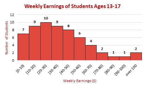
::例4The histogram below shows the weekly earnings of students ages 13 – 17 who have part-time jobs. Use the histogram to answer the questions presented below the graph.
::下面的直线图显示了13-17岁从事非全日制工作的学生的每周收入。 使用直线图回答下图下的问题。How many students earned $50 - $60?
::有多少学生挣50 -60美元?First, find the interval [50-60) on the horizontal axis labelled Weekly Earnings.
::首先,在 " 每周收入 " 的横向轴上找到[50-60]的间隔。Next, go to the top of the vertical bar above this interval and record the number.
::下一步, 转到此间隔上方的垂直栏顶部, 记录数字 。The answer is 6.
::答案是6个How many students had part-time jobs?
::有多少学生从事非全时工作?First, look at the top of each of the vertical bars. These numbers represent the number of students with earnings in the corresponding intervals.
::首先,看看每个垂直栏的顶部。这些数字代表了每隔一段时间有收入的学生人数。Next, record the numbers at the top of each bar.
::接下来,记录每个酒吧顶部的号码。7, 9, 10, 9, 8, 6, 4, 2, 1, 1, 2
Then, add the recorded numbers.
::然后加上记录的数字。The answer is 59.
::答案是59。Review
::回顾Use this histogram from the Guided Practice to answer the questions presented below.
::使用《指导惯例》中的直方图回答下述问题。1. How many students spend less than 30 minutes studying?
::1. 有多少学生学习不到30分钟?2. How many students spend greater than 60 minutes studying?
::2. 有多少学生学习60分钟以上?3. How many students spend greater than 90 minutes studying?
::3. 有多少学生学习超过90分钟?4. How many students spend between 2 and hours studying?
::4. 有多少学生在2至212小时之间学习?The recreation director in a small community asked children between the ages of 13 to 16 to name their favorite sport from a list of six choices. The results of the survey are displayed on the following bar graph according to the selections made by boys and girls.
::一个小社区的娱乐主任要求13至16岁的儿童从六种选择清单中列出他们最喜欢的运动,调查结果根据男孩和女孩的选择情况,在下图中显示。Use the information shown on the graph to answer the questions presented below.
::使用图中显示的信息回答下列问题。5. If each girl could only vote once, what was the total number of girls surveyed?
::5. 如果每个女孩只能投票一次,接受调查的女孩总数是多少?6. If each boy could only vote once, how many boys were surveyed?
::6. 如果每个男孩只能投票一次,接受调查的男孩人数是多少?7. What fraction of the girls surveyed chose track as their favorite sport?
::7. 接受调查的女孩中,有哪一部分选择了田径运动作为她们最喜欢的运动?8. What fraction of the girls surveyed chose soccer as their favorite sport?
::8. 接受调查的女孩中,有哪一部分选择足球作为其最喜欢的运动?9. What percentage of the girls surveyed chose track or soccer as their favorite sport? You may round to the nearest whole percent.
::9. 接受调查的女孩中选择田径或足球作为其最喜欢的运动的比例是多少?你可以圆到最近的百分之一。10. What fraction of the boys chose football as their favorite sport?
::10. 有多少男孩选择足球作为其最喜欢的运动?11. How many boys and girls were surveyed in all?
::11. 总共调查了多少男童和女童?12. True or false. Basketball is the least popular sport among girls.
::12. 篮球是女生中最不受欢迎的运动。13. True or false. It is also the least popular among boys.
::13. 真实或假的,也是男童中最不受欢迎的。14. What is the most popular sport among girls?
::14. 女孩中最受欢迎的运动是什么?15. What is the least popular sport among boys?
::15. 男孩中最不受欢迎的运动是什么?Review (Answers)
::回顾(答复)To see the answer key for this book, go to the and click on the Answer Key under the ' ' option.
::要查看本书的答案键, 请在“ ” 选项下点击答案键 。