10.8 使用散列图来解释数据
章节大纲
-
Fillmore Factories is expanding their chain of furniture stores. They have compiled information of floor area and weekly profits from various stores that already exist.
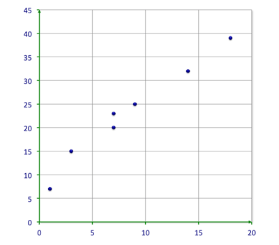
::Fillore工厂正在扩大其家具仓库链,汇编了现有各种商店的楼面面积和每周利润资料。Floor Area (m 2 ) 22 25 29 34 40 41 47 52 55 56 Weekly Profits ($) 128 235 217 244 316 308 362 374 439 474 Create a scatterplot to display the relationship between Floor Space and Weekly Profit and draw a trend line. Is there a positive correlation between the two variables?
::创建一个散点图以显示地面空间和每周利润之间的关系, 并绘制一个趋势线。 这两个变量之间是否有正相关关系 ?In this concept, you will learn to use a scatterplot to interpret data .
::在此概念中, 您将学会使用撒布图来解释数据 。Scatterplots
::散列A scatterplot is a type of graph where corresponding values from a set of data are placed as points on a coordinate plane. A relationship between the points is sometimes shown to be positive, negative, strong, or weak. Sometimes a scatterplot shows that there is no relationship at all. Aside from finding relationships, scatterplots are useful in predicting values based on the relationship that was revealed.
::散点图是一种图表类型, 将一组数据的相应值作为坐标平面上的点。 有时, 点之间的关系显示为正、 负、 强或弱。 有时, 散点图显示根本没有任何关系 。 除了寻找关系外, 散点图对于根据所披露的关系预测数值有用 。Take a look at this scatterplot.
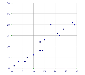
::看看这个撒布图。You can see that there is a relationship between the independent and dependent values of the chart. The relationship is moving up to the right and therefore is a positive correlation.
::您可以看到图表的独立值和依附值之间存在某种关系。 此关系正在向右移动, 因此是正相关关系 。Let’s look at how you can examine these relationships.
::让我们看看如何研究这些关系。What happens to people’s heating bills as the temperature outside goes up?
::外界温度升高, 民众的暖气费又会怎样?You might imagine that as the temperature outside goes up, people’s heating bills go down because they use their heaters less. As one variable goes up, the other goes down. This is a negative relationship or a negative correlation .
::你可以想象,当外面的温度上升时,人们的暖气费就会下降,因为他们少使用暖气。 当一个变数上升时,另一个变数下降。 这是一个负关系或负相关关系。What happens to the gasoline consumption in a vehicle as the miles traveled goes up?
::汽车的汽油消耗会怎么样? 随着里程上升,汽油消耗会怎样?You might imagine that as the miles traveled in a car go up, the amount of gasoline consumed also goes up. So, as one variable goes up, the other goes up, too. This is a positive relationship or a positive correlation.
::你可以想象,随着汽车行驶的里程上升,汽油消耗量也上升。因此,当一个变数上升,另一个变数上升,另一个变数上升。这是一个正关系或正相关关系。What happens to the number of accidents as the number of blue cars increases on the road?
::路上蓝色汽车数量增加,事故数量又会怎样?You can imagine that there would be no relationship. While one variable goes up, the other may go up, down, or stay the same; the number of accidents is independent of the number of blue cars. This oftentimes occurs, too. This is an example of no relationship or no correlation .
::您可以想象不会有任何关系。 当一个变量上升时, 另一个变量会上升、下降或保持不变; 事故数量与蓝色汽车数量无关。 这经常发生。 这是没有关系或没有关联的例子 。These three trends , positive, negative, and no relationship are evident on scatterplots. This is what they look like:
::这三种趋势,积极、消极和没有关系,在散地上是显而易见的。This is a positive relationship. As the -values increase, the -values increase. Some points may not follow an exact pattern but the overall trend, the general tendency or movement, is clearly from the lower left to the upper right of the plot.
::这是一个正关系。 随着 x 值的增加, Y 值会增加。 有些点也许没有精确的规律, 但总体趋势、 总体趋势或运动, 显然是从地块的左下角到右上角。This is a negative relationship. In this case, as the -values increase, the -values decrease. You may argue that the slope is not as steep which is true. However, the general tendency is evident. This graph moves from the upper left to the lower right.
::这是一个负关系。 在此情况下, 随着 x 值的增加, Y 值会下降。 您可以争辩说, 斜坡不是那么陡峭, 而是真的。 但是, 一般趋势是显而易见的。 此图从左上向右下移动 。At times, like the one shown above, there is no relationship between variables. The scatterplots of these situations will show no trend. In other words, there seems to be no definite pattern with the points; you cannot see any particular direction that they take.
::有时,如上文所示,变量之间没有关系。 这些情况的散射点不会显示任何趋势。 换句话说, 点数似乎没有确定模式; 您看不到它们所选择的任何特定方向 。Scatterplots are as useful for finding a relationship between variables as they are for making predictions. Here, you will make a trend line , or a line that best describes the data on a scatterplot, in order to estimate unknown outputs for given inputs.
::散列对于查找变量之间的关系和预测变量之间的关系同样有用。在这里,您将绘制一条趋势线, 或一条描述散列数据的最佳线, 以便估计特定输入的未知输出 。A trend line is a straight line that best represents the points on a scatterplot. The trend line may go through some points but need not go through them all. The trend line is used to show the pattern of the data. This trend line may show a positive trend or a negative trend. However, if there is no relationship, then no trend line can be adequately drawn.
::趋势线是一条最能代表散射点的直线。 趋势线可能经过一些点, 但不必经过所有点。 趋势线用来显示数据模式。 该趋势线可能显示正趋势或负趋势。 但是, 如果没有关系, 则无法充分绘制趋势线 。Your trend line is your best approximation of the pattern of the data.
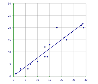
::你的趋势线是数据模式的最佳近似点The line on this graph is the trend line ; it is the line that best describes the data. About half of the points should be on either side of the line. You may notice that outliers are practically ignored when a trend line is drawn. This trend line goes from the lower left to the upper right and shows a positive relationship.
::此图的线条是趋势线; 这是描述数据的最佳线条。 大约一半的点应该位于线的两侧。 您可能会注意到, 当绘制趋势线时, 离线实际上被忽略了。 此趋势线从左下到右上, 并显示正关系 。Notice that this trend goes down and indicates a negative correlation or relationship. You can also see that it goes off of the chart. Therefore, you could use a chart like this one to predict the trend. It is likely that the trend will continue to go down.
::注意此趋势会下降, 并显示负相关关系或负相关关系。 您也可以看到它会从图表中删除。 因此, 您可以使用像这样的图表来预测趋势。 趋势可能会继续下降 。Examples
::实例Example 1
::例1Earlier, you were given a problem about expanding furniture store. The furniture company has collected the following data:
::早些时候,有人给了你扩建家具店的问题。家具公司收集了以下数据:Floor Area (m 2 ) 22 25 29 34 40 41 47 52 55 56 Weekly Profits ($) 128 235 217 244 316 308 362 374 439 474 You need to create a scatterplot to display the relationship between Floor Space and Weekly Profit. Draw a trend line. Finally you need to see if there is a positive correlation between the two variables?
::您需要创建一个撒布图来显示楼层空间和每周利润之间的关系。 绘制一个趋势线。 最后, 您需要检查这两个变量之间是否有正相关关系吗 ?First, draw the scatterplot.
::首先,绘制散射图。Next, draw the trend line.
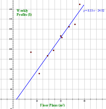
::接下来,绘制趋势线。Then, look at the scatterplot to see if there is a pattern.
::然后,看看散射图 看看是否有模式。There is a definite pattern in the positive direction. This data shows a positive correlation.
::在积极方向上有一个明确的模式,该数据表明了正相关关系。Example 2
::例2What kind of relationship is shown by the data?
::数据显示何种关系?As one variable increases, the other variable increases as well. This scatterplot shows a positive correlation in the data.
::随着一个变数的增加,另一个变数也随之增加。这个散射图显示数据中正相关关系。Example 3
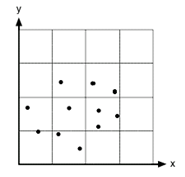
::例3What kind of correlation will describe this scatterplot?
::什么样的相关关系将描述这个撒布点?The answer is that this scatterplot shows no correlation.
::答案是,这个撒布图显示没有关联性。Example 4
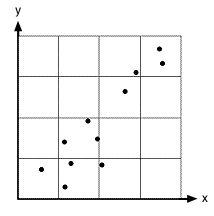
::例4What kind of correlation will describe this scatterplot?
::什么样的相关关系将描述这个撒布点?The answer is that this scatterplot shows a positive correlation.
::答案是,这个散射图显示了正相关关系。Example 5
::例5If the distance of a car increases as its speed increases, what kind of correlation will the data have?
::如果汽车的距离随着车速的增加而增加,数据将具有何种关联性?The answer is that this would show a positive correlation.
::答案是,这将显示出正相关关系。Review
::回顾What type of relationship is shown in the following scatterplots?
::以下撒布图中显示哪类关系 ?1. If the data decreases as one variable increases, what type of relationship is shown?
::1. 如果数据随着一个变数的增加而减少,则显示何种关系?2.
3. Use the following table to make a scatter plot.
::3. 使用下表绘制散射图。3 6 8 14 18 23 29 32 37 55 50 46 40 37 18 26 20 18 4. Draw a trend line.
::4. 绘制一个趋势线。5. Identify the type of relationship.
::5. 确定关系类型。A zoologist studied the relationship between the kilometers from a lake and number of felines per 100 square kilometers. She found the following data:
::一位动物学家研究了湖边的公里与每100平方公里的胎儿数量之间的关系。她发现了以下数据:Distance from Lake 3 1 4 3 4.5 5 5 2 2.5 3.5 8 6 5 # of Felines 5 10 2 8 6 5 8 8 6 6 0 2 4 6. Make a scatterplot that illustrates this data.
::6. 制作一个显示这些数据的散射图。7. Draw a trend line.
::7. 绘制一个趋势线。8. What is the correlation?
::8. 什么是相关关系?9. Estimate the number of felines 1.5 kilometers from a lake.
::9. 估计离湖1.5公里的felines数量。Define the following terms.
::界定以下术语。10. Input value
::10. 投入价值11. Output value
::11. 产出价值12. Positive correlation
::12. 正相关性13. Negative correlation
::13. 负相关性14. No correlation
::14. 无相关关系15. Data set
::15. 数据集Review (Answers)
::回顾(答复)Click to see the answer key or go to the Table of Contents and click on the Answer Key under the 'Other Versions' option.
::单击可查看答题键, 或转到目录中, 单击“ 其他版本” 选项下的答题键 。Resources
::资源