10.9 了解错误领导统计
章节大纲
-
The school track team needs to raise some money to go to regionals. The teams decided to work on selling chocolate bars. They figure that this will be an excellent choice for a bunch of students. At the end of the fundraiser, the team began to tally up their totals. Mary sold 72 bars and Clint sold 65 bars. Mary wants to make it look like she has sold a lot more than Clint. Is this possible? How can he do it?
::学校轨道团队需要募集一些钱去地区。 团队决定出售巧克力棒。 他们认为这对一群学生来说是一个很好的选择。 在筹款活动结束时,团队开始计算他们的总数。 Mary卖了72个酒吧,Clint卖了65个酒吧。 Mary想让它看起来比Clint卖得更多。 这有可能吗? 他怎么能这样做呢? 他怎么能这样做呢?In this concept, you will learn how to understand misleading statistics .
::在这个概念中,你将学会如何理解误导性统计数字。Misleading Statistics
::误导领导统计When you mislead someone, you want them to think something other than what is the truth. Sometimes, there can be data displays that are misleading.
::当你误导某人时,你希望他们去思考真相之外的东西。有时,数据显示会误导别人。When you construct graphs and plots, you take care to show the data correctly by choosing appropriate intervals and scales. There are a variety of ways that graphs can be displayed in a way that is misleading. Sometimes people simply make mistakes. Other times, however, people may try to convince you of something by manipulating a graph that may otherwise not truly represent the data. You must keep a critical eye when you read graphs and compare the data.
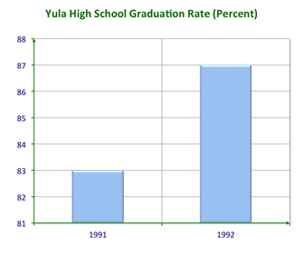
::当您构建图形和绘图时,您要小心地通过选择适当的间隔和比例来正确显示数据。有多种方法可以误导的方式显示图表。有时人们只是犯错误。但有时,人们会试图通过操纵可能无法真正代表数据的图表来说服你某种东西。当您阅读图表并比较数据时,您必须保持批判性的眼睛。Consider the graph below of the Yula High School Graduation Rate.
::请参考下图尤拉高中毕业率。You use bar graphs because they are visual devices that allow you to compare the height of the bars to interpret data. What do the bars show you about the graduation rate at Yula High School?
::您使用条形图, 因为它们是视觉设备, 使得您可以比较条形图的高度来解释数据。 条形图显示您在尤拉高中的毕业率是什么?It appears that the graduation rate skyrocketed. However, if you look at the scale on the -axis, you can see that the entire graph is not represented. The scale only represents a range from 81 to 88 percent . This exaggerates the difference in the data. Was there an improvement from 1991 to 1992? Yes. But the improvement was only 4% where the bars can mislead into thinking that the improvement was much greater.
::毕业率似乎突飞猛进。然而,如果你看看Y轴的比重,你可以看到整个图表没有被代表。这个比重只代表81%到88%。这夸大了数据的差异。1991年至1992年是否有改善?是的。但是,只有4%的比重,这些比重可以误导人们认为改进幅度更大。So you can see that the size of the intervals and bars can impact the way we interpret the data.
::所以您可以看到间隔和条纹的大小 能够影响我们解释数据的方式。Let’s look at another example.
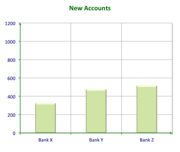
::让我们再看看另一个例子。A sales manager at Bank X prepared a report of the number of new clients they have in this quarter compared to their competitors. He prepared a graph and declared that, although they had fewer new clients, they’re not far far behind. What do you think?
::X银行的一位销售经理准备了一份与竞争对手相比本季度新客户数量的报告。 他准备了一份图表,并宣布,尽管新客户较少,但并不远。 你觉得如何?The graph is misleading. The number of new clients looks similar. If you look at the data represented, you see the following:
::图表有误导性。 新客户的数量看起来相似。 如果您查看所显示的数据, 可以看到以下信息 :Bank X: 325 new accounts
::银行X:325个新账户Bank Y: 475 new accounts
::Y银行:475个新账户Bank Z: 517 new accounts
::Z银行:517个新账户Bank Y has 46% more new clients and Bank Z has 59% more new clients than Bank X. Because the scale on the -axis goes up to 1200, it decreases the relative size of the bars on the graph. An appropriate scale would extend to no further than 600.
::Y银行有46 % 的新客户, Z银行有59%的新客户比X银行多。Y轴的比重高达1200,因此它减少了图中条条的相对大小。适当的比重将扩大到不超过600。Once again, you have to look at how the graph is constructed to see if the data is misleading or not.
::您必须再次查看图表的构建方式, 以查看数据是否误导 。As you can see, it is important to keep an eye on the data and the way that it is presented to you. In order to improve your skills in spotting misleading data, let’s see how you can design data displays to intentionally exaggerate or minimize comparisons.
::正如您所看到的,重要的是要关注数据及其向您展示的方式。 为了提高您识别误导数据的技能,让我们来看看您如何设计数据显示以故意夸大或尽量减少对比。Let’s look at an example.
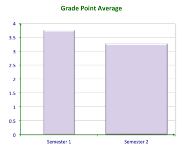
::让我们举个例子。Mei Ling knows that her grade point average has dropped but doesn’t want her parents to notice. It went from 3.75 to 3.25 in one semester. How can she change manipulate a graph to mislead them? She decides to change the width of the bars to make the lower score look bigger.
::Mei Ling知道她的平均分数已经下降,但不希望她的父母注意到。 一学期平均分从3.75到3.25不等。 她如何改变图表来误导他们? 她决定改变栏杆的宽度以使低分看起来更大。In this graph, the second semester bar looks even bigger than the first. Of course, it’s not as tall. Do you think her parents will notice? Why or why not?
::在这张图中,第二学期酒吧看起来甚至比第一个学期酒吧还要大。 当然,它没有那么高。 你认为她的父母会注意到吗? 为什么不行?Examples
::实例Example 1
::例1Earlier, you were given a problem about the chocolate bar sales. For the team fundraiser, they are going to sell chocolate bars. Mary wants to make it look like she has sold a lot more than Clint. She sold 72 bars and Clint sold 65 bars.
::早些时候,你被问及巧克力酒吧的销售问题。对于团队募捐者来说,他们要卖巧克力酒吧。玛丽想让它看起来比克林特卖的要多得多。她卖了72个酒吧,Clint卖了65个酒吧。First, create a misleading graph. Create a bar graph and skip numbers in the scale. In an appropriate graph, a scale may reach 75 or 80, beginning from 0. However, if Mary skips 0-60 on her scale, the bars will look extremely different.
::首先, 创建一个误导图。 在比例尺中创建一个条形图和跳过数字。 在适当的图表中, 比例尺可能从 0 开始达到 75 或 80 。 但是, 如果 Mary 跳过 0 - 60 的比例尺, 条形会变得非常不同 。In this graph, it appears that Mary sold far more bars than Clint when in reality it was only 7 more bars. You can see how changing the -axis intervals can influence how the data is viewed.
::在这张图中,似乎Mary出售的条子比Clint要多得多,而实际上只有7条。你可以看到,改变Y轴间隔会如何影响数据查看方式。Example 2
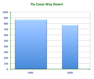
::例2A hospital director was up for his evaluation. He wanted to show that he has helped the community in his years on the job. He prepared this graph for the evaluation committee to show how his work has helped to reduce cases of the flu.
::一位医院主任正在接受他的评估,他想表明他多年来在工作期间帮助社区。他为评估委员会准备了这张图表,以显示他的工作如何帮助减少了流感病例。Did flu cases decrease? Are they way down?
::流感病例有没有减少?The answer is no.
::答案是否定的。What trick did he use to mislead the committee?
::他用什么把戏误导委员会?He did not change the scale but changed the size of the bar. The 1990 bar is very wide; it gives the appearance of being much bigger than 2000. Of course, the width of the bar does not make a difference for what the graph means. The flu cases dropped from about 875 to about 775. It is about a 12% decrease.
::他没有改变规模,而是改变了条形体的大小。 1990年的条形宽阔,似乎比2000年大得多。 当然,条形宽度对图表的含义没有影响。 流感病例从约875例下降到约775例,下降幅度约为12%。You can see that even if the comparison looks like it is true, you have to examine the actual data to see if the data display is accurate or misleading.
::你可以看到,即使比较看起来是真实的,你也必须检查实际数据,看看数据显示是否准确或误导。Use this graph to answer the following questions.
::使用此图表回答下列问题 。Example 3
::例3Is there anything misleading about the data on the -axis?
::X轴上的数据有什么误导吗?The answer is no, the dates are evenly spaced.
::答案是否,日期的间隔是均匀的。Example 4
::例4Is there anything misleading about the data on the -axis?
::Y轴上的数据有什么误导吗?The answer is yes. The -axis shows the amount of money won. The money amounts are not evenly represented.
::答案是是肯定的。 Y 轴显示的是赢的金额。 金额的表示不均匀 。Example 5
::例5How could you fix this graph?
::你怎么能修这个图?You could fix the graph by making the intervals on the -axis are even. Then re-draw the line to accurately represent the data.
::您可以通过使 Y 轴上的间隔平整来修正图形。 然后重新绘制线条以准确代表数据 。Review
::回顾Answer each of the following questions true or false.
::回答以下每一个问题是否真实或虚假。1. To sell more a product, a company may create a display that misleads consumers
::1. 为了更多地销售产品,公司可能制造误导消费者的展示品2. You can create a graph to make it look like you have sold more of a product that you actually have.
::2. 您可以创建一个图表, 让它看起来像你销售了更多你实际拥有的产品。3. Misleading statistics aren’t that relevant in sales.
::3. 错误领导统计数字与销售无关。4. Graphs aren’t actually misleading at all.
::4. 图表实际上完全没有误导性。5. You can create a misleading graph only if your intervals are too small.
::5. 只有在间隔过短的情况下才能创建误导图。6. You can create a misleading graph whether your intervals are too small or too big.
::6. 无论间隔太小还是太大,都可以创建误导图。7. The height of the bars in a bar graph can be misleading.
::7. 条形图中的条形体高度可能误导人。8. If the bars of a graph are too wide this can be misleading too.
::8. 如果图表的条数太宽,也会引起误解。9. You must be careful whenever you read a data display to be sure that the data is accurate.
::9. 阅读数据显示时必须小心,以确保数据准确无误。Why are the following graphs misleading? What is the error in the conclusions drawn based on the graphs?
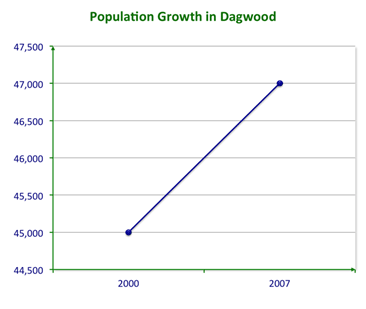
::以下图表为何误导人?根据图表得出的结论中有什么错误?10. Conclusion: “The population in Dagwood is exploding!”
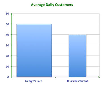
::10. 结论: " 达格伍德的人口正在爆炸! "11. Conclusion: “George’s Café is far more successful than Rita’s Restaurant.”
::11. 结论: " 乔治的咖啡厅比丽塔的餐厅成功得多。12. Draw a graph to intentionally exaggerate this data: “From 2002 to 2004, the average number of semesters that students studied in order to complete their Bachelor’s Degree increased from 4.1 to 4.5.”
::12. 绘制图图,有意夸大这一数据: " 从2002年到2004年,学生为完成学士学位而学习的平均学期从4.1个增加到4.5个 " 。13. Explain the faulty conclusion that could be drawn from this graph.
::13. 解释从这个图表中得出的错误结论。14. Draw a graph to intentionally minimize this data: “Mike had 110 customers on his paper route in March and in June only 75.”
::14. 绘制一个图,有意尽量减少这一数据: " 3月和6月只有75个,迈克有110名顾客登上他的纸路。 "15. Explain the faulty conclusion that could be drawn from this graph.
::15. 解释从这个图表中得出的错误结论。16. Revise your graph in number 3 to represent the data more accurately.
::16. 修改图3,以更准确地反映数据。17. Revise your graph in number 5 to represent the data more accurately.
::17. 修改图5,以更准确地反映数据。Review (Answers)
::回顾(答复)Click to see the answer key or go to the Table of Contents and click on the Answer Key under the 'Other Versions' option.
::单击可查看答题键, 或转到目录中, 单击“ 其他版本” 选项下的答题键 。