4.6 直方图解释
章节大纲
-
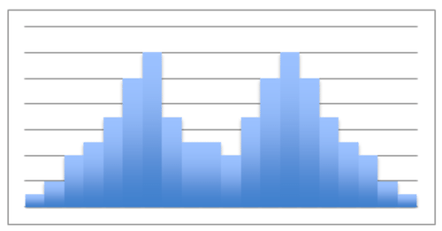
Brian runs a small business selling coffee to morning commuters. Like any other small business owner, he would like to increase his traffic. He decides to offer a “buy 10, get one free” punch-card promotion, and figures that if he gives double credit to customers for coffees purchased on days with generally slower sales, he can increase his overall traffic. If the histogram below represents the average number of coffees sold during a week, what can he conclude about the best and worst day(s) to offer “double punches”? How would you describe the shape of his histogram? Does the shape reveal any particularly useful data in this instance?
::Brian经营一家小生意,向早间通勤者出售咖啡。像任何其他小企业主一样,他想增加他的交通量。他决定提供“买十,免费获得一张”打孔卡促销,并且提供数字,如果他在一般销售较慢的几天内购买咖啡的客户得到双重信贷,他可以增加整个交通量。如果下方的直方图代表一周内平均销售咖啡的数量,那么他能得出什么结论来提供“双击”的最佳和最糟糕的一天?你如何描述他的直方图的形状?这个形状是否显示任何特别有用的数据?This lesson will help you become familiar with using histograms. At the end of the lesson, we will return to this question to apply your skills.
::此课有助于您熟悉直方图的使用。 在课结束时, 我们将回到这个问题来应用您的技能 。Interpreting Histograms
::解释直方图Histograms are a very common method of visualizing data, and that means that understanding how to interpret histograms is a valuable and important skill in virtually any career. There are a number of things to pay particular attention to when reading a histogram, including:
::直方图是数据可视化的一个非常常见的方法,这意味着了解如何解释直方图几乎在任何职业生涯中都是一种宝贵和重要的技能。-
Range
:
Recall that a range is a description of the difference between the greatest and least values in a given
data set
. On a histogram, this is important in two particular ways:
-
How widely dispersed are the frequencies of each bin? Extremely large frequency ranges (particularly as a percentage) may indicate data that is fundamentally unreliable.
::每个垃圾箱的频率分布得有多广?极高的频率范围(特别是百分比)可能表明数据根本上不可靠。 -
How wide are the
bins
themselves? Specifically, how broad are the intervals or how descriptive are the classes? Unusually large or small intervals, or unusually broad or narrow categories may indicate important observations about the data as a whole.
::文件夹本身的宽度有多大? 具体地说,间隔的宽度有多大,或分类的描述性有多广? 异常大或小的间隔,或异常广泛或狭义的分类,可以表明对整个数据的重要观察。
::范围 : 提醒注意, 范围是给定数据集中最大值和最小值之间的差别的描述。 在直方图中, 这一点在两种特定方式中很重要: 每个文件夹的频率分布多广? 极大频率范围( 特别是百分比) 可能表示数据根本上不可靠。 文件夹本身的范围多宽? 具体地说, 间隔范围有多宽, 或描述类别有多宽? 通常是大或小的间隔, 或非常广泛或狭窄的类别, 可能显示对整个数据的重要观察。 -
How widely dispersed are the frequencies of each bin? Extremely large frequency ranges (particularly as a percentage) may indicate data that is fundamentally unreliable.
-
Frequency Density
:
The major difference between a
bar graph
and a histogram is the way in which the frequencies of each class or
interval
are represented. On a
bar graph
, the frequency is the
height
of the bar. On a
histogram
, the frequency is measured by the
area
of the bar. What that means it that you can use a histogram with different interval or class widths to represent data with varying densities. (See Example C)
::密度 密度 : 条形图和直方图之间的主要差异是每个类或间距的频率的表示方式。 在条形图中, 频率是横条的高度。 在直方图中, 频率是用横条的面积来测量的。 这意味着您可以使用具有不同间距或类宽度的直方图来表示不同密度的数据。 (见例C) -
Shape:
The shape of a histogram can lead to valuable conclusions about the trend(s) of the data. In fact, the shape of a histogram is something you should always note when evaluating the data the histogram represents. Some common shapes and their indications are:
::形状 : 直方图的形状可以导致关于数据趋势的有价值的结论。 事实上, 直方图的形状是您在评价直方图所代表的数据时必须注意的。 一些常见的形状及其表示方式是 :
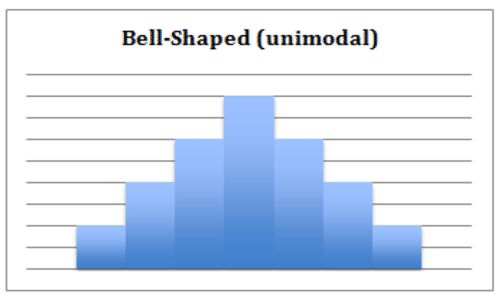
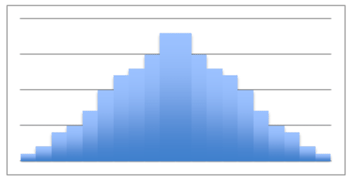
a. Bell-Shaped: A histogram with a prominent ‘mound’ in the center and similar tapering to the left and right. One indication of this shape is that the data is unimodal – meaning that the data has a single mode, identified by the ‘peak’ of the curve. If the shape is symmetrical, then the mean, , and mode are all the same value. Note that a normally distributed data set creates a symmetric histogram that looks like a bell, leading to the common term for a normal distribution : a bell curve .
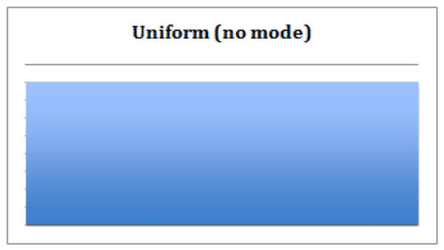
::a. Bell-Shaped: 在中间有一个突出的 " 音响 " 的直方图和向左和右的类似磁带。这种形状的一个标志是数据是单式的 -- -- 这意味着数据有一个单一模式,以曲线的 " 峰值 " 来识别。如果形状对称,那么平均值、平均值和模式都是相同的值。请注意,正常分布的数据集产生一个对称直方图,看起来像钟,导致正常分布的通用术语:钟曲线。b. Uniform : A uniform shaped histogram indicates data that is very consistent; the frequency of each class is very similar to that of the others. A data set with a uniform-shaped histogram may be multimodal – the having multiple intervals with the maximum frequency. One indication of a uniform distribution is that the data may not be split into enough separate intervals or classes. Another possibility is that the scale of the histogram may need to be adjusted in order to offer meaningful observations.
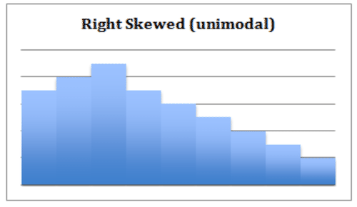
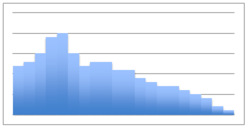
::b. 统一:统一的直方图表示非常一致的数据;每类的频率与其它类非常相似。具有统一形状直方图的数据集可能是多式的 — — 与最大频率有多个间隔。统一分布的一个标志是数据可能不分为足够的分开的间隔或类别。另一种可能性是,直方图的规模可能需要调整,以便提供有意义的观察。c. Right- Skewed : A right-skewed histogram has a peak that is left of center and a more gradual tapering to the right side of the graph. This is a unimodal data set, with the mode closer to the left of the graph and smaller than either the mean or the median. The mean of right-skewed data will be located to the right side of the graph and will be a greater value than either the median or the mode. This shape indicates that there are a number of data points, perhaps outliers , that are greater than the mode.
::c. 向右偏斜:右倾直方图的峰值为中间左端,向图的右侧逐步递减。这是一个单式数据集,其模式接近图的左侧,小于平均值或中位数。右倾数据平均值将位于图的右侧,其数值将大于中位数或模式。这个形状显示,有一些数据点,或许是外端,大于模式。d. Left-Skewed: A left-skewed histogram has a peak to the right of center, more gradually tapering to the left side. It is unimodal, with the mode closer to the right and greater than either mean or median. The mean is closer to the left and is lesser than either median or mode. This shape indicates that the preponderance of any outliers is lesser than the mode.
::d. 左偏斜:左倾直方图在中间的右侧有一个峰值,在左侧逐步递减。它是单式的,其模式更接近右侧,大于中值或中值。平均值更接近左侧,小于中值或中值。这个形状显示,任何外部线的占优势都小于模式。e. Undefined Bimodal : This shape is not specifically defined, but we can note regardless that it is bi-modal, having two separated classes or intervals equally representing the maximum frequency of the distribution.
::e. 未定义的双模式:这一形状没有具体界定,但无论它是双模式的,我们都可以注意到它是双模式的,有两个分开的类别或间隔,同样代表分配的最大频率。Describing Histograms
::描述直方图Describe the shape of the histogram and state a few notable characteristics:
::描述直方图的形状并说明几个显著特征:This is a right-skewed distribution , indicating that there are a number of values greater than the mode. If the modal class of 80-85kg represents a healthy normal weight, this graph would suggest a sample that tended toward being overweight.
::这是右偏斜分布, 表明有数值大于模式。 如果80- 85公斤的模型级代表健康的正常重量, 这个图将显示一个倾向于超重的样本 。Identifying Shape
::识别形状Identify the general shape of the histogram and what the shape indicates about the data:
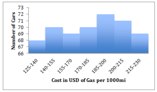
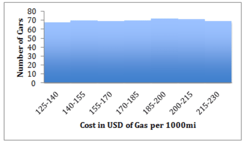
::识别直方图的一般形状以及形状对数据表示什么:This is a slightly tricky one. The overall shape appears somewhat left-skewed and obviously unimodal at first glance. However a closer look tells a different story, note that the overall range is cars. That is a very small range, only about 5% of the mean. The shape is deceiving in large part because the vertical axis does not start at 0, which exaggerates the differences between the classes.
::这是一个略微棘手的形状。 乍一看, 整体形状看起来有点左偏斜, 明显是单式的。 然而, 仔细看可以说明一个不同的故事, 指出整个范围是72- 68=4的汽车。 这是一个非常小的范围, 只有平均值的5%左右。 形状被欺骗的很大程度上是因为垂直轴不是从0开始的, 从而夸大了等级之间的差异 。Look what happens if we re-draw the histogram with the same data but with the vertical axis at 0:
::看看如果我们用相同的数据重新绘制直方图,但以垂直轴为0重新绘制,会发生什么:Pretty huge difference, isn’t it? Now it is apparent that this is really a pretty uniform distribution, and that there is not a very meaningful difference in frequency between the classes.
::差异很大,不是吗? 现在很明显,这确实是一个非常统一的分布,而且各等级的频率之间没有非常有意义的差别。Evaluating Groups of Histogram s
::评价直方图组sThe image below represents data on the relative masses of a number of sampled black holes.
::以下图像显示一些抽样黑洞相对质量的数据。Evaluate the group of histograms as a whole; identify the common shapes and any notable features. Source: IOP Science
::整体评价直方图组;查明共同形状和任何显著特征。Most of the individual histograms are clearly unimodal, and all are clustered rather closely around a single peak, with the exception of GRS 1915. Most of the graphs appear largely symmetrical, with the others being right-shifted. The sharp and narrow peaks in most of the plots suggest that the mass measurements are generally consistent. The location of the majority of the peaks at the same general location on the scale would suggest that the masses of the different black holes appear similar at this scale. The tendency of the non-symmetrical plots to be right-shifted suggests that it would be more reasonable to favor slightly greater mass estimates than slightly lesser ones.
::大多数个人直方图明显是单式的,除1915年GRS外,全部都围绕一个单一的峰值聚集在一起。大多数图表似乎基本对称,其他图表则由右移。大部分地块的尖锐和狭窄的峰值表明质量测量大体一致。多数峰值位于比例尺上同一总地点,表明不同黑洞的团群在这种规模上看起来相似。非对称地块的右移趋势表明,比略小的地块更合理的做法是赞成略高一点的质量估计值。The GRS 1915 plot is notably different, and the broad peak suggests that perhaps clear data on the mass of that particular black hole is difficult to come by.
::1915年的GRS地块明显不同,大面积的峰值表明,也许很难获得关于这一特定黑洞质量的明确数据。Earlier Problem Revisited
::重审先前的问题If the histogram below represents the average number of coffees sold during a week, what can he conclude about the best and worst day(s) to offer “double punches?” How would you describe the shape of his histogram? Does the shape reveal any particularly useful data in this instance?
::如果下方的直方图表示一周内平均销售咖啡的数量,那么他能得出什么结论来说明最佳和最糟糕的一天提供“双拳?” 你如何描述他的直方图的形状? 形状是否显示了这方面的任何特别有用的数据?
Brian should note that he is currently receiving less traffic on Tuesdays and Thursdays than he is the rest of the week. Those two days would be ideal for his “double punches”. This particular histogram does not have a well-defined shape, and therefore no particular information is liable to be pulled from it.
::Brian应该注意到,他目前在星期二和星期四的交通量比本周其余时间要少,这两天是他的“双拳”最理想的两天,这种特别的直方图没有明确界定的形状,因此没有任何特定的信息可以从中提取。We might note that Friday, Saturday, Sunday, and Monday all in fact occur subsequently, so it could be said that the data suggests a peak during those days. As drawn, however, the histogram does not.
::我们或许可以注意到,星期五、星期六、星期日和周一之后都发生了事实上的所有情况,因此可以说,数据表明这些日子的高峰。 但是,据推测,直方图并没有达到高峰。Examples
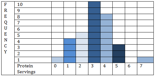
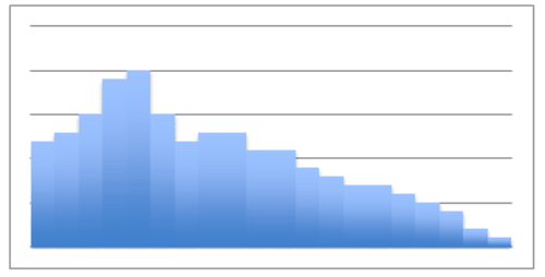
::实例A random sampling was taken of pedestrians on a street corner walking to work one day. They were asked how many servings of protein they ate, on average, on a daily basis. The data collected is displayed in the histogram below:
::抽查了一天在街角行人步行上班的一天,询问他们每天平均吃多少份蛋白质。Example 1
::例1How many people say that they eat at least 4 servings of protein daily?
::有多少人说他们每天至少吃4份蛋白质?8 people claim four servings per day, 3 claim five servings, and 1 claims seven servings, for a total of 12
::8人要求每天4人服务4人,3人要求5人服务5人,1人要求7人服务7人,共计12人Example 2
::例2What percentage of people surveyed eat no more than 3 serving of protein daily?
::在接受调查的人中,每天只吃3种蛋白质的百分比是多少?32 people responded, and of them 20 people eat 3 servings or less.
::32人回应,其中20人吃3个服务或更少。To find the percentage, divide the number who eat 3 or fewer servings by the total number of responses:
::要找到百分比,请将吃3个或3个以下服务对象的人数除以答复总数:2032=62%Example 3
::例3What proportion of the people surveyed eats exactly 5 servings of protein daily?
::接受调查的人中有多少人每天只吃5种蛋白质?3 people claim five servings per day.
::3人要求每天5次服务。To find the percentage, divide:
::要找到百分比,除数: 332=.094,或10%。Example 4
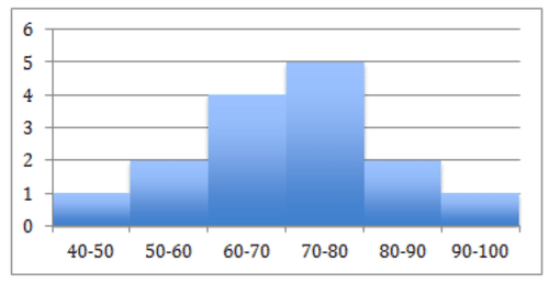
::例4What type of distribution does the histogram below display?
::下面的直方图显示哪种类型的分布 ?This is a symmetric, single peaked (unimodal) distribution.
::这是对称的单峰值(单峰值)分布。Example 5
::例5Using the image from question 4, determine the spread of any outliers on this graph.
::使用问题4的图像 确定此图上任何外部线的分布 。No outliers.
::没有外线。approximate min: 45 (the middle of the lowest interval of scores) approximate max: 95 (the middle of the hightest interval of scores) approximate range: Review
::回顾Identify which images show symmetric distributions and which show skewed distributions. Identify what type of symmetric or skewed distributions are displayed.
::标明显示对称分布的图像和显示偏斜分布的图像。 标明显示的对称分布或偏斜分布的类型 。1.
2.
3.
4.
5. What do you think is the shape of the distribution of the age at which a child takes its first steps? Why?
::5. 你认为儿童迈出第一步的年龄分布形态是什么? 为什么?-
Symetric – Uniform
::对称 - 统一 -
Skewed left
::向左倾斜 -
Skewed right
::倾斜右 -
Symmetric – Unimodal
::对称 - 统一摩托 -
Symmetric – Bimodal
::对称 - 双式双式
6. What do you think is the shape of the distribution of rolling a 6-sided die 1,000 times is? Why?
::6. 你认为滚动六面死亡的分布方式是多少?-
Symmetric – Uniform
::对称 - 统一 -
Skewed left
::向左倾斜 -
Skewed right
::倾斜右 -
Symmetric – Unimodal
::对称 - 统一摩托 -
Symmetric Bimodal?
::对称双向双向模式?
7. Match the graph with the data it most likely displays.
::7. 图表与其最可能显示的数据匹配。SAT Math Scores of future doctors and engineers.
::SAT 未来医生和工程师的数学分数。Prices of 1,000 homes within a given geographical area.
::特定地理区域内1 000所住房的价格。Cholesterol levels of 1000 adults.
::胆固醇水平为1 000名成年人。Men’s & women’s clothing sizes.
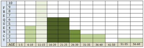
::男女的服装尺寸。The data below shows the number of surveyed people, and their respective ages, who enjoy riding roller coasters.
::以下数据显示了享受过山车的被调查人数及其各自年龄。Use the histogram below to answer questions 8-11.
::用下面的直方图回答问题8 -118. What is the shape of this histogram?
::8. 这种直方图的形状是什么?9. What is the center of this histogram?
::9. 这个直方图的中心是什么?10. What is the Spread of this histogram?
::10. 这种直方图的传播情况如何?11. What are the outliers of this histogram?
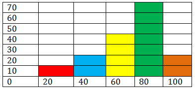
::11. 这种直方图的外线是什么?Use the histogram below to answer questions 12-15.
::使用下面的直方图回答问题12-15。12. What is the shape of this histogram?
::12. 这个直方图的形状是什么?13. What is the center of this histogram?
::13. 这个直方图的中心是什么?14. What is the Spread of this histogram?
::14. 这种直方图的传播情况如何?15. What are the outliers of this histogram?
::15. 这种直方图的外线是什么?Review (Answers)
::回顾(答复)Click to see the answer key or go to the Table of Contents and click on the Answer Key under the 'Other Versions' option.
::单击可查看答题键, 或转到目录中, 单击“ 其他版本” 选项下的答题键 。 -
Range
:
Recall that a range is a description of the difference between the greatest and least values in a given
data set
. On a histogram, this is important in two particular ways: