4.7 频率多边形 -- -- 概率和统计
章节大纲
-
The histogram below is built from data given in the lesson on histograms. How would you convert the histogram into an absolute frequency polygon or a relative frequency polygon ?
::下面的直方图是根据直方图课中提供的数据构建的。 您如何将直方图转换成绝对频率多边形或相对频率多边形 ?After the lesson below, we will return to this question and apply what we have learned.
::在吸取以下教训之后,我们将回到这个问题上,运用我们学到的东西。Frequency Polygons
::频率多边形A frequency polygon is closely related to a histogram. In fact, the difference is really only in the actual construction of the graph. Whereas a histogram is built of bins with a width representing the interval , and a height representing the quantity of data points in each interval, a frequency polygon is constructed by drawing a point to represent the frequency of a particular interval and connecting that point to the one representing the frequency of the next interval. The result is a shape very much like a histogram constructed from the same data, but with points instead of columns.
::频率多边形与直方图密切相关。 事实上, 差异实际上只在图形的实际构造中存在。 虽然直方图是由代表间隔的宽度和代表每个间隔中数据点数量的高度的书包组成的, 但通过绘制一个代表特定间隔频率的点, 并将该点与代表下一个间隔频率的点连接起来, 从而构建一个频率多边形。 结果的形状非常像从相同数据中构造的直方图, 但用点而不是列来构造。The primary purpose of a frequency polygon is to allow histogram-like data representation of two sets of data on the same graph. Two histograms on the same graph tend to shroud each other and make comparison more difficult, but two frequency polygons can be graphed together with much less interference.
::频率多边形的主要目的,是允许同一图上两组数据以直方图形式表示。同一图上的两组直方图往往相互缠绕,使比较更加困难,但两个频率多边形可以与干扰少得多的方式一起绘制图表。There are two common varieties of frequency polygon: absolute frequency and relative frequency . The difference between them is how the frequency is counted. An absolute frequency polygon has ‘peaks’ that represent the actual number of points in the associated interval. A relative frequency polygon has peaks that represent the percentage of total data points falling within the interval.
::有两种常见的频率多边形:绝对频率和相对频率。两者之间的差异是频率的计算方式。绝对频率多边形的“峰值”代表了相关间隔中的实际点数。相对频率多边形的峰值代表了间隔内数据总点的百分比。To create an absolute frequency polygon:
::要创建绝对频率多边形:-
Construct a frame just as you would for a histogram.
::构造像直方图一样的边框 。 -
Label the vertical axis with the
range
of frequencies to be graphed, and the horizontal axis with the intervals you have chosen. Make your horizontal axis long enough to include a full interval above and below your graphed data so that the finished polygon has a visible starting and ending point.
::标出垂直轴, 并标出要绘制的频率范围, 以及您选择的间隔水平轴。 使水平轴长到足以包含您图形数据上方和下方的完整间隔, 以便完成的多边形有一个可见的起始点和终点点 。 -
Sum the number of points in each interval and mark a point representing the sum along the midline of the interval. The midline is on the
arithmetic mean
of the each interval, and can be calculated by adding the lower and upper limits of each interval and dividing the sum by two.
::每间距的点数总和, 并标出一个代表间距中间线和数的点。 中间线是每个间距的算术平均值, 可以通过增加每个间距的下限和上限以及将总和除以两个来计算 。 -
Once all points have been accounted for, connect the points and color in the area under the line.
::一旦所有点点都计算好了, 将线下区域的点和颜色连接起来 。 -
If you are graphing a second set of data, repeat the process.
::如果您正在绘制第二组数据的图表,请重复此进程。
To construct a relative frequency polygon:
::要构建相对频率多边形:-
Construct a frame just as you would for a histogram.
::构造像直方图一样的边框 。 -
Label the vertical axis from 0 – 100%, and the horizontal axis with the intervals you have chosen.
::将垂直轴从 0 - 100%标出,并用您选择的间隔水平轴标出。 -
Sum the number of points in each interval, divide the sum of each interval by the total number of data points, and multiply by 100. The result is the percentage of the total number of data points that is represented by each interval. Mark a point representing the percentage along the midline of the interval.
::乘以 100 。 结果是每个间隔代表的数据点总数的百分比。 标记一个点, 表示间隔中线上的百分比 。 -
Once all points have been accounted for, connect the points and color in the area under the line.
::一旦所有点点都计算好了, 将线下区域的点和颜色连接起来 。 -
If you are graphing a second set of data, repeat the process.
::如果您正在绘制第二组数据的图表,请重复此进程。
Constructing an Absolute Frequency Polygon
::构造绝对频率多边形Construct an absolute frequency polygon to represent the data in the table.
::构造一个绝对频率多边形以代表表格中的数据。Time Spent Playing with Toys vs Unwrapping Presents and Eating on Christmas Day 12am - 3am 3am - 6am 6am - 9am 9am - 12pm 12pm - 3pm 3pm - 6pm 6pm - 9pm 9pm - 12am Time Playing 0 min 10 min 72 min 143 min 94 min 112 min 86 min 58 min Time Opening 0 min 14 min 106 min 54 min 47 min 68 min 73 min 0 min First construct the frame for your graph; label the -axis from 0 – 180 minutes, and the -axis with each of the intervals described in the table (12am-3am, etc.).
::首先为您的图形构建框架; 将 Y 轴从 0 - 180 分钟上标, 并将 X 轴用表格( 12 am-3 am 等) 中描述的每个间隔标为 Y 轴 。Next, mark a single point along the midline of each bin, at the appropriate height to represent the frequency of minutes spent playing during that interval.
::下一点, 标记每个垃圾箱中间线的单点, 以适当的高度代表该间隔期间玩耍分钟的频率 。Finally, connect the points and color in the area between the -axis and the line. Your completed frequency polygon should look something like this:
::最后,连接 X 轴和直线之间的区域中的点和颜色。 您已完成的频率多边形应该看起来是这样的 :
Constructing a Relative Frequency Polygon
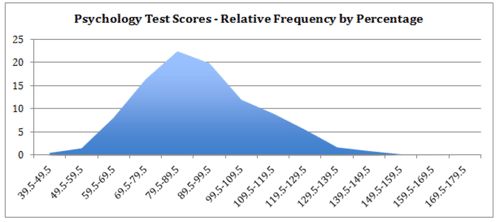
::构造相对频率多边形Construct a relative frequency polygon using the psychology test score data in the table.
::使用表格中的心理学测试分数数据构造相对频率多边形。Interval Frequency 29.5 39.5 0 39.5 49.5 3 49.5 59.5 10 59.5 69.5 53 69.5 79.5 107 79.5 89.5 147 89.5 99.5 130 99.5 109.5 78 109.5 119.5 59 119.5 129.5 36 129.5 139.5 11 139.5 149.5 6 149.5 159.5 1 159.5 169.5 1 169.5 179.5 0 The data has been organized into intervals and the frequency for each has been noted. In order to convert the stated absolute frequencies into relative frequencies, first find the sum of the frequencies from all intervals and then divide each interval’s frequency by the total frequency and multiply by 100 to get the percentage.
::数据是按间隔排列的,每个间隔的频率都得到了注意。 为了将所述绝对频率转换为相对频率,首先从所有间隔中找到频率的总和,然后将每个间隔的频率除以总频率,再乘以100以获得百分比。
::0+3+10+53+107+147+130+78+59+36+11+6+1+1+1+0=652总分-
Relative frequency for the 1
st
interval, including scores between 29.5 and 39.5:
::第一次间隔的相对频率, 包括29.5至39.5分的分数: 0652x100=0% -
Relative frequency for the 2
nd
interval, including scores between 39.5 and 49.5:
-
::3652x100.5%(四舍五入至0%)
::第二年期的相对频率,包括39.5至49.5分的分数:3652×1005%(四至0%) -
-
Relative frequency for the 3
rd
interval, including scores between 49.5 and 59.5:
::第三代的相对频率,包括49.5至59.5分的分数:10652x100=1.5% -
Relative frequency for the 4
th
interval, including scores between 59.5 and 69.5:
::4年期的相对频率,包括59.5至69.5分的分数:53652×1008% -
Repeat for the remaining values
::重复剩余值
Now you can create your graph as before, labeling the vertical axis from 1-25% (since none of the intervals are greater than 25% of the total) and the horizontal axis with the indicated intervals. The finished product should look rather like:
::现在,您可以像以前一样创建您的图表,将垂直轴从1-25%(因为间距均不超过总长度的25%)和水平轴标记为垂直轴,并用指定的间隔标为水平轴。Creating Multiple Relative Frequency Polygons
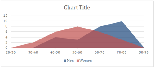
::创建多相对频率多边形The table below contains data on the ages of male and female students at a school dance. Create a multiple relative frequency polygon to illustrate the data in the table.
::下表载有参加学校舞蹈的男女学生年龄数据,创建多个相对频率多边形,以说明表中的数据。Interval (Age in Years) Male Frequency Female Frequency 13-13.5 6 3 13.5-14 5 6 14-14.5 9 13 14.5-15 13 19 15-15.5 12 16 15.5-16 16 17 16-16.5 14 11 First we will need to find the sum of each frequency column and divide the frequency of each interval by the sum to get the relative percentage of each interval. If we add a row for the sum of each column, and two columns for relative percentages, our revised table will look like this:
::首先,我们需要找到每个频率列的总和,并将每个间隔的频率除以总和,以获得每个间隔的相对百分比。如果我们为每列的总和增加一行,为相对百分比增加两列,我们的订正表格将像这样:Interval (Age in Years) Male Frequency Male Relative Frequency Female Frequency Female Relative Frequency 13-13.5 6 8% 3 4% 13.5-14 5 7% 6 7% 14-14.5 9 12% 13 15% 14.5-15 13 17% 19 22% 15-15.5 12 16% 16 19% 15.5-16 16 21% 17 20% 16-16.5 14 19% 11 13% TOTAL 75 100% 85 100% Then we need to graph both relative frequency polygons on the same graph so they can be easily compared.
::然后我们需要在同一图中绘制两个相对频率多边形的图表,以便很容易比较。
Earlier Problem Revisited
::重审先前的问题The histogram below is built from data given in the lesson on histograms. How would you convert the histogram into an absolute frequency polygon or a relative frequency polygon?
::下面的直方图是根据直方图课中提供的数据构建的。 您如何将直方图转换成绝对频率多边形或相对频率多边形 ?To convert the data into an absolute frequency polygon, plot a single point to represent the frequency of each interval at the midline of the interval, then connect the points with a line and color in the area between the line and the -axis.
::要将数据转换成绝对频率多边形,请绘制一个单点,以表示间距中线每个间距的频率,然后将点与线与x轴之间的区域线和颜色连接起来。To convert into a relative frequency polygon, find the sum of frequencies of the entire sample , and divide the frequency of each interval by the sum, then multiply by 100 to get the relative percentage of each interval.
::要转换成相对频度多边形,请找到整个样本的频率和频率,并将每个间隔的频率除以总和,然后乘以100以获得每个间隔的相对百分比。Examples
::实例The following table represents the average times it took for 25 men and 25 women to run a race.
::下表显示了25名男子和25名妇女参加比赛的平均时间。Time in Minutes 30-40 40-50 50-60 60-70 70-80 Frequency Men 0 4 3 8 10 Frequency Women 2 6 8 6 3 Use the following data for examples 4 and 5:
::例4和例5使用下列数据:126, 146, 161, 156, 134, 164, 157, 156, 154, 156, 154, 156, 138, 164, 154, 173, 159, 143, 152, 132, 164, 158, 170, 149, 178, 136, 177, 165, 128
Example 1
::例1Create a frequency polygon (remember to use the midpoints of the time on your graph) displaying the above data.
::创建显示上述数据的频率多边形( 记得在图形上使用时间的中点) 。Build a chart with intervals along the bottom (on the -axis) matching those in the table with one category above and below, and with frequency values from 1- 10 up the side ( -axis):
::在底部(在 X 轴上)与表中的某个类别相匹配,并在侧面( y- 轴) 上方 1 - 10 的频率值为 1- 10 的下方( 在 X 轴上) , 绘制一个带有间隔的图表 :Example 2
::例2Is the data continuous or discrete?
::数据是连续数据还是离散数据?The data is continuous, divided into intervals.
::数据是连续的,按间隔分列。Example 3
::例3Look at the graph below. If the “Mark” represents the midpoint of the represented data, list the classes that the marks were grouped into.
::查看下图。 如果“ 马克” 表示所代表的数据的中点, 请列出标记分组的类别 。
Remember that the data point is the center of the interval it represents, so the intervals are:
::记住数据点是它所代表的间隔的中心, 所以间隔是:0-9, 10-19, 20-29, 30-39, 40-49, 50-59, 60-69, 70-79, 80-89, 90-99, 100-109
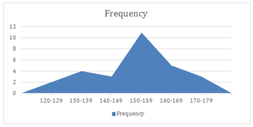
Example 4
::例4Complete the Table
::填写表格Class Interval Midpoimt Frequency 120-129 The table shows an initial interval of 10 units , filling in the remainder of the intervals at the same range yields:
::该表显示10个单位的初始间隔,以相同幅度的产量填充间隔的剩余部分:Class Interval Midpoint Frequency 120-129 124.5 II 130-139 134.5 IIII 140-149 144.5 III 150-159 154.5 IIIIIIIIIII 160-169 164.5 IIIII 170-179 174.5 III Example 5
::例5Create an absolute frequency polygon for the data
::为数据创建绝对频率多边形Review
::回顾1. Why is a frequency polygon called a “polygon”?
::1. 为什么一个频率多边形称为 " 多边形 " ?2. What is the advantage of a frequency polygon?
::2. 频率多边形的优势是什么?A police radar unit measured the speed of 25 cars on a certain street during the week.
::警方雷达股在一周内测量了某条街上25辆汽车的速度。The resulting speeds were:
::所产生的速度如下:29, 23, 30, 30, 27, 24, 30, 25, 23, 28, 25, 24, 28, 30, 23, 30, 27, 25, 29, 24, 23, 26, 30, 28, 25
The policeman then completed the same procedure at the same time of day, only on a weekend.
::然后,警察在一天的同一时间完成了同样的程序,只在周末完成。The resulting speeds were:
::所产生的速度如下:30, 35, 25, 27, 30, 26, 25, 32, 29, 30, 28, 27, 27, 34, 32, 30, 27, 26, 31, 32, 35, 29, 33, 32, 28
3. Create a frequency table for both sets of data, assume an interval of 2 mph.
::3. 为两组数据建立一个频率表,假定间隔为2米/秒。4. Create a combined absolute frequency polygon for the above data (both sets on the same chart).
::4. 为上述数据(同一图表上的两组数据)创建一个合并的绝对频率多边形。5. What information can be derived from the two sets of data? What can you infer about weekday vs. weekend drivers?
::5. 从这两套数据中可以得出哪些信息?你能推断出每周工作日与周末驾驶员之间的差别是什么?6. If you had to take an educated guess, what would you say the speed limit on the street is?
::6. 如果你不得不接受一个有教育的猜测, 你会说街上的速度限制是什么?Based on the following data:
::根据以下数据:11, 21, 30, 40, 57, 37, 51, 27, 35, 47, 33, 50, 14, 23, 63, 42, 66, 38, 65, 19, 43, 31, 32, 53, 56, 33, 25, 44, 52, 39
7. Complete the Table
::7. 填写表格Class Interval Midpoint Frequency 10-19 8. Create an Absolute Frequency Polygon for the data.
::8. 为数据创建绝对频率多边形。Based on the following data:
::根据以下数据:45, 70, 58, 71, 63, 65, 88, 69, 71, 62, 75, 89, 75, 67, 70, 83, 73, 98, 77, 91, 52, 65, 87, 95, 43, 97, 53, 71, 66, 88
9. Complete the Table
::9. 填写表格Class Interval Midpoint Frequency 40-49 10. Create an Absolute Frequency Polygon for the data.
::10. 为数据创建绝对频率多边形。Based on the following data:
::根据以下数据:108, 129, 133, 127, 117, 148, 128, 144, 130, 144, 120, 123, 103, 134, 152, 124, 134, 122, 147, 125, 117, 131, 148, 128, 134, 106, 159, 154, 121, 138
11. Complete the Table
::11. 填写表格Class Interval Midpoint Frequency 100-109 12. Create an Absolute Frequency Polygon for the data.
::12. 为数据创建绝对频率多边形。13. Create a Relative Frequency Polygon for the data, and compare the appearance with that of the absolute frequency polygon.
::13. 为数据创建一个相对频率多边形,并将外观与绝对频率多边形的外观进行比较。Review (Answers)
::回顾(答复)Click to see the answer key or go to the Table of Contents and click on the Answer Key under the 'Other Versions' option.
::单击可查看答题键, 或转到目录中, 单击“ 其他版本” 选项下的答题键 。 -
Construct a frame just as you would for a histogram.