4.12 创建散落绘图和线形图
章节大纲
-
Scott’s teacher was reviewing the research that Scott had conducted regarding the best car stereo systems to buy for college students on a limited budget. Scott had two long columns of numbers indicating the comparison between sound quality (which Scott had summarized with a 10-point scale for each stereo), and cost rounded to the nearest dollar before tax.
::斯科特的老师正在审查斯科特在有限预算范围内为大学生购买最佳汽车立体声系统的研究。 斯科特有两列长的数字,表明音质(Scott对每台立体声进行了10点的总结 ) , 成本在税前四舍五入到最接近美元。The teacher commended Scott on the detailed research, but pointed out that the list of numbers was kind of hard to make sense out of. He suggested that Scott plot the values on a scatter plot or line graph to see if there was a ‘sweet spot’ indicating the best compromise between quality and cost.
::老师赞扬了斯科特的详细研究,但指出数字清单有点难以理解。 他建议斯科特在散射图或线条图上绘制数值,看看是否有一个“甜点 ” , 表明质量和成本之间的最佳妥协。How should Scott decide which type of plot is best for his purpose? How would he go about taking the data from columnar form and converting it into the data visualization he decides to use?
::Scott应该如何决定哪类阴谋最适合他的目的?他应该如何从分栏形式中获取数据并将其转换成他决定使用的数据可视化?Creating Scatter Plots and Line Graphs
::创建散列绘图和线条图Line plots, followed closely by scatter plots, are by far the most common method of displaying bivariate data . By assigning one variable to each axis and plotting points by both horizontal and vertical location simultaneously, you can quickly and easily show the degree to which one set of data is influenced (or not influenced) by another.
::直线图,紧随其后是散块图,是显示双轨数据的最常用方法。通过将一个变量分配给每个轴,同时用水平和垂直位置绘制点,可以快速和轻松地显示一组数据受另一组数据影响(或不受另一组数据影响)的程度。There are two general types of bivariate data sets that are graphed on a line or scatter plot: observed (or experimental) data and calculated (or predicted) data.
::有两种一般的双变量数据集,用线条或散射图绘制图表:观测(或实验)数据和计算(或预测)数据。-
Calculated Data:
To create a line or scatter plot of calculated data, you must first identify your two variables as either
dependent
or
independent
. An independent (or input) variable may also be referred to as the
explanatory
variable, and has values that are assigned to it. A dependent (or output) variable may also be called the
response
variable, and has values that are the result of computations performed on the input variable. By convention, the independent variable is plotted on the horizontal, and the dependent variable is plotted on the vertical.
::计算数据 : 要创建计算数据的线条或分布图, 您必须首先将您的两个变量指定为依附或独立的。 独立的( 或输入) 变量也可以被称为解释变量, 并有指定给它的价值。 依附变量( 或输出) 也可以称为响应变量, 并且有根据输入变量进行计算的结果的数值。 按常规, 独立变量在水平上绘制, 依赖变量则在垂直上绘制 。 -
Observed Data
:
The most common reason to graph two sets of data on the same graph is to evaluate the level of
statistical correlation
. By plotting the two sets of data on separate axes of the same graph, we can see a visual representation of possible related changes in values between the two sets. As with calculated data, you should plot the values of the variable that you expect is the explanatory variable on the horizontal and the expected response variable on the vertical.
::观测到的数据:在同一图中绘制两组数据的最常见原因是评估统计相关性。通过在同一图中不同的轴上绘制两组数据,我们可以看到两组数值之间可能的相关变化的直观表示。与计算的数据一样,您应该绘制您所期望的变量的值,即水平上的注释变量和垂直上的预期响应变量。
When graphing observed data, you do not always know which value is the input and which the output, or even if the two values are indeed dependent at all! In later lessons, we will return to this concept to learn a number of methods to evaluate data and determine the degree of correlation between multiple value sets. For now, place the variable you think is most reasonably the input on the horizontal.
::当绘制观察到的数据时,您并不总是知道输入的值和输出的值,或者即使这两个值确实取决于任何数值。在以后的教训中,我们将回到这个概念,学习一些方法来评价数据并确定多个值组之间的关联程度。现在,将您认为最合理的变量放在水平上。The first and most important step is to organize your data so that it is easy to see how a given input value relates to a given output value. By convention this is done with a ‘T’ chart or a two-column graph, with the input value on the left and the output value on the right, or vertically with the input on the top and output on the bottom.
::第一个也是最重要的步骤是组织您的数据,以便很容易地看到特定输入值如何与给定输出值相关。 按常规,这是用一个“ T” 图表或两列图完成的,左侧是输入值,右侧是输出值,上方是垂直的,下方是输入值。Once you have the table constructed, start with the first pair of values and move across your horizontal axis to the first input value and up the vertical axis to the associated output value. Continue the process until all of your points have been graphed.
::表格构造后,从头一对数值开始,在水平轴上移动到第一个输入值,并将垂直轴上移到相关输出值上方。继续进程,直到您的所有点被图形化为止。Once all of your points have been plotted, if you are creating a scatter plot, you’re done! If you are creating a line plot , start at your minimum input value and connect the points as you move to the right on the input axis.
::一旦绘制了所有点数, 如果您正在创建散射图, 您就完成了 。 如果您正在创建线条图, 请在最小输入值开始, 并在输入轴向右移动时连接点数 。Constructing Scatter Plots
::构造散列绘图Construct a scatter plot from the given values.
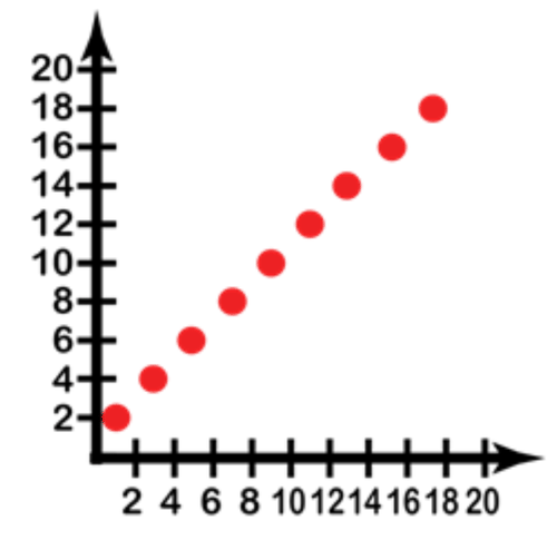
::从给定值构造一个散射图 。Input 1 3 5 7 9 11 13 15 17 Output 2 4 6 8 10 12 14 16 18 The data here is already organized into associated input and output values, so you simply need to create a graph with a horizontal and vertical axis on which to plot the points.
::这里的数据已经组织成相关的输入和输出值, 所以您只需要创建一个带有水平和垂直轴的图形, 就可以绘制点 。Notice that I have only created the positive values here, since the table of values was all positive.
::注意我在这里只创造了正值, 因为数值表都是正值。Now we just plot the points from the table, starting with the first vertical pair: Input = 1, Output = 2. Incidentally, when describing a single point of bivariate data, the conventional method of writing it is in the form (input, output) or . So our first point would be (1, 2), the second would be (3, 4) and so on.
::现在,我们从表格中绘制各点,从第一个垂直对子开始:输入=1,输出=2。顺便说一句,当描述一个双变量数据单一点时,通常的写法是形式(输入、输出)或(x,y ) 。 因此,我们的第一个点是(1,2),第二个点是(3,4)等等。Now we fill in the values on the graph, starting with (1, 2). Beginning at the lower-left corner, which represents (0, 0), move 1 point to the right and 2 points up. The second point is 3 points to the right and 4 points up. Continue until all 10 points are graphed. Since the question asks specifically for a scatter plot, once the individual points are plotted, we are done.
::现在,我们填入图中的数值,从(1,2)开始,从代表 0,0的左下角开始,向右移动1点,向右移动2点。第二点向右移动3点,向上移动4点。继续到所有10点都绘制图表为止。由于问题具体要求绘制散射图,一旦绘制了各个点,我们就完成了。Creating Line Plots
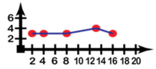
::创建线线绘图Romane loves jellybeans, and she eats an average of 20 each day. Worried about her weight, she decides to see if there is an obvious correlation between the number of jellybeans she eats and her weight. If she records the data below, which variable would be the input and which the output? Create a line plot from the data.
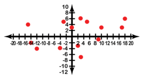
::罗马人喜欢果冻豆, 她每天平均吃20块。 担心她的体重, 她决定看看她吃的果冻糖数量和体重之间是否有明显的关联。 如果她记录了下面的数据, 输入和输出会是什么变量? 从数据中创建一条线条图 。Increase or Decrease # of beans Increase or Decrease in Weight +2 -3 -3 +5 -7 +3 +5 +5 -12 -4 +18 +6 -14 -2 -15 +4 +17 +3 +0 +3 -4 -4 +3 +6 +9 -1 +10 +3 Since Romane can control the number of jellybeans she eats, that would be the input variable, and the increase or decrease in weight would be the output. If we create an graph and plot the points, the result looks like this (note that this time the graph shows negative and positive values!):
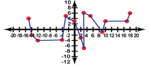
::由于Romane可以控制她吃的果冻豆的数量,那就是输入变量,而重量的增减就是输出。如果我们创建一个(x,y)图表并绘制点形图,结果就像这样(请注意,这次图表显示的是负值和正值 ! ) :Finally we connect the points from left to right, since the question specified a line graph:
::最后,我们将各点从左向右连接,因为问题指定了一个线条图:Interpreting Data Using Graphs
::解释数据使用图图Does more sleep consistently improve math grades?
::更多的睡眠是否不断提高数学成绩?Organize the data below by creating a ‘T’ table for the and values, then graph the data as either a scatter plot or line graph, whichever is most appropriate.
::将以下数据组织起来,为 x 和 y 值创建一个“ T” 表格,然后将数据用散射图或线条图绘制,以最合适的为准。Math Homework Score (out of 20 points) Hours of Sleep (the night before) Day 1 11 Day 1 7 Day 2 19 Day 2 8 Day 3 9.5 Day 3 6.5 Day 4 11 Day 4 7 Day 5 15 Day 5 5 Day 6 6 Day 6 3 Day 7 11.5 Day 7 8.5 Day 8 18.5 Day 8 7.5 Day 9 14 Day 9 6 Day 10 18 Day 10 8 Day 11 15.5 Day 11 5.5 Day 12 15.5 Day 12 4.5 Day 13 12 Day 13 9 Day 14 15.5 Day 14 5.5 The data as given is organized by day in each table. In order to answer the question: “Does more sleep consistently improve math grades?” We need to correlate the data from each night’s sleep with the next day’s grades. In this case, which day it is does not matter as much as the hours of sleep the night before, so we can pull the ‘Day’ column out of each table (being careful not to change the order of the values!) and make a new table with only the correlating scores and hours of sleep. This gives us:
::所提供的数据在每张表格中按白天排列。 为了回答一个问题: " 更多的睡眠会不断提高数学成绩吗? " 我们需要将每晚睡眠的数据与次日的成绩联系起来。 在这种情况下,哪一天与前一晚的睡眠时间无关,所以我们可以把每一张表格中的`日 ' 栏(小心不要改变数值的顺序!),并制作一张新的表格,只有相关的分数和睡眠时间。Hours of Sleep Math Score 7 11 8 19 6.5 9.5 7 11 5 15 3 6 8.5 11.5 7.5 18.5 6 14 8 18 5.5 15.5 4.5 15.5 9 12 5.5 15.5 Since the question is asking about the correlation between sleep the night before and grade the next day, the sleep becomes the input variable (or independent variable ) and score becomes the output variable (dependent variable) . Plotting the points on an graph yields:
::由于问题在于前夜睡觉与次日年级之间的相关性,睡眠成为输入变量(或独立变量),得分成为输出变量(取决于变量)。Given the significant scattering of points as we move left to right, it is appropriate to maintain the scatter plot layout.
::鉴于我们向左向右移动时各点分布很大,宜维持散射地块布局。In later lessons we will discuss linear regression , the process of identifying a line of best fit . A line of fit is a line drawn through a scatter plot that indicates a trend that the data follows, and the line of best fit is the mathematically derived most accurate indicator of that trend.
::在以后的教训中,我们将讨论线性回归,即确定一条最合适的线的过程。 适合的线是通过散射图绘制的线,表明数据所遵循的趋势,而最合适的线是从数学上得出最精确的该趋势的指标。Earlier Problem Revisited
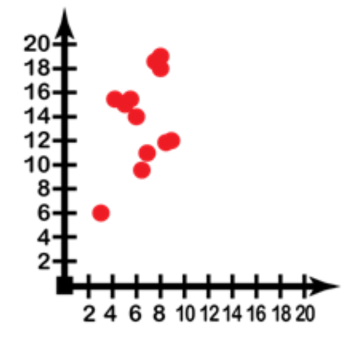
::重审先前的问题Scott’s teacher was reviewing the research that Scott had conducted regarding the best car stereo systems to buy for college students on a limited budget. Scott had two long columns of numbers indicating the comparison between sound quality (which Scott had summarized with a 10-point scale for each stereo), and cost rounded to the nearest dollar before tax.
::斯科特的老师正在审查斯科特在有限预算范围内为大学生购买最佳汽车立体声系统的研究。 斯科特有两列长的数字,表明音质(Scott对每台立体声进行了10点的总结 ) , 成本在税前四舍五入到最接近美元。The teacher commended Scott on the detailed research, but pointed out that the list of numbers was kind of hard to make sense out of. He suggested that Scott plot the values on a scatter plot or line graph to see if there was a ‘sweet spot’ indicating the best compromise between quality and cost. How should Scott decide which type of plot is best for his purpose? How would he go about taking the data from columnar form and converting it into the data visualization he decides to use?
::老师赞扬了Scott的详细研究,但指出数字清单有点难以理解。 他建议Scott在散射图或线条图上绘制数值,看看是否有“甜点”表明质量和成本之间的最佳折中点。 Scott应该如何决定哪类地块最适合他的目的?他应该如何从分栏表中获取数据并将其转换成他决定使用的数据可视化?Scott should view cost as the independent variable (the input) and sound quality as the dependent variable (the output). By creating an graph and plotting each of the corresponding cost/quality values, he will generate a much clearer comparison for the audience of his report. If he notes a particularly clear correlation (all or most of the points in a line) between increasing cost and improved quality, he may wish to indicate a line of fit to further illustrate the trade-off. A graph of his data might look something like this:
::Scott应该将成本视为独立的变量(输入),而将合理质量视为依赖的变量(产出)。通过创建一个(x,y)图表和绘制相应的成本/质量值,他将为报告读者进行更清楚的比较。如果他注意到成本增加与质量提高之间有特别明显的关联(一行中的所有或大部分点 ) , 他也许想指出一条合适的线,以进一步说明权衡。他的数据图表可能看起来是这样的:Examples
::实例Example 1
::例1Construct a scatter plot to represent the data from the chart below indicating the number of birds killed by planes each year.
::构造一个散射图, 以显示下图中的数据, 显示每年被飞机杀死的鸟类数量 。YEAR PLANES REGISTERED BIRDS KILLED 1978 6 13 1979 4 12 1980 7 14 1981 3 11 1982 7 14 1983 6 13 1984 3 12 1985 4 11 1986 1 9 1987 4 12 The number of planes registered is the input, and the number of birds killed is the output.
::注册的飞机数是输入数,死亡鸟类数是输出数。Example 2
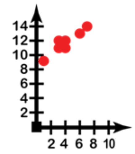
::例2Construct a line graph to illustrate the data.
::构造用于说明数据的线条图。Height Change 4 2 8 13 16 Weight Change 3 3 3 4 3 Change in height is the input, and change in weight the output. Connect the points to create a line graph instead of a scatter plot.
::高度变化是输入, 重量变化是输出。 连接点可以创建线形图, 而不是散射图 。Example 3
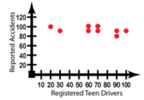
::例3Mike decided to see if the teenage drivers in his city were truly more likely to get into accidents, and he collected the data below. Graph the data appropriately for his study.
::Mike决定看看他所在城市的青少年驾驶员是否真的更可能遭遇事故,他收集了以下数据。为他的研究适当绘制数据图。Year Teen Drivers Registered Auto Accidents 1980 90 80 1981 70 90 1982 60 90 1983 20 100 1984 30 90 1985 100 90 1986 70 100 1987 60 100 1988 70 100 1989 90 90 The number of teens registering to drive is the input, and the number of reported accidents the output. Note that the very little vertical change despite a significant horizontal change would indicate virtually no correlation between the two values.
::注册驾驶的青少年人数是输入数,报告的事故数是输出数。请注意,尽管横向发生了显著变化,但纵向变化很小,这几乎表明这两个值之间没有关联。Example 4
::例4How do you determine which values to graph on the vertical axis and which on the horizontal?
::您如何确定垂直轴上的哪些值和水平上的哪个值 ?The input value or the cause is the independent variable, and the output or the effect is the dependent variable. The independent variable goes on the horizontal and the dependent on the vertical.
::输入值或原因为独立变量,输出或效果为依附变量。独立变量在水平上进行,在垂直上进行。Example 5
::例5Given the data below, which variable represents the explanatory variable? What is the related term for the other variable? How do you know which is which?
::根据以下数据,哪个变量代表解释变量?另一个变量的相关术语是什么? 你怎么知道哪个变量?Sneezes 8 6 5 2 1 4 7 12 Tissues 18 13 7 5 1 9 19 43 Sneezes are the input variable, graphed on the horizontal ‘ ’ axis, since sneezing is the cause related to the effect of using a tissue.
::喷嚏是输入变量,以水平 ' X ' 轴为图表,因为喷嚏是使用组织效果的原因。Review
::回顾1. Create a scatter plot of the data shown below. Describe the relationship that exists within the data.
::1. 创建下文所列数据的散射图,描述数据内存在的关系。Cost associated with raising a child Child's Age 3 6 9 12 15 Annual Cost 11, 800 12, 800 13, 700 16, 000 17, 800 2. Create a scatter plot from the data in the table below.
::2. 从下表的数据中创建散射图。-3 -3 -2 -1 0 0 0 1 1 1 2 3 3 4 3 2 1 2 0 0 -1 -1 -3 -4 3. Draw a reasonable line of fit.
::3. 划出合理的适配线。4. What is the equation of the line of fit?
::4. 合适线的等式是什么?5. The data below shows the number of hours spent studying for a history quiz. Draw a scatter plot.
::5. 以下数据显示历史测验的学习时数,绘制散射图。Study in Hours 4 3 6 2 1 5 4 Grade in Percent 85 78 93 71 61 91 76 6. Draw a reasonable line of fit.
::6. 划出合理的适配线。7. What is the equation of the line of best fit?
::7. 最合适线的等式是什么?8. Predict the grade for a student who studied 7 hours.
::8. 为7小时学习的学生预测年级。9. Could the line go on forever? Why or why not?
::9. 线路能否永远保持下去?为什么或为什么不能?10. The table below shows the number of reported food poisoning cases at a local hospital. Create a scatter plot for the data.
::10. 下表显示了当地医院报告的食物中毒病例数量,为数据绘制一个散射图。Reported Food Poisoning Gases Year 2005 2006 2007 2008 2009 Cases 38 26 19 15 17 11. What relationship, if any exists in the data?
::11. 如果数据中存在何种关系?12. Draw a line of fit. Write the slope intercept form of an equation for the line of fit.
::12. 绘制适合的线,为适合的线写出方程式的斜度截击形式。13. The table shows the average and maximum lifespan of animals that are kept in captivity. Create a scatter plot to represent the data.
::13. 下表显示了被囚禁的动物的平均寿命和最长寿命,并绘制了代表数据的散射图。Lifespan in Years Average 13 26 16 9 36 41 42 21 Maximum 48 51 41 21 71 78 62 55 14. Draw a reasonable line of fit, and write the slope intercept form of the equation.
::14. 划出合理的合适线,并写出方程式的斜坡截击形式。15. Predict the maximum lifespan for an animal with an average age of 33 years.
::15. 预测平均年龄为33岁的动物的最大寿命。Review (Answers)
::回顾(答复)Click to see the answer key or go to the Table of Contents and click on the Answer Key under the 'Other Versions' option.
::单击可查看答题键, 或转到目录中, 单击“ 其他版本” 选项下的答题键 。 -
Calculated Data:
To create a line or scatter plot of calculated data, you must first identify your two variables as either
dependent
or
independent
. An independent (or input) variable may also be referred to as the
explanatory
variable, and has values that are assigned to it. A dependent (or output) variable may also be called the
response
variable, and has values that are the result of computations performed on the input variable. By convention, the independent variable is plotted on the horizontal, and the dependent variable is plotted on the vertical.