15.4 数据图形显示
章节大纲
-
Two common types of graphic displays are bar charts and histograms. Both bar charts and histograms use vertical or horizontal bars to represent the number of data points in each category or interval . The main difference graphically is that in a bar chart there are spaces between the bars and in a histogram there are not spaces between the bars. Why does this subtle difference exist and what does it imply about graphic displays in general?
::两种常见的图形显示类型是条形图和直方图。条形图和直方图都使用垂直或水平条来代表每个类别或间距中的数据点数。主要的图形差别是,在条形图和直方图中,条形图之间没有空格。为什么存在这种微妙的差别,以及它对于一般的图形显示意味着什么?Displaying Data
::显示数据It is often easier for people to interpret relative sizes of data when that data is displayed graphically. Note that a categorical variable is a variable that can take on one of a limited number of values and a quantitative variable is a variable that takes on numerical values that represent a measurable quantity. Examples of categorical variables are tv stations, the state someone lives in, and eye color while examples of quantitative variables are the height of students or the population of a city. There are a few common ways of displaying data graphically that you should be familiar with.
::当用图形显示数据时,人们通常更容易解释数据的相对大小。 请注意, 绝对变量是一个变量, 可以包含数量有限的数值之一, 数量变量是一个变量, 数字值代表一个可测量的数量。 绝对变量的例子有 tv 站、 某人居住状态和眼色, 而数量变量的例子则是学生或城市人口的高度。 您应该熟悉一些用图形显示数据的共同方法。Pie Chart
::饼图A pie chart shows the relative proportions of data in different categories. are excellent ways of displaying categorical data with easily separable groups. The following pie chart shows six categories labeled A − F . The size of each pie slice is determined by the central angle. Since there are 360 ∘ in a circle, the size of the central angle θ A of category A can be found by:
::派图显示不同类别中数据的相对比例。 派图显示绝对数据时, 以容易分解的组别显示绝对数据的极好方式。 以下派图显示六个标签为 A- F 的类别。 每个派切片的大小由中心角度决定。 由于圆形中为360 , A类的中心角 A 的大小可以通过以下方式找到:θ A 360 = # d a t a p o i n t s i n c a t e g o r y A T o t a l n u m b e r o f d a t a p o i n t s
::A360 数据点类别中的数据点数Bar Chart
::条条条图A bar chart displays frequencies of categories of data. The bar chart below has 5 categories, and shows the TV channel preferences for 53 adults. The horizontal axis could have also been labeled News, Sports, Local News, Comedy, Action Movies. The reason why the bars are separated by spaces is to emphasize the fact that they are categories and not continuous numbers. For example, just because you split your time between channel 8 and channel 44 does not mean on average you watch channel 26. Categories can be numbers so you need to be very careful.
::条形图显示数据类别的频率。下面的条形图有5个类别,并显示53个成年人的电视频道首选。水平轴也可以被标为新闻、体育、地方新闻、喜剧、喜剧、动作电影。 条形图用空格分隔的原因是强调它们是类别而不是连续数字。 例如, 仅仅因为您的时间在8频道和44频道之间分开, 并不表示您平均看26频道, 类别可以是数字, 所以您需要非常小心。Histogram
::直方图A histogram displays frequencies of quantitative data that has been sorted into intervals. The following is a histogram that shows the heights of a class of 53 students. Notice the largest category is 56-60 inches with 18 people.
::直方图显示每隔一段时间分类的定量数据的频率。以下是直方图,显示53个学生班的高度。注意最大的类别是56-60英寸,18人。Boxplot
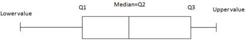
::框图A boxplot (also known as a box and whiskers plot ) is another way to display quantitative data. It displays the five 5 number summary ( minimum , Q 1 , , Q 3 , maximum). The box can either be vertically or horizontally displayed depending on the labeling of the axis. The box does not need to be perfectly symmetrical because it represents data that might not be perfectly symmetrical.
::框图( 也称为框和胡须图) 是显示量化数据的另一种方式。 它显示五个数字摘要( 最小、 Q1 、 Q3 、 最大) 。 框可以垂直显示, 也可以水平显示, 取决于轴的标签。 框不需要完全对称, 因为它代表的数据可能不完全对称 。Examples
::实例Example 1
::例1Earlier, you were asked about the difference between histograms and bar charts. The reason for the space in bar charts but no space in histograms is bar charts graph categorical variables while histograms graph quantitative variables. It would be extremely improper to forget the space with bar charts because you would run the risk of implying a spectrum from one side of the chart to the other. Note that in the bar chart where TV stations where shown, the station numbers were not listed horizontally in order by size. This was to emphasize the fact that the stations were categories.
::早些时候, 有人询问了直方图和条形图之间的差别。 在条形图中, 空格却没有空格, 原因是条形图图形图形绝对变量, 而直方图图形量化变量。 用条形图忘记空格将是极不恰当的, 因为您可能会冒着从图表的一面向另一面暗示频谱的风险。 请注意, 在显示的电视台所在的条形图中, 台号不是按大小水平排列的。 这是要强调这些台是分类的这一事实 。Example 2
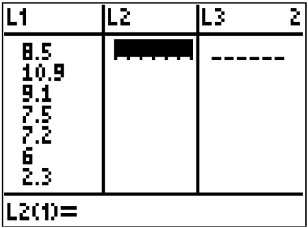
::例2Create a boxplot of the following numbers in your calculator.
::在计算器中创建以下数字的框图 。8.5, 10.9, 9.1, 7.5, 7.2, 6, 2.3, 5.5
Enter the data into L 1 by going into the Stat menu.
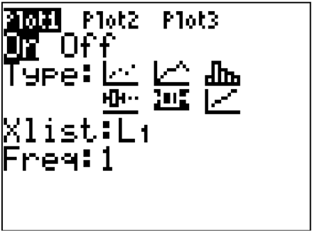
::通过输入 Stat 菜单将数据输入 L1 。Then turn the statplot on and choose boxplot.
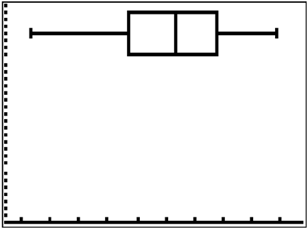
::然后打开Statplot 并选择框plot 。Use Zoomstat to automatically center the window on the boxplot.
::使用 缩放 来自动将窗口居中于框块中 。Example 3
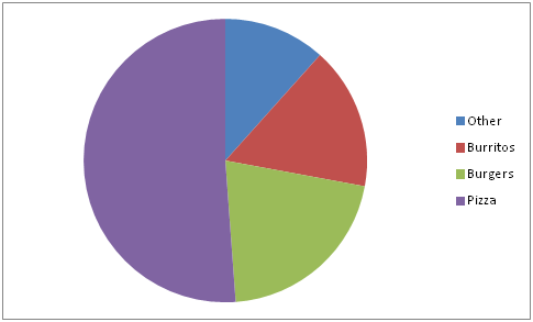
::例3Create a pie chart to represent the preferences of 43 hungry students.
::制作一个派图, 代表43名饥饿学生的偏好。-
Other – 5
::其他 - 5个 -
Burritos – 7
::倾角 - 7 -
Burgers – 9
::汉堡汉堡 - 9 -
Pizza – 22
::披萨 - 22
Example 4
::例4Create a bar chart representing the preference for sports of a group of 23 people.
::创建一张代表23人团体偏爱体育的条形图。-
Football – 12
::足球 - 12 -
Baseball – 10
::棒球 - 10 -
Basketball – 8
::篮球 - 8 -
Hockey – 3
::曲曲琴 - 3
Example 5
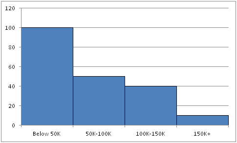
::例5Create a histogram for the income distribution of 200 million people.
::建立2亿人收入分配的直方图。-
Below $50,000 is 100 million people
::低于50 000美元的人口为1亿,低于50 000美元 -
Between $50,000 and $100,000 is 50 million people
::50 000至10 000 000美元之间是5 000万人 -
Between $100,000 and $150,000 is 40 million people
::100 000 000至150 000美元之间的人口为4 000万人 -
Above $150,000 is 10 million people
::超过150 000美元的人口为1 000万人
Summary -
Categorical variables
have a limited number of values.
::分类变量的数值有限。 -
Quantitative variables
represent measurable quantities.
::数量变量代表可衡量的数量。 -
Pie charts show relative proportions of data in different categories, with the size of each slice determined by the central angle.
::饼图显示不同类别数据的相对比例,每个切片的大小由中央角度决定。 -
Bar charts display frequencies of categories of data, with spaces between bars to emphasize that they represent categories, not continuous numbers.
::条形图表显示数据类别的频率,在条形之间留出空格,以强调它们代表的是类别,而不是连续数字。 -
Histograms display frequencies of quantitative data sorted into intervals
::直方图显示按间隔排序的定量数据的频率 -
Boxplots (or box and whiskers plots) display the five-number summary (minimum, Q1, median, Q3, maximum) of quantitative data.
::Boxplots(或方框和胡须图)显示量化数据的五数值摘要(最低、问题1、中位数、问题3、最大值)。
Review
::回顾1. What types of graphs show categorical data?
::1. 哪些类型的图表显示绝对数据?2. What types of graphs show quantitative data?
::2. 哪些类型的图表显示定量数据?A math class of 30 students had the following grades:
::30名学生的数学班成绩如下:Grade Number of Students with Grade A 10 B 10 C 5 D 3 F 2 3. Create a bar chart for this data.
::3. 为此数据创建条形图。4. Create a pie chart for this data.
::4. 为这一数据创建一个饼形图表。5. Which graph do you think makes a better visual representation of the data?
::5. 你认为哪个图表更能直观地显示数据?A set of 20 exam scores is 67, 94, 88, 76, 85, 93, 55, 87, 80, 81, 80, 61, 90, 84, 75, 93, 75, 68, 100, 98
::一组20分考试分数是67、94、88、76、85、93、55、87、80、81、80、61、90、84、75、93、75、68、100、986. Create a histogram for this data. Use your best judgment to decide what the intervals should be.
::6. 为这一数据创建直方图:利用你的最佳判断来确定间隔时间。7. Find the five number summary for this data.
::7. 找到这些数据的五个数字摘要。8. Use the five number summary to create a boxplot for this data.
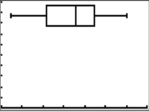
::8. 使用五个数字摘要为此数据创建框图 。9. Describe the data shown in the boxplot below.
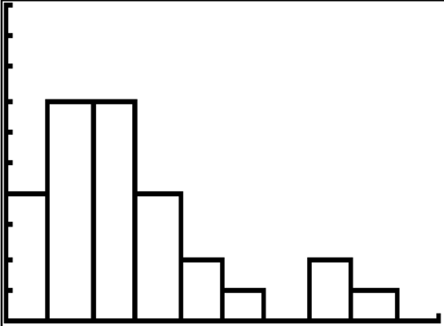
::9. 描述以下方框图中显示的数据。10. Describe the data shown in the histogram below.
::10. 描述下方直方图中显示的数据。A math class of 30 students has the following eye colors:
::30名学生的数学班有以下眼睛颜色:Grade Number of Students with Grade Brown 20 Blue 5 Green 3 Other 2 11. Create a bar chart for this data.
::11. 为此数据创建条形图。12. Create a pie chart for this data.
::12. 为这一数据创建一个饼形图表。13. Which graph do you think makes a better visual representation of the data?
::13. 你认为哪个图表更能直观地显示数据?14. Suppose you have data that shows the breakdown of registered republicans by state. What types of graphs could you use to display this data?
::14. 假设你掌握了按州分列的已登记共和党的分类数据。15. From which types of graphs could you obtain information about the spread of the data? Note that spread is a measure of how spread out all of the data is.
::15. 您可从哪几类图表中获得关于数据传播的信息?请注意,数据传播是衡量所有数据如何分布的一个尺度。Review (Answers)
::回顾(答复)Click to see the answer key or go to the Table of Contents and click on the Answer Key under the 'Other Versions' option.
::单击可查看答题键, 或转到目录中, 单击“ 其他版本” 选项下的答题键 。 -
Other – 5