5.2 直方图和频率分布-interactive
章节大纲
-
The Purpose of this Lesson
::本课程的目的In this lesson, you will represent data sets from scenarios with histograms, and interpret the shape, center, and spread of the data in the context of the scenarios.
::在此课程中,您将用直方图代表假设情景中的数据集,并解释在假设情景中数据的形状、中枢和分布。Introduction: Histograms
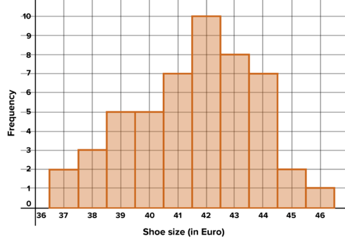
::导言:直方图A histogram is another way to represent the distribution of data. In order to create one, the data needs to be divided into bins , that is, grouped by size. Then a bar is graphed above each bin representing the number of values in each bin. The bars show the frequency with which values appeared in each bin, so histograms are also called frequency plots . Below is a histogram . It shows the masses of a group of adults. The bins feature intervals of 10 kilograms. The first bin has an interval of Anyone with a mass of 65 kilograms is in the first bin, while anyone with a mass of 70 is in the second bin. There are about 21 adults in the first bin.
::直方图是代表数据分布的另一种方式。 为了创建数据, 数据需要分为文件夹, 也就是说, 按大小分组 。 然后在每个文件夹上方绘制一个条形图, 表示每个文件夹中的值数。 条形图显示每个文件夹中值的频率, 因此直方图也称为频率图。 下面是直方图。 它显示一群成年人的质量。 宾箱间距为 10 公斤。 第一箱的间隔为 [65, 70] 。 任何质量为 65 公斤的人在第一个桶中, 而任何质量为 70 的人在第二个桶中。 第一箱中大约有 21 个成年人。A histogram illustrating the average masses of adults
Activity 1: Building and Interpreting Histograms
::活动1:建筑和解释直方图Example 1-1
::例1-1Discuss the shape, center, and spread for the data represented in the histogram above. Discuss the advantages and disadvantages of a histogram compared with a box plot for representing data. Although the first bin begins with a value of 65 kilograms, is it possible that none of the individuals had a mass of 65 kilograms? Explain.
::讨论上面直方图中显示的数据的形状、 中心和传播。 讨论直方图与显示数据的框图相比的利弊。 虽然第一个垃圾箱的起始值为65公斤, 但有没有可能没有人的重量为65公斤? 解释一下 。Solution: The and mean are not visible but can be roughly intuited from the graph. The median is probably in the 80-85 kilogram bin. The data is skewed right--this is much more visible in this histogram than it might be in the corresponding box plot. Because the data is skewed right, the mean will be to the right of the median, perhaps in the 85-90 kilogram bin. There do not appear to be any outliers . As the masses increase, there is a gradual decline in frequency, but the last bin contains around 15 individuals. The data, therefore, doesn't feel particularly widely spread. Outliers need to be far from the center of the data, and there need to be very few of them, otherwise they won't be outliers. Although the bins give an indication of where the actual masses fall, they don't show the exact values. So it is possible that, for example, everyone in the first bin has a mass of 68 kilograms, and none have a mass of 65.
::解析度: 和平均值不可见, 但从图表中可以大致不切实际。 中位数大概在 80- 85 公斤 中位数中。 数据是偏斜的右- 数据在这个直方图中比对应的框图中要明显得多。 由于数据是斜的, 平均值将是中位数右, 也许在85- 90 公斤 中位数中位数中位数中位数中位数中位数中位数中位数中位数中位数中位数中位数。 似乎没有任何外端值。 随着质量的增加, 频率会逐渐下降, 但最后一个中位数包含大约 15 个人。 因此, 数据并不特别广泛分布。 数据需要远离数据中心, 外部值中位数必须非常少, 否则它们不会成为外端数 。 虽然 中位数显示实际质量下降的位置, 但他们没有显示准确的值 。 因此, 例如, 第一磅的每个人都有68 公斤, 没有65 。Example 1-2
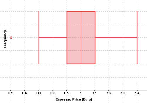
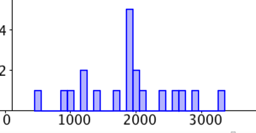
::例1-2Francesco lives in Milan. Over the past year, he's taken careful note of the price of espressos at various cafes. The prices are listed below. The number of cafes with that espresso price is listed to the right of the price. Create a histogram. Find the mean and draw it as a vertical line on the histogram. Interpret the shape, center, and spread. Create a box plot. Is there additional information revealed in the box plot that wasn't visible in the histogram? Explain. Which representation do you prefer and why?
::Francesco 住在米兰。 在过去的一年中, 他仔细注意到了咖啡店的咖啡价格。 价格列在下面。 咖啡价格的咖啡店数量列在价格的右侧。 创建直方图。 查找平均值, 并在直方图上画一条垂直线。 解释形状、 中心和传播; 创建一个盒子图。 框图中是否有其他信息显示在直方图中看不到? 解释。 您更喜欢哪个代表以及为什么?
::埃斯普价格(欧元) 0.50107030808040.901.001.01081.204.3021401Solution: To construct the plot, decide on a bin size. In this case, a bin size of 10 euro cents, beginning at 0.45, contains each price. For example, the first bin has an interval of [0.45,0.55), and the corresponding frequency is 1. The next bin has an interval of [0.55,0.65), and the frequency is 0. The plot shows a roughly symmetrical distribution of data. the mean is about 99 euro cents. Graphed as a vertical line over the distribution, the symmetry is increasingly clear. The data also seems tightly clustered around the mean. To create a box plot, remember that there were, for example, 4 cafes that charged 80 euro cents per espresso. There are 40 prices in the data set above. The box plot shows a median of 1, very close to the mean, which is supported by the absence of skew . Q1 and Q3 are 0.9 and 1.1, establishing that the middle 50% is indeed quite tightly clustered around the median. This tight distribution means that the 50 euro cent espresso is an outlier .
::解决方案 : 要构建绘图, 请决定一个 bin 大小 。 在此情况下, 从 0. 45 开始, 以 0. 45 、 0. 55 计每 个价格 。 例如, 第一个 bin 大小为 10 欧元 。 例如, 第一个 bin 的间隔为 [ 0. 45 055 , 相应的频率为 1 。 下一个 bin 的间隔为 [ 05. 065 , 频率为 0 。 此图显示的数据分布大致对称对称 。 平均值约为 99 欧元 。 以分布的垂直线绘制的对称越来越清楚。 数据似乎也紧紧地围绕平均值分组 。 创建了一个 框块图时, 请记住, 例如, 有 4 4 个 个咖啡馆, 收取 80 欧元 。 以上 数据集有 40 个价格 。 框图显示 1 中位为 1 , 十分接近平均值 , 由 skeww. Q 1 和 Q 3 0. 9 和 1. 1 支持, 确定 中 中 中 50% 的 的 中位 50% 相当 。The price of an espresso (in euros) at various cafes Average price of an espresso at various cafes - box plot Work it Out
::工作出来A class of students records the number of plastic water bottles they use in a week. Students in the class used anywhere from 1 to 8 bottles. The number of students that used each number of bottles is the frequency shown in the table below. Create a histogram to represent the data, and interpret the data. Create a box plot of the data, and interpret the data. Which representation of the data do you prefer and why?
::一组学生记录一周内他们使用的塑料水瓶的数量; 班级学生在任何地方使用1至8瓶; 每个瓶数的学生人数是下表显示的频率。 创建直方图来代表数据, 并解释数据。 创建一个数据框图, 并解释数据。 您喜欢哪种数据表示方式, 以及为什么 ?
::瓶数 瓶数 11213344456687782
Activity 2: Choosing Bin Size for Histograms
::活动2:对直方图选择线图的 Bin 大小Example 2-1
::例2-1Below is a table showing the caloric content of various food items at a restaurant. Build a histogram from the data with bin size of 100 calories. Build another histogram with a bin size of 500 calories. Find the mean. Which histogram does a better job of reflecting the shape and spread of the data? Why?
::下面的表格显示餐厅各种食品的热量含量。 根据文件箱大小为100卡路里的数据构建直方图。 另建文件箱大小为500卡路里的直方图。 找到平均值。 哪个直方图更能反映数据的形状和分布? 为什么?
::菜单目录:Pizza 16550 Hummus450 Hommus450 Hot Dog900 土耳其 桑威奇1200蛋和培根1400锅和培根20500红蛋和培苗20500Spinach Salad1200Sushi Plate1850Breakfast Burrito1900Chocolat Milkshake 2000Littal Nachos1000Chocolate 2000Littal Nachos1000Nachos1000Super Nachos 3350超级纳乔斯2350Many, 许多苹果2850Sundale1850Sundae和樱桃1900Stempeh Plate1850Tolate1850Tolate2700Soba 面粉和海鲜2550Tetempeh Plate1850Tal2700SubaSolution: A bin size of 100 and a bin size of 500 is shown below. The mean is 1847.5 calories. The strengths and weakness of each histogram are up to interpretation. A bin size of 100 shows us that there is a cluster of values near the mean. At the same time, it appears to show that the values are otherwise rather evenly dispersed. But a bin size of 500 provides a different perspective. The symmetry of the data is more obvious. The data is clustered around the mean and tapers on either side.
::解析方式 : 下面显示的是100 和 500 的文件夹大小。 平均值是 184. 7.5 卡路里。 每根直方图的优缺点接近于判读。 100 的文件夹大小显示有接近平均值的一组值。 与此同时, 它似乎显示这些值的分布很均匀。 但500 的文件夹大小则提供了不同的视角。 数据的对称性更明显。 数据围绕平均值和截取器组合在一起。Interactive
::交互式互动Use the following interactive to explore the results of changing the bin size. Discuss the results. Decide which bin size best reflects the shape, center, and spread of the data.
::使用以下互动方式来探索更改文件夹大小的结果。 讨论结果。 决定哪个文件夹大小最能反映数据的形状、 中心和传播 。Work it Out
::工作出来-
A class of 15 students receives the following grades on an exam. Choose a bin size and create a histogram. Find the mean. Interpret the histogram in the context of the scenario. Find the median, Q1 and Q3. Draw and label vertical lines to indicate these on the histogram. Is it possible to
estimate
the middle 50% from a histogram without finding these
statistics
? Explain.
::由15名学生组成的班级在考试中获得以下分级。选择一个书包大小并创建直方图。 查找平均值。 在情景中解释直方图。 查找中位数Q1和Q3, 绘制并标出垂直线以在直方图上显示。 能否在直方图中估算中位数的50%而不找到这些统计数据? 解释 。
88, 48, 60, 51, 57, 85, 69, 75, 97, 72, 71, 79, 65, 63, 73
-
Following is the list of heights of chairs in a restaurant in meters. Create bin size such that all of the data fits into one of two bins. Graph the resulting histogram. Create another histogram with a bin size such that all the data fits into one bin. Are these histograms reflective of the actual distribution of the data? Why or why not? Choose a bin size that is more reflective of the actual distribution, and graph the resulting histogram. Find the mean and the median. Which measure of center do you prefer, and why?
::下面是餐厅椅子高度的米数列表。 创建使所有数据都适合两个书包中的一个的书包大小。 绘制由此产生的直方图。 创建另一个带有一个书包大小的直方图, 使所有数据都适合一个书包的书包大小。 这些直方图是否反映了数据的实际分布? 为什么或为什么不? 选择一个更反映实际分布的书包大小, 并绘制由此得出的直方图。 查找平均值和中位值。 您喜欢哪种中间值, 以及为什么 ?
0.7, 0.7, 0.7, 0.7, 0.7, 0.7, 0.9, 0.9, 0.9, 0.9, 1.2, 1.2, 1.2, 1.2
-
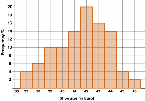
A popular rock climbing shoe is called the Warrior
. Below is a histogram showing the numbers of each size (in European sizes) of the
Warrior
that is available at the climbing store in Tucson, Arizona. Find the mean shoe size of all the Warriors at the store. Visually estimate the middle 50% of the data, and state the
range
for the middle 50%. Explain your
process
. Now find the median, Q1 and Q3. How close were you to correct?
::流行的攀岩鞋叫“ 勇士 ” 。 下面是一个直方图, 显示亚利桑那州Tucson 爬山商店的勇士的每个大小( 以欧洲大小) 。 找到该商店所有勇士的平均鞋尺寸 。 从视觉角度估计数据中位数的50%, 并描述中位数的50% 。 请解释您的过程 。 现在找到中位数, Q1 和 Q3 。 您要纠正的距离有多近 ?
Warrior style rock climbing shoes in stock in Tuscon, AZ -
How many shoes are represented with the histogram above? What percentage of shoes were size 42? What percentage of shoes were size 44? If you walked into the store and bought a pair of Warriors randomly, without looking at the size, what are the chances it would be size 39? What are the chances it would be any of the sizes between and including 40 and 43? Explain your reasoning.
::上面的直方图代表了几双鞋?42号鞋占多大比例?44号鞋占多大比例?如果你走进商店随机购买一对战士,而没有看尺寸,那么39号鞋的几率有多大?在40和43号之间,包括40和43号之间,几率有多大?请解释一下你的推理。
PLIX Interactive
::PLIX 交互式互动
Activity 3: Relative Frequency Plots
::活动3:相对频率绘图A histogram is considered a frequency plot because it shows the frequency of values that appear in each bin. In the last problem, size 38 shoes showed up 3 times, so that's the frequency of size 38 shoes. A relative frequency plot shows the percentage that appears within each bin. The percentage of size 38 shoes is The chance that a shoe chosen at random from the shop above is size 38 is 6%.
::直方图被认为是一个频率图, 因为它显示了每个文件夹中出现的值的频率。 在最后一个问题中, 38号鞋的频率上升了3次, 这就是38号鞋的频率。 一个相对频率图显示了每个文件夹中出现的百分比。 38号鞋的百分比为 350=6%。 从以上商店随机选择的鞋的概率为 38 号 6% 。Example 3-1
::例3-1Convert the frequency plot in the last problem to a relative frequency plot. Discuss differences and similarities. Which do you prefer and why?
::将最后一个问题中的频率图转换为相对频率图。 讨论差异和相似点。 您更喜欢哪一种和为什么?Solution: The relative frequency plot has exactly the same shape as the frequency plot. The only change is the meaning of and values on the -axis. For the original frequency plot, the -axis represented the frequency with which each shoe size appeared. For the relative frequency plot, the -axis represents the percentage of the total that each bin of shoes represents. Relative frequency plots have the advantage that they show the percentage, which is useful for calculating probabilities.
::溶解度: 相对频率图与频率图的形状完全相同。 唯一的变化是 Y 轴的含义和值。 对于原来的频率图, Y 轴代表每个鞋大小的出现频率。 对于相对频率图, Y 轴代表每张鞋的总数的百分比。 相对频率图的优势在于显示百分比, 这对于计算概率有用 。Warrior rock climbing shoes in stock, by relative frequency Work it Out
::工作出来-
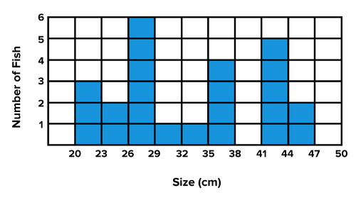
Pietro is a fisherman in Corsica. The histogram below shows the number of fish he caught one day. All the fish are in a large container in his boat. If he selects a fish at random from the container, what is the probability that it's in the interval [35, 38}? Create a relative frequency plot for the data. Is it possible to find the mean for this data set from the given histogram? Why or why not? Is it possible to find the median? Why or why not? Approximate the middle 50% of the data. Explain your reasoning.
::Pietro是科西卡的渔民。 下面的直方图显示他有一天捕获的鱼的数量。 所有鱼都在船上的大型容器中。 如果他从容器中随机选择一条鱼, 那么在间隔[ 35, 38] 的概率是多少? 为数据建立一个相对频率图。 是否有可能从给定的直方图中找到这个数据集的平均值? 为什么或为什么没有? 能否找到中位数? 为什么或为什么没有? 能否找到中位数? 为什么或为什么没有? 接近数据中点的50%。 解释你的推理 。
The number of fish of each size that Pietro caught in one day -
The histogram below shows the
heights
of students
in a particular class
. Convert it to a relative frequency plot. Estimate the
heights
that represent the middle 30% of the data. Describe the shape of the data. Does it appear skewed? Explain this in the context of the scenario.
::下面的直方图显示特定班级学生的高度。 将其转换为相对频率图。 估计代表数据中30%的高度。 描述数据形状。 它看起来是否偏斜? 在假设情景中解释这一点 。
The heights of students in a class
Activity 4: Describing Histograms
::活动4:说明直方图Histograms can take on a wide variety of shapes. The histogram in the last problem is roughly bell-shaped , but a bit skewed to the left.
::直方图可以呈现各种各样的形状。 最后一个问题的直方图大致是钟形, 但向左偏斜了一点 。Histograms can also be roughly uniform , meaning there is little or no variation in the frequency of different values.
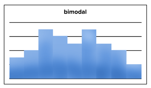
::直方图也可能大致一致,意味着不同数值的频率变化很少或没有变化。A histogram with uniform distribution Histograms can be roughly bi-modal , meaning there appear to be two separate bins that feature the maximum frequency.
::直方图可能大致是双式的, 意思是似乎有两个单独的垃圾箱 具有最大频率的特点。A histogram with bimodal distribution These descriptors can be used to roughly describe patterns in data. A distribution can be roughly bell-shaped, roughly skewed, roughly uniform, or roughly bimodal . In other words, real-world data sets rarely perfectly fit these descriptors, but these descriptors are still used because they effectively summarize patterns in the data.
::这些描述符可以用来粗略描述数据模式。 分布符可以大致是钟形的、大致斜斜的、大致统一的或大致双向的。 换句话说,真实世界数据集很少完全适合这些描述符,但这些描述符仍然被使用,因为它们有效地概括了数据中的模式。PLIX Interactive
::PLIX 交互式互动Work it Out
::工作出来-
Spinner
C
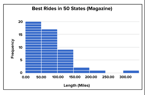
ycling Magazine publishes an article on the 50 best rides in each state. The histogram below organizes them by the length of ride. Describe and interpret the data.
::Spinner Cycling杂志发表了一篇关于每个州50次最佳骑车的文章。下面的直方图按骑车长度排列。描述和解释数据。
Spinner Cycling's 50 best bicycle rides - one in each state -
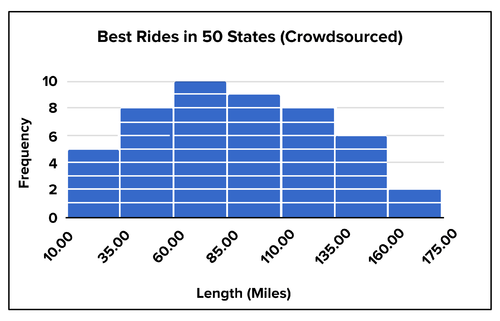
Peleton Cycling Magazine invites its readers to submit the 50 best rides in each state. the histogram below organizes the results by length of ride. Describe and interpret the data. Compare it to the data from the previous histogram.
::Peleton Cycling杂志邀请读者提交每个州的50次最佳行程。 下面的直方图按行程长度排列结果。 描述和解释数据。 比较前一直方图的数据 。
Peleton's crowdsourced best bicycle rides in each state -
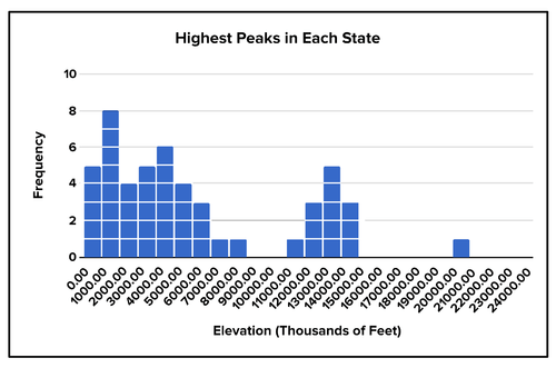
Trekker Hiking Magazine publishes a list of the highest peaks in each state.
Below is a histogram of t
he data. Describe and interpret the data. Explain the shape of the data set based on your knowledge of US geography.
::Trekker Hikking杂志公布了每个州最高峰值的清单。 下面是数据的直方图。 描述和解释数据。 根据您对美国地理的了解解释数据集的形状 。
The highest mountain peaks in each state. -
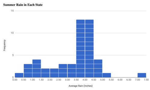
Below is a histogram showing the
average
summer rainfall amounts in each state. Describe and interpret the data. Explain features of the data set in terms of your knowledge of the geography of the US.
::以下是一个直方图,显示每个州平均夏季降雨量。描述和解释数据。根据你对美国地理的了解,解释数据集的特征。
The average summer rainfall amounts in each state -
Flip two coins 20 times, and count the number of heads each time. Create a histogram showing the frequencies with which 0,1, or 2 heads appeared. Convert it to a relative frequency plot. Find the mean number of heads. Find the median. Are they the same or different? Explain in the context of the histogram. If you choose one of your experimental results at random, what is the chance that the result was 1 head? Based on your understanding of how flipping coins works, is this consistent with your expectations? Why or why not? Do you think the quality of your results would be strengthened by increasing the number of experiments? Why or why not?
::翻转两个硬币 20 次, 每次计数头数 。 创建直方图, 显示 0, 1 或 2 个头出现的频率 。 将其转换为相对频率图 。 查找平均头数 。 查找中位数 。 查找中位数 。 它们相同还是不同 ? 在直方图背景下解释 。 如果您随机选择实验结果之一, 结果为1 个头的可能性是多少 ? 根据您对翻硬币如何起作用的理解, 这是否与您的期望一致 ? 为什么呢 ? 您认为通过增加实验数量可以提高结果的质量吗? 为什么或为什么没有?
PLIX Interactive
::PLIX 交互式互动Summary -
A histogram is a way to represent a distribution of data using bins or intervals.
::直方图是代表使用书包或间隔分配数据的一种方式。 -
When choosing the size of bins, consider which better reflects the size and spread of the data.
::在选择垃圾箱大小时,请考虑哪些更好地反映数据的大小和分布。 -
A relative frequency plot is a histogram where the y axis shows the percentage that appears in each bin.
::相对频率图是一个直方图,其中 Y 轴显示每个文件夹中显示的百分比。 -
Some common shapes of histograms are bell-shaped, uniform, and bimodal.
::直方图的一些常见形状是钟形、制服和双式的。
-
A class of 15 students receives the following grades on an exam. Choose a bin size and create a histogram. Find the mean. Interpret the histogram in the context of the scenario. Find the median, Q1 and Q3. Draw and label vertical lines to indicate these on the histogram. Is it possible to
estimate
the middle 50% from a histogram without finding these
statistics
? Explain.