2.10频率表中的线形图
章节大纲
-

Mr. Smith took a survey in his class of how many books his students read over the summer. He first created a list of the data as shown here:
::Smith先生在他的班级调查了他的学生夏天读了多少本书。1, 1, 2, 2, 2, 3, 4, 4, 5, 6, 6, 6, 7
Each number represents a student and the number of books they read over the summer. He decides to organize the data further into a frequency table .
::每个数字代表学生和他们夏季阅读的书籍数量。他决定将数据进一步组织成一个频率表。# of Books Read Frequency (# of students who read that many books) 1 2 2 3 3 1 4 2 5 1 6 3 7 1
Now, he wants to display the data visually for his students to analyze . How can Mr. Smith visually organize his frequency table for his students?
::Smith先生如何为学生组织频率表?In this concept, you will learn how to take data in a frequency table and create a line plot to display the data.
::在此概念中,您将学习如何在频度表格中获取数据,并创建一个线图以显示数据。Line Plots
::线线绘图A line plot is another display method to organize data.
::线条图是组织数据的另一个显示方法。Like a frequency table, a line plot shows how many times each number appears in the data set . Instead of putting the information into a table, it is placed on a number line. Line plots are especially useful when the data falls over a large range . Take a look at the data and the line plot below.
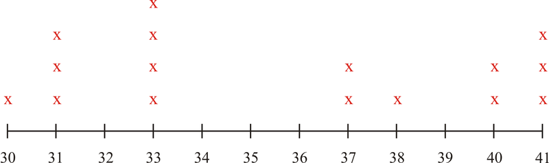
::像频率表一样,线条图显示数据集中每个数字的倍数。它不是将信息放入表格,而是放在数字线上。当数据落在大范围时,线条图特别有用。看看下面的数据和线条图。This data represents the number of students in each class at a local community college.
::这一数据代表了地方社区学院每个班的学生人数。30, 31, 31, 31, 33, 33, 33, 33, 37, 37, 38, 40, 40, 41, 41, 41
The first thing to do is to organize this data into a frequency table. That will show how often each number appears.
::首先要做的是将这些数据组织成一个频率表。 这将显示每个数字的出现频率 。# of students Frequency (number of classes with that many students) 30 1 31 3 32 0 33 4 34 0 35 0 36 0 37 2 38 1 39 0 40 2 41 3 Some conclusions can be drawn from this data:
::从这一数据可以得出一些结论:-
The range of students in each class is from 30 to 41.
::每个班的学生人数从30人到41人不等。 -
There aren’t any classes with 32, 34, 35, 36 or 39 students in them.
::其中没有32、34、35、36或39名学生的班级。
A line plot can be created to display this same data, only in a different way.
::可以创建一个线条图来显示相同的数据, 只能以不同的方式显示 。Building the line plot involves counting the number of students and then plotting the information on a number line. The symbol is used to represent the number of classes that has that number of students in it.
::构建线条图包括计算学生人数,然后在数字线上绘制信息。符号 X 用于代表学生人数在其中的班级数量 。Notice that even though there is no class with 32 students in it, is was still included on the number line. This is very important. Each value in the range of numbers needs to be represented, even if that value is 0.
::请注意, 尽管没有班级有32名学生, 但仍包含在数字行。 这非常重要 。 数字范围内的每个值都需要被代表, 即使该值为 0 。Examples
::实例Example 1
::例1Earlier, you were given a problem about Mr. Smith and his data showing the number of books his students read over the summer. This was the data he collected and then organized into a frequency table:
::早些时候,你对史密斯先生和他显示学生夏季阅读的书籍数量的数据感到疑惑,这是他收集的数据,然后整理成一个频率表:1, 1, 2, 2, 2, 3, 4, 4, 5, 6, 6, 6, 7
# of Books Read Frequency (# of students who read that many books) 1 2 2 3 3 1 4 2 5 1 6 3 7 1
Mr. Smith has done the first step to creating a visual display of data which is to organize the data and create the frequency table.
::Smith先生迈出了第一步,为数据制作了一个直观显示,即组织数据和创建频率表。Next, he creates the line plot.
::接下来,他创造了线的地块。Then, he can analyze the data and draw conclusions. For example:
::然后,他可以分析数据并得出结论。例如:-
2 students read only 1 book over the summer
::夏季有2名学生只读一本书 -
1 student read 7 books over the summer
::1名学生在夏天读了7本书 -
There were no students who did not read at all- that's great!
::根本没有学生没读过书,太好了!
Example 2
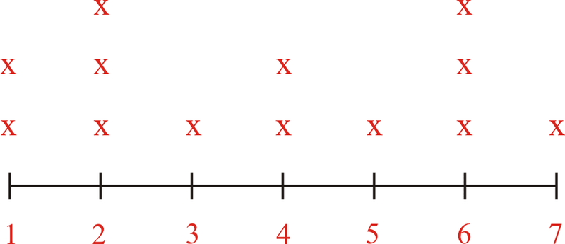
::例2Jeff counted the number of ducks he saw swimming in the pond each morning on his way to school. Here are his results:
::Jeff计算了他每天早上上学途中在池塘里游泳的鸭子数量。6, 8, 12, 14, 5, 6, 7, 8, 12, 11, 12, 5, 6, 6, 8, 11, 8, 7, 6, 13
First, organize the data in numerical order.
::首先,按数字顺序排列数据。6, 6, 6, 6, 6, 7, 7, 8, 8, 8, 8, 11, 11, 12, 12, 12, 13, 14
Next, create a frequency table. There are two columns in the frequency table. The first column shows the number of ducks and the second column shows how many times that number of ducks was on the pond.
::接下来,创建一个频率表。在频率表中有两个列。第一列显示鸭子的数量,第二列显示池塘中鸭子的数量的多少倍。Number of Ducks Frequency 6 5 7 2 8 4 9 0 10 0 11 2 12 3 13 1 14 1 Then, turn the frequency table into a line plot.
::然后,将频率表变成线状图。Here are some conclusions that can be drawn by looking at both methods of displaying data:
::以下是通过研究两种显示数据的方法可以得出的一些结论:-
In both, the range of numbers is shown. There were between 6 and 14 ducks seen, so each number from 6 to 14 is represented.
::两者中的数字范围都有显示,可以看到6到14只鸭子,每个6到14只鸭子都有代表。 -
There weren’t any days where 9 or 10 ducks were counted, yet both are represented because they fall in the range of ducks counted.
::也没有一天计有9到10只鸭子, -
Both methods help to visually understand data and its meaning.
::这两种方法都有助于从视觉上理解数据及其含义。
Use the data below, which shows the enrollment in different college classes, to answer the following questions.
::使用以下显示不同大学班级入学情况的数据回答下列问题。# of Students in the Classes
::班级学生数量Example 3
::例3How many classes at the college have 31 students in them?
::大学有多少班级有31名学生?First, find the data from the question on the line plot.
::首先,在线路图上找到问题的数据。Next, look at the frequency represented by X's to see how many classes had 31 students.
::接下来,看看X's代表的频率 看看有多少班级有31名学生。Then, answer the question with the data that is shown.
::然后用显示的数据回答问题。The answer is 3 classes have 31 students in them.
::答案是3个班有31名学生。Example 4
::例4How many classes at the college have 38 students in them?
::学院有多少班级里有38名学生?First, find the data from the question on the line plot.
::首先,在线路图上找到问题的数据。Next, look at the frequency represented by X's to see how many classes have 38 students.
::接下来,看看X's代表的频率 看看有多少班级有38名学生。Then, answer the question with the data shown.
::然后用所显示的数据回答问题。The answer is 1 class has 38 students in it.
::答案是1个班里有38名学生Example 5
::例5How many classes at the college have 33 students in them?
::大学有多少班级有33名学生?First, find the data from the question on the line plot.
::首先,在线路图上找到问题的数据。Next, look at the frequency represented by X's to see how many classes have 33 students.
::接下来,看看X's代表的频率 看看有多少班级有33名学生。Then, answer the question with the data shown.
::然后用所显示的数据回答问题。The answer is 4 classes have 33 students in them.
::答案是4个班有33名学生。Review
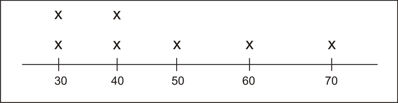
::回顾Here is a line plot that shows how many seals came into the harbor in La Jolla California during an entire month. Use it to answer the following questions.
::这是一条线图,显示 有多少海豹在一个月内 进入加州拉霍拉港, 用它回答以下的问题。-
How many times did thirty seals appear on the beach?
::海滩上有30条海豹多少次了? -
Which two categories have the same frequency?
::哪两类的频率相同? -
How many times were 50 or more seals counted on the beach?
::海滩上有50个或更多的海豹吗? -
True or False. This line plot shows us the number of seals that came on each day of the month.
::这个线条图向我们展示了每个月 每天的封条数量。 -
True or False. There weren’t any days that less than 30 seals appeared on the beach.
::沙滩上没有超过30天的海豹出现。 -
How many times were 60 seals on the beach?
::海滩上的60条海豹有多少次? -
How many times were 70 seals on the beach?
::海滩上的70条海豹有多少次? -
What is the smallest number of seals that was counted on the beach?
::海滩上最小的海豹数量是多少? -
What is the greatest number of seals that were counted on the beach?
::海滩上最大的海豹数量是多少? -
Does the frequency table show any number of seals that weren't counted at all?
::频率表是否显示任何未加计数的封条数量?
Organize each list of data. Then create a frequency table to show the results.
::组织每个数据列表。 然后创建一个显示结果的频率表 。- 8, 8, 2, 2, 2, 2, 2, 5, 6, 3, 3, 4
- 20, 18, 18, 19, 19, 19, 17, 17, 17, 17, 17
- 100, 99, 98, 92, 92, 92, 92, 92, 92, 98, 98
- 75, 75, 75, 70, 70, 70, 70, 71, 72, 72, 72, 74, 74, 74
- 1, 1, 1, 1, 2, 2, 2, 3, 3, 5, 5, 5, 5, 5, 5, 5
-
The range of students in each class is from 30 to 41.