Inkscape指南
ne of Inkscape's main priorities is ease of use. This is visible on the Main Window as every bar's button (icon), numeric value and unit of measure boxes will produce
tooltip
(help) messages. The
Menu bar
is
title
, not button, based so when using these titled edits Inkscape still provides updated assistance. For a quick example, click the Menu's bar
‣
F
ile
option, then mouseover 🖰 one of the
‣
F
ile
options and there will be two feedback features.
(1)
The mouseover of one of the drop down menu items will highlight (background color) the item.
(2)
The Statusbar (bottom center) will provide an updated
Notificaton
message describing the highlighted Menu bar item.
[1]
::简单易用是Inkscape的主要优先事项之一.在主窗口上可以看到,因为每个的按 (图标),数值和单位测量框都会产生工具提示 (帮助) 消息.菜单是标题,而不是按,因此在使用这些标题编辑时,Inkscape仍然提供更新的帮助.为了快速举例,点击菜单的文件选项,然后鼠标转移文件选项中的一个,将有两个反功能. (1) 下拉菜单项之一的鼠标转移将突出显示 (背景颜色) 项. (2) 状态 (底部中心) 将提供更新的通知消息,描述突出显示的菜单项.[1]
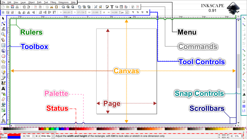
The Inkscape default window is laid out with four bars at the top, two on the left, two on the right and three at the bottom. You can create and edit graphics using various displays, such as bars, dialogs, numeric value and unit of measure boxes. You can also adapt the bars and dialog displays to the way you draw, by customizing the Main Window view with style settings. The window layout of an application is also referred to as the Graphical User Interface (GUI).
[2]
::默认的Inkscape窗口上方设置了四条条,左边两个条,右边两个条,下面三个条.您可以使用各种显示器,如条,对话框,数值和单位尺寸框来创建和编辑图形.您还可以通过定制主窗口视图与风格设置来调整条和对话框以适应您的绘制方式.应用程序的窗口布局也被称为图形用户界面 (GUI).[2]
-
The
Menu bar
across the top contains file and graphic based editing, using a number of drop-down menus. The menu titles are displayed, and if assigned the titles keyboard shortcut key(s) are also displayed.
::顶部的菜单包含基于文件和图形的编辑,使用多个下拉菜单.菜单标题显示,如果分配标题键盘快捷键 ().
-
The
Commands bar
contains common commands associated with file and graphic editing. Related commands are grouped together and separated by vertical lines (|).
::命令包含与文件和图形编辑相关的常见命令.相关命令被组合在一起并用垂直线分开 ().
-
The
Tool Controls bar
displays editing option buttons (icons), numeric-value (if applicable) and unit of measure boxes for the currently enabled
Toolbox bar
tool.
::工具控制显示当前启用的工具箱工具的编辑选项按 (图标),数值 (如果适用) 和测量单位框.
-
The
Rulers bar
shows the
x and y axis
positioning of the cursor on the canvas and is one source for placing Guidelines over the canvas.
::统治者显示线索在画布上的 x 轴和 y 轴位置,是将指南放置在画布上的一个来源.
-
The
Scrollbars
are placed to the right and bottom, adjacent to the canvas.
::滚动位于右下方,与画布相邻.
-
The
Snap Controls bar
is displayed on the right side of the user interface and sets the snapping methods (modes).
::快照控制显示在用户界面的右侧,并设置快照方法 (模式).
-
The
Pallete bar
below the bottom Scrollbar and above the Statusbar displays customizable color palletes.
::在底部的滚动和状态上方的"色板"显示可定制的色板.
-
The
Statusbar
at the very bottom of the interface, displays common editors, dynamic tool-tip messages of the current on Canvas node/handle mouseover 🖰, edits and Menu bar interaction being performed.
::界面最底部的状态显示常见的编辑器,动态工具提示消息,当前的Canvas节点/处理鼠标转移,编辑和菜单交互正在执行.
-
The
Canvas
area is the play area for your creations, the canvas has no borders.
::画布是您创作的游戏区,
-
The
Page
can be seen as the print area and is restricted by its 'page border'. One can still export based on page, selection, drawing and custom.
::页面可以被视为打印区域,并受到其"页边框"的限制. 仍然可以根据页面,选择,图纸和自定义进行导出.
The sub Menu option
‣
V
iew ‣‣Sh
o
w/Hide
allows on and off display of various bars, the Menu bar is the only bar that cannot be hidden.
::显示/隐藏的子菜单选项允许各种条的显示和关闭,菜单条是唯一不能隐藏的条.
If you work with two or more files, you can position each window side by side on the screen or across multiple monitors. You can also switch between file windows using;
::如果您使用两个或更多的文件,您可以将每个窗口放在屏幕上或多个显示器上并排.您还可以使用;
-
‣
V
iew ‣‣N
e
xt Window
or
⇧ Shift
+
Tab ↹
::查看下一个窗口或转移+标签 -
‣
V
iew ‣‣P
r
evious Window
or
Ctrl
+
⇧ Shift
+
Tab ↹
::查看 上一个窗口或Ctrl+Shift+Tab
Interface basics
::接口基础知识
The Inkscape interface is based on the
GNOME Human Interface Guidelines (HIG)
standard. The HIG uses visual indicators, like background and cursor (pointer) changes. It also provides feedback with pop-ups, tooltip and notification messages for any interface buttons, numeric value and units of measure boxes, on canvas editing icons, bounding boxes, guides, etc. and Menu bar 'titled' commands.
[3]
::墨景界面基于GNOME人机界面准则 (HIG) 标准.HIG使用视觉指标,如背景和光标 (指针) 变化.它还提供弹出窗口,工具提示和任何界面按的通知消息,数值和测量方框的单位,在画布编辑图标,边界方框,指南等,以及菜单"标题"命令的反. [1]
Here are some examples of Inkscapes HIG features:
::以下是Inkscapes HIG功能的一些例子:
-
Mouseover 🖰 the cursor on top of any interface button, numeric-value or unit of measure box and the interface will display a pop-up (feedback) description of the button and boxes. And if the button or box is available for execution, the interface will highlight the button/box with a light blue visual indicator (background).
::鼠标转移 任何接口按,数值或测量单位框的顶部的光标,接口将显示按和框的弹出 (反) 描述.如果按或框可用于执行,接口将以浅蓝色视觉指示器 (背景) 突出显示按/框. -
When a button or numerical-value box foreground is grayed out, this indicates that the button/box cannot be used under the current canvas selection/status, but will still display a pop-up message.
::当按或数字值框前景灰色时,这表明按/框不能在当前画布选择/状态下使用,但仍将显示弹出消息. -
Edit/Tool buttons that are currently enabled will have blue square/rectangle backgrounds.
::现在启用的编辑/工具按将具有蓝色的方形/矩形背景. -
Mouseover 🖰 on top of any on canvas editing icons (i.e., nodes, handles, segments, etc.) and the editing icon will change colors and generate a tooltip message in the Statusbar's Notification area.
::鼠标转移在任何画布上的编辑图标 (即节点,手柄,段等) 上,编辑图标将改变颜色并在状态的通知区域生成工具提示消息. -
When Snap Controls are enabled, during the 'snap to' action an on-canvas pop-up messages will briefly display feedback on how the snap will be placed (example, Bounding Box Corner to Bounding Box Corner)
::当启用快速控制时,在"快速到"动作期间,在画布上的弹出消息将简短地显示如何放置快速的反 (例如,将框角与框角相结合) -
Within the Statusbar there is a
Notification Area
that will display dynamic messages based on;
-
Mouseover 🖰 of any on canvas edit icons/segments
::任何在画布上的编辑图标/部分的鼠标转移 -
Menu bar highlighting of command features
::显示命令功能的菜单 -
Menu bar transactions
::菜单交易
::在状态内有一个通知区域,将显示基于动态消息; 鼠标转移 任何在画布上的编辑图标/部分菜单突出显示命令功能菜单交易 -
Mouseover 🖰 of any on canvas edit icons/segments
Interface preferences
::接口偏好
To open the Interface preferences menu, use the Menu bar
‣
E
dit, ‣‣P
r
eferences...
(
Ctrl
+
⇧ Shift
+
P
) and open the <Interface> sub-menu. There are many customizable settings available under the Interface preferences and its three sub-menus. Just like the mouseover 🖰 feature availability for on canvas edits and interface bars, you can also mouseover 🖰 preferences' window items; drop down menus, check box descriptions and value boxes.
::打开界面偏好菜单,使用菜单 编辑, 偏好... (Ctrl+ 转换+P) 并打开<界面>子菜单. 界面偏好和其三个子菜单下有许多可定制的设置. 就像在画布编辑和界面条上使用的鼠标转移功能一样,您也可以鼠标转移 偏好窗口项;下拉菜单,勾选框描述和值框.
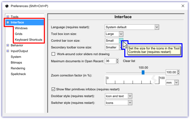
The three sub-menus under Interface are; Windows, Grids and Keyboard Shortcuts. Under the Windows sub-menu there is a setting for:
Dialog behavior (requires restart)
::接口下的三个子菜单是; Windows,网格和键盘快捷键. 在Windows子菜单下有一个设置:对话行为 (需要重新启动)
-
Dockable
::可靠的 -
Floating
::浮动
The Dockable setting will place a dialog's (example, Fill and Stroke Dialog) window against (docked) the Snap Controls bar on the right side of the Interface. The Floating setting will place the dialog's window onto the top right area of the Canvas.
::可对接设置将对话框 (例如,填充和冲击对话框) 放置在接口右侧的快速控制 (对接).浮动设置将对话框放置在帆布右上方.
View modes
::视图模式
You can change the interface display of the Inkscape window using three view modes.
::您可以使用三个视图模式来更改Inkscape窗口的界面显示.
1. Normal view mode displays artwork in the default window. In this mode, access to all of the editing tools and menu interactions are available.
::1. 常态视图模式显示在默认窗口中的图片. 在此模式中,可访问所有编辑工具和菜单交互.
2. Fullscreen view mode
‣
V
iew ‣‣
F
ullscreen
(
Alt
+
V
,
F
) or shortcut
F11
displays artwork in a fullscreen window, only eliminating the document title bar. In this mode, shortcut key edits are still available. To return to Normal view mode use
‣
V
iew ‣‣
F
ullscree
n (
Alt
+
V
,
F
) or shortcut
F11
.
::2. 全屏查看模式 查看 全屏 (Alt+V,F) 或快捷方式 F11 显示图片在全屏窗口中,只删除文档标题.在此模式中,快捷键编辑仍然可用.返回正常查看模式使用 查看 全屏 (Alt+V,F) 或快捷方式 F11.
3. Fullscreen view mode with Dialog (Dock) Bar
⇧ Shift
+
F11
displays artwork in a fullscreen window with the dialog window or dock bar displayed. In this mode, shortcut key edits are also available, to return to Normal view mode press
⇧ Shift
+
F11
.
::3. 采用对话框 (码头) 条的全屏查看模式 转换键+F11 显示全屏窗口中的图片,显示对话框或码头. 在此模式中,还可使用快捷键编辑,返回正常查看模式按 转换键+F11.
Menu bar
::菜单
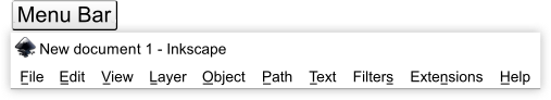
The very top bar of the Inkscape interface is the
Menu bar
, the Menu contains the basic
F
ile,
E
dit and
H
elp functions like many other programs. A fairly new feature worth noting is the
‣
F
ile ‣‣Import Clip Art...
window which allows for the searching and importing of files from the Open Clip Art library, for this to work you need to be connected to the internet. The remainder of the Menu bar's commands are related to working with graphic design.
::墨景界面的顶部是菜单,菜单包含基本的文件,编辑和帮助功能,像许多其他程序一样.值得注意的一项相当新的功能是"文件" "导入剪辑艺术"...窗口,它允许从开放剪辑艺术库搜索和导入文件,为了实现这一点,您需要连接到互联网.菜单的其余命令与图形设计工作有关.
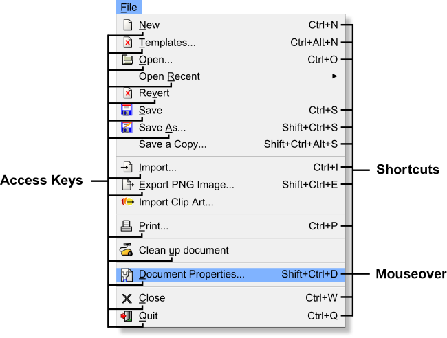
Most commands are available directly from the keyboard, by either using
access keys
(underlined letter) or keyboard
shortcuts
. These two keyboard methods are available features within Inkscape. Using the
‣
F
ile
drop down menu as an example, access keys for commands under the
‣
F
ile
menu are available by first using
Alt
+
F
(drop down menu is displayed), then a given access key. Example, to access the
‣
F
ile ‣‣
D
ocument Properties
command use the following keyboard entries of
Alt
+
F
,
D
, you can also use the assigned keyboard shortcut of
⇧ Shift
+
Ctrl
+
D
. Frequently used menu items are assigned keyboard shortcuts, this amounts to over 60% (not including Filter
s
, Exte
n
sions and
H
elp) of Inkscape's Menu bar commands having keyboard shortcuts.
[4]
::大多数命令可以直接从键盘中使用,使用访问键 (划线字母) 或键盘快捷键.这两种键盘方法是Inkscape中可用的功能.使用文件下拉菜单作为例子,文件菜单下的命令的访问键可以首先使用Alt+F (显示下拉菜单),然后使用给定的访问键.例如,访问文件文件文件属性命令使用以下键盘输入Alt+F,D,您也可以使用分配的键盘快捷键Shift+Ctrl+D.经常使用的菜单项目被分配键盘快捷键,这相当于超过60% (不包括过器,扩展和帮助) 的Inkscape菜单命令条带有键盘快捷键.[4]
Additionally, in the Menu bar - drop down graphic above, the Document Properties... Shift+Ctrl+D item is highlighted. When a Menu bar item has a
mouseover
applied the Statusbar's Notification display will update with a live message. Here is the notification message for the mouseover of
D
ocument Properties
:
::此外,在上面的菜单 - 下拉图中,文件属性... 转移+Ctrl+D项被突出显示.当菜单项有鼠标转移应用时,状态的通知显示将更新一个实时消息. 这里是文件属性的鼠标转移的通知消息:
| F ile |
| D ocument Properties... Shift+Ctrl+D: |
Statusbar, notification message:
Edit properties of this document (to be saved with the document)
::状态,通知消息:编辑此文档的属性 (将与文档一起保存)
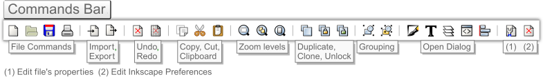
Commands bar
::命令
The
Commands bar
has buttons of frequently used edits such as file options, zoom levels, undo, copy, group, etc. Related edits are grouped along the bar and are separated by a vertical line |. A great example of this is the grouping of the highly used Zoom levels.
::命令有经常使用的编辑按,如文件选项,放大级别,撤消,复制,组等.相关的编辑沿着进行分组,并用垂直线隔开. 这是一个很好的例子是高度使用的放大级别的分组.
Toolbox and Tool Controls bars
::工具箱和工具控制条
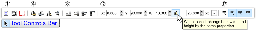
The third bar down is the
Tool Controls bar
, which
changes
depending upon the currently enabled tool in the Toolbox bar. The
Toolbox bar
is located on the left side of the user interface. In the example graphic the Tool Controls bar edits are complementary to the Toolbox bar's Selector Tool.
::第三个下面的是工具控制,它取决于工具箱中当前启用的工具而变化.工具箱位于用户界面的左侧.在图示中,工具控制的编辑与工具箱的选择器工具相辅相成.
The Tool Controls bar edit buttons (icons) and numeric-value boxes are editors under the Selector Tool properties and are grouped into five sections, each separated with vertical lines |. Here is a summary of the groupings starting with the left grouping first:
::工具控制条编辑按 (图标) 和数值框是选择器工具属性下的编辑器,分成五个部分,每个部分以垂直线分开. 以下是从左侧组开始的组合的摘要:
-
-
-
① Select all objects or all nodes(
Ctrl
+
A
); ② Select all objects in all visible and unlocked layers (
Ctrl
+
Alt
+
A
); ③ Deselect any selected objects or nodes(
Esc
)
::1 选择所有对象或所有节点 (Ctrl+A); 2 选择所有可见和解锁层中的所有对象 (Ctrl+Alt+A); 3 取消任何已选对象或节点 (Esc)
-
① Select all objects or all nodes(
Ctrl
+
A
); ② Select all objects in all visible and unlocked layers (
Ctrl
+
Alt
+
A
); ③ Deselect any selected objects or nodes(
Esc
)
-
|
-
-
-
④ Rotate selected objects 90° counter-clockwise (
Ctrl
+
[
); ⑤ Rotate selected objects 90° clockwise (
Ctrl
+
]
); ⑥ Flip selected objects horizontally (
H
); ⑦ Flip selected objects vertically (
V
)
::4 选择的对象以反时钟方向 (Ctrl+[) 旋转 90°; 5 选择的对象以时钟方向 (Ctrl+) 旋转 90°; 6 选择的对象水平翻转 (H); 7 选择的对象垂直翻转 (V)
-
④ Rotate selected objects 90° counter-clockwise (
Ctrl
+
[
); ⑤ Rotate selected objects 90° clockwise (
Ctrl
+
]
); ⑥ Flip selected objects horizontally (
H
); ⑦ Flip selected objects vertically (
V
)
-
|
-
-
-
⑧ Lower selection to bottom (
End
); ⑨ Lower selection one step (
Page Down
);
⑩ Raise selection one step ( Page Up ); ⑪ Raise selection to top ( Home )
::8 选择向下 (末); 9 选择向下一步 (下页);10 选择向上一步 (上页); 11 选择向上 (首页)
-
⑧ Lower selection to bottom (
End
); ⑨ Lower selection one step (
Page Down
);
-
|
-
-
-
⑫ Horizontal coordinate of selection; ⑬ Vertical coordinate of selection;
::12 选择的水平坐标; 13 选择的垂直坐标; -
⑭Width of selection; Lock button - See graphic above for mouseover pop up msg; ⑮ Height of selection; ⑯ Drop down menu, sets the selected object(s) units of measure
::选择的宽度;锁定按 - - 参见图表上方的鼠标转移弹出消息; 选择的高度; 下拉菜单,设置所选对象的测量单位
-
-
- For value box shortcuts, see the "Control bar shortcuts" section below
-
-
⑫ Horizontal coordinate of selection; ⑬ Vertical coordinate of selection;
-
|
-
-
-
⑰ When scaling objects, scale the stroke width to the same proportion; ⑱ When scaling rectangles, scale the reach of rounded corner; ⑲ Move gradients (in fill or stroke) along with objects; ⑳ Move patterns (in fill or stroke) along with objects
::17 在缩放物体时,将冲动宽度缩小到相同的比例; 18 在缩放矩形时,缩小圆角的范围; 19 与物体一起移动梯度 (填充或冲动); 20 与物体一起移动图案 (填充或冲动)
-
⑰ When scaling objects, scale the stroke width to the same proportion; ⑱ When scaling rectangles, scale the reach of rounded corner; ⑲ Move gradients (in fill or stroke) along with objects; ⑳ Move patterns (in fill or stroke) along with objects
-
The amount of interface bar button pop-up messages support in Inkscape is very impressive, as it is hard to find a button, numeric-value and unit of measure boxes that do not generate pop-up messages on mouseovers 🖰. The Tool Controls bar example graphic shows a pop-up message, that is generated (feedback) when a mouseover 🖰 is above the Selector's Tool Controls bar open lock button.
::接口按弹出消息支持量在Inkscape非常令人印象深刻,因为很难找到按,数值和单位测量框,不会在鼠标转移时生成弹出消息. 工具控制示例图显示一个弹出消息,当鼠标转移位于Selector的工具控制开锁按上方时,会产生 (反).
Controls bar value boxes
::控制条数值框
To access the Tool Controls bar numeric-value boxes and units of measure box:
::访问工具控制条数值框和测量单位框:
-
-
Click inside the numeric-value boxes
::点击数字值框中的值 -
Click the drop down button in the unit of measure box
::在测量单位框中点击下拉按
-
Click inside the numeric-value boxes
There are also Controls bar shortcuts that not only make the navigation of the varying boxes quicker, but will likely lead to a great habit of using more precise settings when creating detail oriented files. While svg editors compliment bitmap editors, svg editors can be seen as another domain for artwork. SVG relies heavily on mathematics and a part of Inkscape's ease of use gateway to its internal mathematics are via these boxes. While the shortcuts below may seem cumbersome at first, over time they will ultimately lead to enhanced graphic creations through ease of use and a 'best practice' of zeroing in on Inkscape's rich mathematics.
::控制的快捷键不仅使不同框的导航更快,而且可能会导致在创建面向细节的文件时使用更精确的设置的好习惯.虽然svg编辑器赞美位图编辑器,但svg编辑器可以被视为艺术品的另一个领域.SVG严重依赖数学,Inkscape内部数学的易用网关的一部分是通过这些框.虽然下面的快捷键最初可能看起来很麻烦,但随着时间的推移,它们最终会通过易用和对Inkscape丰富的数学进行零化的'最佳实践'来提高图形.
Tool controls bar shortcuts
::工具控制条的快捷方式
Access
::接入
-
- The Tool Controls bar provides different buttons and numeric-value boxes for each tool.
|
jump cursor to the first value box
|
Navigate
::导航
-
- Use these shortcut keys to move between boxes in the Tool Controls bar.
|
jump to the next box
|
Change values
::变化值
-
- Values can be entered by typing, right-clicking for a preset pop-up menu along with these shortcut key options:
|
change value by 0.1
|
Tool controls bar visual feedback
::工具控制器可视反条
The currently enabled Toolbox tool will have a blue colored squared backdrop. The Tool Controls bar also places a blue colored squared backdrop to any enabled edits. In the Tool Controls graphic there is an example of four edit features grouped together. The first button is not enabled so there is no blue background on the button, but it is available since it is not grayed out. The next three edits are enabled: and have blue color backgrounds. For new (rookie) graphic designers over looking these settings can lead to re-editing of objects.
::目前启用的工具箱工具将有一个蓝色的方形背景. 工具控制也将蓝色的方形背景放置在任何启用的编辑中. 在工具控制图中,有四个编辑功能组合在一起的例子. 第一个按没有启用,所以按上没有蓝色的背景,但它是可用的,因为它没有灰色化. 下一个三个编辑是启用:并且具有蓝色的背景. 对于新手 (新手) 图形设计师来说,过多查看这些设置可能导致对象的重新编辑.
Selector tool rate of use
::选择器工具使用率
The Selector Tool is the most used tool in Inkscape. So to improve the ease of use for this tool it has three shortcuts, and is one of the two tools that has a 'toggle' feature. One of the three Selector Tool shortcuts is the
Spacebar
, which toggles the activation of the Selector Tool. When using any other tool, press the
Spacebar
to switch to the Selector Tool, then perform the Selector Tool-based edit(s). Once the Selector Tool edit(s) are completed press the
Spacebar
again to return (toggle) to the previously enabled tool.
::选择器工具是Inkscape中最常用的工具.因此,为了提高这个工具的易用性,它有三个快捷键,并且是具有'切换'功能的两个工具之一.选择器工具的三个快捷键之一是空格条,它切换了选择器工具的激活.当使用任何其他工具时,按空格条切换到选择器工具,然后执行基于选择器工具的编辑.一旦选择器工具编辑完成,请再次按空格条返回 (切换) 之前启用的工具.
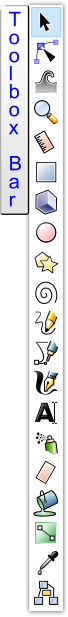
Toolbox bar descriptions
::工具箱条形容
The tools can be enabled from the Toolbox bar on the left side of the interface or by using the shortcut key assigned to the specific tool. To find out what edit/feature each tool provides, simply mouseover 🖰 a Toolbox bar button (icon) and a pop-up message (feedback) will provide the tools title and its assigned shortcut key in parenthesis.
::这些工具可以从界面左侧的工具箱或使用分配给特定工具的快捷键来启用. 为了了解每个工具提供什么编辑/功能,只需鼠标转移一个工具箱按 (图标) 和弹出消息 (反) 将提供工具标题及其分配的快捷键.
Here is a table with shortcut key(s), tool's name and descriptions for each of the Toolbox tools (v0.91):
::以下是每个工具箱工具 (v0.91) 的快捷键,工具名称和描述:
| Icon | Key(s) | Action | Description |
|---|---|---|---|
|
S |
Select and
Transform tool |
From this option you can, select, freehand move, rotate, flip, raise and lower in steps,
raise to top, lower to bottom, change width/height with W/H numeric-value boxes,
|
|
N | Edit Node tool | Edit object's nodes, handles and segments to set geometry |
|
W | Tweak tool | Tweak objects by sculpting or painting |
|
Z , Q | Zoom tool | Allows you to access a wide set of zoom operations, Q allows quick (temporary) zoom |
|
M | Measurement tool |
Live on-canvas update with measurements of length and angles as you pass over
objects in your drawing. |
|
R |
Rectangles and
Squares tool |
For creating and editing rectangles and squares, with optional rounded corners (Rx, Ry) |
|
X | 3D Box tool | Used to create 3D boxes |
|
E |
Circles, Ellipses
and Arcs tool |
For creating and editing circles, ellipses and arcs |
|
* |
Star and
Polygon tool |
For creating and editing stars and polygons |
|
I | Spiral tool | For creating and editing spirals |
|
P | Pencil tool | Draw lines in freehand or spirol modes, creating dots |
|
B |
Bézier curves
and lines tool |
For drawing bézier curves and straight lines, spiros, straight line segments and
paraxial lines, creating dots |
|
C | Calligraphy tool | For drawing calligraphic or brush objects |
|
T | Text tool | For creating and editing text |
|
A | Spray tool | Spray clones, copies or single objects by sculpting or painting |
|
Shift+E | Eraser tool | Used to erase an area from an object or to delete an entire object |
|
U | Fill (Bucket) tool | Used to fill objects with a color or gradient and can also color a stroke (border) |
|
G | Gradient tool | Used to add and edit radial or linear gradients to an object's stroke and fill separately |
|
D |
Color Picker
(Dropper) tool |
Used to pick and or drop a color from any image/object to any object within the canvas |
|
O | Connector tool | Used to create diagram connectors |
Rulers bar
::统治者杆
Keyboard shortcut:
Ctrl
+
R
::键盘快捷键:Ctrl+R
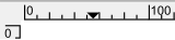
The fourth bar down, from the top, is the
Rulers bar
, this interface bar is two-sided as it also displays along the left side of the Canvas. Both of the rulers directly border the Canvas area. The top bar (left to right) is "horizontal" and is referred to as the
X axis
. The left bar (down to up) is "vertical" and is referred to as the
Y axis
within Inkscape. In the example Rulers bar graphic, the X axis ruler's down arrow icon (⏷) and Y axis ruler's right arrow icon (⏵) follow the on-canvas cursor's positioning. If you prefer not to use the Guidelines or Canvas Grids, zooming in while editing nodes, handles, etc. will increase the accuracy of on-canvas editing. The Node's Tool Controls bar also has precise x/y numeric-value boxes for an objects bottom-left bounding boxes corner for x/y placement on the canvas.
::从上方向下的第四条条是"统治者"条,这个接口条是双面的,因为它也显示在帆布的左侧.这两个统治者直接与帆布区域接壤.顶条 (从左到右) 是"水平"的,被称为X轴.左条 (从下到上) 是"垂直"的,被称为Inkscape中的Y轴.在"统治者"图形示例中,X轴统治者的向下箭头图标 () 和Y轴统治者的右箭头图标 () 遵循帆布光标的位置.如果您不喜欢使用指南或帆布网格,在编辑时放大图标,手柄等,将增加帆布编辑的准确性.节点的控制条还具有精确的x/y值框,用于在底部
The rulers can represent distances by different
units of measure
and can be set using the following Menu bar command,
‣
F
ile ‣‣
D
ocument Properties ‣‣‣Page Tab <Default
u
nits>
,
⇧ Shift
+
Ctrl
+
D
. Any changes will be saved with the document, as this is not an entire (application) preference. Inkscape provides the following configurable default units of measure:
::统治者可以用不同的测量单位表示距离,并可以使用以下菜单命令设置, 文件 文档属性 页面标签 <默认单位>, 转移+Ctrl+D.任何更改将与文档一起保存,因为这不是整个 (应用程序) 偏好.Inkscape提供了以下可配置的默认测量单位:
|
|
|
|

The
D
ocument Properties
default units (of measure setting) is px (pixels). To verify any change of the default units, simply mouseover 🖰 the Rulers bar and a pop-up will display the default units of measure setting.
::文档属性默认单位 (测量设置) 是 px (像素). 为了验证默认单位的任何变化,只需鼠标移动 统治者,弹出窗口将显示默认单位的测量设置.
Displaying the Rulers bar to the user interface can also be viewed or hidden using the following options,
Ctrl
+
R
or via the Menu bar
‣
V
iew ‣‣Sh
o
w/Hide ‣‣‣
R
uler bars
(
Alt
+
V
,
O
,
R
.
::显示Rulers条的用户界面也可以使用以下选项,Ctrl+R或通过菜单条 View Show/Hide Ruler条 (Alt+V,O,R.
Rulers bar - Guidelines
::统治者 - 准则
Keyboard Shortcut:
⇧ Shift
+
|
::键盘快捷键: 转换+ 工作
The Rulers bar is one method of placing
guidelines
onto the canvas area. The guidelines are in place to assist in editing and are not part of rendering or exporting of any files.
::统治者条是将指南放置在画布区域的一个方法.指南是为了协助编辑而不是任何文件染或导出的一部分.
To extract (pull out) a guideline from one of the Rulers bar, switch the Toolbox tool to either the Selector Tool (
spacebar
) or the Node Tool (
N
). For a 0° angle guideline place the mouse cursor over the top Ruler Bar (X axis ⏷), then
Drag
(Click+Hold) the mouse cursor down toward the canvas. A red line will come out of the Rulers bar and will be
positioned
(x/y) over the canvas where the drag is
released
. Once released the Guideline will change to the color blue (default). For a 90° angle guideline repeat this drag over the left Ruler Bar (Y axis ⏵).
::要从统治符中提取 (拉出) 指南,请将工具箱工具切换为选择器工具 (空格条) 或节点工具 (N). 对于0°角度的指南,将鼠标光标放置在顶部的统治符 (X轴),然后将鼠标光标向下拉向画布. 统治符将出现一个红线,将在拖放的画布上 (x/y) 放置. 一旦释放,指南将变为蓝色 (默认). 对于90°角度的指南,请重复在左边的统治符 (Y轴) 上进行拖动.
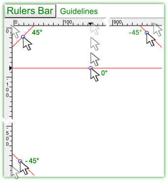
The graphic (Inkscape v0.91 Rulers bar guideline drags) also shows how to drag pre-configured guidelines from the top left corner for a 45° angle and for a -45° angle from the top right or the bottom left of the Rulers bar.
::图 (Inkscape v0.91 Rulers bar指南拉动) 还显示如何从左上角拖动预配置的指南,以45°的角度,以及从右上角或左下角的 -45°角度拖动.
The modifier keys
Ctrl
and
⇧ Shift
enhance the edits of the guidelines. Here is the Statusbar's Notification display (bottom-center) tooltip message when hovering the Selector or Node Tool cursor over an existing guideline:
::修改键Ctrl和Shift可以改进指南的编辑.当选择器或节点工具的光标在现有指南上移动时,状态的通知显示 (下部中心) 工具提示消息:
Guideline
: horizontal, at 50px;
Shift+Drag
to rotate,
Ctrl+Drag
to move origin,
Del
to delete
::准则:水平,50px; 转移+拖动旋转,Ctrl+拖动移动源,Del删除
To angle a guideline at 15° snap increments drag the guideline using the following keys,
Ctrl
+
⇧ Shift
+
Drag
. The guidelines can be viewed or hidden by, a Single-Click over the Rulers bar, shortcut
⇧ Shift
+
|
and
‣
V
iew ‣‣G
u
ides
(
Alt
+
V
,
U
).
::为了以15°的快速增量来设置指南,请使用以下键拖动指南,Ctrl+ 转换+拖动.指南可以通过单击在统治符上,快捷键 转换+ 库存和 查看 指南 (Alt+V,U) 查看或隐藏.
Displaying the Guidleines to the user interface can be viewed or hidden using the following options,
⇧ Shift
+
|
or via the Menu bar
‣
V
iew ‣‣G
u
ides
(
Alt
+
V
,
U
).
::通过下列选项,可以查看或隐藏指南线, 转换+ 书记或通过菜单 查看 指南 (Alt+V,U).
Scrollbars
::滚动
Keyboard shortcut:
Ctrl
+
B
::键盘快捷键:Ctrl+B
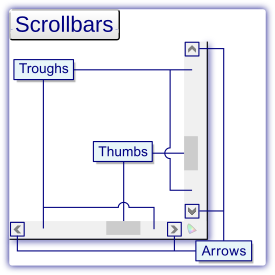
Thumb dragging
::指拖动
Move the cursor over one of the two thumbs and then
Drag
(press and hold) the thumb, to scroll the canvas. If using a laptop pad, move the cursor over a thumb and double-click the thumb, then drag it.
::移动光标在两个指之一上,然后拖动 (按住) 指,滚动画布.如果使用笔记本电脑,移动光标在指上,双击指,然后拖动它.
Clicking the trough
::按一下下水槽
The trough area above or below the thumbs can be clicked in order to jump to that point on the canvas. After clicking the trough, scrolling automatically begins and then stops once the thumb has reached the position of the mouse cursor. To jump the thumb to a trough position use the shortcut Click the Middle Mouse Button (
Click
+
MMB
).
::指上方或下方的谷区域可以点击以跳到画布上的那个点.点击谷后,滚动自动开始,然后在指到达鼠标光标位置时停止.将指跳到谷位置使用快捷键点击中鼠标按 (点击+MMB).
Arrow buttons on scrollbar
::在滚动上的箭头按
Left-clicking on the arrows scrolls a small amount of the canvas at a time. Press and hold an arrow button and the canvas continuously scrolls faster until released. Right-clicking the arrows will automatically move the canvas' to the far left, far right, very top or very bottom of the canvas.
::按右键在箭头上滚动一小部分的画布.按住箭头按,画布会不断滚动更快,直到释放.右键在箭头上会自动移动画布到最左边,最右边,最上或最下面的画布.
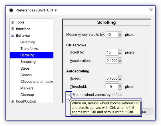
Scrolling preferences
::滚动偏好
Mouse wheel
::鼠标轮
A mouse wheel, the middle mouse button (MMB), on a three button mouse may also be used to scroll the canvas. Moving the wheel in a desired direction moves the content in the same direction. Most mouses have a MMB that only scroll up and down, to scroll horizontally (left or right) use
⇧ Shift
+
MMB
. To change the distance one notch of the mouse wheel scrolls (moves) edit the "Mouse wheel scrolls by" spin box in the
E
dit P
r
eferences... (
Alt
+
E
,
R
) or shortcut
⇧ Shift
+
Ctrl
+
P
Scrolling menu, shown above.
::鼠标轮,三键鼠标上的中鼠标按 (MMB) 也可以用来滚动画布. 移动轮在一个所需的方向移动的内容在同一个方向. 大多数鼠标有一个MMB只滚动上下,横向滚动 (左或右) 使用 转移+MMB. 为了改变距离一个口的鼠标轮滚动 (移动) 编辑"鼠标轮滚动"旋转框在编辑偏好... (Alt+E,R) 或快捷键 转移+Ctrl+P滚动菜单,如上所示.
Arrow keys
::箭头键
You can scroll the canvas in any direction using
Ctrl
+
Arrow
keys. Or drag (click + hold) the middle mouse button (
Drag
+
MMB
) scrolling the mouse in any direction. The Inkscape
‣Preferences ‣‣Behavior ‣‣‣Scrolling
provides user settings for the
Ctrl+arrows
feature:
::您可以使用Ctrl+箭头键向任何方向滚动画布.或者拖动 (点击+按住) 中间鼠标按 (Drag+MMB),将鼠标滚动向任何方向.Inkscape 偏好 行为 滚动为Ctrl+箭头功能提供用户设置:
-
-
Sc
r
oll by: will set the distance for each notch (step) of the MMB
::通过滚动:将设置MMB的每个口 (步骤) 的距离 -
A
cceleration: will gradually (gently) speed up scrolling, set the spin box to '0' for no acceleration
::加速:将逐渐 (轻轻地) 加速滚动,设置旋转盒到"0"没有加速
-
Sc
r
oll by: will set the distance for each notch (step) of the MMB
Mouse wheel zooms by default
::默认将鼠标轮放大
When the Mouse wheel zooms by default check box is checked (on), the mouse wheel
zooms
without Ctrl and
scrolls
the canvas with Ctrl. When this setting is unchecked (off), the mouse wheel
zooms
with Ctrl and
scrolls
without Ctrl. The graphic above shows the tooltip message when you mouseover 🖰 the check box or the check box description.
::当默认的鼠标轮放大选项框被勾选 (开启),鼠标轮放大没有Ctrl,并用Ctrl滚动画布. 当此设置被勾选 (关闭) 时,鼠标轮放大有Ctrl,并没有Ctrl滚动. 上图显示了工具提示消息,当你鼠标转移选项框或选项框描述.
To view/hide the scrollbars using the Menu bar,
‣
V
iew ‣‣Sh
o
w/Hide
<Scroll
b
ars> (
Alt
+
V
,
B
) or shortcut keys
Ctrl
+
B
).
::通过菜单查看/隐藏滚动, 查看 显示/隐藏 <滚动> (Alt+V, B) 或快捷键 Ctrl+B).
Snap controls bar

::快速控制条
Keyboard Shortcut:
%
::键盘快捷方式: %
The bar to the far right, of the interface, is the
Snap Controls bar
that enables setting of object snapping modes. In general, snapping is a method for accurate and symmetrical (balanced) placement of objects onto the canvas. It features edits that easily align items in many different ways. The
topmost
icon in the bar enables snapping in general for the current file, the keyboard shortcut
%
is assigned to the Snap bar. Once snapping is enabled, there are six modes available, the first three modes have secondary snap edits available, while the last three snap edits are stand alone modes.
::截图图像的右边是Snap Controls (快速控制) 条,它允许设置对象截图模式.一般来说,快速控制是对象在画布上准确和对称 (平衡) 的放置方法.它具有以许多不同的方式轻松对齐的编辑.条的顶部图标允许对当前文件进行一般的快速处理,键盘快捷键%被分配给快速处理条.一旦启用快速处理,就有六种模式可用,前三种模式有可用的二级快速编辑,而最后三种快速编辑则是独立的模式.
Snap bar settings
::快速的设置
The options for Snap bounding boxes include:
::对于Snap边界框的选项包括:
-
-
 Snap bounding boxes
(must be enabled for setting of the following secondary modes)
Snap bounding boxes
(must be enabled for setting of the following secondary modes)
::接界限框 (必须启用以设置下列次要模式)
-
-
 Snap to edges of a bounding box, not corners
::抓住边框边缘,而不是角落 -
 Snap bounding box corners
::截止边界盒角 -
 Snap midpoints of bounding box edges
::边界框边的中点 -
 Snap centers of bounding boxes
::边界箱的抓取中心
-
-
The second mode of snapping, is Snap nodes, paths and path segments, here are the options:
::截取的第二种模式是Snap节点,路径和路径段, 以下是选项:
-
-
 Snap nodes, paths and handles
(must be enabled for setting of the following secondary modes)
Snap nodes, paths and handles
(must be enabled for setting of the following secondary modes)
::结,路径和手柄 (必须启用以设置下列次要模式)
-
-
 Snap to paths
::快速到路径 -
 Snap to path intersections
::快速到路径交叉点 -
 Snap cusp nodes, including rectangle corners
::结节点,包括矩形角 -
 Snap smooth nodes, including quadrant points of ellipses
::平的节点,包括圆的象限点 -
 Snap midpoints of line segments
::线段的中点
-
-
The third mode of snapping is Snap to other points (centers, guideline origins, gradient handles, rotation center (+), etc.), options include:
::第三种快速拍摄方式是快速拍摄到其他点 (中心,指导线原点,梯度手柄,旋转中心 (+),等等),选项包括:
-
-
 Snap to other points
(must be enabled for setting of the following secondary modes)
Snap to other points
(must be enabled for setting of the following secondary modes)
::快速到其他点 (必须启用以设置下列次要模式)
-
-
 Snap to centers of objects
::抓取对象的中心 -
 Snap an objects rotation center
::拍摄一个物体的旋转中心 -
 Snap text anchors and baseline
::快速文本和基线
-
-
The following three snap modes are independent of each other and are not grouped like the previous modes. These snap modes require that the general snapping mode is enabled, shortcut key
%
.
The three independent modes are:
::以下三个快速模式彼此独立,并且不像前面的模式一样被分组.这些快速模式需要启用通用快速模式,快捷键% .三个独立模式是:
-
-
 Snap to the page border
::快速到页边框 -
 Snap to grids
::快速到网格 -
 Snap to guides
::快速到指南
-
Bounding boxes
::边界盒
One of the six modes of snapping, is Snap bounding boxes. A
bounding box
is a dashed line box, outlining an object's height and width. There are two outlining settings for the bounding box feature. (1) Visual bounding box; encloses strokes, markers, filter margins, etc. and (2) Geometric bounding box; outlines only the bare path. Here are some example graphics of the two bounding box types with plain and filtered objects, using the Selector tool:
::截图的六种模式之一是Snap边界框.边界框是一个划线框,概述一个对象的高度和宽度.边界框功能有两个概述设置. (1) 视觉边界框;包含冲动,标记,过边缘等,以及 (2) 几何边界框;仅概述裸路径. 以下是使用Selector工具的两个边界框类型的示例图形,其中包括平面和过对象:
-
 Visual bounding box
::视觉界限框 -
 Visual bounding box with filtered object
::视觉界限框与过对象 -
 Geometric bounding box
::几何界限框 -
 Geometric bounding box with filtered object
::具有过对象的几何界限框
To choose between the two bounding box features open ‣
E
dit ‣‣P
r
eferences (
Alt
+
E
,
R
) or shortcut
⇧ Shift
+
Ctrl
+
P
select Tools, then click the radio button of your choice;
Bounding box to use:
::选择两个界限框功能打开 编辑 偏好 (Alt+E,R) 或快捷方式 转换+Ctrl+P 选择工具,然后单击您选择的无线电按;使用界限框:
- ◉ Visual bounding box (default)
-
◎ Geometric bounding box
Snapping preferences
::快速使用偏好
Keyboard Shortcut:
⇧ Shift
+
Ctrl
+
P
::键盘快捷键: 转换+Ctrl+P
A 'Snapping' tab is available in the
‣
E
dit ‣‣P
r
eferences
(
Alt
+
E
,
R
or
⇧ Shift
+
Ctrl
+
P
) ‣‣‣Behavior <Snapping> options. Features found on this tab are:
::在"编辑"选项中可使用"快照"选项卡. 编辑选项卡中的功能包括:
- Enable snap indicator (checkbox)
- After snapping has occurred, an on canvas pop up message is displayed at the specific snap position, providing vector and snap mode information (feedback) of the edit.
- Delay in ms (slider)
- Postpone snapping as long as the mouse is moving, then wait in milliseconds (ms) before applying the snap. The delay is set on this slider, with values from 0 to 1000 ms available. When set to zero or a very small number snapping will be immediate.
- Only snap the node closest to the pointer (checkbox)
- Try to snap to the node that is closest to the mouse pointer (cursor). Example, If you want to use the bottom left node (corner) of an object as a snap point, start the drag (click + hold, left mouse button) close to the bottom left corner of the object.
- Weight factor (slider)
- When multiple snap targets are found, Inkscape can either prefer the closest transformation (when set to 0). Or prefer the node that was initially the closest to the pointer (when the slider is set to 1).
- Snap the mouse pointer when dragging a constrained knot (checkbox)
- When dragging a knot along a constraint line, then snap the position of the mouse pointer instead of snapping the projection of the knot onto the constrained line.
Palette bar
::调色板
Keyboard Shortcut:
⇧ Shift
+
Alt
+
P
::键盘快捷键: 转换+ 替换+P
At the bottom of the user interface below the Scrollbar is the
Palette bar
. This bar provides fill and stroke style (colors, gradients, patterns, etc.) options. Fill is the style inside of an object, stroke is the outer edge (border) of an object.
::在用户界面的底部,在滚动下方是调色板.这个调色板提供填充和冲刺风格 (颜色,渐变,图案等) 选项.填充是对象内部的风格,冲刺是对象的外边 (边界).
Here is how some of the palette's color edits are placed onto objects:
::以下是如何将一些调色板的颜色编辑放在对象上:
-
Drag
(press and hold the left mouse button) a color box from the palette onto an object and release the drag, this will change the target object's fill. The great benefit of this feature is the object does not have to be selected before the drag color box edit.
::拖动 (按住鼠标左键) 从调色板上的一个颜色框到一个对象上,然后释放拖动,这将改变目标对象的填充.这个功能的最大好处是,在拖动颜色框编辑之前不必选择对象. -
⇧ Shift
+
Drag
a color box from the pallete onto an object and release the drag, this will change the object's stroke color. Again, the target object does not have to be selected.
:: 移动+拖动一个色框从托盘上拉到一个对象上,然后释放拖动,这将改变对象的冲刺颜色.再次,目标对象不必被选择. -
Select an object first, then
Right-Click
a color box in the palette. A pop-up menu provides options to 'Set fill' or 'Set stroke'.
::首先选择一个对象,然后右键单击调色板中的颜色框. 弹出菜单提供了'设置填充'或'设置冲动'的选项. -
Select an object then
Left-Click
a color box to set the object's fill.
::选择一个对象,然后左键单击一个颜色框来设置对象的填充. -
Select an object then
⇧ Shift
+
Left-Click
a color box to set the object's stroke.
::选择一个对象,然后 移动+左键单击一个颜色框设置对象的笔画.
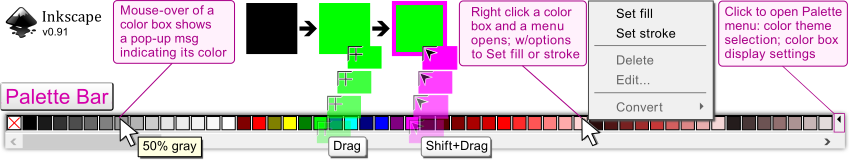
The top half of the palette bar displays color boxes. To the right of the last displayed color box is a small left arrow.
Click
the arrow
⏴
for a menu with the following options:
::调色板上半部分显示颜色框.最后显示的颜色框的右侧是一个小的左箭头. 点击箭头以获得一个菜单,其中包含以下选项:
- Size
- from tiny to huge color boxes (5 settings).
- Width
- from narrower to wider color boxes (5 settings)
- Border
- none, solid and wide (wide setting is shown in the palette bar graphic)
- Wrap
- will add a second row of color boxes to the palette
- Color theme
- there are 21 (v0.91) themes to chose from.
Just below the color boxes is the palette's scrollbar, there are many colors to choose from and most of the color themes require the use of this scrollbar. The scrollbar's default placement is to the left of the palette bar.
::在色框下方是调色板的滚动,有很多颜色可供选择,大多数色彩主题都需要使用这个滚动.滚动的默认位置是在调色板的左边.
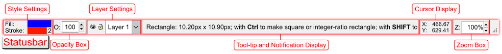
Statusbar
::状态
The
Statusbar
delivers routine edit settings and essential display only information (see below).
::状态提供常规编辑设置,并仅显示基本信息 (见下文).
-
Settings with editing capabilities
-
Style settings
: Fill and Stroke style bars, Stroke width setting
::风格设置:填充和冲击风格条,冲击宽度设置 -
O:
Opacity numeric value spin box
:::透明度数值旋转框 -
Layer
: Visibility, Lock/Unlock and Selection drop down menu
::层:可见性,锁/解锁和选择下拉菜单 -
Z:
Zoom percentage value spin box
::变焦百分比值旋转框 -
Window size
: Change window size
::窗口大小: 改变窗口大小
::编辑功能设置 风格设置:填充和冲击风格条,冲击宽度设置 O:透明度数值旋转框 层:可见性,锁/解锁和选择下拉菜单 Z:缩放百分比值旋转框 窗口大小:更改窗口大小 -
Style settings
: Fill and Stroke style bars, Stroke width setting
-
Displays only
-
Notification Display
: On canvas editing tooltip and Menubar interaction messages
::通知显示: 在画布编辑工具提示和菜单交互消息 -
X: Y:
: Horizontal (X) and vertical (Y) values of the cursor's on canvas position
::标针在画布上的水平 (X) 和垂直 (Y) 值
::仅显示通知 显示:在画布上编辑工具提示和菜单交互消息 X:Y:: 标针在画布上的水平 (X) 和垂直 (Y) 值 -
Notification Display
: On canvas editing tooltip and Menubar interaction messages
Style settings
::风格设置
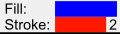
First, select an object and the style setting (bottom left of the user interface) will update to reflect the style of the object. With the selection still in place,
Right-Click
the Fill style bar and a pop-up menu will provide the following options:
::首先,选择一个对象,风格设置 (用户界面左下方) 将更新以反映对象的风格. 选择仍然在位,右键点击填充风格和弹出菜单将提供以下选项:
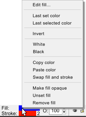
-
Edit fill... (opens the Fill and Stroke Dialog, to the Fill tab)
::编辑填充... (打开填充和冲击对话框,到填充选项卡) -
Last set color
(a)
::最后一个颜色 -
Last selected color
(b)
::最后选择的颜色 -
Invert; changes fill to the opposite color
::倒置; 变更填充到相反的颜色 -
White and Black; set fill to white or black
::白色和黑色;将填充设置为白色或黑色 -
Copy/Paste color
::复制/粘贴颜色 -
Swap fill and stroke
::交换填充和冲动 -
Make fill opaque (full coloring, no alpha or opacity)
::填充不透明 (全彩,没有阿尔法或不透明) -
Unset fill
::没有填充 -
Remove fill
::删除填充
-
(a)
Lest set - will replace the color to the object's last 'set' color, no matter what sequence of selections and edits that have occurred. This edit is attached to the object's properties and is not attached to a que (chain) of selections/edits.
- (b) Last selected - is a mirror of the common chain based ‣ E dit ‣‣ U ndo , shortcut key Ctrl + Z edit.
The Stroke style bar,
Right-Click
is a mirror of the Fill style bar pop-up menu (above), but it applies to the selected object's stroke, not the fill. When a stroke style is displayed of a selected object, the stroke style bar is narrowed and the stroke's width numeric value is displayed (example graphic the stroke is set to 2).
Right-Click
the numeric value and a pop-up menu provides editing of the stroke's unit of measure (example; px, mm, inch, etc.), preset stroke width values from 0.1 to 32 and a remove (stroke) edit.
::冲击风格,右键是填充风格弹窗菜单 (上) 的镜像,但它适用于所选对象的冲击,而不是填充.当显示所选对象的冲击风格时,冲击风格会缩小,并显示冲击的宽度数值 (例如图形,冲击设置为2).右键数值和弹出菜单提供了冲击的测量单位 (例如:px,mm,inch等),预设冲击宽度值从0.1到32,并删除 (冲击) 编辑.
Opacity spin box
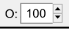
::透明旋转盒
First lets define
Opacity
with regards to graphic design. The opacity value applies the transparency (see through) percentage of an object or a group of objects. The percentage is a unit of measure to which the background behind (below) the object is overlaid.
::首先让我们定义Opacity与图形设计有关.Opacity值适用于一个对象或一个对象组的透明度 (透视) 百分比.百分比是对象背后 (下面) 的背景被覆盖的测量单位.
The opacity percentage-value,
O: box
displays the opacity value for the selected object's combined fill and stroke.
Right Click
the percentage-value O: box to select preset values from 0% (transparent/no color) to 100% (opaque/full color).
Double Click
the box to manually enter an opacity setting of any number between 0 and 100.
::透明度百分比值,O:框显示所选对象的加密填充和冲动的透明度值.右键点击百分比值O:框以选择预设值从0% (透明/无色) 到100% (不透明/全色).双击框以手动输入0到100之间的任意数值的透明度设置.
Please note that in Inkscape, Opacity refers to the transparency of
both
an object's
fill and stroke
. While the term
Alpha
refers to Color models (RGB
A
, HSL
A
, CMYK
A
, etc.) and allows for individual alpha (transparency) editing of either an object's fill and stroke.
::请注意,在Inkscape中,Opacity是指对象填充和冲刺的透明度.而Alpha术语是指色彩模型 (RGBA,HSLA,CMYKA等),并允许对象填充和冲刺的单独alpha (透明度) 编辑.
Layer settings
::层设置
The Statusbar's layer settings is a minimized version of the full featured "Layers Dialog" and allows for
quick layer selection/settings
. The Layer Dialog will be fully covered in the Dialogs chapter. Briefly, layers allow for the creation and grouping of objects within a given layer, not to be confused with the object group/ungroup features. If you are new to graphics, most graphic nerds use layers from a bottom to top method for their artwork, this is a side step as most people see things from a top to bottom view. An example of using layers can be drawn from the creation of a birthday card, here is a quick outline of the potential layers:
::状态的层设置是全面功能"层对话"的最小化版本,允许快速选择/设置层.层对话将在对话章节中完全涵盖.简而言之,层允许在给定的层内创建和分组对象,不要与对象组/不分组功能混.如果您对图形是新手,大多数图形学 nerds 使用层从底到顶方法为他们的艺术品,这是一个侧步骤,因为大多数人从顶到底看待事情.使用层的例子可以从创建生日卡中提取,这里是潜在层的快速概述:
-
Text (layer 6 - Top), Happy Birthday _ _ _ _ _!
::文字 (第6层 - 上层), 祝你生日快乐! -
Photograph (layer 5), bitmap image of birthday person
::照片 (第5层),出生日的人的位图图像 -
Candles (layer 4)
:: (第4层) -
Balloons (layer 3)
::气球 (第三层) -
Gradient (layer 2), contains a radial gradient or a filter/effect over the background layer
::梯度 (二层),包含一个辐射梯度或过器/效果在背景层 -
2nd Background/Backrop, contains a different background color for quick comparison
::包含不同的背景颜色以快速比较 -
Background/Backdrop (layer 1 - Bottom), contains a background color for the birthday card
::背景/背景 (第1层 - 下方),包含生日卡的背景颜色
The Layer settings let you work on one layer and its objects potential filters/effects, with no worry of mistakenly editing other objects. For a first time user the layer features may not seem essential. But as a given creation becomes more complex, the layers make graphic editing so much easier.
::层设置让你在一个层和它的对象潜在的过器/效果上工作,不用担心错误地编辑其他对象.对于第一次使用者来说,层功能可能看起来不必.但是随着特定的创作变得更加复杂,层使图形编辑变得更加容易.
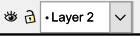
Here are the definitions of the Statusbars' layer settings. The first button is the layer
view
 / hide
 button
. Followed, to the right, by the
lock
button
. Followed, to the right, by the
lock
 / unlock
 button
of the current layer. When a layer is locked the objects within this layer are still displayed but cannot be selected nor edited. The layer's name and its
drop down menu
allows for a quick way to change layers. The Statusbar's layer settings are a quick and essential way of moving between layers.
button
of the current layer. When a layer is locked the objects within this layer are still displayed but cannot be selected nor edited. The layer's name and its
drop down menu
allows for a quick way to change layers. The Statusbar's layer settings are a quick and essential way of moving between layers.
::以下是状态的层设置的定义.第一个按是层查看/隐藏按.右边是当前层的锁定/解锁按.当一个层被锁定时,该层中的对象仍然显示,但无法选择或编辑.层名称及其下拉菜单允许快速更改层.状态的层设置是层之间移动的快速和必不可少的方法.
Tool-tips and Notifications display
::工具提示和通知显示
The Tool-tips and Notifications display is very helpful for beginners, as it generates
Tool-tip Messages
by following the sequence of possible
on canvas
edits one is performing on an object. It also generates
Notification Messages
when interacting with the
Menu bar functions
. If you are new to graphics, the tool-tip messages are prominent within graphic programs when compared to other types of programs. Please note Inkscape has thousands of edits, and this display is a key element if you want to grow your graphic design skills and have more fun.
::工具提示和通知显示对于初学者来说非常有用,因为它通过在一个对象上执行的可能的画布编辑的顺序生成工具提示消息.它还在与菜单函数交互时生成通知消息.如果您对图形是新手,则与其他类型的程序相比,工具提示消息在图形程序中很突出.请注意Inkscape有数千次编辑,如果您想增强您的图形设计技能并获得更多乐趣,此显示是关键元素.
Tooltip messages
::工具提示消息
Here is an example of the
on-canvas tooltip messaging
feature. First select the Square and Rectangle tool, while you are actively dragging (editing) the shape onto the canvas, the Statusbar's messaging will change and provide 'live' object and modifier key
(
Ctrl
,
⇧ Shift
,
Alt
) tooltip message, this shows Object, Ctrl and Shift tips:
::以下是画布上工具提示消息功能的一个例子.首先选择方形和矩形工具,当你在画布上主动拖动 (编辑) 形状时,状态的消息将会改变并提供'实时'对象和修改键 (Ctrl, 转移, Alt) 工具提示消息,这显示了对象,Ctrl和转移提示:
Statusbar, tooltip message:
Rectangle
: 11.00px x 766px; with
Ctrl
to make square or integer-ratio rectangle; with
Shift
to draw around the starting point
::状态,工具提示消息:矩形: 11.00px x 766px;使用Ctrl制作方形或整数比矩形;使用Shift绘制起点周围
Now with the rectangle on the canvas, mouseover 🖰 one of the rectangles square handles, the handle will change color (visual indicator) and a new two item (width and height and Ctrl) tooltip message (feedback) will appear:
::现在在画布上的矩形,鼠标转移矩形方形的手柄之一,手柄将改变颜色 (视觉指示器) 和一个新的两个项目 (宽度和高度和Ctrl) 工具提示消息 (反) 将出现:
Statusbar, tooltip message:
Adjust the
width and height
of the rectangle; with
Ctrl
to lock ratio or stretch in one dimension only
::状态,工具提示消息:调整矩形的宽度和高度;使用Ctrl锁定比例或仅在一个维度中拉伸
Another example, again with the rectangle already rendered (displayed) on the canvas, mouseover 🖰 a handle then press and hold one or two of the modifier keys, like the
Ctrl
key or both the
Ctrl
+
⇧ Shift
. While holding down the modifier key(s) the tooltip message updates again and provides assistance for the modifier key(s) you are holding, here is the tooltip for two modifier
Ctrl
+
⇧ Shift
keys:
::另一个例子,再次用在画布上已经染 (显示) 的矩形,鼠标转移一个手柄,然后按住一个或两个修改键,如Ctrl键或Ctrl+Shift. 当按住修改键时,工具提示消息再次更新并为您持有的修改键提供帮助,这里是两个修改键Ctrl+Shift键的工具提示:
Statusbar, tooltip message:
Ctrl:
make a square or integer-ratio rectangle; lock a rounded corner circular;
Shift:
draw around the starting point
::状态,工具提示消息:Ctrl:制作一个正方形或整数比矩形;锁定一个圆角圆形;转移:画在起点周围
To summarize the rectangle tooltips over the three separate messages we received seven tips, to help make Inkscape easier to use. Here is a breakdown of the seven tips provided:
::为了总结三条单独的消息中的矩形工具提示,我们收到了七个提示,以帮助使Inkscape更容易使用. 以下是七个提示的细分:
|
5. with
Ctrl
to lock ratio or stretch in one dimension only
|
When you switch from a newly created rectangle to either the Selector
spacebar
or Node tool
N
, the tooltip messaging will update to the newly enabled tool. Tooltips are extensive and very helpful, here are the on-canvas tooltips based on frequently used tools:
::当您从新创建的矩形切换到选择器空格条或节点工具N时,工具提示消息将更新到新启用的工具. 工具提示是广泛的和非常有用的,以下是基于经常使用的工具的画布工具提示:
-
Shape or Path tools active on-canvas edits, along with handle, node, node handles and path segment mouseovers 🖰.
::形状或路径工具可以在画布上进行主动编辑,以及手柄,节点,节点手柄和路径段鼠标转移. -
Selector tool active edits of scale, stretch, skew, rotation and center of rotation along with mouseovers 🖰 also generate tooltips.
::选择器工具的规模,拉伸,斜率,旋转和旋转中心的活跃编辑以及鼠标转移也会产生工具提示. -
The Node tool also generates extensive tooltips based on active edits and mouseovers 🖰 of cusp, smooth and auto-smooth nodes, node handles and segments.
::节点工具还基于主动编辑和鼠标转换生成了广泛的工具提示,包括点,平滑和自动平滑节点,节点手柄和段.
Regardless of the active tool, nearly every on-canvas edit icon will generate a new tooltip message.
::无论使用哪个工具,几乎每一个画布上的编辑图标都会产生一个新的工具提示消息.
Notification messages
::通知信息
The Statusbar Notifications Messages are generated based on any type of
Menu bar interactions
, except for the
‣Exte
n
sions
menu (v0.91). As an example, click
‣
F
ile
then move the cursor down and highlight the
‣‣
S
ave
option. The Statusbar will update and display a new notification message of "Save Document'. Now click on the
‣‣
S
ave
option and a new notification message of "Saving file" will be displayed. Once the file save is complete the Statusbar will then display an updated notification message with the file's directory information. While most applications have this similar feature, Inkscape's notifications implementation stands as one of its best features.
::状态通知消息是基于任何类型的菜单交互生成的,除了"扩展菜单 (v0.91) ".作为一个例子,点击"文件",然后将光标向下移动并突出显示"保存"选项.状态将更新并显示"保存文档"的新通知消息.现在点击"保存"选项,将显示"保存文件"的新通知消息.一旦文件保存完成,状态将显示更新的通知消息,其中包含文件的目录信息.虽然大多数应用程序都有类似的功能,但Inkscape的通知实现是其最好的功能之一.
If you are new to graphics, notification messages are very helpful when interacting with the Menu's bar. More than 70% of the Menu bar's commands are based on graphics. These messages provide great help with the understanding of what a specific graphic based command will do and will also update the message if a command failed to execute.
::如果您对图形是新手,则在与菜单交互时通知消息非常有帮助.菜单的70%以上的命令是基于图形的.这些消息对了解特定的图形命令的作用有很大的帮助,如果命令未能执行,则会更新消息.
In this example three messages are shown with the last two b) and c) are user errors and shows how the Statusbars display will update with assistance based notification messages on how to execute the command correctly.
::在此示例中,显示了三个消息,最后两个 b) 和 c) 是用户错误,并显示了状态显示如何更新辅助基于如何正确执行命令的通知消息.
1)
Command:
‣Object ‣‣Clip <Set>
::1) 命令: 对象 剪辑 <设置>
Notes
::其他
|
Notification Display:
Provides very useful live tooltips and notifications based on the current edit being performed. If the window is too small to show all of the message, simply mouseover the notification display area and a pop-up message will show all of the text.
|
Cursor display

::标签显示
In vector graphics, sometimes the positioning of objects can be cumbersome. But dependent upon what the final workup will be used for positioning can be very important. Laser printers, material cutters will print/cut with precision and therefore any mis-alignment of objects may easily be seen. The X: (horizontal) and Y: (vertical) display shows exactly where the cursor is on the canvas. A higher zoom level increases the accuracy of the cursor's position. Grids, Guides, Snapping and Zoom levels are additional methods for increasing accuracy of object, handle, node, text, etc. vector based placements.
::在矢量图形中,有时对象的定位可能很麻烦.但取决于最终的处理将用于定位可能非常重要.激光打印机,材料切割机将精确地打印/切割,因此任何对象的错误对齐都可能很容易被看到.X: (水平) 和Y: (垂直) 显示器显示精确地显示光标在画布上的位置.更高的变焦水平增加了光标位置的精度.网格,指南,快速缩放和变焦水平是增加对象,手柄,节点,文本等矢量基于位置的精度的额外方法.
Zoom box

::放大盒
Keyboard shortcut:
Alt
+
Z
::键盘快捷键: Alt+Z
The Zoom box increases accuracy of any on canvas edits.
Right-Click
the percentage-value box for a pop-up menu with preset zoom levels. The pop-up menu also has options for setting zoom levels to; page, drawing and selection. You can also click inside the value box and set the zoom percentage to your liking.
::放大框增加了任何在画布上的编辑的准确性.右键点击百分比值框以获得预设放大级别的弹出菜单.弹出菜单还具有设置放大级别的选项;页面,绘图和选择.您还可以点击值框内并根据自己的喜好设置放大百分比.
|
Tip
- When working with blurs, path effects, filters and extensions you may want to set the zoom level to 100%. This will help you see the final workup. As an example, some filters may not seem impactful enough when viewed at 100%. A work-around for this is to repeat (stack) the same filter (at 100% zoom) onto the object until you are satisified with the filter's edit.
|
Window size
::窗口大小
At the bottom right corner of the Statusbar is the freehand window size handle. Using this handle is free form, you can set the height and width of the Inkscape window to your monitors liking. To resize the window,
Drag
the window size handle to the way you want the window to be displayed, then release the mouse.
::在状态的右下角是自由手窗口大小的手柄. 使用这个手柄是自由形式,你可以设置Inkscape窗口的高度和宽度,以您的监视器喜欢. 为了调整窗口的大小,拖动窗口大小的手柄,以您想要窗口显示的方式,然后释放鼠标.
Like other applications the top right corner of the Inkscape interface has window minimize _ and maximize □ buttons. In the Menu bar there is a full screen option using
‣
V
iew ‣‣
F
ullscreen
(
Alt
+
V
,
F
) or the shortcut key
F11
, to toggle back to the previous window display repeat the previous fullscreen menu command or press the shortcut key again.
::像其他应用程序一样,Inkscape界面的右上角有窗口最小化和最大化 □ 按.在菜单中,使用 查看 全屏 (Alt+V,F) 或快捷键 F11 进行全屏选项,可切换回上一个窗口显示,重复上一个全屏菜单命令或再次按快捷键.
Canvas
::布
For all objects, the canvas describes "the space where SVG objects are rendered.
[5]
It is the area for drawing objects and may extend beyond the zoom (viewable) area. Scrollbars, Keyboard shortcuts and Zoom levels can be used to move around the canvas.
::对于所有对象,canvas描述的是"SVG对象染的空间.[5]它是绘制对象的区域,可以超越缩放 (可视) 区域.可以使用滚动,键盘快捷键和缩放级别来移动canvas.

|
To do:
|
Grids
::网格

|
To do:
|
Guides
::导游

|
To do:
|
Menu types
::菜单类型

|
To do:
|
Drop Down menus
::放下菜单

|
To do:
|
Popup menus
::弹出菜单

|
To do:
|
sub-menus
::副菜单

|
To do:
|
Dialogs
::对话
A dialog is a window that allows an exchange of information and settings between the user and Inkscape features. A dialog obtains additional information from the user that is needed to carry out a particular setting or edit. A dialog appears in a its own panel window. Inkscape's dialog windows can be identified by a Menu bar command/edit that is followed by three dots, here is an example of a Menu bar dialog feature:
::对话窗口是一个允许用户与Inkscape功能之间交换信息和设置的窗口. 对话窗口从用户那里获取需要进行特定设置或编辑的额外信息. 对话窗口出现在自己的面板窗口中. Inkscape的对话窗口可以通过一个菜单命令/编辑,然后用三个点来识别,以下是菜单对话功能的一个例子:

|
To do:
|
Dock and Float
::停靠和漂浮
Any open dialogs are raised above (float) the canvas and can also be viewed under a dockable (right attachment) setting. When a dialog is docked it will attach itself to the right side of the interface next to the Snap Controls bar. Both of the dialogs, float and dock, have left pointing arrow on the right side of the title bar. Mouseover of the left arrow will display the tooltip message "Iconify this dock". Left-clicking this button will minimize the dialog to the right side of the interface.
::任何开放的对话框都会升到画布上方 (浮动),也可以在可对接 (右附加) 设置下查看.当对话框对接时,它将自己附加到接口的右侧,旁边是快速控制.两个对话框,浮动和对接,在标题的右侧有左向箭头.鼠标移动左箭头将显示工具提示消息"标识此端口".左键点击此按将将对话框最小化到接口的右侧.

|
To do:
|
Panning
::制
Panning is another way of moving around the canvas without using the scrollbar's features. Panning is not restricted to left-right and up-down movement like scrolling. Panning allows moving in any direction/angle of the canvas (also known as main view).
::移动是移动在画布上,而不使用滚动的功能.移动不像滚动一样被限制在左向右和上向下移动.移动允许移动在画布的任何方向/角度 (也称为主视图).
-
-
Pan the canvas in any direction using Ctrl plus the Arrow keys
Ctrl
+
Arrow-keys
.
::通过使用Ctrl+箭头键, 任意方向滑动画布.
-
Pan the canvas in any direction using Ctrl plus the Arrow keys
Ctrl
+
Arrow-keys
.
-
-
For a two button mouse use Shift or Ctrl plus the right mouse button (RMB) and drag (click and hold)
⇧ Shift
+
RMB
+
Drag
or
Ctrl
+
RMB
+
Drag
.
::对于双按鼠标,使用Shift或Ctrl加右键 (RMB) 并拖动 (点击和按住) Shift+RMB+Drag或Ctrl+RMB+Drag.
-
For a two button mouse use Shift or Ctrl plus the right mouse button (RMB) and drag (click and hold)
⇧ Shift
+
RMB
+
Drag
or
Ctrl
+
RMB
+
Drag
.
-
-
With a three button mouse by dragging (click and hold) the middle mouse button (MMB)
MMB
+
Drag
, then moving the mouse at any angle.
::使用三键鼠标,拖动 (点击和按住) 中间鼠标按 (MMB) MMB+Drag,然后以任何角度移动鼠标.
-
With a three button mouse by dragging (click and hold) the middle mouse button (MMB)
MMB
+
Drag
, then moving the mouse at any angle.
-
-
Rolling the middle mouse button
MMB
+
Roll
, rolling up and down pans the canvas up and down. To pan left and right, press and hold the Shift key while rolling the MMB (
⇧ Shift
+
MMB
+
Roll
) up pans to the left, down pans to the right.
::滚动鼠标中键MMB+Roll,上下滚动画布上下. 为了左向右移动画布,按住Shift键,同时滚动MMB (Shift+MMB+Roll) 上向左移动画布,下向右移动画布.
-
Rolling the middle mouse button
MMB
+
Roll
, rolling up and down pans the canvas up and down. To pan left and right, press and hold the Shift key while rolling the MMB (
⇧ Shift
+
MMB
+
Roll
) up pans to the left, down pans to the right.
-
-
Spacebar: press and hold the
Spacebar
and move the mouse cursor in any direction to pan the canvas.
[6]
::空间:按住空间,然后将鼠标光标移动到任何方向,以滑动画布.[1]
-
Spacebar: press and hold the
Spacebar
and move the mouse cursor in any direction to pan the canvas.
[6]
Changing between multiple Inkscape windows, for the next window
Ctrl
+
Tab ↹
, the previous window, use
Ctrl
+
⇧ Shift
+
Tab ↹
.
::在多个Inkscape窗口之间切换,对于下一个窗口Ctrl+Tab ,使用Ctrl+Shift+Tab .
To view/hide the scrollbars using the Menu bar,
‣
V
iew ‣‣Sh
o
w/Hide <Scrollbars>
or shortcut keys
Ctrl
+
B
.
::使用菜单, 查看 显示/隐藏 < 滚动> 或快捷键 Ctrl+B 查看/隐藏滚动.