Python 机器学习
在上一章中,我们讨论了数据对于机器学习算法的重要性,以及一些通过统计学理解数据的 Python 方法。还有另一种理解数据的方法叫做可视化。
借助数据可视化,我们可以看到数据是什么样子的,以及数据的属性之间存在何种关联。这是最快的方法来查看特征是否与输出对应。借助以下 Python 代码,我们可以通过可视化理解机器学习数据。
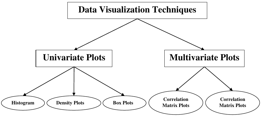
数据可视化技术
- 单变量图 (Univariate Plots)
- 直方图 (Histograms)
- 密度图 (Density Plots)
- 箱线图 (Box Plots)
- 多变量图 (Multivariate Plots)
- 相关矩阵图 (Correlation Matrix Plots)
- 散点矩阵图 (Scatter Matrix Plots)
单变量图:独立理解属性
最简单的可视化类型是单变量或“单变量”可视化。借助单变量可视化,我们可以独立地理解数据集的每个属性。以下是一些在 Python 中实现单变量可视化的技术:
直方图
直方图将数据分组到箱中,是了解数据集中每个属性分布的最快方法。直方图的一些特征如下:
- 它为我们提供了为可视化创建的每个箱中观测值的计数。
- 从箱的形状,我们可以轻松观察分布,即它是高斯分布、偏斜分布还是指数分布。
- 直方图还可以帮助我们发现可能的异常值。
示例
下面显示的代码是一个 Python 脚本的示例,它创建了 Pima Indian 糖尿病数据集属性的直方图。在这里,我们将使用 Pandas DataFrame 的 hist() 函数生成直方图,并使用 matplotlib 绘制它们。
from matplotlib import pyplot
from pandas import read_csv

path = r"C:\pima-indians-diabetes.csv"
names = ['preg', 'plas', 'pres', 'skin', 'test', 'mass', 'pedi', 'age', 'class']
data = read_csv(path, names=names)
data.hist()
pyplot.show()
输出
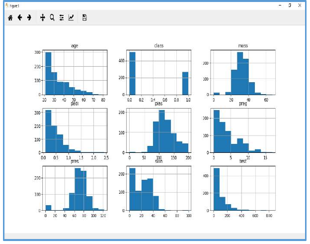
上面的输出显示它为数据集中的每个属性创建了直方图。从这里我们可以观察到,年龄(age)、族谱功能(pedi)和胰岛素(test)属性可能呈指数分布,而体重指数(mass)和血糖(plas)呈高斯分布。
密度图
获取每个属性分布的另一种快速简便的技术是密度图。它也像直方图,但通过每个箱的顶部绘制一条平滑曲线。我们可以称它们为抽象的直方图。
示例
在以下示例中,Python 脚本将为 Pima Indian 糖尿病数据集属性的分布生成密度图。
from matplotlib import pyplot
from pandas import read_csv

path = r"C:\pima-indians-diabetes.csv"
names = ['preg', 'plas', 'pres', 'skin', 'test', 'mass', 'pedi', 'age', 'class']
data = read_csv(path, names=names)
data.plot(kind='density', subplots=True, layout=(3,3), sharex=False)
pyplot.show()
输出
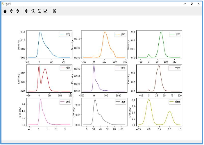
从上面的输出中,可以很容易地理解密度图和直方图之间的区别。
箱线图
箱线图,简称 boxplots,是另一种有用的技术来审查每个属性的分布。该技术具有以下特点:
- 它本质上是单变量的,并总结了每个属性的分布。
- 它为中间值(即中位数)绘制一条线。
- 它在 25% 和 75% 处绘制一个框。
- 它还绘制了晶须,这将使我们了解数据的分布范围。
- 晶须之外的点表示异常值。异常值将比中间数据的分布大小大 1.5 倍。
示例
在以下示例中,Python 脚本将为 Pima Indian 糖尿病数据集属性的分布生成密度图。
from matplotlib import pyplot
from pandas import read_csv

path = r"C:\pima-indians-diabetes.csv"
names = ['preg', 'plas', 'pres', 'skin', 'test', 'mass', 'pedi', 'age', 'class']
data = read_csv(path, names=names)
data.plot(kind='box', subplots=True, layout=(3,3), sharex=False,sharey=False)
pyplot.show()
输出
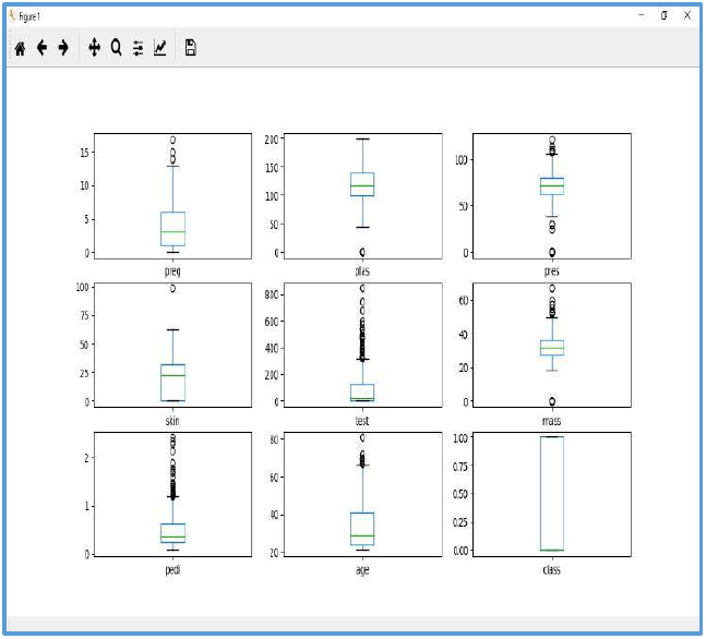
从上面的属性分布图可以看出,年龄(age)、胰岛素(test)和皮肤厚度(skin)似乎偏向较小的值。
多变量图:多个变量之间的交互
另一种可视化类型是多变量或“多变量”可视化。借助多变量可视化,我们可以理解数据集中多个属性之间的交互。以下是一些在 Python 中实现多变量可视化的技术:
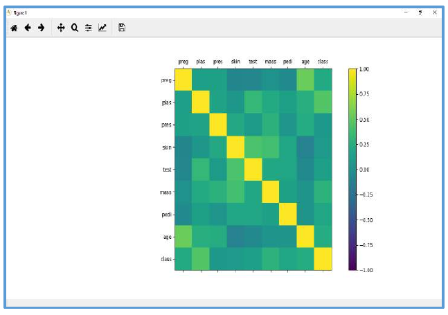
相关矩阵图
相关性是两个变量之间变化的指示。在之前的章节中,我们讨论了 Pearson 相关系数和相关性的重要性。我们可以绘制相关矩阵来显示哪个变量与另一个变量具有高或低相关性。
示例
在以下示例中,Python 脚本将为 Pima Indian 糖尿病数据集生成并绘制相关矩阵。它可以使用 Pandas DataFrame 的 corr() 函数生成,并使用 pyplot 绘制。
from matplotlib import pyplot
from pandas import read_csv
import numpy

Path = r"C:\pima-indians-diabetes.csv"
names = ['preg', 'plas', 'pres', 'skin', 'test', 'mass', 'pedi', 'age', 'class']
data = read_csv(Path, names=names)
correlations = data.corr()
fig = pyplot.figure()
ax = fig.add_subplot(111)
cax = ax.matshow(correlations, vmin=-1, vmax=1)
fig.colorbar(cax)
ticks = numpy.arange(0,9,1)
ax.set_xticks(ticks)
ax.set_yticks(ticks)
ax.set_xticklabels(names)
ax.set_yticklabels(names)
pyplot.show()
输出
(这里应该有一个包含颜色编码的相关矩阵图的图片输出,显示不同属性之间的相关性。由于我无法生成图像,请自行想象或替换为实际图像。)
从上面相关矩阵的输出中,我们可以看到它是对称的,即左下角与右上角相同。还观察到每个变量之间都呈正相关。
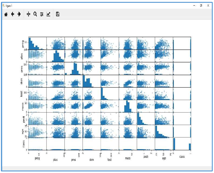
散点矩阵图
散点图显示一个变量受另一个变量影响的程度,或它们之间在二维空间中通过点表示的关系。散点图在概念上与折线图非常相似,它们都使用水平和垂直轴来绘制数据点。
示例
在以下示例中,Python 脚本将为 Pima Indian 糖尿病数据集生成并绘制散点矩阵。它可以使用 Pandas DataFrame 的 scatter_matrix() 函数生成,并使用 pyplot 绘制。
from matplotlib import pyplot
from pandas import read_csv
from pandas.plotting import scatter_matrix # 注意:旧版本可能是 pandas.tools.plotting

path = r"C:\pima-indians-diabetes.csv"
names = ['preg', 'plas', 'pres', 'skin', 'test', 'mass', 'pedi', 'age', 'class']
data = read_csv(path, names=names)
scatter_matrix(data)
pyplot.show()
输出
6.Machine Learning with Python – Understanding
Machine Learning with Python
Data with
Visualization
Introduction
In the previous chapter, we have discussed the importance of data for Machine Learning
algorithms along with some Python recipes to understand the data with statistics. There
is another way called Visualization, to understand the data.
With the help of data visualization, we can see how the data looks like and what kind of
correlation is held by the attributes of data. It is the fastest way to see if the features
correspond to the output. With the help of following Python recipes, we can understand
ML data with statistics.
Data Visualization Techniques
Univariate Plots
Multivariate Plots
Histogram
s
Density Plots
Box Plots
Correlation
Matrix Plots
Correlation
Matrix Plots
Univariate Plots: Understanding Attributes Independently
The simplest type of visualization is single-variable or “univariate” visualization. With the
help of univariate visualization, we can understand each attribute of our dataset
independently. The following are some techniques in Python to implement univariate
visualization:
Histograms
Histograms group the data in bins and is the fastest way to get idea about the distribution
of each attribute in dataset. The following are some of the characteristics of histograms:
It provides us a count of the number of observations in each bin created for
visualization.
35
Machine Learning with Python
From the shape of the bin, we can easily observe the distribution i.e. weather it is
Gaussian, skewed or exponential.
Histograms also help us to see possible outliers.
Example
The code shown below is an example of Python script creating the histogram of the
attributes of Pima Indian Diabetes dataset. Here, we will be using hist() function on
Pandas DataFrame to generate histograms and matplotlib for ploting them.
from matplotlib import pyplot
from pandas import read_csv
path = r"C:\pima-indians-diabetes.csv"
names = ['preg', 'plas', 'pres', 'skin', 'test', 'mass', 'pedi', 'age',
'class']
data = read_csv(path, names=names)
data.hist()
pyplot.show()
Output
36
Machine Learning with Python
The above output shows that it created the histogram for each attribute in the dataset.
From this, we can observe that perhaps age, pedi and test attribute may have exponential
distribution while mass and plas have Gaussian distribution.
Density Plots
Another quick and easy technique for getting each attributes distribution is Density plots.
It is also like histogram but having a smooth curve drawn through the top of each bin. We
can call them as abstracted histograms.
Example
In the following example, Python script will generate Density Plots for the distribution of
attributes of Pima Indian Diabetes dataset.
from matplotlib import pyplot
from pandas import read_csv
path = r"C:\pima-indians-diabetes.csv"
names = ['preg', 'plas', 'pres', 'skin', 'test', 'mass', 'pedi', 'age',
'class']
data = read_csv(path, names=names)
data.plot(kind='density', subplots=True, layout=(3,3), sharex=False)
pyplot.show()
Output
37
Machine Learning with Python
From the above output, the difference between Density plots and Histograms can be easily
understood.
Box and Whisker Plots
Box and Whisker plots, also called boxplots in short, is another useful technique to review
the distribution of each attribute’s distribution. The following are the characteristics of this
technique:
It is univariate in nature and summarizes the distribution of each attribute.
It draws a line for the middle value i.e. for median.
It draws a box around the 25% and 75%.
It also draws whiskers which will give us an idea about the spread of the data.
The dots outside the whiskers signifies the outlier values. Outlier values would be
1.5 times greater than the size of the spread of the middle data.
Example
In the following example, Python script will generate Density Plots for the distribution of
attributes of Pima Indian Diabetes dataset.
from matplotlib import pyplot
from pandas import read_csv
path = r"C:\pima-indians-diabetes.csv"
names = ['preg', 'plas', 'pres', 'skin', 'test', 'mass', 'pedi', 'age',
'class']
data = read_csv(path, names=names)
data.plot(kind='box', subplots=True, layout=(3,3), sharex=False,sharey=False)
pyplot.show()
38
Output
Machine Learning with Python
From the above plot of attribute’s distribution, it can be observed that age, test and skin
appear skewed towards smaller values.
Multivariate Plots: Interaction Among Multiple Variables
Another type of visualization is multi-variable or “multivariate” visualization. With the help
of multivariate visualization, we can understand interaction between multiple attributes of
our dataset. The following are some techniques in Python to implement multivariate
visualization:
Correlation Matrix Plot
Correlation is an indication about the changes between two variables. In our previous
chapters, we have discussed Pearson’s Correlation coefficients and the importance of
Correlation too. We can plot correlation matrix to show which variable is having a high or
low correlation in respect to another variable.
Example
In the following example, Python script will generate and plot correlation matrix for the
Pima Indian Diabetes dataset. It can be generated with the help of corr() function on Pandas
DataFrame and plotted with the help of pyplot.
39
Machine Learning with Python
from matplotlib import pyplot
from pandas import read_csv
import numpy
Path = r"C:\pima-indians-diabetes.csv"
names = ['preg', 'plas', 'pres', 'skin', 'test', 'mass', 'pedi', 'age',
'class']
data = read_csv(Path, names=names)
correlations = data.corr()
fig = pyplot.figure()
ax = fig.add_subplot(111)
cax = ax.matshow(correlations, vmin=-1, vmax=1)
fig.colorbar(cax)
ticks = numpy.arange(0,9,1)
ax.set_xticks(ticks)
ax.set_yticks(ticks)
ax.set_xticklabels(names)
ax.set_yticklabels(names)
pyplot.show()
Output
40
Machine Learning with Python
From the above output of correlation matrix, we can see that it is symmetrical i.e. the
bottom left is same as the top right. It is also observed that each variable is positively
correlated with each other.
Scatter Matrix Plot
Scatter plots shows how much one variable is affected by another or the relationship
between them with the help of dots in two dimensions. Scatter plots are very much like
line graphs in the concept that they use horizontal and vertical axes to plot data points.
Example
In the following example, Python script will generate and plot Scatter matrix for the Pima
Indian Diabetes dataset. It can be generated with the help of scatter_matrix() function on
Pandas DataFrame and plotted with the help of pyplot.
from matplotlib import pyplot
from pandas import read_csv
from pandas.tools.plotting import scatter_matrix
path = r"C:\pima-indians-diabetes.csv"
names = ['preg', 'plas', 'pres', 'skin', 'test', 'mass', 'pedi', 'age',
'class']
data = read_csv(path, names=names)
scatter_matrix(data)
pyplot.show()
41
Output