加载数字数据(Loading Digits Data)
章节大纲
-
我们将更深入地研究这些数据集中的一个。我们来看一下数字数据集 (digits data set)。我们先加载它:
Pythonfrom sklearn.datasets import load_digits digits = load_digits()同样,我们可以通过查看 "keys" 来获取可用属性的概览:
Pythondigits.keys()输出:
dict_keys(['data', 'target', 'target_names', 'images', 'DESCR'])我们来看看项目和特征的数量:
Pythonn_samples, n_features = digits.data.shape print((n_samples, n_features))输出:
(1797, 64)Pythonprint(digits.data[0]) print(digits.target)输出:
[ 0. 0. 5. 13. 9. 1. 0. 0. 0. 0. 13. 15. 10. 15. 5. 0. 0. 3. 15. 2. 0. 11. 8. 0. 0. 4. 12. 0. 0. 8. 8. 0. 0. 5. 16. 8. 0. 0. 9. 8. 0. 0. 4. 11. 0. 1. 12. 7. 0. 0. 2. 14. 5. 0. 0. 0. 0. 6. 13. 10. 0. 0. 0.] [0 1 2 ... 8 9 8]数据也可以通过
digits.images获取。这是以 8 行 8 列形式表示的图像的原始数据。通过 "data",一张图像对应一个长度为 64 的一维 Numpy 数组;而 "images" 表示则包含形状为 (8, 8) 的二维 Numpy 数组。
Pythonprint("一个项目的形状: ", digits.data[0].shape) print("一个项目的数据类型: ", type(digits.data[0])) print("一个项目的形状: ", digits.images[0].shape) print("一个项目的数据类型: ", type(digits.images[0]))输出:
一个项目的形状: (64,) 一个项目的数据类型: <class 'numpy.ndarray'> 一个项目的形状: (8, 8) 一个项目的数据类型: <class 'numpy.ndarray'>让我们将数据可视化。这比我们上面使用的简单散点图稍微复杂一些,但我们可以很快完成。
Pythonimport matplotlib.pyplot as plt # 设置图表 fig = plt.figure(figsize=(6, 6)) # 图表大小(英寸) fig.subplots_adjust(left=0, right=1, bottom=0, top=1, hspace=0.05, wspace=0.05) # 绘制数字:每个图像都是 8x8 像素 for i in range(64): ax = fig.add_subplot(8, 8, i + 1, xticks=[], yticks=[]) ax.imshow(digits.images[i], cmap=plt.cm.binary, interpolation='nearest') # 用目标值标记图像 ax.text(0, 7, str(digits.target[i])) plt.show()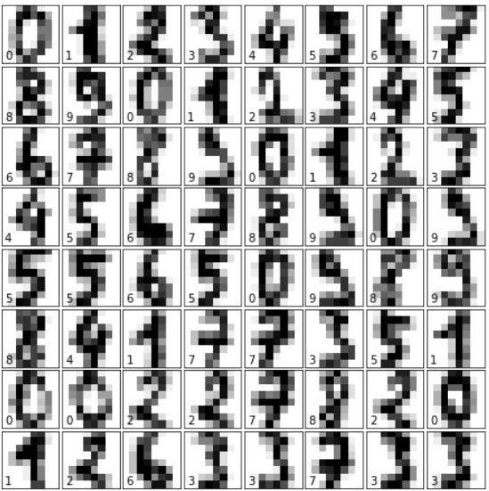
练习
练习 1
sklearn 中包含一个“葡萄酒数据集 (wine data set)”。
-
找到并加载此数据集。
-
您能找到它的描述吗?
-
类别的名称是什么?
-
特征是什么?
-
数据和带标签的数据在哪里?
练习 2
创建葡萄酒数据集中特征
ash和color_intensity的散点图。练习 3
创建葡萄酒数据集特征的散点矩阵。
练习 4
获取 Olivetti 人脸数据集并可视化这些人脸。
解决方案
练习 1 解决方案
加载“葡萄酒数据集”:
Pythonfrom sklearn import datasets wine = datasets.load_wine()描述可以通过 "DESCR" 访问:
Pythonprint(wine.DESCR)类别的名称和特征可以通过以下方式获取:
Pythonprint(wine.target_names) print(wine.feature_names)输出:
['class_0' 'class_1' 'class_2'] ['alcohol', 'malic_acid', 'ash', 'alcalinity_of_ash', 'magnesium', 'total_phenols', 'flavanoids', 'nonflavanoid_phenols', 'proanthocyanins', 'color_intensity', 'hue', 'od280/od315_of_diluted_wines', 'proline']数据和带标签的数据:
Pythondata = wine.data labelled_data = wine.target练习 2 解决方案
Pythonfrom sklearn import datasets import matplotlib.pyplot as plt wine = datasets.load_wine() features = 'ash', 'color_intensity' features_index = [wine.feature_names.index(features[0]), wine.feature_names.index(features[1])] colors = ['blue', 'red', 'green'] for label, color in zip(range(len(wine.target_names)), colors): plt.scatter(wine.data[wine.target==label, features_index[0]], wine.data[wine.target==label, features_index[1]], label=wine.target_names[label], c=color) plt.xlabel(features[0]) plt.ylabel(features[1]) plt.legend(loc='upper left') plt.show()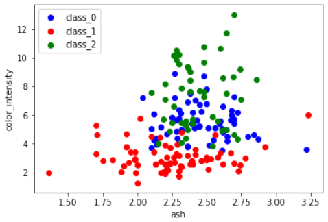
练习 3 解决方案
Pythonimport pandas as pd from sklearn import datasets import matplotlib.pyplot as plt # 导入 matplotlib 以便显示图表 wine = datasets.load_wine() def rotate_labels(df, axes): """ 改变标签输出的旋转角度, y 轴标签水平,x 轴标签垂直 """ n = len(df.columns) for x in range(n): for y in range(n): # 获取子图的轴 ax = axes[x, y] # 使 x 轴名称垂直 ax.xaxis.label.set_rotation(90) # 使 y 轴名称水平 ax.yaxis.label.set_rotation(0) # 确保 y 轴名称在绘图区域之外 ax.yaxis.labelpad = 50 wine_df = pd.DataFrame(wine.data, columns=wine.feature_names) axs = pd.plotting.scatter_matrix(wine_df, c=wine.target, figsize=(8, 8), ) rotate_labels(wine_df, axs) plt.show() # 显示图表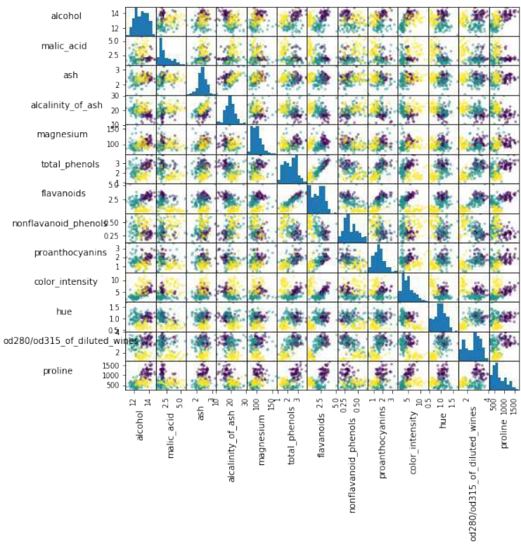
练习 4 解决方案
Pythonfrom sklearn.datasets import fetch_olivetti_faces import numpy as np import matplotlib.pyplot as plt # 获取人脸数据 faces = fetch_olivetti_faces() faces.keys()输出:
dict_keys(['data', 'images', 'target', 'DESCR'])Pythonn_samples, n_features = faces.data.shape print((n_samples, n_features))输出:
(400, 4096)Pythonnp.sqrt(4096)输出:
64.0Pythonfaces.images.shape输出:
(400, 64, 64)Pythonfaces.data.shape输出:
(400, 4096)Pythonprint(np.all(faces.images.reshape((400, 4096)) == faces.data))输出:
TruePython# 设置图表 fig = plt.figure(figsize=(6, 6)) # 图表大小(英寸) fig.subplots_adjust(left=0, right=1, bottom=0, top=1, hspace=0.05, wspace=0.05) # 绘制人脸:每个图像是 64x64 像素 for i in range(64): ax = fig.add_subplot(8, 8, i + 1, xticks=[], yticks=[]) ax.imshow(faces.images[i], cmap=plt.cm.bone, interpolation='nearest') # 用目标值标记图像 ax.text(0, 7, str(faces.target[i])) plt.show()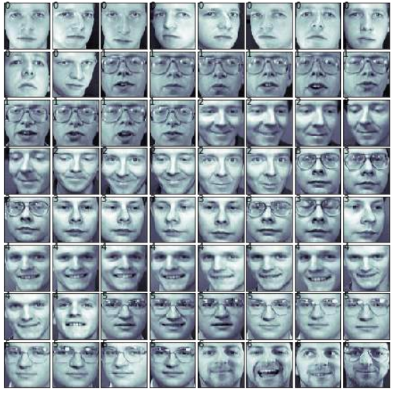
更多数据集
sklearn 提供了许多其他数据集。如果您还需要更多,可以在维基百科的“机器学习研究数据集列表”中找到更多有用的信息。
We will have a closer look at one of these datasets. We look at the digits data set. We will load it first:
from sklearn.datasets import load_digits
digits = load_digits()
Again, we can get an overview of the available attributes by looking at the "keys":
digits.keys()
Output:dict_keys(['data', 'target', 'target_names', 'images', 'DESC
R'])
Let's have a look at the number of items and features:
n_samples, n_features = digits.data.shape
print((n_samples, n_features))
(1797, 64)
print(digits.data[0])
print(digits.target)
[ 0. 0. 5. 13. 9. 1. 0.
0.
0.
0. 13. 15. 10. 15.
5.
0.
0. 3.
15. 2. 0. 11. 8. 0. 0.
4. 12.
0.
0.
8.
8.
0.
0.
5.
8. 0.
0. 9. 8. 0. 0. 4. 11.
0.
1. 12.
7.
0.
0.
2. 14.
5. 1
0. 12.
0. 0. 0. 0. 6. 13. 10.
0.
0.
0.]
[0 1 2 ... 8 9 8]
The data is also available at digits.images. This is the raw data of the images in the form of 8 lines and 8
columns.
With "data" an image corresponds to a one-dimensional Numpy array with the length 64, and "images"
representation contains 2-dimensional numpy arrays with the shape (8, 8)
print("Shape of an item: ", digits.data[0].shape)
print("Data type of an item: ", type(digits.data[0]))
print("Shape of an item: ", digits.images[0].shape)
31
print("Data tpye of an item: ", type(digits.images[0]))
Shape of an item: (64,)
Data type of an item: <class 'numpy.ndarray'>
Shape of an item: (8, 8)
Data tpye of an item: <class 'numpy.ndarray'>
Let's visualize the data. It's little bit more involved than the simple scatter-plot we used above, but we can do it
rather quickly.
# set up the figure
fig = plt.figure(figsize=(6, 6)) # figure size in inches
fig.subplots_adjust(left=0, right=1, bottom=0, top=1, hspace=0.0
5, wspace=0.05)
# plot the digits: each image is 8x8 pixels
for i in range(64):
ax = fig.add_subplot(8, 8, i + 1, xticks=[], yticks=[])
ax.imshow(digits.images[i], cmap=plt.cm.binary, interpolatio
n='nearest')
# label the image with the target value
ax.text(0, 7, str(digits.target[i]))
32
EXERCISES
EXERCISE 1
sklearn contains a "wine data set".
•
•
•
•
•
Find and load this data set
Can you find a description?
What are the names of the classes?
What are the features?
Where is the data and the labeled data?
EXERCISE 2:
Create a scatter plot of the features ash and color_intensity of the wine data set.
33
EXERCISE 3:
Create a scatter matrix of the features of the wine dataset.
EXERCISE 4:
Fetch the Olivetti faces dataset and visualize the faces.
SOLUTIONS
SOLUTION TO EXERCISE 1
Loading the "wine data set":
from sklearn import datasets
wine = datasets.load_wine()
The description can be accessed via "DESCR":
In [ ]:
print(wine.DESCR)
The names of the classes and the features can be retrieved like this:
print(wine.target_names)
print(wine.feature_names)
['class_0' 'class_1' 'class_2']
['alcohol', 'malic_acid', 'ash', 'alcalinity_of_ash', 'magnesiu
m', 'total_phenols', 'flavanoids', 'nonflavanoid_phenols', 'proant
hocyanins', 'color_intensity', 'hue', 'od280/od315_of_diluted_wine
s', 'proline']
data = wine.data
labelled_data = wine.target
SOLUTION TO EXERCISE 2:
from sklearn import datasets
import matplotlib.pyplot as plt
34
wine = datasets.load_wine()
features = 'ash', 'color_intensity'
features_index = [wine.feature_names.index(features[0]),
wine.feature_names.index(features[1])]
colors = ['blue', 'red', 'green']
for label, color in zip(range(len(wine.target_names)), colors):
plt.scatter(wine.data[wine.target==label, features_index[0]],
wine.data[wine.target==label, features_index[1]],
label=wine.target_names[label],
c=color)
plt.xlabel(features[0])
plt.ylabel(features[1])
plt.legend(loc='upper left')
plt.show()
SOLUTION TO EXERCISE 3:
import pandas as pd
from sklearn import datasets
wine = datasets.load_wine()
def rotate_labels(df, axes):
""" changing the rotation of the label output,
y labels horizontal and x labels vertical """
35
n = len(df.columns)
for x in range:
for y in range
# to get the axis of subplots
ax = axs[x, y]
# to make x axis name vertical
ax.xaxis.label.set_rotation(90)
# to make y axis name horizontal
ax.yaxis.label.set_rotation(0)
# to make sure y axis names are outside the plot area
ax.yaxis.labelpad = 50
wine_df = pd.DataFrame(wine.data, columns=wine.feature_names)
axs = pd.plotting.scatter_matrix(wine_df,
c=wine.target,
figsize=(8, 8),
);
rotate_labels(wine_df, axs)
36
SOLUTION TO EXERCISE 4
from sklearn.datasets import fetch_olivetti_faces
# fetch the faces data
faces = fetch_olivetti_faces()
faces.keys()
Output:dict_keys(['data', 'images', 'target', 'DESCR'])
37
n_samples, n_features = faces.data.shape
print((n_samples, n_features))
(400, 4096)
np.sqrt(4096)
Output:64.0
faces.images.shape
Output400, 64, 64)
faces.data.shape
Output
print(np.all(faces.images.reshape((400, 4096)) == faces.data))
True
# set up the figure
fig = plt.figure(figsize=(6, 6)) # figure size in inches
fig.subplots_adjust(left=0, right=1, bottom=0, top=1, hspace=0.0
5, wspace=0.05)
# plot the digits: each image is 8x8 pixels
for i in range(64):
ax = fig.add_subplot(8, 8, i + 1, xticks=[], yticks=[])
ax.imshow(faces.images[i], cmap=plt.cm.bone, interpolation='ne
arest')
# label the image with the target value
ax.text(0, 7, str(faces.target[i]))
38
FURTHER DATASETS
sklearn has many more datasets available. If you still need more, you will find more on this nice List of
datasets for machine-learning research at Wikipedia. -